

Labels always have their place within the marketing business. They hold the viewer’s attention with an attention-grabbing quality. That’s why labels remain a popular option for selling products of all kinds. There are a lot of stock labels readily available, but if your goal is to distinguish your product with a truly unique, tailor-made presentation, you’re likely better off building your own label in Photoshop. So, today we’ll learn to create an interesting and compelling product label in Photoshop.
In this tutorial, I’ll walk you through the process of creating an attractive label from scratch. Along the way, we’ll practice the use of various shape tools, the pen tool, different layer styling techniques, and advanced shading of layers and elements. So, let’s get started!
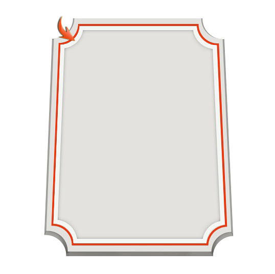
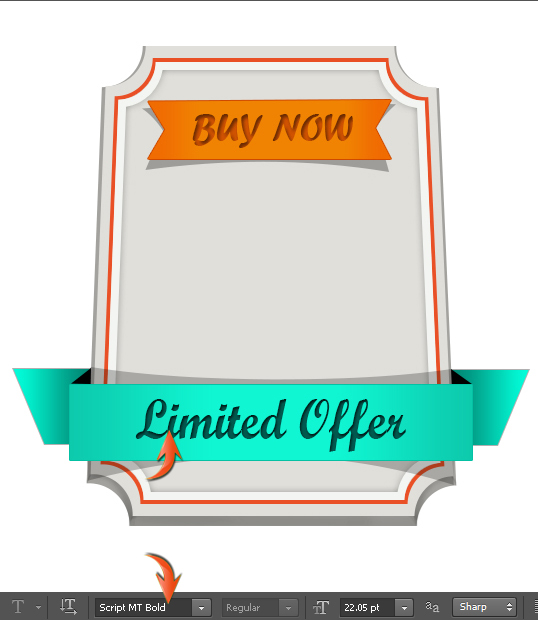
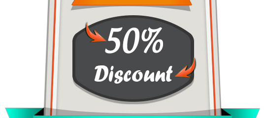
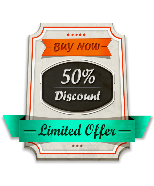
Final result:
Before we start, let’s look ahead at our end result:

Key Takeaways
- Creating a unique, tailor-made product label in Photoshop can help distinguish your product in the market. This involves using various shape tools, the pen tool, different layer styling techniques, and advanced shading of layers and elements.
- The process of creating a compelling product label in Photoshop includes creating and styling the base layer of the label, adding and styling text, creating and adding ribbons and other decorative elements, and adding a texture to the label for a finished look. Each step involves specific tools and techniques in Photoshop.
- Photoshop offers a wide range of tools for creating a product label, including the Text tool for adding text, the Shape tool for creating shapes, the Brush tool for adding artistic elements, the Layers panel for managing and organizing design elements, the Gradient tool for adding depth and dimension, and the Color Picker for choosing exact colors.
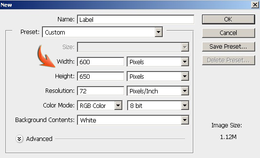
Step 1
Create a new document in Photoshop with a 600px width and a 650px height.
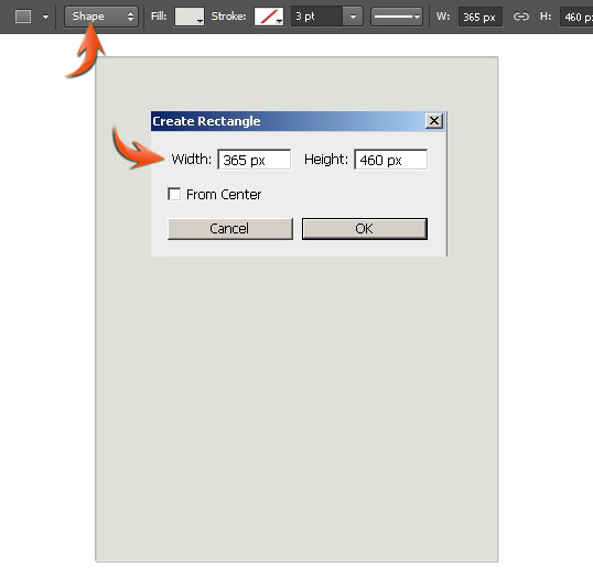
Step 2
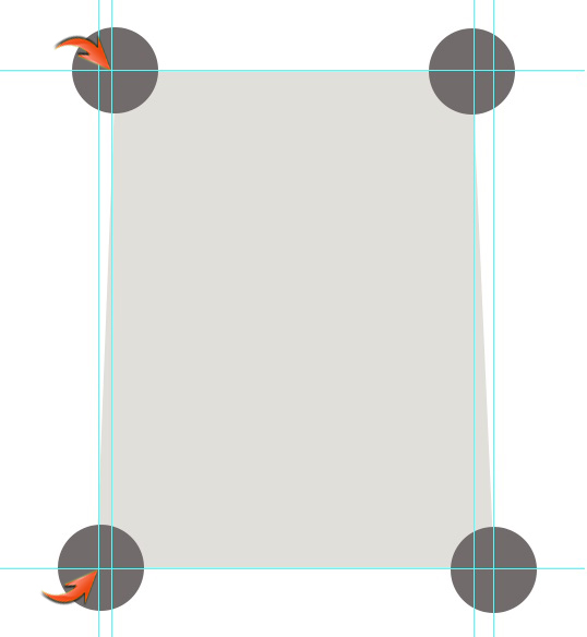
Set #e0dfda as your foreground color, and select the rectangle tool (using tool mode: shape) to draw a rectangle shown below.
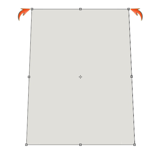
Step 3
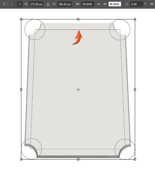
Now, we’ll bring top corners of the rectangle closer using distort. Click on the rectangle layer and go to “Edit” > “Transform” > “Distort,” and drag the top corners slightly inward one by one.
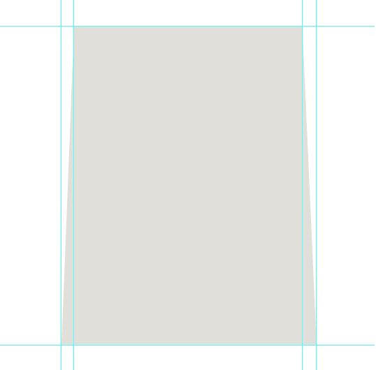
Step 4
Next, we’ll add guides, which will help us achieve the desired look more accurately. So, go to “View” > “Rulers.” This will bring the rulers at top and left side of the canvas. Now, simply select the move tool and drag guides from horizontal and vertical rulers to the borders of the rectangle as shown below.
Now, select the ellipse tool (using tool mode: shape) and draw a circle. You can use any color for the ellipse, it doesn’t matter. Then, duplicate this circle three times and arrange them as shown below.
Step 5
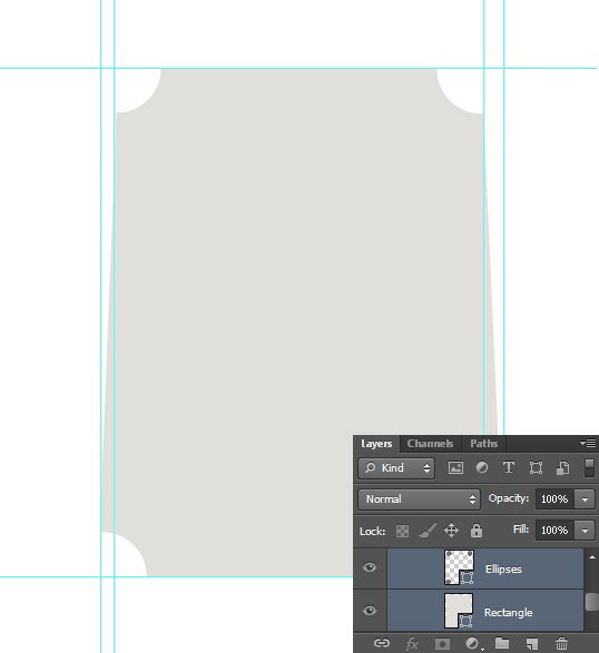
Now, select all the circle layers by pressing the Shift key and go to “Layer” > “Combine shapes” > “Unite shapes.”
Next, select the circles layer and rectangle layer and go to “Layer” > “Combine shapes” > “Subtract front shape.” By doing so, the rectangle color will be changed, give it color #e0dfda once again. Label this modified rectangle layer as “Label’s base.”
Step 6
If you prefer, you can remove the guides by going to “View” > “Clear guides.” Duplicate the “Label’s base” layer by going to “Layer” > “Duplicate layer.” Change its color to #a3a29e. Drag it below the original layer, increase the size of this layer a bit using free transform tool (Ctrl + “T”), and drag it downward to give the label some thickness.
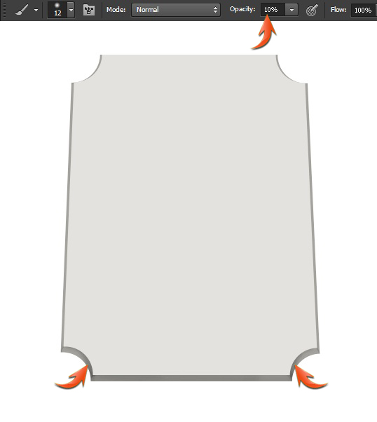
Now press Ctrl+ <click on this new layer> to make a selection around it. Create a new layer between the duplicated base layer and the original base layer. After that, select the soft round brush with 10% opacity and apply it within the selection on this new layer in pure black color.
Step 7
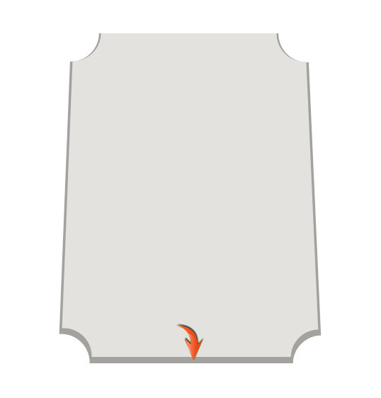
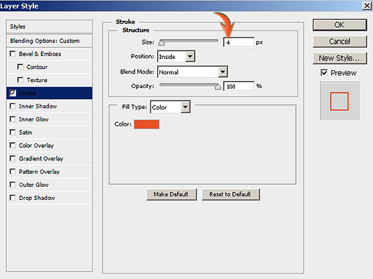
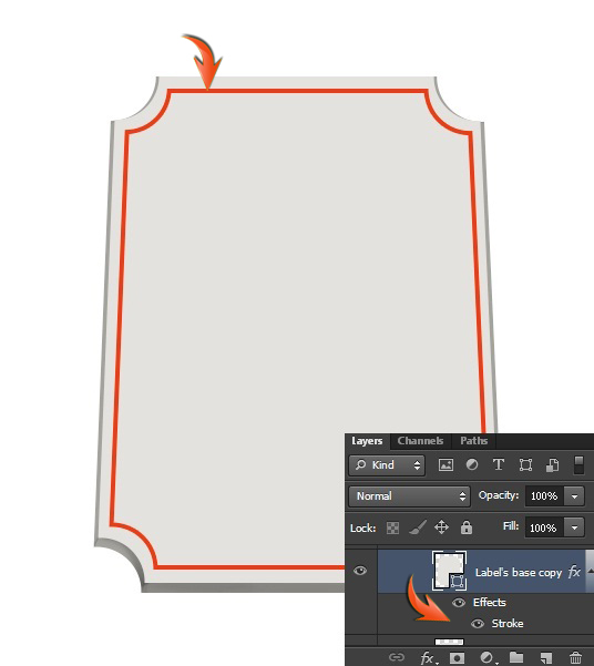
Now, duplicate the label base layer, this copy should be at top of the rest of the layers. Reduce its size by 5% using the free transform tool. After that, double-click on this layer to apply the following settings as a stroke.
Step 8
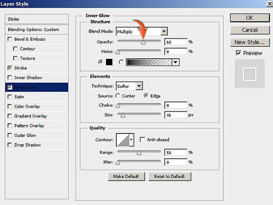
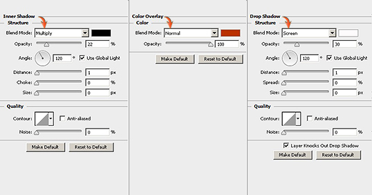
Next, duplicate the layer formed in step 7, reduce its size by 2%, and apply the following layer style settings for stroke and inner glow on this layer.

Step 9
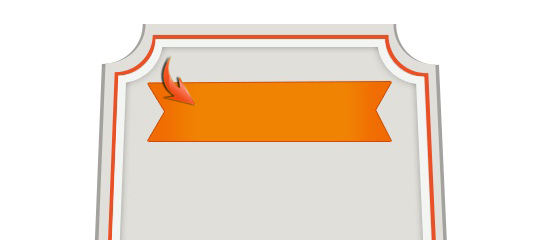
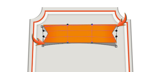
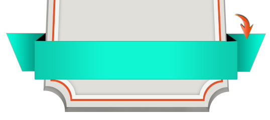
Next, we’ll create a ribbon. Select the pen tool (using tool mode: Shape) and draw the ribbon as shown below. You can use any color for now, as we’ll apply a gradient on it in later steps.
Double-click on the ribbon layer and apply the following settings for stroke and gradient overlay.
Step 10
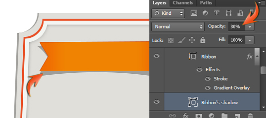
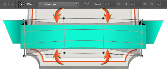
Now to create ribbon’s shadow, duplicate the ribbon layer, remove the effects by simply dragging them to the delete icon located at the bottom of the layers panel. Change this new layer’s color to pure black and reduce its opacity to 30%. Place this layer below the original ribbon layer and go to “Edit” > “Transform” > “Warp.” Use it to make a shadow behind the ribbon, as shown below.
Step 11
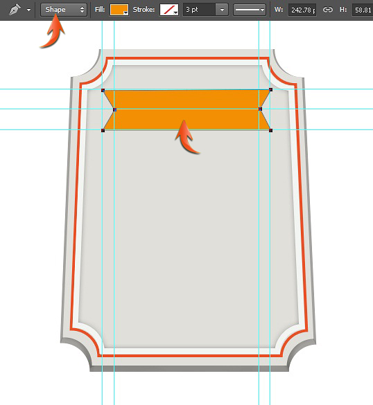
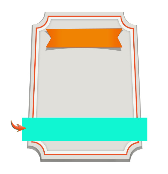
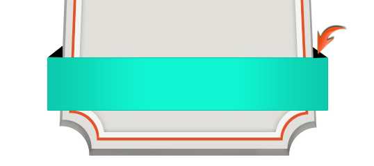
Next, we’ll create another ribbon over the lower part of the label. Draw a rectangle as shown below.
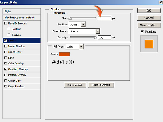
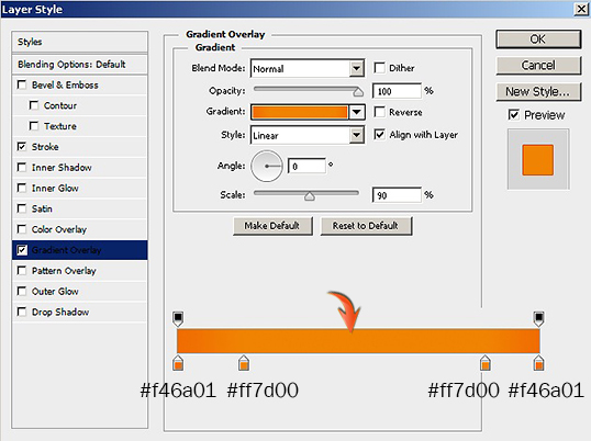
Apply the following layer style settings to this new layer.
Step 12
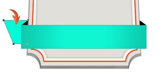
Select the pen tool (tool mode: shape) to draw a triangle like the one below in pure black.
Now, duplicate the triangle layer and go to “Edit” > “Transform” > “Flip Horizontal.” Position this new duplicate over the other corner of the ribbon.
Step 13
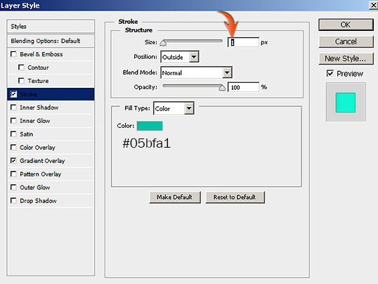
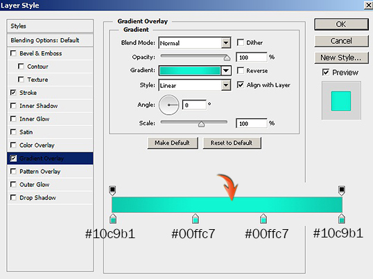
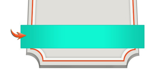
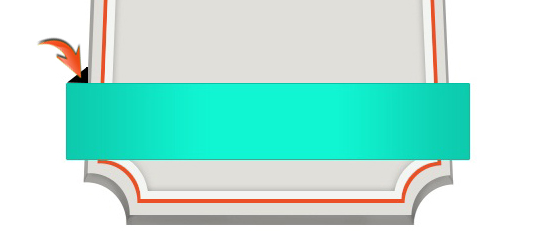
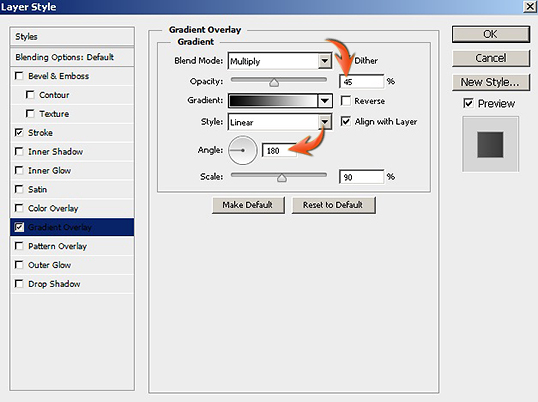
Select color #02fbd7 and draw the shape shown below using the pen tool.
Apply a stroke using the same layer style settings used in step 11, and apply the following gradient on it as well.
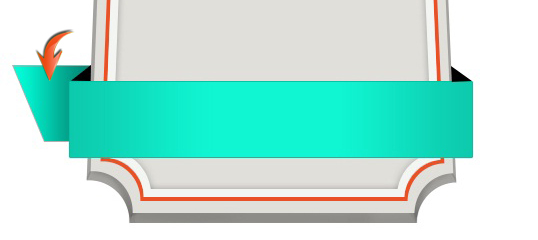
Duplicate this side ribbon shape, flip it horizontally, and change the angle of gradient overlay from 180 to 0 degree to get the effect shown below.
Step 14
Now, form the ribbon shadow using the same process that we used for the orange ribbon in step 10.
Step 15
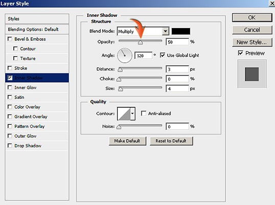
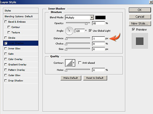
Next, we’ll add text over the ribbons. Select the type tool and type text over the orange ribbon in color #d65401 using the “Forte” font. Apply the following settings for inner shadow on this new text layer.
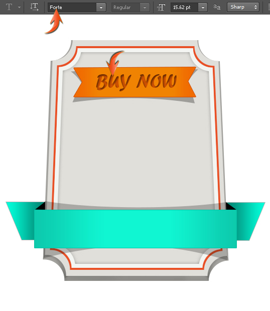
Type some text over the blue ribbon; use “Script MT Bold” font and #00968d as your color. Apply an inner shadow using the same settings from the last ribbon text.
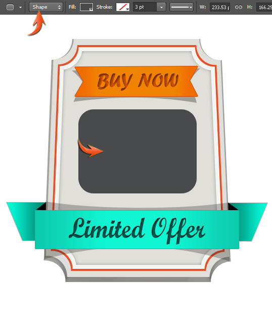
Step 16
Select #484a4c as your color and draw a rectangle using the rounded rectangle tool with a 30px radius.
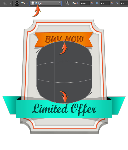
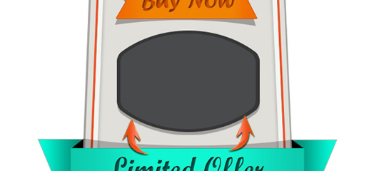
Now go to “Edit” > “Transform” > “Warp.” Select “Bulge” with a 50% bend in the top properties bar. Once you are done, decrease its size vertically using the free transform tool to get the shape shown below.

Step 17
Duplicate this new shape layer, Change its color to a darker gray (#363636), and increase its size slightly. Place this layer below the original layer and form its shadow as shown below.
Step 18
Add text over this new shape in pure white. We’ll use “Forte” font to write the word “discount”.
Apply the following layer style settings on this new white text.

Step 19
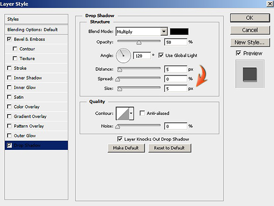
Duplicate the rounded rectangle layer, increase its size slightly, and apply a stroke of 3px in pure white color.

Right-click on the thin white border layer and select “Rasterize layer Style.” Now, select the rectangular marquee tool to draw a horizontal and vertical rectangular selection on this stroke one by one and go to “Edit” > “Clear.”

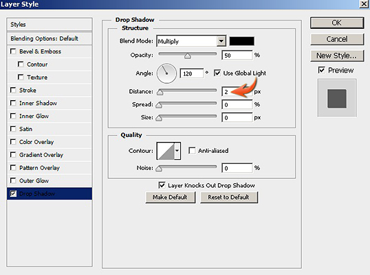
Now use the following values to apply a drop shadow to the same layer.

Step 20
Create a new layer on top of rest of the layers, make a thin rectangular selection using the rectangular marquee tool, and fill it with pure white. Now, gently erase the new shape’s edges to give them pointed look.

Apply an inner shadow with the following settings.

Step 21
Duplicate and resize this thin partition layer and arrange them over the ribbons as shown below.

Now, apply the following layer style settings for the orange ribbon partition lines.
Use the same settings for the dividers over the blue ribbons. However, use a darker blue shade for the color overlay.

Step 22
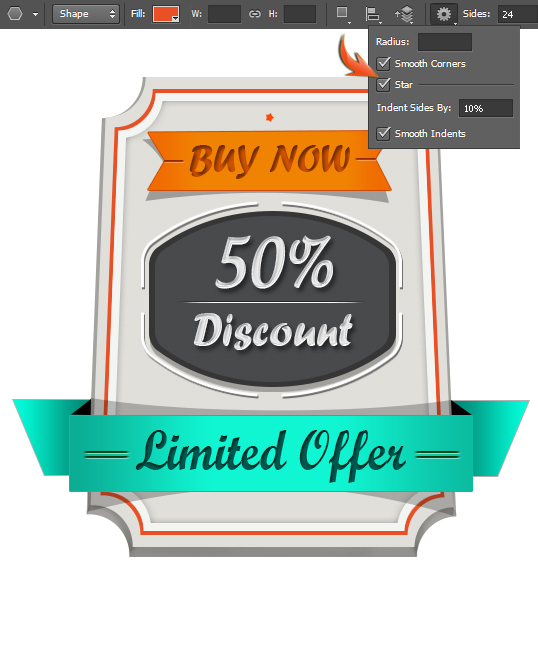
We’ll add tiny stars now. Select the polygon tool and use the following settings to draw a star.
Apply an inner shadow on the stars layer using the following settings.

Make two thin rectangles and duplicate the star layer a few times. Arrange these elements as shown below.

Step 23
Next, to make a shadow, duplicate the darker base layer of the label, turn it pure black and go to “Filter” > “Blur” > “Gaussian blur.” For that, you’ll need to rasterize this new layer. Then, use 3.5px for the Gaussian blur and reduce the opacity of this layer to 30%.

Then, make a shadow below the blue ribbon sides using the same technique.

Step 24
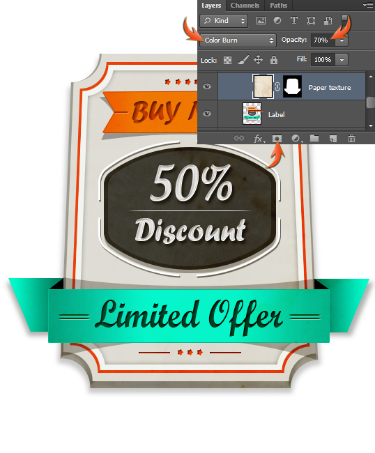
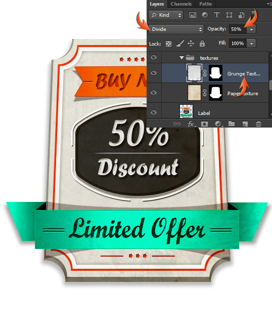
Now we’ll apply a subtle texture to the label. Load the paper texture in Photoshop, copy it, and paste it in your document on top of the other layers. Collect all label layers in a group, merge this group, and name it as “Label.” Now, click on the texture layer and press Ctrl + <click on the “Label” layer> to make a selection around it. Then, click on the icon to “Add layer mask.” Change the blending mode of texture layer to “Color Burn,” and reduce its opacity to 70%.
Paste the grunge texture above the paper texture and add a layer mask like before. Now, change its blending mode to “Divide,” and reduce its opacity to 50%.
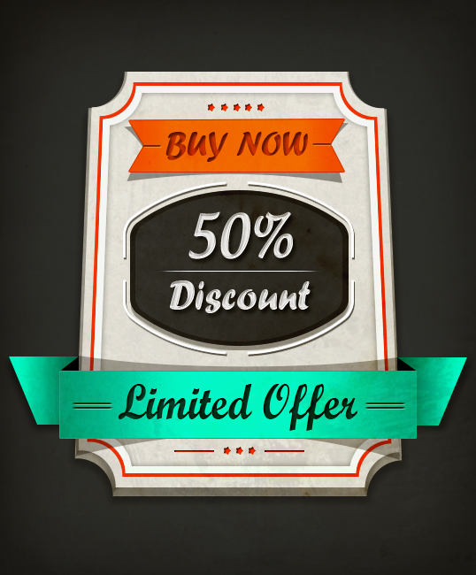
Step 25
Our stylish product label is all done. I’ve added a dark grungy background. Here is how it looks:
That’s it guys. I hope you have learned something useful and gotten some good practice.
Frequently Asked Questions about Creating a Compelling Product Label in Photoshop
What are the basic tools in Photoshop that I need to use to create a product label?
Photoshop offers a wide range of tools that can be used to create a product label. The most basic tools you will need include the Text tool for adding text, the Shape tool for creating shapes, and the Brush tool for adding artistic elements. The Layers panel is also essential as it allows you to manage and organize different elements of your design. The Gradient tool can be used to add depth and dimension to your label, while the Color Picker allows you to choose the exact colors you want to use.
How can I ensure my product label design is print-ready?
To ensure your product label design is print-ready, you need to set the correct resolution, color mode, and bleed settings. The resolution should be set to at least 300 pixels per inch (PPI) for high-quality print output. The color mode should be set to CMYK, which is the standard for print materials. Lastly, you should add a bleed of at least 0.125 inches to your design to prevent any unwanted white borders from appearing in the final print.
How can I add a barcode to my product label in Photoshop?
To add a barcode to your product label in Photoshop, you first need to generate the barcode using a barcode generator online. Once you have your barcode, save it as an image file. Then, you can import this image into your Photoshop document by going to File > Place Embedded. Resize and position the barcode as needed.
How can I create a 3D effect on my product label in Photoshop?
Photoshop has a 3D feature that allows you to create a 3D effect on your product label. To do this, first, create a new layer for your 3D element. Then, go to 3D > New 3D Extrusion from Selected Layer. You can then adjust the depth and perspective of your 3D element using the 3D panel.
How can I add a custom shape to my product label in Photoshop?
To add a custom shape to your product label in Photoshop, you can use the Custom Shape tool. This tool allows you to choose from a variety of pre-made shapes, or you can import your own. To use this tool, select it from the toolbar, choose your desired shape from the options bar, and then click and drag on your canvas to draw the shape.
How can I make my product label design more appealing?
There are several ways to make your product label design more appealing. One way is to use color effectively. Choose colors that represent your brand and product well. Another way is to use typography that is easy to read and visually appealing. You can also add images or illustrations to make your label more eye-catching. Lastly, keep your design simple and uncluttered for maximum impact.
How can I save my product label design in Photoshop for professional printing?
To save your product label design in Photoshop for professional printing, go to File > Save As, and choose Photoshop PDF as the file format. In the PDF settings, choose [Press Quality] preset. Make sure to check the boxes for ‘Embed Page Thumbnails’, ‘Optimize for Fast Web View’, and ‘Embed All Fonts’. This will ensure your design is saved in high quality and is ready for professional printing.
How can I create a transparent background for my product label in Photoshop?
To create a transparent background for your product label in Photoshop, you need to use the Layers panel. First, create a new layer and move it below your label design. Then, select the original background layer and hit the delete key. This will leave you with a transparent background.
How can I add a texture to my product label in Photoshop?
To add a texture to your product label in Photoshop, you first need to have a texture image. You can find free texture images online or create your own. Once you have your texture image, go to File > Place Embedded to import it into your document. Resize and position the texture as needed, then change the blending mode to Overlay to blend the texture with your design.
How can I create a vintage or retro effect on my product label in Photoshop?
To create a vintage or retro effect on your product label in Photoshop, you can use adjustment layers and filters. For example, you can add a sepia tone to your design using a Photo Filter adjustment layer. You can also use the Noise filter to add a grainy texture to your design, which can give it a vintage look.

