

Key Takeaways
- Mixing typefaces in design requires careful consideration to avoid clashes. The first step is to align the x-heights of the typefaces, which is the distance from the baseline to the common height of lowercase letters without an ascender.
- Stylistic elements must also be taken into account when mixing typefaces. These include stroke modulation, angle of axes, serif styles, apertures, and negative space. The typefaces should complement each other and create a balance of contrast and harmony.
- The selection of typefaces can greatly influence the mood or tone of the text. For instance, serif typefaces often convey tradition and authority, while sans-serif typefaces appear modern and clean. It’s important to choose typefaces that align with the intended mood or tone of the design.
A common technique in typesetting and design is to mix typefaces. This needs to be done with a bit of grace to ensure the addition of the second (or third) typeface doesn’t clash with the primary face of the work, and the design as a whole.
Perhaps most common is the pairing of a serif with a sanserif. One could be used to set headings whilst the other serves to set the body copy; or vice versa. Alternatively, one could set the content whilst the other is used for the user interface controls.
Generally the first concern is to account for sizing discrepancies between the glyphs. To describe how this problem arises, it’s useful noting how type design distinguishes “characters” from “glyphs”.
A character is the semantic representation whilst a glyph is a particular stylistic drawing of that character. So, the letter “a” is a character; the way your computer has rendered the letter “a” from the typeface Lucida Grande roman here makes it a glyph. Lucida Grande has a number of glyphs for the letter “a”: an italic, a roman bold, a bold italic, and so forth. In each case that “font” style has a different drawing for the letter; each a different glyph.
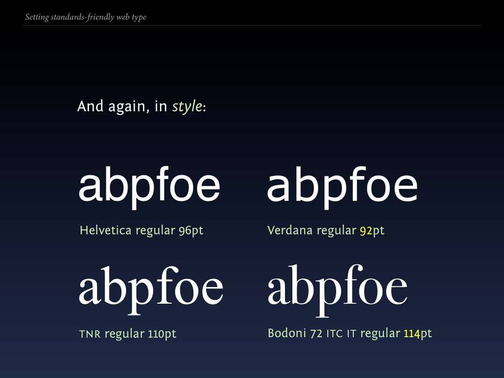
This leads onto the problem that can arise when mixing multiple typefaces: typefaces—even at the same set point sizes—vary optically in many ways. This means Helvetica set at 96pt will be quite different to Times New Roman, set at the same size.
Aligning x-heights
To ensure things don’t clash, especially when setting two faces in the same flowing text, is to begin by aligning the x-heights:
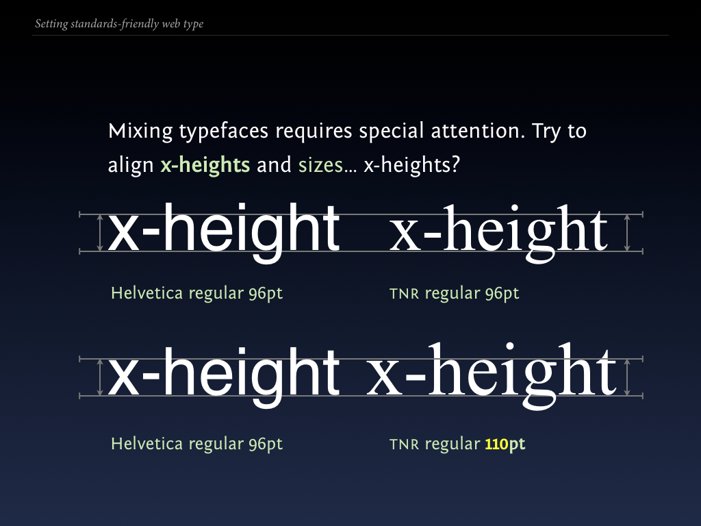
The x-height is the length spanning from the baseline, the invisible line letters rest on, to the common height of lowercase letters that don’t have an ascender (e.g. a, c, e, g, m, n, o, p, q, r, s, u, v, w, x, y, z — of which g, p, q, and y have descenders). This invisible line that marks the x-height is called the meanline.
We do this by simply taking our first typeface at a given size and style, and then upping or lowering the size of the second typeface until the x-heights align.
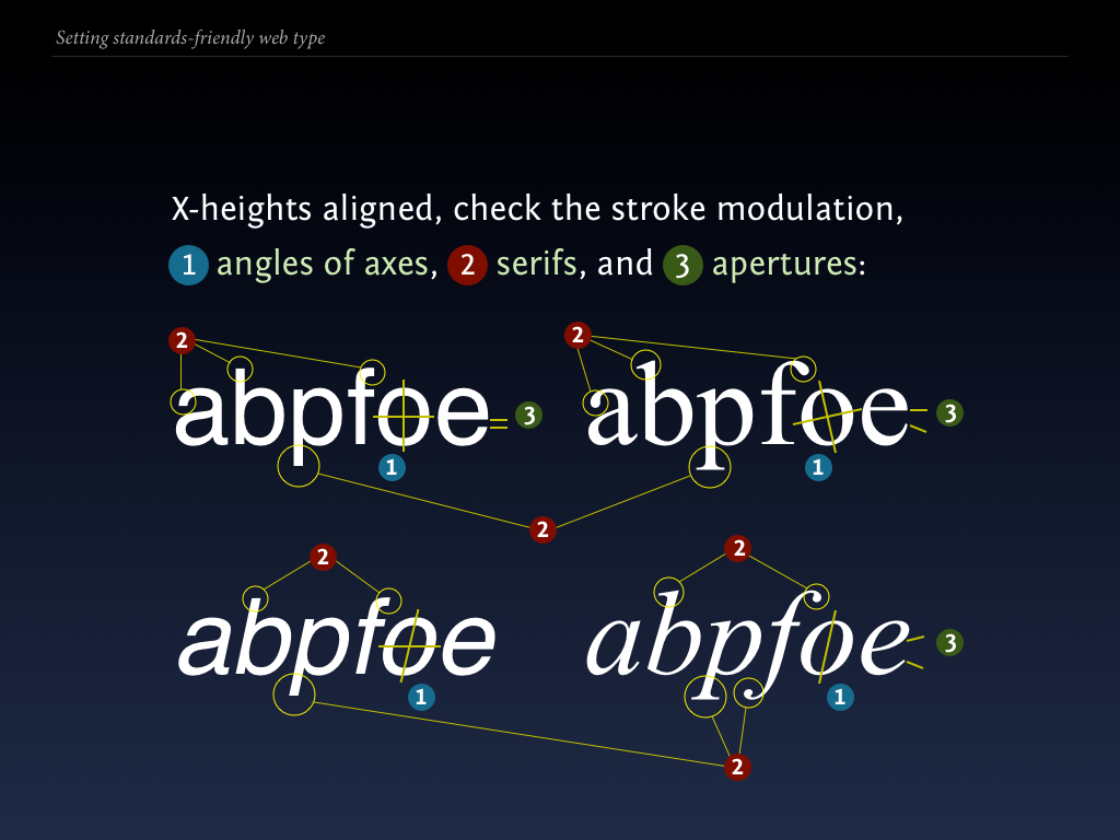
Stylistic Clashes
Having aligned the x-heights is just the first step, and often one I never bother doing if I feel the typefaces just clash stylistically. Here we need to account for a large range of factors:
- Stroke modulation (the varying thickness of the glyphs, particularly evident on serif italics).
- Angle of axes and the inherent slope in the face — it could be that everything is fine but the one italic slants in one direction whilst the second slants in the other direction.
- Serif styles (hairline or thick, terminal styles: lachrymal, beak, elliptical), or the lack thereof.
- Apertures, the openings of counters (see below).
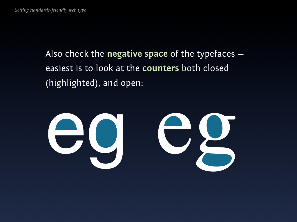
That done, check the negative space — the space between and in-between the letters:

Having aligned the x-heights and paired, there could be other more directly visible eyesores, such as ones of weight:

Let’s have a look at a few more:
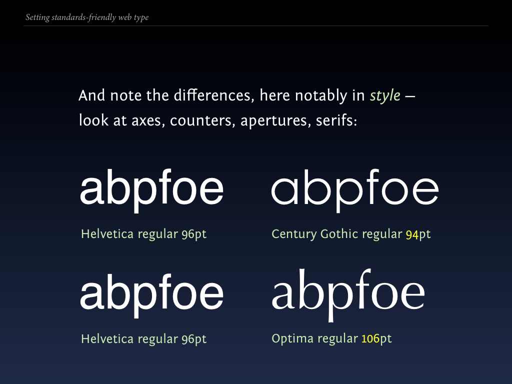
Notice the stylistic differences between Helvetica and Verdana? That’s primarily because Helvetica is a realist or neo-grotesque face while Verdana is a humanist face. (These are stylistic classifications used by type designers and typographers.)
Now imagine pairing a beautiful humanist serif face with a realist or worse yet geometric sanserif? They would be inherently at odds with one another, even with x-heights aligned (1):

Instead, select an adequate partner to your first face, in this situation the classical humanist Palatino and the highly legible and readable screen-optimized Verdana (2).
These two would be an ideal humanist combination for a screen-based typesetting project because both are fairly widely available, and both are very legible when rasterized on a screen.
Do you have any favourite combinations and pairings?
Frequently Asked Questions on Mixing Typefaces
What is the significance of x-height in typography?
The x-height in typography refers to the distance between the baseline and the mean line of lower-case letters in a typeface. It’s called the ‘x-height’ because it’s typically the height of the lowercase ‘x’ in the font family. This is a crucial aspect of typography because it significantly impacts the legibility and readability of the text. A typeface with a larger x-height tends to be more legible at smaller sizes, making it a preferred choice for body text in print and digital media.
How does cap height affect the overall look of a typeface?
Cap height refers to the distance from the baseline to the top of the uppercase letters in a typeface. It plays a significant role in defining the visual size and impact of the typeface. A typeface with a larger cap height can appear more commanding and prominent, while one with a smaller cap height can seem more subtle and understated. It’s essential to consider cap height when mixing typefaces to ensure a harmonious and balanced typographic hierarchy.
What factors should I consider when mixing typefaces?
Mixing typefaces requires a careful consideration of several factors. These include the x-height, cap height, weight, width, and style of the typefaces. The key is to create a contrast that is visually appealing and enhances readability. For instance, pairing a serif typeface with a sans-serif one can create an interesting contrast. Similarly, typefaces with different weights or widths can complement each other well. However, it’s important to avoid mixing typefaces that are too similar, as this can cause confusion and strain for the reader.
How can I ensure good readability when mixing typefaces?
Good readability is achieved by maintaining a clear hierarchy and balance between the typefaces. This can be done by using typefaces with compatible x-heights and cap heights. The typeface used for the body text should have a larger x-height for better legibility at smaller sizes. The headings or subheadings can have a smaller x-height and larger cap height to stand out and command attention. Also, ensure there is enough contrast in terms of weight, width, and style between the typefaces.
What is the role of kerning in typography?
Kerning refers to the adjustment of space between individual letters in a typeface. It plays a crucial role in ensuring the text is evenly spaced and easy to read. Poor kerning can lead to letters appearing too close together or too far apart, disrupting the flow of reading. When mixing typefaces, it’s important to consider the kerning of each typeface and adjust it if necessary to maintain a consistent and harmonious look.
How does the choice of typeface affect the mood or tone of the text?
The choice of typeface can greatly influence the mood or tone of the text. For instance, serif typefaces are often associated with tradition, reliability, and authority, while sans-serif typefaces are seen as modern, clean, and straightforward. Script typefaces can convey elegance and creativity, while display typefaces can add a unique and distinctive character. When mixing typefaces, consider the mood or tone you want to convey and choose typefaces that reflect this.
What is the difference between typeface and font?
A typeface refers to a family of related fonts, while a font is a specific style and weight within a typeface. For example, ‘Helvetica’ is a typeface, and ‘Helvetica Bold’ is a font. When mixing typefaces, it’s important to consider not just the overall typeface, but also the specific fonts you’re using.
How many typefaces should I use in a design?
As a general rule, it’s best to limit the number of typefaces to two or three in a design. Using too many typefaces can make the design look cluttered and confusing. When mixing typefaces, aim for a balance of contrast and harmony. The typefaces should be different enough to create an interesting contrast, but similar enough to maintain a cohesive and harmonious look.
What is the impact of weight and width in typography?
Weight refers to the thickness of the strokes in a typeface, while width refers to the width of the letters. Both weight and width can significantly impact the look and feel of the typeface. A typeface with a heavier weight can appear bold and commanding, while one with a lighter weight can seem delicate and subtle. Similarly, a typeface with a wider width can look expansive and open, while one with a narrower width can appear compact and efficient. When mixing typefaces, consider the weight and width of each typeface to create a balanced and visually appealing contrast.
How can I experiment with mixing typefaces?
Experimenting with mixing typefaces can be a fun and creative process. Start by choosing two or three typefaces that you think might work well together. Consider their x-height, cap height, weight, width, and style. Try different combinations and see what works best. Remember, the key is to create a contrast that is visually appealing and enhances readability. Don’t be afraid to break the rules and try something new. With practice and experimentation, you’ll develop a keen eye for mixing typefaces effectively.