


Making pixel-perfect layouts on mobile is hard. Even though React Native makes it easier than its native counterparts, it still requires a lot of work to get a mobile app to perfection.
In this tutorial, we’ll be cloning the most famous dating app, Tinder. We’ll then learn about a UI framework called React Native Elements, which makes styling React Native apps easy.
Since this is just going to be a layout tutorial, we’ll be using Expo, as it makes setting things up much easier than plain old react-native-cli. We’ll also be making use of a lot of dummy data to make our app.
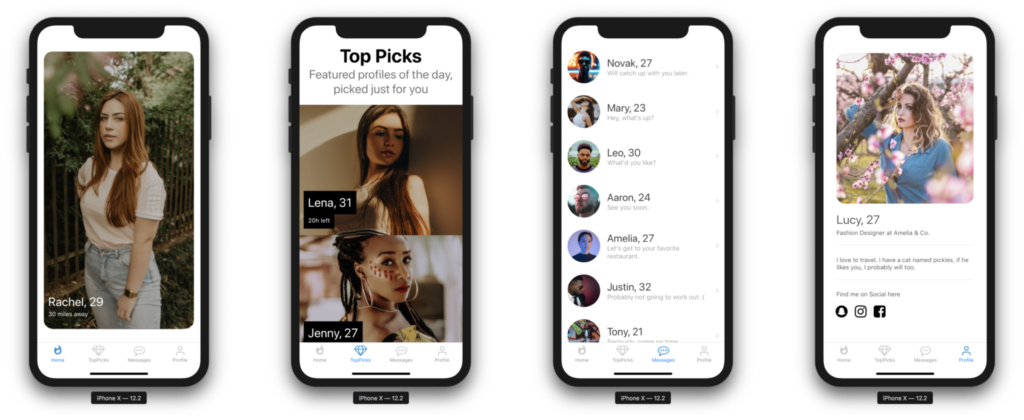
We’ll be making a total of four screens—Home, Top Picks, Profile, and Messages.
Want to learn React Native from the ground up? This article is an extract from our Premium library. Get an entire collection of React Native books covering fundamentals, projects, tips and tools & more with SitePoint Premium. Join now for just $9/month.
Key Takeaways
- Utilize React Native Elements for efficient and consistent styling across Android, iOS, and web platforms, simplifying the development process.
- Implement Expo for easy setup and running of the Tinder clone project, enhancing developer convenience and efficiency.
- Clone four main Tinder screens: Home, Top Picks, Profile, and Messages, using predefined components and navigation patterns.
- Customize the navigation and tab bar using React Navigation and custom icons, ensuring a user-friendly and intuitive interface.
- Manage assets and dependencies effectively to maintain performance and ease of updates, including using yarn for package management.
- Leverage external libraries such as react-native-deck-swiper for interactive card swiping functionalities, mimicking Tinder’s user experience.
Prerequisites
For this tutorial, you need a basic knowledge of React Native and some familiarity with Expo. You’ll also need the Expo client installed on your mobile device or a compatible simulator installed on your computer. Instructions on how to do this can be found here.
You also need to have a basic knowledge of styles in React Native. Styles in React Native are basically an abstraction similar to that of CSS, with just a few differences. You can get a list of all the properties in the styling cheatsheet.
Throughout the course of this tutorial we’ll be using yarn. If you don’t have yarn already installed, install it from here.
Also make sure you’ve already installed expo-cli on your computer.
If it’s not installed already, then go ahead and install it:
$ yarn global add expo-cli
To make sure we’re on the same page, these are the versions used in this tutorial:
- Node 11.14.0
- npm 6.4.1
- yarn 1.15.2
- expo 2.16.1
Make sure to update expo-cli if you haven’t updated in a while, since expo releases are quickly out of date.
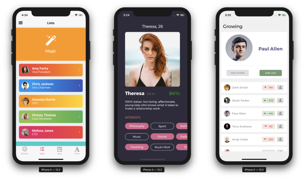
We’re going to build something that looks like this:
If you just want to clone the repo, the whole code can be found on GitHub.
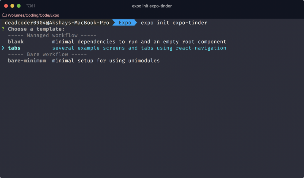
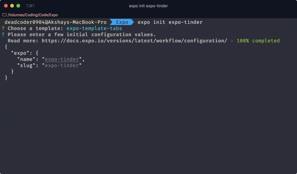
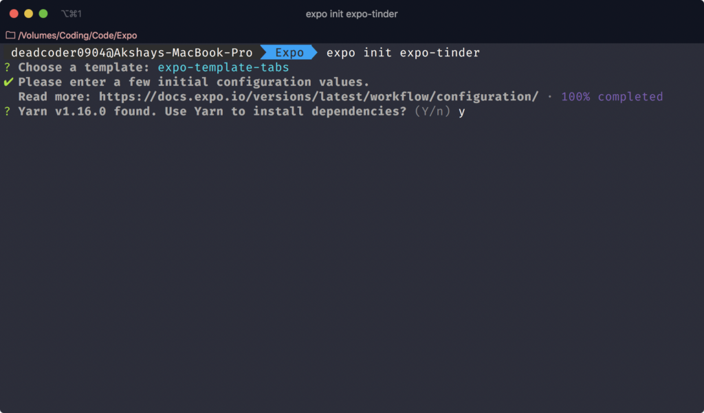
Getting Started
Let’s set up a new Expo project using expo-cli:
$ expo init expo-tinder
It will then ask you to choose a template. You should choose tabs and hit Enter.
Then it will ask you to name the project. Type expo-tinder and hit Enter again.
Lastly, it will ask you to press y to install dependencies with yarn or n to install dependencies with npm. Press y.
This bootstraps a brand new React Native app using expo-cli.
React Native Elements
React Native Elements is a cross-platform UI Toolkit for React Native with consistent design across Android, iOS and Web.
It’s easy to use and completely built with JavaScript. It’s also the first UI kit ever made for React Native.
It allows us to fully customize styles of any of our components the way we want so every app has its own unique look and feel.
It’s also open source and backed by a community of awesome developers.
You can build beautiful applications easily.
Cloning Tinder UI
We’ve already created a project named expo-tinder.
To run the project, type this:
$ yarn start
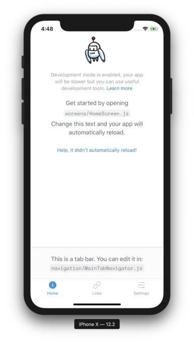
Press i to run the iOS Simulator. This will automatically run the iOS Simulator even if it’s not opened.
Press a to run the Android Emulator. Note that the emulator must be installed and started already before typing a. Otherwise it will throw an error in the terminal.
It should look like this:
Navigation
The initial setup has already installed react-navigation for us. The bottom tab navigation also works by default because we chose tabs in the second step of expo init. You can check it by tapping on Links and Settings.
The screens/ folder is responsible for the content displayed when the tabs are changed.
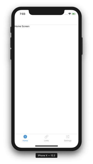
Now, completely remove the contents of HomeScreen.js and replace them with the following:
import React from 'react'
import { Text, View } from 'react-native'

class HomeScreen extends React.Component {
  render() {
    return (
      <View>
        <Text>Home Screen</Text>
      </View>
    )
  }
}

export default HomeScreen
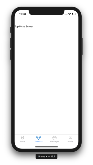
You should see the updated UI now:
Now we’ll adapt the tabs according to the application we’re going to build. For our Tinder clone, we’re going to have four screens: Home, Top Picks, Profile, and Messages.
We can completely delete LinksScreen.js and SettingsScreen.js from the screens/ folder. Notice our app breaks, with a red screen full of errors.
This is because we’ve linked to it in the navigation/ folder. Open MainTabNavigator.js in the navigation/ folder. It currently looks like this:
import React from 'react';
import { Platform } from 'react-native';
import { createStackNavigator, createBottomTabNavigator } from 'react-navigation';

import TabBarIcon from '../components/TabBarIcon';
import HomeScreen from '../screens/HomeScreen';
import LinksScreen from '../screens/LinksScreen';
import SettingsScreen from '../screens/SettingsScreen';

const HomeStack = createStackNavigator({
  Home: HomeScreen,
});

HomeStack.navigationOptions = {
  tabBarLabel: 'Home',
  tabBarIcon: ({ focused }) => (
    <TabBarIcon
      focused={focused}
      name={
        Platform.OS === 'ios'
          ? `ios-information-circle${focused ? '' : '-outline'}`
          : 'md-information-circle'
      }
    />
  ),
};

const LinksStack = createStackNavigator({
  Links: LinksScreen,
});

LinksStack.navigationOptions = {
  tabBarLabel: 'Links',
  tabBarIcon: ({ focused }) => (
    <TabBarIcon
      focused={focused}
      name={Platform.OS === 'ios' ? 'ios-link' : 'md-link'}
    />
  ),
};

const SettingsStack = createStackNavigator({
  Settings: SettingsScreen,
});

SettingsStack.navigationOptions = {
  tabBarLabel: 'Settings',
  tabBarIcon: ({ focused }) => (
    <TabBarIcon
      focused={focused}
      name={Platform.OS === 'ios' ? 'ios-options' : 'md-options'}
    />
  ),
};

export default createBottomTabNavigator({
  HomeStack,
  LinksStack,
  SettingsStack,
});
Remove references to LinksStack and SettingsStack completely, because we don’t need these screens in our app. It should look like this:
import React from 'react'
import { Platform } from 'react-native'
import {
  createBottomTabNavigator,
  createStackNavigator,
} from 'react-navigation'
import TabBarIcon from '../components/TabBarIcon'
import HomeScreen from '../screens/HomeScreen'

const HomeStack = createStackNavigator({
  Home: HomeScreen,
})

HomeStack.navigationOptions = {
  tabBarLabel: 'Home',
  tabBarIcon: ({ focused }) => (
    <TabBarIcon
      focused={focused}
      name={
        Platform.OS === 'ios'
          ? `ios-information-circle${focused ? '' : '-outline'}`
          : 'md-information-circle'
      }
    />
  ),
}

export default createBottomTabNavigator({
  HomeStack,
})
Go ahead and create TopPicksScreen.js, ProfileScreen.js and MessagesScreen.js inside the screens/ folder.
Add the following inside TopPicksScreen.js:
import React from 'react'
import { Text, View } from 'react-native'

class TopPicksScreen extends React.Component {
  render() {
    return (
      <View>
        <Text>Top Picks Screen</Text>
      </View>
    )
  }
}

export default TopPicksScreen
Add the following inside ProfileScreen.js:
import React from 'react'
import { Text, View } from 'react-native'

class ProfileScreen extends React.Component {
  render() {
    return (
      <View>
        <Text>Profile Screen</Text>
      </View>
    )
  }
}

export default ProfileScreen
Add the following inside MessagesScreen.js:
import React from 'react'
import { Text, View } from 'react-native'

class MessagesScreen extends React.Component {
  render() {
    return (
      <View>
        <Text>Messages Screen</Text>
      </View>
    )
  }
}

export default MessagesScreen
Let’s go ahead and change components/TabBarIcon.js, since we’ll be needing custom icons on our bottom tab navigation. It currently looks like this:
import React from 'react';
import { Icon } from 'expo';

import Colors from '../constants/Colors';

export default class TabBarIcon extends React.Component {
  render() {
    return (
      <Icon.Ionicons
        name={this.props.name}
        size={26}
        style={{ marginBottom: -3 }}
        color={this.props.focused ? Colors.tabIconSelected : Colors.tabIconDefault}
      />
    );
  }
}
The only thing we’re doing here is adding an Icon prop so we can have different types of Icon instead of just Ionicons. Currently, the different supported types are AntDesign, Entypo, EvilIcons, Feather, FontAwesome, FontAwesome5, FontAwesome5Brands, Foundation, Ionicons, MaterialCommunityIcons, MaterialIcons, SimpleLineIcons, Octicons and Zocial.
You can choose a variety of different icons from the @expo/vector-icons directory. It adds a compatibility layer around @oblador/react-native-vector-icons to work with the Expo asset system.
TabBarIcon.js should now look like this:
import React from 'react'
import Colors from '../constants/Colors'

export default class TabBarIcon extends React.Component {
  render() {
    const { Icon, name, focused } = this.props
    return (
      <Icon
        name={name}
        size={26}
        style={{ marginBottom: -3 }}
        color={focused ? Colors.tabIconSelected : Colors.tabIconDefault}
      />
    )
  }
}
Now we can pass the Icon prop to the above TabBarIcon component to load different icons.
We need to change the implementation of HomeStack in the MainTabNavigator.js folder to incorporate with the new TabBarIcon component’s Icon prop.
Change the HomeStack variable implementation to this:
import { Icon } from 'expo'

const HomeStack = createStackNavigator({
  Home: HomeScreen,
})

HomeStack.navigationOptions = {
  tabBarLabel: 'Home',
  tabBarIcon: ({ focused }) => (
    <TabBarIcon
      Icon={Icon.MaterialCommunityIcons}
      focused={focused}
      name="fire"
    />
  ),
}
The only change here is the addition of Icon={Icon.MaterialCommunityIcons}, since we changed the implementation of TabBarIcon to accept the icon source so we can use different types of icons from different providers.
Now these icons need to be loaded first. Otherwise, we’ll see a flash of empty screen before the icons show up. For that, we need to change App.js by adding the following:
Font.loadAsync({
  // This is the font that we're using for our tab bar
  ...Icon.MaterialIcons.font,
  ...Icon.MaterialCommunityIcons.font,
  ...Icon.FontAwesome.font,
  ...Icon.Feather.font,
}),
These font types are used at some points in our application. That’s why we’ve included only four fonts. For example, MaterialCommunityIcons is used in the HomeStack variable in the MainTabNavigator.js file, as shown above.
We’ll also be hiding our StatusBar in App.js with this:
<StatusBar hidden />
We’ll also replace the assets used in App.js:
Asset.loadAsync([
  require('./assets/images/splash.png'),
  require('./assets/images/icon.png'),
]),
The App.js file should now look like this:
import { AppLoading, Asset, Font, Icon } from 'expo'
import React from 'react'
import { StatusBar, StyleSheet, View } from 'react-native'
import AppNavigator from './navigation/AppNavigator'

export default class App extends React.Component {
  state = {
    isLoadingComplete: false,
  }

  render() {
    if (!this.state.isLoadingComplete && !this.props.skipLoadingScreen) {
      return (
        <AppLoading
          startAsync={this._loadResourcesAsync}
          onError={this._handleLoadingError}
          onFinish={this._handleFinishLoading}
        />
      )
    } else {
      return (
        <View style={styles.container}>
          <StatusBar hidden />
          <AppNavigator />
        </View>
      )
    }
  }

  _loadResourcesAsync = async () => {
    return Promise.all([
      Asset.loadAsync([
        require('./assets/images/splash.png'),
        require('./assets/images/icon.png'),
      ]),
      Font.loadAsync({
        // This is the font we're using for our tab bar
        ...Icon.MaterialIcons.font,
        ...Icon.MaterialCommunityIcons.font,
        ...Icon.FontAwesome.font,
        ...Icon.Feather.font,
      }),
    ])
  }

  _handleLoadingError = error => {
    // In this case, you might want to report the error to your error
    // reporting service, such as Sentry
    console.warn(error)
  }

  _handleFinishLoading = () => {
    this.setState({ isLoadingComplete: true })
  }
}

const styles = StyleSheet.create({
  container: {
    flex: 1,
    backgroundColor: '#fff',
  },
})
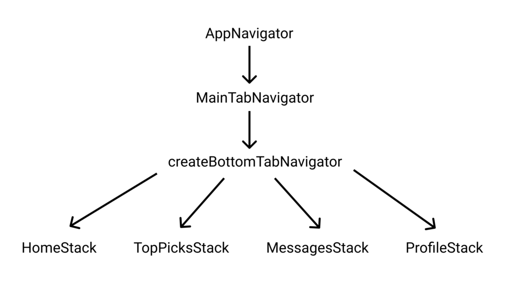
We also need to link all of the above screens—TopPicksScreen.js, ProfileScreen.js and MessagesScreen.js—inside screens/ in MainTabNavigator.js inside the navigation/ folder, as shown in the following flowchart:
Also add the following in MainTabNavigator.js:
import MessagesScreen from '../screens/MessagesScreen'
import ProfileScreen from '../screens/ProfileScreen'
import TopPicksScreen from '../screens/TopPicksScreen'

const TopPicksStack = createStackNavigator({
  TopPicks: TopPicksScreen,
})

TopPicksStack.navigationOptions = {
  tabBarLabel: 'TopPicks',
  tabBarIcon: ({ focused }) => (
    <TabBarIcon Icon={Icon.FontAwesome} focused={focused} name="diamond" />
  ),
}

const MessagesStack = createStackNavigator({
  Messages: MessagesScreen,
})

MessagesStack.navigationOptions = {
  tabBarLabel: 'Messages',
  tabBarIcon: ({ focused }) => (
    <TabBarIcon Icon={Icon.FontAwesome} focused={focused} name="commenting-o" />
  ),
}

const ProfileStack = createStackNavigator({
  Profile: ProfileScreen,
})

ProfileStack.navigationOptions = {
  tabBarLabel: 'Profile',
  tabBarIcon: ({ focused }) => (
    <TabBarIcon Icon={Icon.Feather} focused={focused} name="user" />
  ),
}
The above code creates three stack navigators—TopPicksStack, MessagesStack and ProfileStack. The static property navigationOptions lets us add our own label and icon to the bottom tab.
Also, change createBottomTabNavigator to make sure TopPicksStack, MessagesStack and ProfileStack show up in the bottom tab navigation:
export default createBottomTabNavigator({
  HomeStack,
  TopPicksStack,
  MessagesStack,
  ProfileStack,
})
Now you should be able to see different icons in the bottom tab navigation with different screens as follows:
We now need to get rid of the header that’s showing on each screen, taking up some top space. To get rid of it, we need to add headerMode: 'none' in the createStackNavigator config.
We need to add it on HomeStack, TopPicksStack, MessagesStack and ProfileStack.
HomeStack should look like this:
const HomeStack = createStackNavigator(
  {
    Home: HomeScreen,
  },
  {
    headerMode: 'none',
  },
)
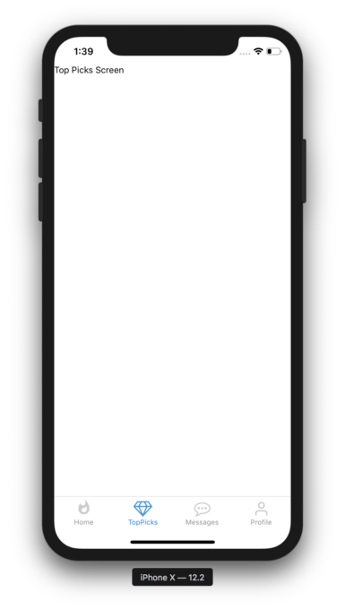
Do the same for the rest of them. Now if you check, the text goes up to the top left, right above the clock.
There’s an easy fix for this. We need to use SafeAreaView. SafeAreaView renders content within the safe area boundaries of a device. Let’s go into the screens/ directory and change HomeScreen.js to use SafeAreaView, so that it looks like this:
import React from 'react'
import { SafeAreaView, Text } from 'react-native'

class HomeScreen extends React.Component {
  render() {
    return (
      <SafeAreaView>
        <Text>Home Screen</Text>
      </SafeAreaView>
    )
  }
}

export default HomeScreen
It now renders the content inside the boundaries of the device.
Go ahead and change the rest of them to do the same.
It’s repetitive to wrap SafeAreaView inside every component instead of setting it up on a root component like App.js. But be aware that this won’t work if you try doing it on App.js.
Remember, SafeAreaView should always be set up on screen components or any content in them, and not wrap entire navigators. You can read more about it on this blog post.
Screens
Now that our navigation is taken care of, we can start working on the layout.
We’re going to be using a UI toolkit called React Native Elements, so go ahead and install it:
$ yarn add react-native-elements
Before starting anything, make sure to copy the assets/ directory from the GitHub repo entirely for dummy images.
Now we’ll start working on the Home screen.
Home Screen
Before starting to work on HomeScreen.js, let’s delete unnecessary files. Go to the components/ folder and delete StyledText.js and the __tests__ folder.
Now let’s start working on our Home screen.
Firstly, create Card.js in the components/ folder. We’re going to display a profile card with the person’s name, their age and how far away they live.
We’re going to use a Tile component from react-native-elements to display our User Card.
The Tile component from react-native-elements looks like this:

import React from 'react'
import { Platform, StyleSheet } from 'react-native'
import { Tile } from 'react-native-elements'
import Layout from '../constants/Layout'

const BOTTOM_BAR_HEIGHT = !Platform.isPad ? 29 : 49 // found from https://stackoverflow.com/a/50318831/6141587

export const Card = ({ pic, title, caption }) => (
  <Tile
    imageSrc={pic}
    imageContainerStyle={styles.imageContainer}
    activeOpacity={0.9}
    title={title}
    titleStyle={styles.title}
    caption={caption}
    captionStyle={styles.caption}
    containerStyle={styles.container}
    featured
  />
)

const styles = StyleSheet.create({
  container: {
    flex: 1,
    alignItems: 'center',
  },
  imageContainer: {
    width: Layout.window.width - 30,
    height: Layout.window.height - BOTTOM_BAR_HEIGHT * 6,
    borderRadius: 20,
    overflow: 'hidden', // this does magic
  },
  title: {
    position: 'absolute',
    left: 10,
    bottom: 30,
  },
  caption: {
    position: 'absolute',
    left: 10,
    bottom: 10,
  },
})
The Card component takes pic, title and caption, which in turn are passed on to the Tile component.
The Tile component has some additional properties. activeOpacity is a number passed to control opacity on pressing the Tile, which is optional, but the default value is 0.2, which makes it look transparent on press, so we pass a value close to 1 to keep it opaque. The featured prop changes the look of Tile. It keeps the text in title and a caption prop on the image rather than below when featured is not specified or is set to false.
The rest are styles applied to get the user card right. The container style centers the user card. imageContainer has a width and a height. The width is set to the total width of the device—30dp (device pixels)—and the height is set to the total height of the device—BOTTOM_BAR_HEIGHT * 6.
We get the BOTTOM_BAR_HEIGHT from stackoverflow.com.
We get the device width from the constants/Layout.js file, which basically contains the following:
import { Dimensions } from 'react-native'

const width = Dimensions.get('window').width
const height = Dimensions.get('window').height

export default {
  window: {
    width,
    height,
  },
  isSmallDevice: width < 375,
}
Then we add a border radius to the image. But the border radius won’t be applied. We also need overflow: hidden to make it work.
Then we position our title and caption to use absolute positioning and make them appear on the bottom-left corner, just above the image.
Next, create a utils/shuffleArray.js file and paste the following into it:
// found at https://stackoverflow.com/a/46545530/6141587
const shuffleArray = array =>
  array
    .map(a => ({ sort: Math.random(), value: a }))
    .sort((a, b) => a.sort - b.sort)
    .map(a => a.value)

export default shuffleArray
This makes sure our array is randomized every time.
Now create a constants/Pics.js file and paste in the following:
import shuffleArray from '../utils/shuffleArray'

export const HomeScreenPics = shuffleArray([
  {
    pic: require('../assets/images/women/women1.jpg'),
    title: 'Amelia, 27',
    caption: '16 miles away',
  },
  {
    pic: require('../assets/images/women/women2.jpg'),
    title: 'Joanna, 19',
    caption: '2 miles away',
  },
  {
    pic: require('../assets/images/women/women3.jpg'),
    title: 'Charlie, 32',
    caption: '24 miles away',
  },
  {
    pic: require('../assets/images/women/women4.jpg'),
    title: 'Mary, 23',
    caption: '45 miles away',
  },
  {
    pic: require('../assets/images/women/women5.jpg'),
    title: 'Lucy, 27',
    caption: '32 miles away',
  },
  {
    pic: require('../assets/images/women/women6.jpg'),
    title: 'Rachel, 29',
    caption: '30 miles away',
  },
  {
    pic: require('../assets/images/women/women7.jpg'),
    title: 'Ava, 31',
    caption: '14 miles away',
  },
  {
    pic: require('../assets/images/women/women8.jpg'),
    title: 'Monica, 35',
    caption: '19 miles away',
  },
  {
    pic: require('../assets/images/women/women9.jpg'),
    title: 'Lisa, 25',
    caption: '7 miles away',
  },
  {
    pic: require('../assets/images/women/women10.jpg'),
    title: 'Julia, 22',
    caption: '9 miles away',
  },
  {
    pic: require('../assets/images/men/men1.jpg'),
    title: 'Aaron, 24',
    caption: '3 miles away',
  },
  {
    pic: require('../assets/images/men/men2.jpg'),
    title: 'Novak, 27',
    caption: '12 miles away',
  },
  {
    pic: require('../assets/images/men/men3.jpg'),
    title: 'Justin, 32',
    caption: '20 miles away',
  },
  {
    pic: require('../assets/images/men/men4.jpg'),
    title: 'Tony, 21',
    caption: '4 miles away',
  },
  {
    pic: require('../assets/images/men/men5.jpg'),
    title: 'Leo, 30',
    caption: '22 miles away',
  },
  {
    pic: require('../assets/images/men/men6.jpg'),
    title: 'Ronald, 39',
    caption: '35 miles away',
  },
  {
    pic: require('../assets/images/men/men7.jpg'),
    title: 'Johnny, 41',
    caption: '44 miles away',
  },
  {
    pic: require('../assets/images/men/men8.jpg'),
    title: 'Chandler, 35',
    caption: '29 miles away',
  },
  {
    pic: require('../assets/images/men/men9.jpg'),
    title: 'Joey, 29',
    caption: '17 miles away',
  },
  {
    pic: require('../assets/images/men/men10.jpg'),
    title: 'Alfie, 37',
    caption: '27 miles away',
  },
])
This contains all the images required for our app. Notice every time we call shuffleArray to randomize our array.
Let’s install react-native-deck-swiper to make sure our cards get swiped like Tinder. The latest version (v1.6.7 at the time of writing) uses react-native-view-overflow, which doesn’t support Expo. Hence, we’re going to install v1.5.25:
$ yarn add react-native-deck-swiper@1.5.25
Now go into the HomeScreen.js file and paste the following:
import React from 'react'
import { SafeAreaView, StyleSheet } from 'react-native'
import Swiper from 'react-native-deck-swiper'
import { Card } from '../components/Card'
import { HomeScreenPics } from '../constants/Pics'

class HomeScreen extends React.Component {
  render() {
    return (
      <SafeAreaView style={styles.container}>
        <Swiper
          cards={HomeScreenPics}
          renderCard={Card}
          infinite // keep looping cards infinitely
          backgroundColor="white"
          cardHorizontalMargin={0}
          stackSize={2} // number of cards shown in background
        />
      </SafeAreaView>
    )
  }
}

const styles = StyleSheet.create({
  container: {
    flex: 1,
    backgroundColor: 'transparent',
  },
})

export default HomeScreen
Now our cards are swipable, and our home screen looks like this:
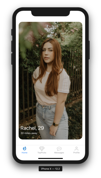
Try swiping now, and it should work as follows:
If you want to learn how to make these kinds of Tinder Swipe animations, you should check out Varun Nath’s Tinder Swipe Series on YouTube.
Now that our Home screen is finished, let’s build the Top Picks screen.
Top Picks Screen
Now let’s design the Top Picks screen.
Firstly, go into constants/Pics.js and add the following bit at the end:
export const TopPicksScreenPics = shuffleArray([
  {
    pic: require('../assets/images/women/women11.jpg'),
    title: 'Annie, 40',
    caption: '26h left',
  },
  {
    pic: require('../assets/images/women/women12.jpg'),
    title: 'Lena, 31',
    caption: '20h left',
  },
  {
    pic: require('../assets/images/women/women13.jpg'),
    title: 'Kendra, 19',
    caption: '15h left',
  },
  {
    pic: require('../assets/images/women/women14.jpg'),
    title: 'Mia, 23',
    caption: '45h left',
  },
  {
    pic: require('../assets/images/women/women15.jpg'),
    title: 'Jenny, 27',
    caption: '12h left',
  },
  {
    pic: require('../assets/images/men/men11.jpg'),
    title: 'Dwayne, 34',
    caption: '13h left',
  },
  {
    pic: require('../assets/images/men/men12.jpg'),
    title: 'Novak, 27',
    caption: '22h left',
  },
  {
    pic: require('../assets/images/men/men13.jpg'),
    title: 'Zikomo, 32',
    caption: '20h left',
  },
  {
    pic: require('../assets/images/men/men14.jpg'),
    title: 'Sam, 19',
    caption: '42h left',
  },
  {
    pic: require('../assets/images/men/men15.jpg'),
    title: 'Richard, 31',
    caption: '21h left',
  },
])
These are the images we’ll need in the Top Picks screen.
Now add the following code in TopPicksScreen.js:
import React from 'react'
import { ScrollView, StyleSheet, View } from 'react-native'
import { Text, Tile } from 'react-native-elements'
import { SafeAreaView } from 'react-navigation'
import { TopPicksScreenPics } from '../constants/Pics'

class TopPicksScreen extends React.Component {
  render() {
    return (
      <SafeAreaView>
        <ScrollView>
          <Text h2 h2Style={styles.h2Style}>
            Top Picks
          </Text>
          <Text h4 h4Style={styles.h4Style}>
            Featured profiles of the day, picked just for you
          </Text>
          <View style={styles.grid}>
            {TopPicksScreenPics.map(({ pic, title, caption }, i) => (
              <Tile
                imageSrc={pic}
                activeOpacity={0.9}
                title={title}
                titleStyle={styles.title}
                caption={caption}
                captionStyle={styles.caption}
                featured
                key={title}
              />
            ))}
          </View>
        </ScrollView>
      </SafeAreaView>
    )
  }
}

const styles = StyleSheet.create({
  h2Style: {
    fontWeight: 'bold',
    textAlign: 'center',
    color: '#000000',
  },
  h4Style: {
    textAlign: 'center',
    color: '#757575',
  },
  grid: {
    marginTop: 20,
    marginBottom: 20,
  },
  title: {
    position: 'absolute',
    left: 10,
    bottom: 50,
    backgroundColor: 'black',
    marginBottom: -2,
    padding: 10,
  },
  caption: {
    position: 'absolute',
    left: 10,
    bottom: 0,
    backgroundColor: 'black',
    marginTop: 10,
    padding: 10,
  },
})

export default TopPicksScreen
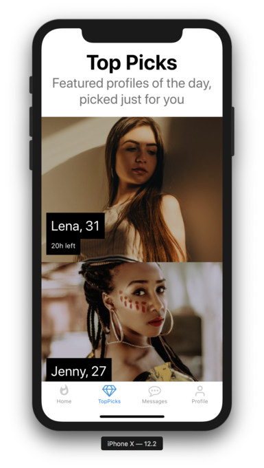
Firstly, we use the basic Text component found in react-native-elements with a heading and a subheading.
Then we loop through all the images we just added in constants/Pics.js and display them using the Tile component.
The title and caption are placed in center by default, but we’ve moved them to the bottom left with position:'absolute'.
That concludes our Top Picks screen, which was very simple.
It looks like this:
Messages Screen
Now let’s get started with the Messages screen. Firstly, we need some dummy data to display on the listicles.
Create Messages.js in the constants/ folder and paste in the following:
import shuffleArray from '../utils/shuffleArray'

export const Messages = shuffleArray([
  {
    pic: require('../assets/images/women/women1.jpg'),
    title: 'Amelia, 27',
    message: "Let's get to your favorite restaurant.",
  },
  {
    pic: require('../assets/images/women/women2.jpg'),
    title: 'Joanna, 19',
    message: "What's the best way to win you over?",
  },
  {
    pic: require('../assets/images/men/men2.jpg'),
    title: 'Novak, 27',
    message: 'Will catch up with you later.',
  },
  {
    pic: require('../assets/images/men/men3.jpg'),
    title: 'Justin, 32',
    message: 'Probably not going to work out :(',
  },
  {
    pic: require('../assets/images/women/women3.jpg'),
    title: 'Charlie, 32',
    message: 'How about we go for a coffee on Sunday?',
  },

  {
    pic: require('../assets/images/women/women5.jpg'),
    title: 'Lucy, 27',
    message: 'Sleeping for now.',
  },
  {
    pic: require('../assets/images/men/men1.jpg'),
    title: 'Aaron, 24',
    message: 'See you soon.',
  },
  {
    pic: require('../assets/images/men/men4.jpg'),
    title: 'Tony, 21',
    message: 'Seriously, come on time.',
  },
  {
    pic: require('../assets/images/men/men5.jpg'),
    title: 'Leo, 30',
    message: "What'd you like?",
  },
  {
    pic: require('../assets/images/women/women4.jpg'),
    title: 'Mary, 23',
    message: "Hey, what's up?",
  },
  {
    pic: require('../assets/images/women/women14.jpg'),
    title: 'Michelle, 45',
    message: 'Howdy!!!',
  },
  {
    pic: require('../assets/images/women/women12.jpg'),
    title: 'Arya, 18',
    message: 'Not today!',
  },
])
Next, create MessagesScreen.js in the components/ folder and paste in the following:
import React from 'react'
import { SafeAreaView, ScrollView, StyleSheet } from 'react-native'
import { ListItem } from 'react-native-elements'
import { Messages } from '../constants/Messages'

class MessagesScreen extends React.Component {
  render() {
    return (
      <SafeAreaView>
        <ScrollView>
          {Messages.map((user, i) => (
            <ListItem
              key={i}
              leftAvatar={{ source: user.pic, size: 'large' }}
              title={user.title}
              titleStyle={styles.title}
              subtitle={user.message}
              subtitleStyle={styles.subtitle}
              chevron
            />
          ))}
        </ScrollView>
      </SafeAreaView>
    )
  }
}

const styles = StyleSheet.create({
  title: {
    fontSize: 24,
    color: '#3F3F3F',
  },
  subtitle: {
    color: '#A5A5A5',
  },
})

export default MessagesScreen
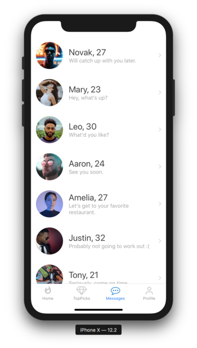
We take the dummy data Messages and map over it and put it in a ListItem exported from react-native-elements. The ListItem component displays a list of items one after the other, just like we see on any messages app—with a large avatar, the name of the user, and the message. react-native-elements takes away all the hassle of writing our own listicle for messages so that we can just use five lines of code to make a nice list.
It currently looks like this:
Profile Screen
Let’s make the final Profile screen.
First, create a utils/randomNo.js file and paste in the following:
export const randomNo = (min, max) =>
  Math.floor(Math.random() * (max - min) + min)
The function randomNo returns a random number between min and max.
Now open up components/ProfileScreen.js and paste in the following:
import React from 'react'
import { Image, SafeAreaView, StyleSheet, View } from 'react-native'
import { Divider, Icon, Text } from 'react-native-elements'
import Layout from '../constants/Layout'
import { HomeScreenPics } from '../constants/Pics'
import { randomNo } from '../utils/randomNo'

const { pic, title } = HomeScreenPics[randomNo(1, HomeScreenPics.length)]

const Social = ({ name }) => (
  <Icon
    name={name}
    type="font-awesome"
    containerStyle={styles.iconContainer}
    size={32}
  />
)

class ProfileScreen extends React.Component {
  render() {
    return (
      <SafeAreaView style={styles.container}>
        <View style={styles.imageContainer}>
          <Image source={pic} style={styles.image} />
        </View>
        <Text h4 style={styles.name}>
          {title}
        </Text>
        <Text style={styles.desc}>Fashion Designer at Amelia & Co.</Text>
        <Divider style={styles.divider} />
        <Text style={styles.desc}>
          I love to travel. I have a cat named pickles. If he likes you, I
          probably will too.
        </Text>
        <Divider style={styles.divider} />
        <Text style={styles.desc}>Find me on Social here</Text>
        <View style={styles.socialLinks}>
          <Social name="snapchat" />
          <Social name="instagram" />
          <Social name="facebook-square" />
        </View>
      </SafeAreaView>
    )
  }
}

const styles = StyleSheet.create({
  container: {
    flex: 1,
    alignItems: 'center',
  },
  imageContainer: {
    margin: 20,
  },
  image: {
    width: Layout.window.width - 60, // device width - some margin
    height: Layout.window.height / 2 - 60, // device height / 2 - some margin
    borderRadius: 20,
  },
  name: {
    color: '#5E5E5E',
    alignSelf: 'flex-start',
    marginLeft: 30,
  },
  desc: {
    color: '#5E5E5E',
    alignSelf: 'flex-start',
    marginTop: 5,
    marginHorizontal: 30,
    fontSize: 14,
  },
  divider: {
    backgroundColor: '#C0C0C0',
    width: Layout.window.width - 60,
    margin: 20,
  },
  socialLinks: {
    flex: 1,
    alignItems: 'flex-start',
    flexDirection: 'row',
    width: Layout.window.width,
    marginLeft: 40,
  },
  iconContainer: {
    paddingHorizontal: 8,
    paddingVertical: 15,
  },
})

export default ProfileScreen
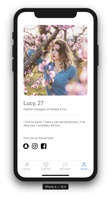
Let’s decipher the code a bit.
Firstly, we get a random pic and title from the HomeScreenPics array, which is not the first image but can be any of the rest of the images from that array.
Then we’ve created a Social component, looking like this:
const Social = ({ name }) => (
  <Icon
    name={name}
    type="font-awesome"
    containerStyle={styles.iconContainer}
    size={32}
  />
)
This takes in a name as a prop. We use this in our render method. The render method contains the usual SafeAreaView, Text, View, and our custom Social component—with a little bit of styling which we’ve already covered above.
The only unique component here is a Divider component. Dividers are visual separators of content. We use them to make a distinction between different sections of content.
Lastly, we add some styling. That’s it.
It currently looks like this:
I’ve also made a repo, in case you want to clone it. You can find it here on GitHub.
Conclusion
We’ve successfully cloned a Tinder UI with a little bit of custom styling and with a lot of help from React Native Elements.
React Native Elements takes all the hassle away while building a beautiful UI by using its pre-made component library.
We could also create everything completely from scratch without using any UI library, but it would require us to write a lot of code—mostly styling. By using a UI library, we can write less code and deliver our application faster.
You can now mimic any UI by taking the smallest part of the UI and building it. Use UI frameworks to write less code and ship faster.
Frequently Asked Questions (FAQs) about Cloning Tinder Using React Native Elements and Expo
How Can I Customize the User Interface of My Tinder Clone?
Customizing the user interface of your Tinder clone is a crucial step in making your app unique. You can do this by modifying the styles in the React Native Elements. For instance, you can change the color scheme, font size, and layout of the app. You can also add new components or remove existing ones to suit your needs. Remember, the goal is to make the app as user-friendly as possible, so always consider the user experience when making changes.
How Can I Add More Features to My Tinder Clone?
Adding more features to your Tinder clone can make it more appealing to users. Some features you might consider include a chat feature, a location-based matching system, or a super like feature. To add these features, you’ll need to modify the codebase and possibly integrate third-party libraries or APIs. Always test new features thoroughly before deploying them to ensure they work correctly.
How Can I Use Firebase with My Tinder Clone?
Firebase is a great tool for adding backend functionality to your Tinder clone. It can handle user authentication, database management, and storage. To use Firebase, you’ll need to install the Firebase SDK and initialize it in your project. Then, you can use the various Firebase services by calling the appropriate functions in your code.
How Can I Deploy My Tinder Clone?
Once you’ve finished developing your Tinder clone, you’ll need to deploy it so users can download and use it. You can deploy your app to the Google Play Store or the Apple App Store. The process involves creating a developer account, preparing your app for release, and submitting it for review.
How Can I Optimize the Performance of My Tinder Clone?
Optimizing the performance of your Tinder clone is essential for providing a smooth user experience. You can optimize performance by minimizing the use of heavy animations, using efficient data structures, and reducing the number of network calls. Additionally, you can use tools like the React Profiler to identify performance bottlenecks in your app.
How Can I Secure My Tinder Clone?
Security is a critical aspect of any app. You can secure your Tinder clone by implementing user authentication, encrypting sensitive data, and regularly updating your dependencies. Additionally, you should follow best practices for secure coding to prevent common security vulnerabilities.
How Can I Monetize My Tinder Clone?
There are several ways to monetize your Tinder clone. You could implement in-app purchases, display ads, or offer a premium subscription. Each method has its pros and cons, so you’ll need to consider which is most suitable for your app.
How Can I Handle User Data in My Tinder Clone?
Handling user data correctly is crucial for maintaining user trust and complying with data protection laws. You should store user data securely, limit the amount of data you collect, and provide a clear privacy policy that explains how you use and protect user data.
How Can I Test My Tinder Clone?
Testing your Tinder clone is essential for ensuring it works correctly and provides a good user experience. You can test your app manually, or you can use automated testing tools like Jest or Detox. You should test all features of your app, including user interface, functionality, and performance.
How Can I Update My Tinder Clone?
Updating your Tinder clone involves modifying the codebase and deploying the new version of the app. You should always test updates thoroughly before deploying them to ensure they don’t introduce new bugs. Additionally, you should communicate updates to your users and provide support for any issues they encounter.