It’s hardly world shattering news, but as we’re interested in all things design here, I feel mention should be made of the new iTunes application icon which came out with the launch of the latest version of iTunes last week. As with all things Apple related it’s been a big talking point on Twitter and the blogs.
The new icon is a fairly generic affair with a dark navy/black musical note sitting on a dark blue glassy style button with a drop shadow. The big change is of course the removal of the shiny CD under the music note. The music note itself has changed from a glassy, glossy, bubbly note to more of a cartoon style. Steve Jobs said the reason for dropping the CD from the icon is that “We thought it was appropriate, since, next spring, it looks like iTunes is actually going to surpass sales of CDs in the US… we thought ‘maybe it’s time to ditch the CD in the logo”.
 |
 |
| Out with the old… | and in with the new. |
The icon is also integrated as part of Ping – Apple’s new social network for music.
Much of the criticism of the icon seems to be about the glossy style and beveled edges which some are decrying as a cliché. And maybe it is, but isn’t glossy the Apple style or at least very much popularized by Apple and copied by influential to many designers? Looking at the type treatment on the iTunes homepage, the icon looks positively flat in comparison to the glossy, beveled, metallic and reflective text.
Others have pointed out that iTunes is no longer just an online shop for music, but a huge entertainment centre selling everything from books to movies and this has not been reflected in the icon design. Check out the Brand New article looking at the icon in detail with a humorous eye.
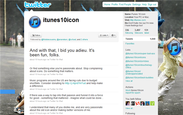
If you’d like to hurl some abuse or give it a gentle pat on the back, you can find the iTunes10 icon defending itself here on Twitter.

Does the new icon design float your boat or leave you cold? Or are we all just taking this a little too seriously?
Jennifer Farley is a designer, illustrator and design instructor based in Ireland. She writes about design and illustration on her blog at Laughing Lion Design.


