One of the common myths about mobile web development is the misguided notion that content from your traditional web site can be easily re-purposed into smaller bite-sized chunks for the mobile version. A simple change of style from media="screen" to media="handheld" is all you need to do to magically mobilize your site, right?
Wrong.
While it’s indeed possible to filter content with the liberal use of display: none in your mobile style sheet, in reality, this isn’t a good idea. In fact, many CMS systems can output a mobile, streamlined version of your web site, but even this is not always what your customers will want.
The W3C defines the concept of One Web as follows:
One Web means making, as far as is reasonable, the same information and services available to users irrespective of the device they are using. However, it does not mean that exactly the same information is available in exactly the same representation across all devices. The context of mobile use, device capability variations, bandwidth issues and mobile network capabilities all affect the representation. Furthermore, some services and information are more suitable for and targeted at particular user contexts.
As this definition suggests, some things are simply not available (or even usable) on some devices. Additionally, some devices (such as a mobile phone) are much better at certain activities (like making phone calls) than other devices. Therefore, a device designed for a specific activity should utilize its unique features on the Web.
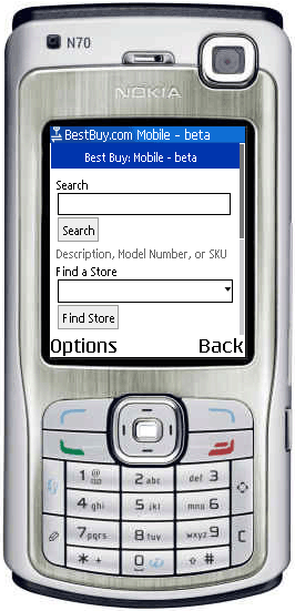
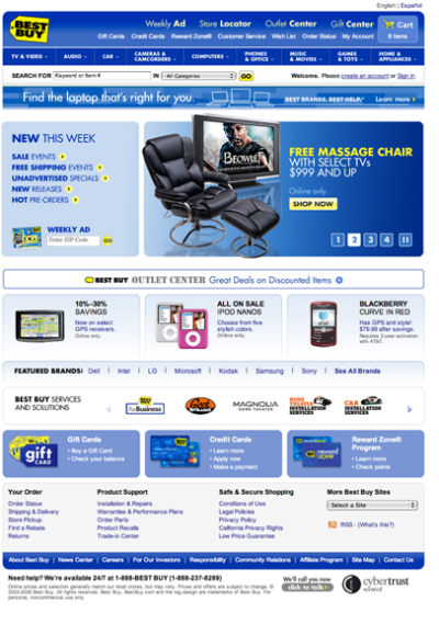
While the concept of having only one site, and to simply style it differently depending on the medium the visitor is using, is popular with many standardistas, a separate mobile site is required in order to deliver an optimized experience for mobile users. Customers who are surfing on a mobile device have different needs and requirements, so to force-feed them the same content as that displayed on the traditional site is a recipe for disaster. The following images show a good example of this principle. The Best Buy mobile site displays only two functions (Product Search and Find A Store) — a far cry from the traditional site.
How do you go about selecting content and functionality to include on mobile versions of the sites you’re working on?
 Brian Suda
Brian Suda is an informatician currently residing in Rekyavik, Iceland. He has spent a good portion of each day connected to Internet after discovering it back in the mid-01990s. Most recently, he has been focusing more on the mobile space and future predictions. How smaller devices will augment our every day life and what that means to the way we live, work and are entertained. People will have access to more information, so how do we present this in a way that they can begin to understand and make informed decisions about things they encounter in their daily life. This could include better visualizations of data, interactions, work-flows and ethnographic studies of how we relate to these digital objects. His own little patch of Internet can be found at suda.co.uk where many of his past projects and crazy ideas can be found.