Gerhardus Mer•ca•tor : Flemish cartographer, who developed the “Mercator projection” (1568).
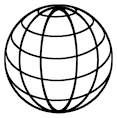
3D artists know this as “Spherical Projection, or Mapping”: A map in which the meridians and the parallels of latitude are shown as straight lines that cross at right angles, and in which areas appear more distorted the farther they are from the equator.
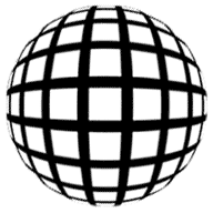 This image can have a number of different looks to it, the most popular being the one where the lines all appear like strings that have been wrapped around the shape of a sphere (‘Style 2’ in this tutorial). This kind of image is most often created with an Illustration program, but with a little resourcefulness, it can also be created using a non-illustrative program, such as Photoshop.
We’ll be covering 2 styles here — the one you see above (style 1), and ‘Style 2’ mentioned above. And as a bonus, I’ll show a couple of quick ways you can alter and add to this image, to give it a number of different looks.
Note to Mac Users: The PC key Ctrl = the Mac key Cmd. And the PC key Alt = the Mac key Option. Don’t forget to Save after every 2 or 3 steps!
Ok, let’s get started!
Key Takeaways
- The Mercator projection, developed by Flemish cartographer Gerhardus Mercator in 1568, is a type of map that portrays meridians and parallels as straight lines crossing at right angles, with distortion increasing away from the equator.
- This projection is frequently used in digital mapping and navigation due to its ability to maintain accurate angles, making it ideal for charting courses on a navigable map.
- The creation of a Mercator projection involves transforming spherical coordinates into Cartesian coordinates using complex trigonometric functions, including the natural logarithm of the tangent of latitude.
- Despite its navigational advantages, the Mercator projection is controversial because it distorts the size of landmasses, which can influence perceptions of the relative importance of different regions.
- Alternatives to the Mercator projection, such as the Robinson and Winkel Tripel projections, attempt to balance the distortions of size, shape, and direction but may be more complex to construct.
- Modern online mapping services often use a variant of the Mercator projection that minimizes distortion at high latitudes, facilitating easier panning and zooming capabilities.
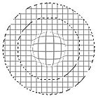
Style 1 — The Basic Mercator
- Create a new document and give it equal length and width dimensions, i.e. 300px by 300px. Use a white background (for this example, at least).
- Create a New Layer (Ctrl+Shift+N), and name it ‘Mercator’. Then fill it with White (press the D key, then Ctrl+Delete).
- Under the FILTER menu, choose “Sketch”, then “Halftone Pattern…” Set the ‘Pattern Type’ to LINE. Then set the Contrast to full, and the line thickness to 6px. Press OK to apply these settings.
- Under the SELECT menu, choose “Color Range…”. Then within the ‘Select’ dropdown menu, change the option to ‘Highlights’. Click OK to apply, then press the Delete key. And finally, Deselect (Ctrl+D).
In case anyone is curious, the reason we didn’t use the Magic Wand tool to select the white area was because the ‘Select Color Range’ function gives cleaner results.
- Also, older versions of Photoshop don’t have the new ‘Background Eraser’ and ‘Magic Eraser’ tools — but they do have the ‘Select Color Range’ function. So the method explained here applies to all version of Photoshop.
- This step is optional, and can be used if you want thinner lines. Under the FILTER menu, choose “Other”, then “Maximum…” and set it to 3px. This, as you’ll notice, will reduce the thickness of your lines by 3 pixels.
In case you’re wondering, this step cannot be done automatically using the “Halftone Pattern” filter; it doesn’t work like that.
- Press Ctrl+J to duplicate this layer. And under the EDIT menu, choose “Transform/Rotate 90 CCW”. Press Ctrl+E to merge these 2 layers together.
- Under the FILTER menu choose “Distort/Spherize…”. Use the “Normal” setting at maximum levels, and click OK to apply. Then press Ctrl+F to apply the same filter again.
- Now under the EDIT menu, choose “Transform/Scale…”. Hold the ALT and Shift keys down together, then grab and drag inward one of the corner control points. Resize it to about 2/3 its original size. Once scaled, make sure it’s in the true center of the canvas — press Ctrl+A (select all), Ctrl+X (cut selected), Ctrl+V (paste). Now it’s really centered.
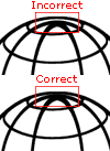
 Now use the Elliptical selection tool. Hold the ALT and Shift keys down; click as close to the exact middle of the sphere as you can, and scale a selection that is almost exactly the same size as the globe shape. You can get it close, then nudge it into perfect position afterwards using the arrow keys. You want the selection centered within the globe shape. Note that I’ve lightened my image here so you can see my selection more easily.
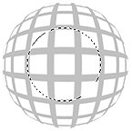 Press Ctrl+Shift+I to Invert the selection. Then press your Delete key, followed by Ctrl+D to Deselect. Then apply the ‘Spherize’ filter one more time. This will increase the spherical look of the lines, as well as increasing the size of the sphere, which is why we scaled the sphere down in Step 8. This is the secret to making this effect look good and clean.
- The last step to making this effect complete is to spherize just the very center of the line grid, to improve the ‘Mercator projection’ of the lines. So, create a circular selection like the one shown in the example image.
Use the Elliptical selection tool, and hold the ALT and Shift keys down; click as close to the exact middle of the sphere as you can, and drag your mouse outward. Note that you only want to select the radius of 3 squares, starting from the center and moving outward.
Once that’s done, Feather the selection by 10 pixels (SELECT>Feather). Then apply the Spherize filter with a setting of only 10, using the ‘Normal’ mode. Then you can Deselect.
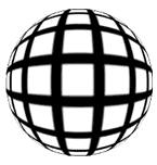
Your image should now look a lot like the one at the top of this page. And if you’d like your sphere to tilt, just use the Rotate function under the ‘EDIT/Transform’ menu. Try plus or minus 30 degrees. Voila! A Mercator!
Extra Tips
- If the lines look a bit fuzzy from the rescaling step, use the ‘Unsharp Mask’ filter on the sphere to sharpen the lines. Don’t overdo this though — try using 100% / 0.5 / 0 for the settings.
 The trick to getting the best results from this effect are is in Step 8 — scaling down the sphere before re-applying the ‘Spherize’ filter a second time.
If you want to see the difference in quality and effect, then at Step 7, just apply the filter 2 times in a row. Most tutorials that show how to create this image use the Spherize filter this way, but it just doesn’t look as good.
- If you wanted to make the effect look even more spherical, you’d simply repeat Step 8, then re-apply the ‘Spherize’ filter. Be careful about overdoing the filter though, because your lines near the center will begin to get too fuzzy (see sample image), which will require you to zoom in and clean them up manually — because the Unsharp Mask filter will no longer be useful for that.
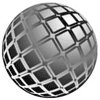
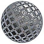
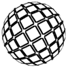
Style 2 — A Wireframe Sphere
 This image is somewhat different than the previous style, but this one’s also very popular — especially in company logos. It’s going to take a bit more to create this effect compared to the first one, but once you’re familiar with these steps, it won’t take you long to repeat the effect whenever you need it.
You can also create an Action to do a lot of the grunt work for you. While an Action won’t be able to create this effect completely, it can do most of the steps involved.
Note to Mac Users: The PC key Ctrl = the Mac key Cmd. And the PC key Alt = the Mac key Option. Don’t forget to Save after every 2 or 3 steps!
- Create a new document and give it equal length and width dimensions, i.e. 300px by 300px. Use a white background (for this example, at least).
- Create a New Layer (Ctrl+Shift+N). Then create a circular selection that fills most of the canvas area. Hold down the ALT and SHIFT keys to create a perfect circle that draws from the center outward.
 Apply a white-to-black Radial Gradient to the selection. Holding the Shift key down, start the gradient tool at the very top center of the circle, and drag it to the very bottom center. Leave the selection going.
 Add an Adjustment Layer right above the sphere layer (click the split black and white circle image at the bottom of the Layers palette). Choose the “Posterize” filter for this adjustment layer. Set the filter to 6.
Notice what happens? We get 6 individually shaded sections, which will end up becoming our wireframe rings. So set the filter to the number of rings you want. If your selection is no longer active, Ctrl-click on the gradient sphere layer again to reselect it.
- Add another Adjustment Layer right above the previous one. Choose the “Brightness and Contrast” filter for this layer. Set the Brightness up to +25, and Contrast down to -50. This will allow us to see every level of gray clearly. Which will be helpful in the steps to come. If your selection is no longer active, Ctrl-click on the gradient sphere layer again to reselect it.
- Now I’ve left this part until after the Adjustment layers were added, specifically so you could see what happens when we apply the “Spherize” filter. Click on the gradient sphere layer to make it the active layer. Apply the “Spherize” filter (FILTER>Distort>Spherize) using the ‘Normal’ mode, and set to 100% strength.
Did you notice how applying this filter made the gray sections of the sphere flatter, and gave them a better, proper shape for our effect? If you didn’t apply this filter to your gradient, your globe’s lines would be too steep — they wouldn’t look correct. Once you’ve done this, leave the selection going.
- Under the EDIT menu choose ‘Copy Merged’ (Ctrl+Shift+C). Open the Channels palette and create a new channel. Then paste what you just copied into the channel (press Ctrl+V). Now you can Deselect.
- Now under the FILTER menu, choose ‘Noise>Median’. Set it to 3px, and click OK. Then apply it twice more by pressing Ctrl+F twice. And now, also from the FILTER>Noise menu, choose ‘Dust and Scratches’. Apply this with the settings Radius=6 and Threshold=0. Before going on, create a duplicate of your new channel as a backup.
These filters are used to help smooth out the lines dividing the different shades. Unfortunately, though, they can’t smooth them completely, which is one of the drawbacks of trying to achieve this effect with filters only. Actually the problem filter here is the ‘Posterize’ filter, not the other 2, but don’t worry — we’ll get the lines even cleaner by applying one more filter.
 Now open the FILTER menu and choose Stylize>Glowing Edges. Use the settings 5/20/15. And now for the secret ingredient — a filter that will smooth our lines out even more! Under the ‘FILTER>Stylize’ menu, choose ‘Diffuse>Anisotropic’. Apply it once, then press Ctrl+F 4 times to apply the filter a total of 5 times.
Lastly, press Ctrl+L to open the Levels filter. Drag the right slider left, to 128. Then start dragging the left slider to the right until your lines get cleaner, harder edges. Don’t go too far, or the lines will look jagged. If that happens, move the left slider back a bit. Click OK to apply.
- Ctrl-Click the channel to select the lines. Then go back to the Layers palette and create a New Layer, filling the selection with black. Then Deselect. Now you’ll need to ‘hide’ the bottom 3 layers — the original gradient sphere layer, and the 2 adjustment layers. Click on their ‘eye’ icons to hide those layers.
You should end up seeing a negative version of your channel. Name this layer ‘base sphere’. If your lines are a little uneven, then run the ‘Diffuse>Anisotropic’ filter again, and apply the Unsharp Mask set to 250% / 0.5 / 0. If they’re just a little fuzzy, then only apply the Unsharp Mask filter set to 100% / 0.5 / 0.
Extra Tips
- This entire effect can be made into an Action. But as an Action it would be best if you followed the advice given in tip 4, below. I would also advise that if you make it into an Action, you get the Action to create a new document for the Mercator effect, and not combine it with any current image you may be working with. Once the effect is made, you can just merge the layers and drag it into the document you’re working on.
- If your circle’s border is uneven, just select the gradient sphere and invert the selection. Then while on the outline layer — ‘base sphere’ — press Delete. Now invert the selection back again and under the EDIT menu choose Stroke. Apply a 7 pixel stroke, in the center. That should give you a nice clean border.
- If you want the lines to be thicker, then apply the ‘Minimum’ filter to the layer (FILTER>Other>Minimum). I wouldn’t go higher than 1 or 2 pixels using this filter though, as the lines will start to look distorted.
- There’s a way to get slightly nicer results for this effect. Start out by making your globe twice the size you intend on using. Then, after you’ve completed all the steps, resize your document down by 50%. Because Photoshop reinterpolates the image, the lines become a little smoother. This is especially good if you plan on thickening the lines up, as mentioned in the previous tip.
- It took me several hours of playing around to discover that the ‘Anisotropic’ setting of the ‘Diffuse’ filter was the filter that would allow us to really clean up and smooth out the edges of the lines. I tried many other filters before coming across this one. And the point here is that just because you don’t find a solution to a problem right away, doesn’t mean there isn’t one to find. You just have to persist with your experimenting until you discover the right filter using the perfect settings.
Next, we’re going to add the vertical lines to the sphere so it looks more like a wireframe globe.
I know this may seem a bit arduous right now, but trust me: once you know the steps, this effect can take literally minutes to achieve — especially if you create an Action to do most of the work. Speaking of which, this is the part that would be difficult to create using an Action, as it involves manual selections.
- Create a New Layer above your ‘base sphere’ layer. You don’t have to name this one.
- Ctrl-Click the original shaded sphere layer to make a selection of it. Now Stroke this selection by 5 pixels, in the center (EDIT>Stroke…)
 Again under the EDIT menu, go to the ‘Transform’ option and choose the ‘Scale’ function. Hold down the ALT key, grab one of the side control handles, and drag it inward so the circle gets thinner. Make it look like an oval — like the example image here.
Create another New Layer, and repeat the same steps as above, but this time, resize the circle until it’s even thinner than the first one. You’ll notice that this step makes the line really thin. We can easily fix this using the ‘Maximum’ filter found under the ‘Other’ option (FILTER>Other>Minimum…).
After both the vertical line layers have been created to your satisfaction, click on the top one and press Ctrl+E to merge them together. Then merge the vertical lines layer to the ‘base shape’ layer. Now you should have only one layer that has your entire Mercator on it, and you’re free to colour it, fill it with a texture, etc.
And that’s all there is to it. We’re done!
Extra Tips
- There is one more tiny detail that really finishes off the effect. Select the ‘Transform>Scale’ tool and reduce the height of both of the vertical line layers by 2 or 3 pixels. Basically, you want the tops of these lines to sit just below the top line of the ‘base sphere’ layer. But don’t let any white area show in between them (see the example image). If you ‘Link’ these layers together you can resize them both at the same time.
 At this point, you might do well to create a new custom Brush out of your Mercator shape. That way, next time it will only be one click away. So, how can you do it?
In PS7: Just make sure the Mercator layer is active, then under the EDIT menu choose “Define Brush”. In PS6 and 5.5: Ctrl-Click the Mercator layer to select it, then open the EDIT menu and choose “Define Brush”.
If you’re wondering why I don’t suggest creating a Vector Shape from this, it’s because Photoshop’s pretty terrible when it tries to convert this image to vector — the lines are just not smooth enough for it. You’d be better off to create one in a vector (Illustration) program and import it. At least as brush, you have the option of scaling it before you create it (in PS7 only. In earlier versions you’ll have to create it, then use the ‘Transform>Scale’ tool).
Mercator Effects
 Now we’re going to apply some different effects to our original wireframe sphere. There are, of course, unlimited options here for this, but I’m going to get you started by showing you a few I’ve found. This header image to the right is just one good example of how far you can develop a simple Mercator, toward creating a more complex graphic.
Note to Mac Users: The PC key Ctrl = the Mac key Cmd. And the PC key Alt = the Mac key Option.
Even though ‘Style 2’ is the more frequently used style, I want us to use ‘Style 1’ here, so I can show you how to create the inner wireframe sphere of the graphic above. So, save and close your ‘Style 2’ document, and re-open your ‘Style 1’ document. Don’t forget to Save after every 2 or 3 steps!
- Your ‘Style 1’ document should have only 2 layers — the Mercator layer and the document Background layer. If it doesn’t, then do whatever you have to in order to achieve this.
 Then… if you didn’t rotate your Mercator at the end of the tutorial, do that now. Press Ctrl+T, and in the settings box for the Rotate function put -30. In PS6 and 7, look for this symbol along the Option Bar for the Transform tools.
 - Press Ctrl+J to duplicate the ‘Mercator’ layer. Name this layer ‘1’. Then press Ctrl+I to invert the colour to white. Wow! Now we have a pencil outline of the Mercator.
- Now duplicate the ‘Mercator’ layer again, and make sure this layer is below layer ‘2’. Name this layer ‘3’. Press Ctrl+I to invert the black lines to white, and change the Blend Mode to Exclusion.
 Create another new layer and move it so that it’s right above the bottom ‘Mercator’ layer. Name this new layer ‘4’. Then create a circular selection that’s the exact same size as the Mercator. The easiest way to do this is to hold the ALT and SHIFT keys down, click in the center of the Mercator, and drag outward until you reach the desired size.
Now fill the selection with a white-to-black Radial gradient, starting at the top right, and ending at the bottom left. Your image should look similar to the one shown here. Now change the Blend Mode of the gradient sphere layer to ‘Overlay’. Leave the selection going. And don’t worry — we’ll get this look back again in a few more steps.
- Duplicate layer ‘3’. Name this duplicate layer ‘5’. Now change your colour swatches to be white and a medium sky blue — not too dark, not too light. Ctrl-click on the layer to select the Mercator shape, and run the Clouds filter on the selection. Then Deselect, and change the Blend Mode to Multiply. Also, turn down the Opacity of this layer to 25%.
- This next part is a bit complex, but it shouldn’t take long. Create a new layer above the original ‘Mercator’ layer. Name this new layer ‘6’. Hide the other layers above this by clicking on their eye icons; we need to see the contents of just this layer while we work on it.
Now Fill the circular selection with white. Keep the selection going. Under the FILTER menu, choose “Sketch”, then “Halftone Pattern…”. Set the ‘Pattern Type’ to LINE. Then set the Contrast to full, and the line thickness to 2px. Press OK to apply. Now under the FILTER menu choose ‘Other>Maximum’. Set it to 2 pixels, and press OK.
Press Ctrl+J to duplicate this layer, and then, from the EDIT menu, choose ‘Transform>Rotate 90 CW’. Now change this layer’s Blend Mode to Multiply, and press Ctrl+E to merge these 2 striped layers together.
Merging layers deactivates a selection, so Ctrl-click the grid layer to select it again. Then Contract the selection by 50 pixels. Users with older versions of PS should just create a new selection over the middle of the Mercator that’s 50×50 pixels. Now Feather the selection by 2 pixels. Run the Spherize filter on the selected area, using the settings +100% and ‘Normal’ mode.
 Expand the selection by 25 pixels — users with older versions of PhotoShop will have to do this in 2 stages. Now invert the selection by pressing Ctrl+Shift+I. Next, we need to intersect our selection with the main circle shape. Do this by holding down the Alt, Shift, and Ctrl keys at the same time, and clicking on the layer. You should now have a donut-shaped selection like the one shown here. If you don’t get this result, press Ctrl+Z to Undo, and try it again.
 Now under the FILTER menu, choose ‘Distort>Pinch’. Set it to +100% and apply it. Next, Ctrl-click layer ‘4’, so you’ve fully selected the grid circle, and run the Spherize filter on the selected area. This time, set the filter to -100% and ‘Normal’ mode. Now Feather this selection by 10 pixels, invert the selection, and press the Delete key 3 times. Then Deselect. And finally, change this layer’s Blend Mode to Multiply.
 Ok we’ve almost finished the effect — just a couple more things to do. Click on the original ‘Mercator’ layer, and create a new layer above it that you’ll call layer ‘7’. Press the D key to reset your Fore and Background colours, and run the Clouds filter. Ctrl-click layer ‘4’, to get a circular selection and, from the FILTER menu, choose ‘Pixelate>Mosaic’. Set it to 15, apply it, and then run the Unsharp Mask with the settings 150% / .5 / 0. Run the Spherize filter twice, with the settings +100% and ‘Normal’ mode. Now press Ctrl+Shift+I to invert the selection, press the Delete key, and then Deselect.
Under the EDIT menu, choose ‘Transform>Rotate’. Rotate the sphere -30 degrees to match the lines on this layer up with all the other lines.
And, last but not least, change the layer’s Blend Mode to Exclusion. You should now have an image similar to the one shown here. The variable that can have a big impact on the look of the image is the Clouds filter. As it’s a random filter effect, everyone’s results will look different.
 Now this next part will depend on how closely you followed my instructions from the first part of the tutorial. But I’m showing you an example here so you can see exactly what I’ll explain. Under the FILTER menu, choose ‘Other>Maximum’ and set it to 3. Then look at my example image here.
If your white lines don’t look like mine, then either increase or decrease the value until they look the same. You want very thin lines, with small dots at the line intersections. Once you have the right setting, click OK to apply it. Then change the Blend Mode to Exclusion. And to help make these lines and dots stand out better against this busy image (you’ll see the effect of this later on), press Ctrl+J to duplicate the layer.
Name this new layer ‘2’. Now move this layer right below layer ‘1’. Press Ctrl+I to invert the white to black, and set this layer’s Blend Mode to Overlay.
I hope you found this exercise interesting, and that you got something from it, even if things didn’t turn out perfectly for you — the first time anyway! There are a lot of things that can be learned from the steps for this effect, only one of which is the final result shown here.
Extra Tips
- One step where you can affect the final look of the Mercator is to alter the colours used — these should be in the 3rd layer from the top. Also, try setting that layer on Exclusion blend mode for a different look.
- Another way to alter this effect is to turn off layer ‘4’. This produces an interesting outlined effect. Play around with turning off and on some of the other layers, and see what variations you can find for the look.
Have fun!
Frequently Asked Questions about Mercator Projection
What is the mathematical basis for the Mercator projection?
The Mercator projection is based on a mathematical formula that transforms the spherical coordinates of a point on the earth’s surface into Cartesian coordinates on a plane. This formula involves complex trigonometric functions, including the natural logarithm of the tangent of the latitude. The result is a map where all lines of longitude and latitude intersect at right angles, but the size of landmasses is distorted as you move away from the equator.
Why does the Mercator projection distort the size of landmasses?
The Mercator projection distorts the size of landmasses because it stretches the surface of the sphere onto a cylinder. This stretching becomes more pronounced as you move away from the equator, causing landmasses near the poles to appear much larger than they actually are. This distortion is a necessary trade-off to maintain accurate angles and shapes, which is why the Mercator projection is often used for navigation.
How does the Mercator projection affect our perception of the world?
The Mercator projection can significantly affect our perception of the world by making certain landmasses appear larger or smaller than they actually are. For example, Greenland appears to be the same size as Africa on a Mercator map, even though Africa is actually 14 times larger. This can lead to misconceptions about the relative size and importance of different countries and continents.
Are there any alternatives to the Mercator projection?
Yes, there are many alternatives to the Mercator projection, each with its own strengths and weaknesses. For example, the Robinson projection maintains more accurate sizes and shapes of landmasses, but distorts distances and directions. The Winkel Tripel projection balances the distortion of size, shape, and direction, but is more complex to construct.
How is the Mercator projection used in modern mapping technology?
The Mercator projection is widely used in modern mapping technology, especially in online mapping services like Google Maps. This is because the Mercator projection allows for easy panning and zooming, and maintains accurate angles, making it ideal for street-level navigation. However, these maps often use a variant of the Mercator projection that reduces the distortion of size at high latitudes.
What is the history of the Mercator projection?
The Mercator projection was first developed by the Flemish geographer and cartographer Gerardus Mercator in 1569. It was originally designed for use in maritime navigation, as it preserves accurate compass bearings. Despite its distortions, the Mercator projection has remained popular for over 450 years due to its usefulness in navigation and its simple, rectangular grid.
How can I create my own Mercator projection?
Creating your own Mercator projection involves applying the Mercator formula to the spherical coordinates of each point on the earth’s surface. This requires a good understanding of trigonometry and logarithms. However, there are also many online tools and software packages that can create a Mercator projection for you.
Why is the Mercator projection controversial?
The Mercator projection is controversial because its distortion of size can lead to misconceptions and biases. For example, it can make developed countries in the northern hemisphere appear larger and more important than developing countries near the equator. Some people argue that this reinforces a Eurocentric view of the world.
What are the advantages of the Mercator projection?
The main advantage of the Mercator projection is that it preserves accurate angles and shapes, making it ideal for navigation. It also has a simple, rectangular grid that is easy to use and understand. Furthermore, the Mercator projection allows for easy panning and zooming in online mapping services.
What are the disadvantages of the Mercator projection?
The main disadvantage of the Mercator projection is that it distorts the size of landmasses, especially near the poles. This can lead to misconceptions about the relative size and importance of different countries and continents. The Mercator projection is also more complex to construct than some other map projections.
Mark is the author of "The Photoshop Guru's Handbook" Website, and he's a freelance Website designer and creator.