Keep up to date on current trends and technologies
Blog
How to Run AI Agents 24/7: OpenClaw Hosting & Production Runtime Lessons
kylian

How to Run AI Agents 24/7: OpenClaw Hosting and Production Runtime Lessons
SitePoint Team
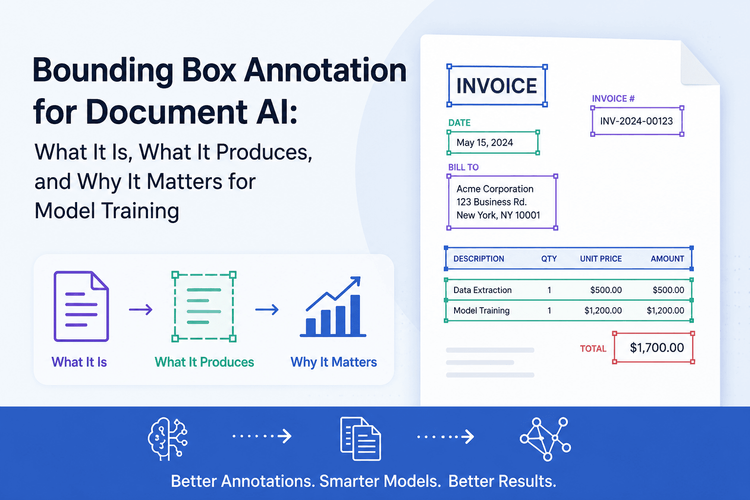
Bounding Box Annotation for Document AI: What It Is, What It Produces, and Why It Matters for Model Training
Bilal Ahmad

Payment orchestration Platforms for Enterprises to watch in 2026
SitePoint Sponsors
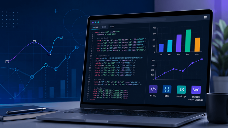
Build SVG Charts for Web Applications with Code Examples
Shamal
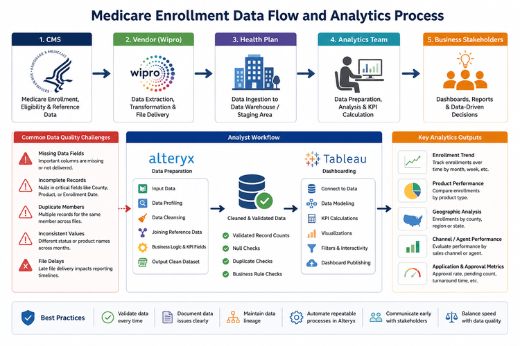
The Hidden Challenge of Healthcare Analytics: Building Reliable Dashboards with Incomplete CMS Data
Shilei Zhang

Beyond Dashboards: How Predictive Analytics Is Transforming Healthcare Decision-Making
Shilei Zhang

Image Optimization for Core Web Vitals in 2026: What Actually Moves the Needle
Dhananjay Kumar

Sharing Content to Instagram Using Python
Bria Catthien

Building Interactive Charts in JavaScript: A Developer’s Guide
Shamal

Professional Video Editor: The Foundation of Modern Digital Storytelling
SitePoint Sponsors
How I Built a 47-Signal Website Audit Tool That Runs in 15 Seconds
Adam McClarin
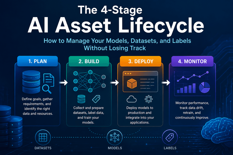
The 4-Stage AI Asset Lifecycle: How to Manage Your Models, Datasets, and Labels Without Losing Track
Bilal Ahmad
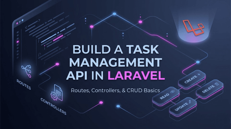
I Built a Task Management API in Laravel to Learn the Fundamentals (Here's What Happened)
SitePoint Team

**PyTorch Stochastic Gradient Optimization Technique**
aritrabesu

How to Authenticate AWS Workloads to Google Cloud Without Service Account Keys
Saurabh Ahuja
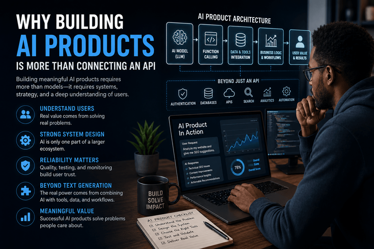
Why Building AI Products Is More Than Connecting an API
Christian chimeremeze ezenwa

Why Function Calling Is More Important Than Prompt Engineering
Christian chimeremeze ezenwa

Which DeepSeek Model Fits Your Hardware? VRAM Sizing Guide for 2026
SitePoint Team
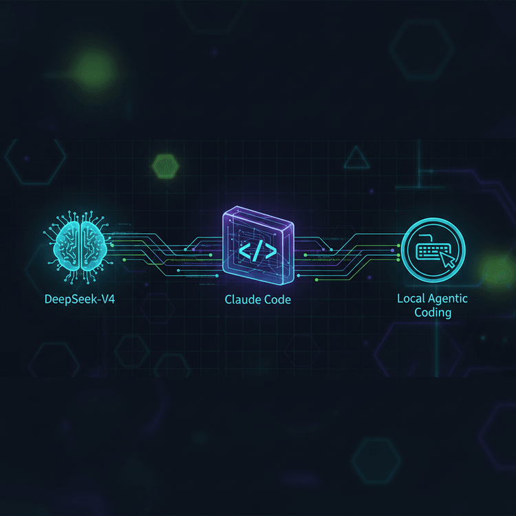
How to Route DeepSeek-V4 Through Claude Code for Local Agentic Coding
SitePoint Team

Claude Code Plan Mode: The Read-First Workflow for Complex Refactors
SitePoint Team

AI Is Not Your Accessibility Expert: What LLMs Still Miss About WCAG
ashokyadav1231

How I Architected an Automated Programmatic SEO Auditor Using Node.js and LLM Function Calling
Christian chimeremeze ezenwa
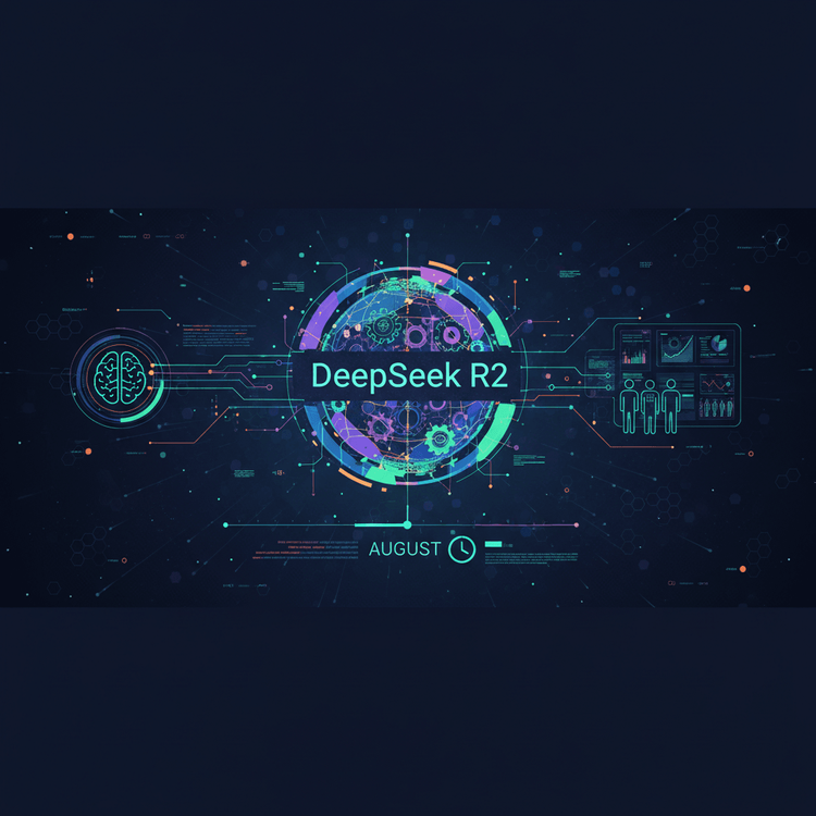
DeepSeek R2: What Developers Need to Know Before August
SitePoint Team
Automating Code Review with DeepSeek in GitHub Actions
SitePoint Team

DeepSeek API + OpenAI SDK: A Developer's Quick-Start Guide
SitePoint Team

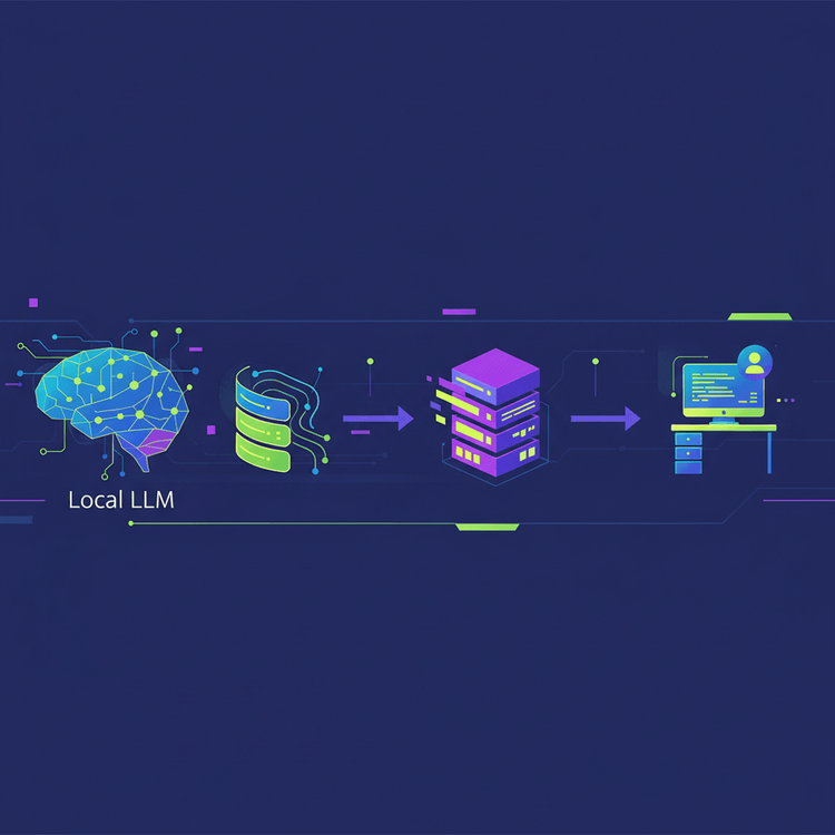
Local LLMs Are Getting Easier: The Complete Guide (2026)
SitePoint Team
Local LLM Deployment: Ollama vs vLLM vs LM Studio Compared
SitePoint Team
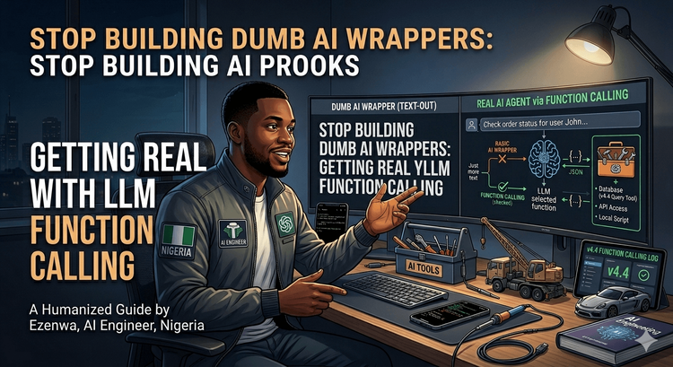
Stop Building Dumb AI Wrappers: Getting Real with LLM Function Calling
SitePoint Team

Stop Guessing: Why Transparent Pricing Calculators Are the Future of Web Agencies
sharjeel

Vibe Coding 2026: The Structured Guide to AI-First Development
SitePoint Team

Build a Human-AI Collaborative Workflow with ArvoWorks and Kanban
SitePoint Team
Showing 32 of 8401