Icons and infographics are so integral to all GUIs (OS’s and online) that, like the street signs outside your window, we hardly notice them, even when we’re using them. And that’s exactly the way it really should be. The first time we see one it should help explain a concept behind a menu item, button or link — perhaps with a shopping cart silhouette next to a purchase option or a disk next to the ‘save’ option. After the first time, we then tend to use them as flags or landmarks to move around interfaces we are familiar with.
However, there are time when that imagery can work against what you’re trying to achieve. Sometimes it can be as simple as emphasizing the wrong part of an interaction. In an online shopping situation, do you mark the ‘BUY’ button with coins or bills — emphasizing what the user is losing — or do you associate the process with the shopping cart or bag, emphasizing what your user is gaining. We don’t have to bug the Amazon board room to know the answer to that one.
I saw another case in point today. About a month ago I installed a new Antispam extension for Thunderbird — the curiously named ‘Spamato‘. The system works nicely by combining a number of techniques and allowing you to adjust the relative influence of each one. The system learns quickly, but still requires you to manually tag good and bad mail for it to learn from.
While the decisions it made were generally excellent, I had a small but nagging issue. Every time I went to mark an email as spam, I felt a strange sense of unease. Often I’d find myself hovering over that ‘SPAM’ button, wanting to push it, but with a nagging doubt, which I could never quite put my finger on. I felt like I was doing something wrong, but I couldn’t figure out why.
Finally, I took a moment to analyze what was happening and figured it out.
The text on the button is fine — it say ‘Spam’. Simple and succinct. However the icon is of an envelope overlapped by the classic red, barred circle — the universal symbol for ‘Don’t’ or ‘No‘ or ‘Forbidden‘. Read together, you could interpret the imagery as ‘No Mail‘ or ‘Not Mail‘ — one way of describing spam, I guess.
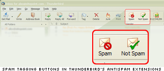
However, in the setting of an email client, the iconic image of an envelope is used so often that it almost loses it’s meaning. Envelope icons are used, naturally enough, throughout all levels of the application, and there are six more just on the main navigation panel.
So, when I hover my mouse over that button, what message am I subconsciously getting?
The big red ‘Not‘ symbol and the word ‘Spam‘. My conscious mind knows from experience that this is the Spam tagging button, but somewhere deeper, a part of my brain is screaming ‘No! It says NOT SPAM!!!‘. Precisely the opposite result to what the icon is trying to achieve.
Likewise, the accompanying button for tagging ‘good mail’ is marked with the negative ‘Not Spam’ label, but then paired with a positive, affirming green tick. Not quite as psychologically potent as that red circle device, but still counterintuitive to my way of thinking, anyway.
I’ve got an idea these icons are actually generic and used in other antispam extensions including Spambayes so they’ve made their way onto a lot of desktops.
So, am I being to too picky? Is it just me?
I might put some thought into designing some new icons that support their labels a little more. In fact maybe new labels might make sense. ‘Good’ and ‘bad’ are simple concepts that are more deeply wired into our heads than ‘spam’ and ‘Not spam’, so maybe it makes sense to tap into those deeper ‘gut feelings’.
Perhaps you have some ideas yourself? I’d be interested to see some other approaches.
 Alex Walker
Alex has been doing cruel and unusual things to CSS since 2001. He is the lead front-end design and dev for SitePoint and one-time SitePoint's Design and UX editor with over 150+ newsletter written. Co-author of The Principles of Beautiful Web Design. Now Alex is involved in the planning, development, production, and marketing of a huge range of printed and online products and references. He has designed over 60+ of SitePoint's book covers.