You know the old saying ‘brevity is the soul of wit’?
It seems that saying is evolving, and brevity is also the soul of the web. As a UX designer, I am always looking for ways of simplifying things, and using shorthand indicators when it makes sense to do so.
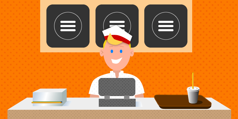
When mobile browsing made us rethink how we can simplify user experience within the constraints of minimal screen sizes, the “hamburger” icon was put to the test. Whether or not you believe another icon, shape or even text would do a better job, those three little horizontal lines seem to have won the menu icon arms race.
Originally, the hamburger icon was born out of pure necessity. A desktop-style fixed navigation bar didn’t make much sense on a phone screen. So we started using hidden menus and indicators together, allowing the hidden to become visible. More and more mobile sites got on board with the icon, even before it was widely recognized as the universal symbol for “menu.”
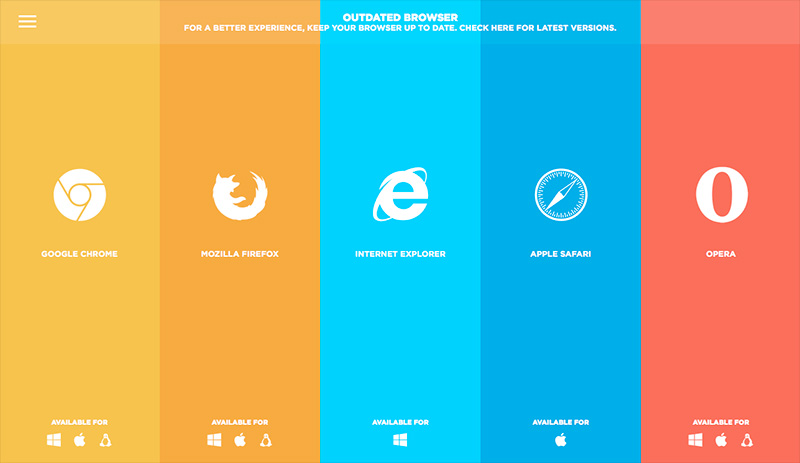
Now practically everyone browses on mobile devices. Practically all mobile websites use the hamburger icon. Voilá! Near-worldwide recognition. Now we are put in an interesting conundrum: If everyone universally recognizes the hamburger’s meaning, can we jailbreak it from mobile and set it free onto our desktops? Or more to the point, will users accept it?
Let’s examine the arguments for and against the hamburger on desktop, and ultimately see where it is likely to work best, and where to avoid it altogether.
The Good
The “clean factor”
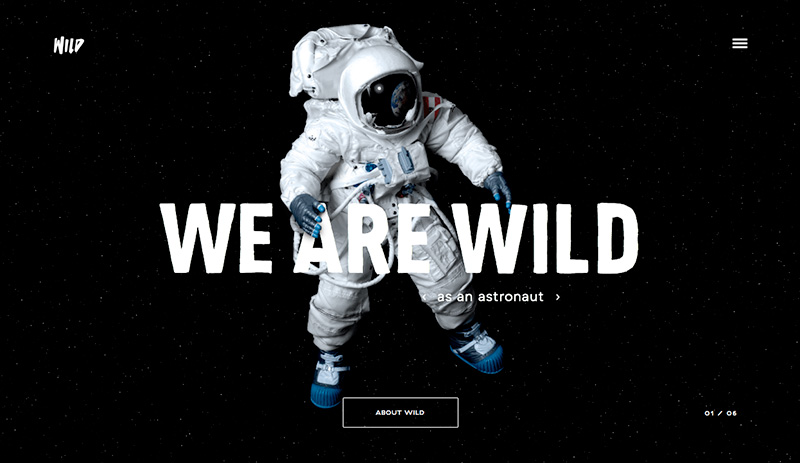
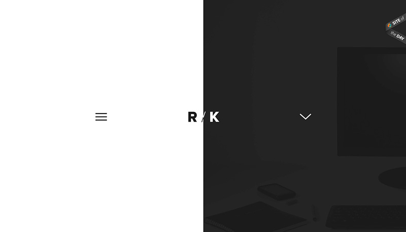
For designer/developers, the main draw for using the hamburger icon in a desktop application is the “clean factor.” Minimalist design continues to gain popularity, so of course the impulse would be to strip away everything but the most basic elements.
Navigation is traditionally the workhorse of a website, not adding much in the way of visual flair (in most cases.) If we could swap out something cumbersome and obtrusive with something minimal yet recognizable, the overall effect would undoubtedly be much simpler.

But let’s be careful not to confuse visual simplicity with functional simplicity. More on that later.
Let your CTA be the hero
One of the biggest jobs any UX professional faces is creating a hierarchy that makes sense. We must place more emphasis on certain elements just to make them stand out. But when we scale something up, unfortunately, other elements must end up being minimized.
Hiding the navigation elements away behind a hamburger icon is a great way to call more attention to whatever action you want the end user to take. As an example, in a simple portfolio site, the ultimate action you want from your users is to hire you. So, if your landing page has enough information for them to go on, it isn’t unrealistic to expect them to click your CTA directly from that page. The goal is to highlight your main CTA button, since the other menu items are probably secondary anyway.

By utilizing the hamburger and hidden menu, you have successfully prioritized your main goal, while lessening the distractions of other choices.
The power of popularity
Of course the one element that makes the hamburger icon usable at all is its sheer recognizability. The fact is, users have been interacting with it since roughly 2010, when it started spreading in mobile applications. A/B tests show steady improvement in engagement every year, which can most likely be attributed to increased exposure.
Although the hamburger is widely recognizable, it’s not yet reached complete saturation, which brings us to…
The Not-so-good
Not Universally recognized by users
The hamburger is well-known, but it still has a few blind spots, making it a riskier choice than a straightforward navigation menu. Anecdotally, it is believed that users who browse on mobile the least are also the least familiar with the menu icon as we know it. Generally speaking, this is especially true in older demos, specifically people 65 years and over.
Another click, another barrier
Perhaps the biggest drawback to using the hamburger icon in lieu of a more standard menu is the extra action a user must take to get where they want to go. One of the guiding principles of good UX dictates that we eliminate as many barriers as possible between users and content. Remember when I brought up functional simplicity earlier? This is it.
When we make somebody click an icon just to get to the navigational choices contained within it, we are making them go through an extra step. This may not seem like much, but if someone is going to spend much time on your site, they probably won’t want to take this extra step over and over again. If you’re going to make your users take an extra step, it needs to be for a good reason, and only under the right circumstances.
Out of sight, out of mind
What if your hidden navigation contains something delightful and unexpected? What if because it is hidden away, nobody will ever see it? Decreased discoverability can be a major problem when you have interesting content that might push a conversion over the top.
For example, a website that has a testimonials page might rely on said testimonials to connect with potential customers, and convince them to convert. If that is a clearly visible choice in the navigation, users will be more likely to “accidentally” discover this page. Since it isn’t an overtly obvious section that every website has, it is likely to be unanticipated and overlooked if hidden.
Best Uses
With no clear universal answer to the hamburger question, let’s look at the different cases you might want to use it, as well as how to make the most of it.
Simple sites with few pages/little content
If your site is on the smaller end, and you really want to make good use of white space, you can probably get away with hiding your main menu behind the icon. Since you aren’t expecting users to click through page after page, the extra clicks are probably worth the clean aesthetic you’re after.

When it’s obviously clickable
Studies and countless A/B tests have concluded that menu icons perform about 20% better when they are contained within a button. Therefore, you would be well-advised to take this approach, and put a border around it.

Traditionally, hamburger icons never needed a hover state since they were purely for mobile applications, but if you’re going to include it in your desktop design, make sure to give it some visual feedback for users who mouse over it, so they know it is indeed clickable.
While you’re at it, make sure it is clearly visible. Keep contrast, size and placement in mind. Generally, anything that is placed on the left side of the screen gets more action, so you might opt for the upper left side, rather than the right. It is also advisable to keep it sticky, so it stays anchored to the top of the window as your users scroll down.
Paired with a CTA
Perhaps the very best case to be made for using a hidden menu is that when used in tandem with a strong CTA, you are effectively telling users exactly what is expected of them. Doing so places the emphasis on your CTA, while minimizing the risk of your users getting lost in extraneous content. This generally works best if you have dedicated landing pages that are all relatively self-contained, eliminating the need for users clicking around to get the info they want.

Worst uses
On the other end of the spectrum, here are a few of the worst cases for a hamburger/hidden menu combo.
On a site aimed at older demographics
As stated earlier, the 65+ demo is the least familiar with the meaning behind the hamburger icon, thus the least likely to interact with it. So if you are designing a site that skews toward that age group, you would be much better off keeping all navigation clear and out in the open.
Sites with unexpected content
Any site that relies on spontaneous discoverability would be a bad candidate for the hamburger icon, simply because these elements are much less likely to ever be discovered. Anything fun and/or unexpected that might add to the site’s overall conversion should be explicitly displayed by default. People are not likely to discover something they don’t even know exists.
Final Thoughts
As with web design itself, there are no “one size fits all” answers to the desktop hamburger debate. Ultimately, you need to weigh out all factors, and determine if the visual simplicity it affords is worth the potential UX risks. It is certainly not advisable in all cases, but I think I can safely say that as time goes on, it will become less and less risky.
What do you think? Is it ever advisable to use a hidden menu with a hamburger icon on desktop sites? Have I overlooked a good use or obstacle? Please chime in with your thoughts below, and keep the conversation going!
Wes McDowell is the Principal and Creative Director forThe Deep End Design in Chicago. In addition to client work, he has authored several books for freelance designers and co-hosts a popular graphic design podcast called The Deeply Graphic DesignCast.


