Apple’s reputation for bringing beautiful design to the world of technology is rock-solid, from products to packaging to marketing material. Whenever Steve Jobs has been at the helm, great design has been the focus.
But we’ve found an anomaly for you. Apple’s Summer Movie Guide features a pretty hard-to-look-at design, and it doesn’t look like something that should have gotten past Jobs’ watchful eye. Let’s take a look at the design, see what’s wrong with it and figure out how it could be remedied.
Color Scheme
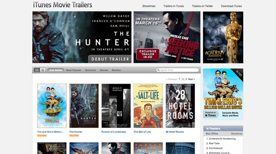
The first thing that strikes me is the color scheme. The dull green-blue on a bright orange background immediately creates a contrast problem, drawing the eyes to the bright orange while making it difficult to concentrate on the dark, subdued center. While the use of such a bright background could be troublesome in any configuration, the contrast between the two is the main problem and even a white foreground replacing the green-blue would be preferable.
You’ll notice that, at the top of the page, “iTunes Movie Trailers” and the navigation links are nearly invisible against the bright orange background.
If you scroll down the page as the gradient progresses, instead of green-blue on orange you’ll see a brighter blue on a darker green background. This is much easier on the eyes and allows you to more easily focus on the text.
However, the orange text used in the heading for each month works much better at the top of the page. It clashes belligerently with the bright blue towards the second half of the page.
How can Apple fix it? Change the color scheme to use a darker background and a lighter foreground, as can be seen at the bottom of the page. Make the section headers white or something else that’s more neutral.
Summer Movie Guide Banner
To me, the banner — the first image inside the teal box — is one of the better designed components of the site. It could use a dash of familiar branding to engage the viewer’s loyalty, though.
How can Apple fix it? Apple could consider including the Apple logo to the left of the words “iTunes Movie Trailers” and redoing those words in the classic Apple font used for all headings on the site. The words “Summer Movie Guide” look great and on-theme as they are.
Here’s an example of the words “iTunes Movie Trailers” in the more traditional Apple font as seen elsewhere on the site:
Layout
The layout for this page puts the content — the movies — front and center, delineated by the most important information for the reader: when is a particular movie coming out?
Apple’s typical tiled look from the iTunes Store is missing, leaving some large gaps. Whitespace is important, but typically in an Apple design the only whitespace is there by design, not due to a lack of content.
One thing I love about Apple’s designers is that they make their store pages look alive and exciting, with moving elements and hover-over effects that reveal more information; this is missing from the page, which makes the design look comparatively dead. It’d be good to hover over a movie thumbnail and see more information overlaying the image.
How can Apple fix it? Explore a tiling layout that leaves no conspicuous empty spaces that aren’t helpful to developing the structure of the page. Provide some subtle movement and interactivity to elements such as the movie thumbnails; in the past year or so hovering for more information has become part of the user’s expectation.
Conclusion
The page has some good elements, but as a whole, it’s a disaster. Apple needs to make changes to the color scheme pronto, and consider some other improvements while they’re on the job. If you’ve got other suggestions for the page, let us know in the comments — we hope you enjoyed this deconstruction.
 Jean-Pierre Gassin
Jean-Pierre Gassin is a web developer, writer and design enthusiast from the Gold Coast, Australia. He runs The GeekGrounds, a tech and gaming culture site, and is studying a Bachelor of Information Technology.