

Key Takeaways
- Easings, or the way objects animate, can be fine-tuned to enhance user experience, contribute to a visual aesthetic, or even alter the user’s mood. Natural motion easings, in particular, can help users understand the interface more easily.
- The type of easing chosen should depend on how much attention the animated element warrants and the action required from the user. For instance, a bounce easing is suitable for error messages and popup dialogs, while a simple ease transition is more suitable for micro-interactions.
- Just like colors and typography, the duration and easing of an animation can influence the user’s mood. Slower animations can imply elegance or seriousness, while faster ones can convey something more upbeat. However, animation should not be used thoughtlessly, as poor use can hinder the user experience as much as it can enhance it when used correctly.
By changing the length and speed of your animations, you can create some very unique transitions, and even enhance the user experience of micro-interactions.
The manner with which an object animates is often referred to as an easing, and when smartly fine-tuned, these easings can help micro-interactions chaperone the user safely throughout your UI, contribute to a visual aesthetic, or even alter the user’s mood.
How? Lets take a look.
Easings Can Make Interfaces Animate Naturally
In real life, objects rarely move at constant speed. For instance, when we open doors, we accelerate them at the start and slow them at the end, because that’s how our muscles work. Likewise, if you bounce a ball on the floor, it rises quickly at first, slows down, pauses momentarily, before dropping to the floor due again.
In fact, the way we navigate and interact with our world is dictated by our understanding of how objects move.
- Would you involuntarily try to catch an object if it were suspended in mid-air? Probably not.
- Would you attempt to board a moving train? Hopefully not.
Our brains are programmed to understand **natural motion**, and that’s why crafting easings that animate in a natural way will help your users understand them more easily.
Let’s take our first look at an easing.
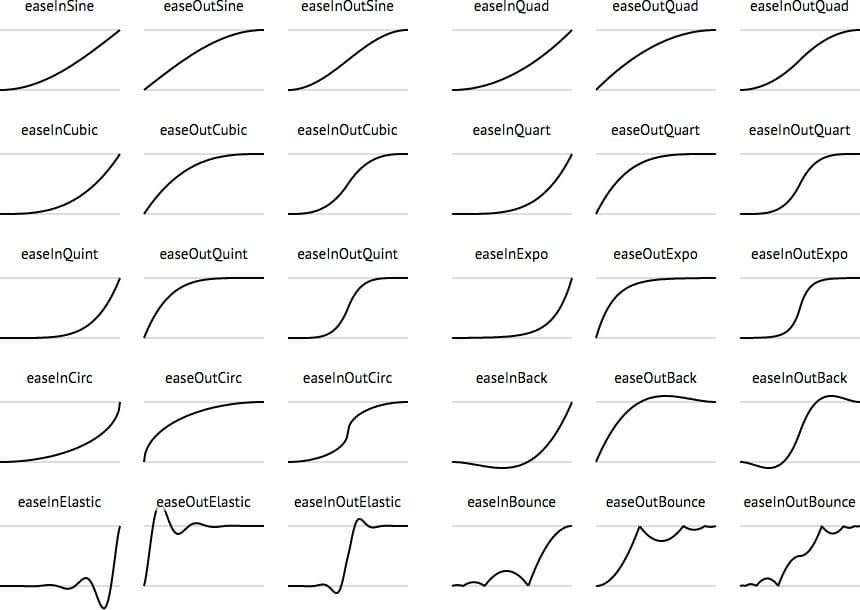
Types of Easings
Witnessing easings in action is probably the best way to understand them. Many programming languages (like CSS) and frameworks (like jQuery) have a set of ready-made easing functions built-in . Easings.net compiles a wide selection of common easings.
Consider a double-sided card interface (perhaps credit card information on the front, security code on the back) — you would typically flip the card to read the code. You wouldn’t do this at constant speed (linear easing). But you also wouldn’t use any fancy motions to do it (elastic or bounce easings).
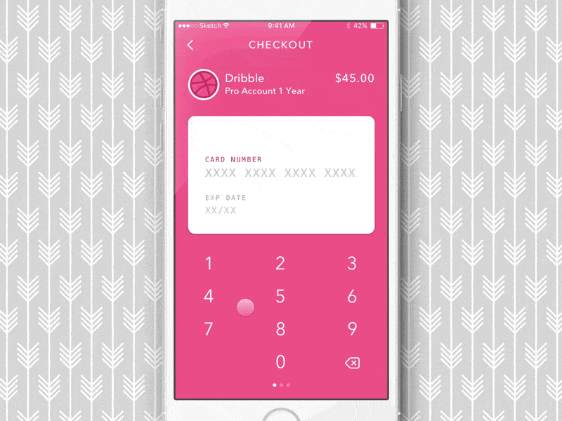
A simple ease motion would suffice, meaning that one state simply eases into another. If an element on the screen dropped from the top of the screen to the bottom, that might warrant a bounce easing because some objects bounce when dropped.
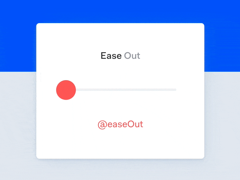
How Does Ease-In Differ From Ease-Out?
Ease-in is slow at the beginning, fast at the end — ease-out is the opposite. As a general rule you should use ease-in when something is moving out, and ease-out when something is moving in. Ease-in-out is slower at the beginning and end.
In fact, Google has some very specific ideas about how fast elements should transition in-and-out, and the acceleration/deceleration of the speed.
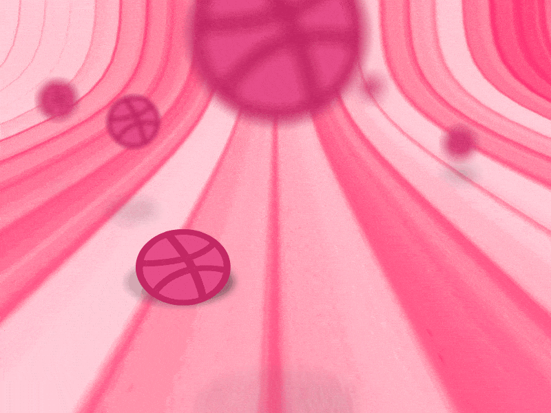
Easings Can Guide the User Safely
A bounce easing is more eye-catching, making it suitable for error messages and popup dialogs, whereas a simple ease transition doesn’t steal too much time and focus from the user, making them more suitable for micro-interactions.
The type of easing you choose should depend on how much attention the animated element warrants, and the sort of action is that is required from the user – different easings communicate different things.
Guiding the user safely is no easy task; it’s a collaborative effort between animation, color, and even the use of words; each can contribute to effectively communicating to the user what they should do next, or where they should go.
How Long Should an Animation Last?
For ease animations, something between 200ms-500ms is optimal; this gives the human brain enough time to “read” the animation and decide what the user should do next, without delaying the user too much. If the animation is too long the user is forced to wait; too short and it’ll feel uncomfortably sharp, both of which are very annoying to the user.
Elastic or bounce easings should have a longer duration (around 800ms-1200ms) to allow the animation to flow. Without this added time the animation will feel aggressively jolty.
Easings Can Influence Mood
In a similar way to colours and typography, animation can influence the mood of the user. You can fine-tine the duration and easing of an animation to influence how a user feels.
Slower animations can imply elegance or seriousness (depending on the nature of the app/website), whereas faster animations can convey something more upbeat. Your mood can affect your decision-making (i.e. a slower, more serious tone might convince you to donate to a charity, and a faster, more upbeat tone might make you feel more impulsive and more likely to spend money).
Since experts generally tend to agree on the duration of easings for micro-interactions, there isn’t much room to apply branding in this respect. Animation in branding is still a relatively untouched topic, however, as a rule, I would save complex animations for larger components (modals, et cetera) and illustrations (you can animate SVG in web design for example!).
Further Reading: Prototyping Animations and Easings
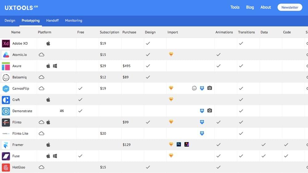
You only have to take a look at the abundance of design tools on the market these days, offering ways to prototype interactions and animations, to understand how motion plays such an important role in UX. Principle, FramerJS, Atomic App, InVision App, Marvel App, Flinto, Proto.io, et cetera (you can compare them over at uxtools.co) are a few of the big names. Personally, Atomic App is my #1 because I love how easy it is to customise easings with their Advanced Animation Control, which I wrote about a while back.
I also like InVision App because their Craft Plugin allows me to prototype transitions and user flows directly in Sketch!
Conclusion
Animations are certainly trendy, especially in web design where CSS transitions have become widely supported by modern browsers without affecting page performance too much (jQuery easing functions are very GPU-heavy in comparison to CSS transitions).
But – no different to using color or typography – they shouldn’t be used thoughtlessly (i.e. because they look “cool”, or because you want to use modern technology for the sake of it). Poor use of animation can hinder the user experience as much as it can enhance it when used correctly.
Do you have any animation or interaction tips to share?
Let us know in the comments!
Frequently Asked Questions (FAQs) on Animations Using Easings
What are the different types of easing functions available in CSS?
CSS provides a variety of easing functions that can be used to create different animation effects. These include linear, ease, ease-in, ease-out, ease-in-out, and cubic-bezier. Each of these functions provides a different type of motion for the animation. For example, ‘linear’ creates a uniform motion, while ‘ease’ starts slow, becomes fast in the middle, and ends slow. ‘Ease-in’ starts slow, ‘ease-out’ ends slow, and ‘ease-in-out’ starts and ends slow. The ‘cubic-bezier’ function allows you to define your own easing function.
How can I use easing functions in my CSS animations?
Easing functions can be used in CSS animations by specifying them in the ‘animation-timing-function’ property. For example, if you want to use the ‘ease-in’ function in your animation, you would write ‘animation-timing-function: ease-in;’. This will make the animation start slow and then speed up.
What is the purpose of using easing functions in animations?
Easing functions are used in animations to create more natural and realistic motion. They allow you to control the speed of the animation at different points, which can make the animation feel more lifelike. For example, an object in real life doesn’t instantly start moving at full speed, it gradually speeds up. Easing functions allow you to mimic this behavior in your animations.
Can I create my own custom easing functions?
Yes, you can create your own custom easing functions using the ‘cubic-bezier’ function in CSS. This function takes four arguments, which represent the points of a cubic bezier curve. By adjusting these points, you can create your own custom easing function.
What are some common uses of easing functions in web design?
Easing functions are commonly used in web design to create smooth transitions and animations. They can be used to animate elements as they enter or leave the page, to create scrolling effects, to animate dropdown menus, and much more. By using easing functions, you can create animations that are more engaging and pleasing to the eye.
How can I test different easing functions?
There are several online tools available that allow you to test different easing functions and see how they affect an animation. These tools typically allow you to select an easing function from a dropdown menu and then play an animation using that function. This can be a great way to experiment with different functions and see which one works best for your animation.
Can I use easing functions in all browsers?
Most modern browsers support easing functions in CSS. However, some older browsers may not support all easing functions. It’s always a good idea to test your animations in multiple browsers to ensure they work as expected.
What is the difference between ‘ease’ and ‘linear’ easing functions?
The ‘ease’ and ‘linear’ easing functions create different types of motion in an animation. ‘Linear’ creates a uniform motion, where the animation moves at a constant speed from start to finish. ‘Ease’, on the other hand, starts slow, becomes fast in the middle, and ends slow. This creates a more natural and realistic motion.
How can I combine multiple easing functions in a single animation?
If you want to use multiple easing functions in a single animation, you can do so by using the ‘animation’ shorthand property in CSS. This property allows you to specify multiple values for the ‘animation-name’, ‘animation-duration’, ‘animation-timing-function’, and other animation properties. Each set of values is separated by a comma.
Can I use easing functions in CSS transitions?
Yes, easing functions can also be used in CSS transitions. Just like with animations, you can specify the easing function in the ‘transition-timing-function’ property. This will control the speed of the transition at different points.