What’s on the program?
As I’m sure you’ve seen by now, there’s not a whole lot of limitations on what can be done with a group of pixels these days. For example: you can bend them, twist them, warp them, tear them, augment their colour, diminish their colour, even create large and small groups of them and choreograph their appearance to work in either harmony or discord. And then, when you’ve done all that, you can teach them how to dance! Now that’s a lot of versatility for something so tiny, it’s dwarfed by the point of a pencil!
And if you had a few dozen million bucks, you could create a block-buster movie where dinosaurs are cloned, and look so real because there’s so much detail put into the graphic work, and they take over a tropical island theme park, and you can make more than a hundred million bucks from showing it to people!!! Oops, got carried away there, sorry. But you get where I’m going with that, right?
What we’ll be talking about in this article is how we ‘teach our pixels to dance’, in other words, how to animate them. Gif animation has become one of the Web’s most popular and interesting characteristics I think. There are hundreds of animation contests going on all over the Internet at any given time, to satisfy the cravings of the average Gif animation enthusiast. It’s definitely one of the more ‘user-friendly’ ways to add some excitement to a site (no plugins required!).
In order to create an animated Gif image, you need to use a program that’s been designed for that purpose. The more specific it is to serving that purpose, the better its performance will be in ease of use, file optimization, and the creation of a great end product. There are, however, a few new graphics programs out there that have been designed to fulfill more than just this one function, and these still work nicely to create animations. These programs are geared more toward the Web designer crowd, and will also help the Web or Graphic Artist to compress, compile, and even slice’n’dice images for placement within table cells on a Web page. And on top of all that, they also provide a degree of painting and/or drawing capability for the more experienced artist.
Since I myself don’t have every different animation program ever made, I’ll reference examples here from the ones that I tend to use the most: (before you get started, have a quick look at these samples done with each program)

Corel Xara 2® Things to note are: it has 17 frames, is 22.3kbs, and uses a 24 colour Adaptive palette (Global Optimized), with no dithering.

Macromedia Flash®
Things to note are: it has 29 frames, is 11.9kbs, and uses the 215 Web safe palette (Global Optimized), with no dithering.
Let’s start off by breaking down what’s behind an animated Gif, shall we?
Animation Breakdown
What makes an animated Gif, animated?
Well for starters, things are usually moving around in the picture. That would be your first clue :) But more exactly, it’s a Gif image. Not a Jpg, not a Png, not a Tiff… but a Gif. That’s important to note because, at the present time, only the Gif image format is the most browser-friendly and compatible graphics format that can be used for Web animations. Why? I’m not exactly sure. It may just have something to do with the fact that the Gif image format is one of the oldest to be used on the Internet, and it’s been developed the most over the other formats to include things like transparency and interlacing.
NOTE: For reference sake you should also know that most animation programs will let you ‘import’ a lot of other image formats; i.e. Jpg, Png, Bmp, Tiff, etc. It’s only when you’re ready to ‘export’ the finished animation that it gets converted to the Gif format by the program. That’s why it’s important to pay close attention to the types and amount of colour used in the creation of the separate images for your animation. Otherwise, you might end up with a horrid looking animation, or one with a file size blowout.
Nowadays, Jpgs and Pngs also support interlacing, and the Png format is catching up very fast to the versatility and compatibility of the Gif in all aspects. It shouldn’t be too long now before it slides in and takes over for the tired ol’ Gif format. Another (dubious) answer might be that the Gif format can store its own selective palette information within its binary data, and can produce good quality results using a lossless type of compression that can reduce file size, while maintaining image integrity. Hmm… just a thought ;-)
Whatever the reason, it’s of no real concern to us here. We want to dance! So let’s get on with it!
Back to our original question then: what makes an animated Gif, animated?
Ok, to begin with, all Gif animations are made from a compilation of separate images. These individual images are usually created in either a raster or vector graphics program, and then, using a Gif animation/compiling program, put into a specific sequential order. It’s done in the same way that a movie is made, only it’s a lot more primitive.
Have a look at the image below. Here you’ll see what’s meant by ‘a specific sequential order’. I’ve created 4 separate images that are only slightly different. For the most part, the majority of pixels in each ‘frame’ look the same. They will be compiled together into one image file, which will progressively show each image in turn until they’ve all been displayed. Then, depending on whether the animation is set to ‘loop’ over (repeat) or not, it will either stop on the last image in the sequence or continue from the beginning again and repeat itself endlessly (or until the user hits the STOP! button on their browser).

And that’s another thing… you can think of Gif animations in terms of ‘frames’ or ‘cells’. just like the individual frame cells that you see when looking at a roll of film on which a movie is created. They are, in essence, the same thing, except that ours is created with binary data, not burned onto celluloid :)
Here’s a screen shot taken from Macromedia Flash®. This image demonstrates the raw structural concept of how animated Gifs are constructed.
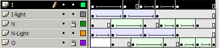
These layers and time tracks are the animation controls of the Flash interface, and they’re very easy to understand and learn. The layout of each separate frame or cell in the animation (they call it a ‘Scene’, and multiple scenes make a ‘Movie’), is quite logically designed, and is based on the small blocked spaces to the right of the layers. Along the top is where the frames or cells are numbered. Note that the program uses a ‘layers’ concept to allow the user to ‘overlay’ multiple animated sequences (per layer), and combine them into one complex Movie. That’s a very strong capability to have and in the hands of the right person, and it can yield some extraordinary results, such as many of the Flash Movie-styled sites that are more common now. Lots of other programs also use the ‘layer’ concept because it’s so familiar, and easy to understand.
Thought: A Flash Movie is nothing more or less than a glorified Gif animation, but with a multi-million dollar budget, instead of a couple of grand for an independent production :)
After thought: If you were to create 1000 frames for an animated Gif, each frame being only a fraction different than the previous one, you too could make a very smooth, good quality ‘mini-movie’, and still come in under budget. But the file size would be out of this world! And quite unsuitable for the average Web page. But it can be done, if you have the time and patience.
Animations, by the way, don’t have to be as simplistic as the above example. There can be a lot of movement in them if you want or need a more complex effect. But beware the file size of your finished product! Remember that the more colours (including combinations or shades) you use, the larger the end file size will be. So one can see by that fact just how tough it might be to create an effective, dynamic, and entertaining animation, that doesn’t take forever to download and render in the users browser. That part of the ‘art’ will come with practice though. Just be aware of that fact as you learn, and you’ll do fine.
Understand Your Options
Next up is what we can do to alter the way our animation behaves, and affect its colour attributes. Most decent animation programs these days will give you fairly similar types of options here. They usually include:
Selection of colour palette/optimization
- global optimized – one large palette for the entire animation that uses only the best colours contained within all the separate images (most useful/practical choice)
- optimized per frame – same as above, except that each frame of the animation will have its own specific palette, based on its unique collection of colours (not used much due to larger file sizes, but will yield the best looking results)
- global Web Safe – the same as global optimized, except this option will use the 215 Web safe palette as a base palette from which to draw its colours (used more for simple animations with few colours, and is not suitable for dithering)
Individual frame speed/duration
…whereby shorter frame durations produce a faster animation. Frame speed is based on duration in 100ths of a second: i.e. 5/100s = 1/5th of a second; 50/100s = 1/2 a second; 500 = 5 seconds; etc…
Further optimization & adjustments
You can choose to make any frame in the sequence either a Background for the animation, or have it Overlay onto the previous frames, for continuous movement and the building up of the animation’s complexity. This creates the illusion of more movement and increasing pixel depth, which, by-the-way, increases file size. It’s all relative.
Let’s continue on by examining a few animation examples, to see what’s gone into them.
Behind The Scenes
 Here’s a small example (albeit 13kbs) showing how, by simply ‘stacking’ layers on top of each other, we can produce ‘perspective’ in an animation. This image wasn’t designed with any real purpose in mind, and so it may seem a tad trite for a Web page. Try to keep in mind that by using animations on your Website, you’re not only adding to the aesthetics and interest of the pages, you’re also adding to the download time for your visitors.
So it’s always a good practice to create them with very specific intent, to embellish the message within your site content; not just for the sake of ‘eye candy’. And on the same note, having more than 2 animations per page can not only boggle the eye, but put extra stress on the user’s browser and system resources.
The above animation contains 11 images/layers. Each layer/image is a copy of the previous one, which has been altered slightly to produce changes in the progression of the sequence. It would be good to note here that what you’re seeing in that animation is something of an optical illusion. What I mean by that is your eyes are actually seeing things that aren’t really there (kind of like when you don’t go to sleep for 35 hours!).
 Hey! Just for the fun of it, here’s a slightly different version of the eyes animation, where the individual frames were set to ‘overlay’ on top of each other instead of replacing each other. It’s a tad more devious-looking. What do I mean by this?
Well, when your eyes perceive that animation, they’re ‘filling in’ a bunch of blank spots where the animation isn’t actually doing anything. Does anyone remember those little ‘flip books’ that were big way back in the ol’ days? The ones that had a small drawing on each page of the book that was drawn in sequence to produce the illusion of a continuous animation, when you peeled back the pages with your thumb and let them flip over real fast? We’re using the same principal here. Your eyes are so well designed (or so easily fooled) that they can ‘create’ (or imagine) the missing parts of an animation, which will make the sequence of broken movements ‘appear’ to flow more continuously than they really do.
Here again is the de-constructed smiley animation from page 2, where you can see exactly just how choppy the images look from one to the next. Notice all the ‘missing’ movements in the sequence? Well those empty spots will appear to be there when these images are played at an average rate of about 10/100s of a second. That’s pretty fast per image. So fast, in fact, that the images’ positions will appear to blur together, and your eyes won’t be able to see all the holes that are actually there. This point proves the ‘eyes fooled’ theory.
 Let’s fool your eyes for a minute. See if you can tell just what parts of the face’s movements your eyes are ‘filling in’.
And what does all this mean you ask? Hmm…
Well essentially this all comes down to one thing again… file size! files size! file size! Why, that ‘full facial contortion extravaganza’ was only a measly 1.7 kb. Yep. It’s a proven fact that fewer frames in an animation can heartily reduce the finished animation’s file size; especially if you’re using a Global Optimized Palette (hint hint). And that means? More happy visitors! If you don’t ‘need’ all those extra frames in your animation, then why add them? Save yourself some work (unless you’re entering the piece into a contest or something).
You’d be surprised to learn that most animations you see on big corporate-type Web sites have fewer than 5-5 frames, tops. And most of them are optimized to the max. But hey! It gets the job done right?! Also, keep in mind here that folks have gotten used to Web animations being slightly "choppy looking". And that’s fine for the purpose they serve. What folks will never get used to though, is having to click on a link, go make dinner, wash the dog, run to the store, watch a movie, and come back to their browser to find an empty image icon where a bloated animation is trying to load in.
Last but not least, let’s look at some types of animations that are used on Web pages, and a method we can use to keep them lean and clean, so they’ll load fast.
Organization and Efficiency
As you’ve seen in abundance around the Internet, animations can come in many shapes and forms, most of which are simple rotating banner ads. Other forms are smaller product box shots that rotate through an image list. And still others are simple animated graphics used to make certain sections of a page stand out more obviously to the viewer. All these forms of animation have their merit, and all can be used quite effectively.
Banner Ads
For banners, the industry standard size is now 468 by 60 pixels. Because of their size, they require that you pay particular attention to optimization. A good banner design outline might include things such as:
- A good design and layout of the information contained in the ad(s). This will help you keep the number of ‘pages’ needed and used in the banner to a minimum; thus keeping its overall file size down.
- A small, Global Web safe colour palette, using no more than 4 to 5 colours. This is especially important if the rotating banner animation contains 3 to 5 individual one-page ads. If they’re all assigned the same Global palette, the file size will be more easily optimized. There’s usually a small trade off here in image quality, by the way. It’s a small price to pay though.
- Using as little image dithering and gradients as possible. Try to use mainly solid colour schemes. As an example of how dithering can adversely effect file size, take a look at the ‘sky 1,2,3’ image that’s shown below. Its file size (animated) is 2.4 kbs (and that’s only because of the clouds), and it uses 24 colours from a 255 Adaptive palette, with no dithering. Even if we chopped the palette down to only 15 colours and we added dithering to it to make the clouds a smooth as they could be, the file size jumps to a whopping 8.4 kbs! That’s almost 4 times as much. All for that tiny animation!? It’s not worth it in the long run. So keep an eye out for that: it’s always better to simply use more colours in the image’s Global palette, than to reduce colours and add dithering.
- The speed of the frames should be long enough to allow for the message to be read completely, but not so long that a multi-page ad takes more than 5 to 10 seconds to cycle through. In the same respect, the frames shouldn’t be set to 5/100s of a second either — this would cause each frame to whip by in a blurred fury to get to the end of the message.
Product Box Shots
The above outline can also hold true for the rotating ‘product box shot’ type of animations. The one exception for these, though, is the fact that they are usually a lot smaller in dimension than a banner ad, and so the amount of colour used can be increased slightly. But attention should still be paid to the optimization of each separate graphic that’s used in the animation; especially because these types of animations will usually contain more separate images than will a banner ad. And if you’re optimizing individual images before you sequence them, use the Gif format, not the Jpg: Jpg uses a ‘destructive’ type of optimization, and Gif doesn’t.
Topic Specific Animations or "Attention Grabbers"
Again, the above outline can also be followed and applied to these types of animations. Some variants may apply here though. One thing to watch for is that, when you compile the animation, you use what’s called ‘calculating dirty rectangles’ wherever possible. It will definitely reduce the file size of animations, and allow you to create longer, more complex ones if need be. Not all animation programs have this capability, but most of the better ones do.
Here’s what happens.
First, you assign one image to become the ‘background’ for the animation. It will usually be the first image you import into the animation program, and can also (in most cases) become the source for your animation’s Global palette. The pixels in an animation background image will usually remain fairly constant throughout the animation, hence the title ‘background’.
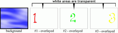
Next, you import or create the other images that you’ll use in subsequent frames. For example, say we made a simple animation where, against a sky background, the numbers 1, 2 and 3 appear from left to right, and all three numbers remain in the animation until the end.
Using the ‘dirty rectangles’ method, this animation would have 4 frames:
- the background
- the numeral one
- the numeral two
- the numeral three
The numbers would have nothing else in their frames, just the single number digit. The program would then start off by showing only the sky image, followed by a sequential rendering of the number images overlayed onto the sky, until all the numbers were visible. If set to ‘Loop’, it would then start over with just the blank sky image (background).

The alternative method of creating the same animation would be to have 4 separate images of the sky, each of which also contained a numeral. The program would then consider each new image as a background, and render them in succession until it completed the sequence. The images needed for such an animation would then be:
- just the sky image itself
- sky with numeral 1 on it
- sky with numerals 1 and 2 on it
- sky with numerals 1, 2 and 3 on it
However, this animation would be about 4 to 5 times the file size that the ‘dirty rectangle’ method would produce. So you can see the benefits in using this method for most types of animations. Some programs have the ability to calculate the ‘dirty rectangle’ effect even though you use full and complete separate images. Banner ads and the like would probably not benefit much from this method, because each separate image is not at all alike in terms of the location of pixels in the graphics. And that’s why they require that you pay more attention to optimization, and use a smaller number of Global colours.
Things to Note
If you add dithering to optimized images that contain text, you may cause the text to look ‘gritty’ around the edges. This also holds true if you dither images that contain a large number of solid colours. The solid colours will become ‘speckled’ in some areas where the dithering tries to do its job. Remember, you’re much better off to add more colours to the palette than you are to add dithering. This rule applies to the Gif format specifically, whether it’s animated or not.
There will sometimes (though not often these days) be the need to pay particular attention to which images are used first and last in your animations. The reason for this is that there are some older browsers that don’t support animation in use today. Plus, some people prefer to browse with graphics turned off. What these users see will vary.
- The non-animation browsers will simply show whatever the first image in your animation is. In other words, if you have an empty frame/cell as your first image, then that’s what will be rendered in those browsers. So choose your ‘opening image’ carefully. This might require that you put more thought into constructing your animation sequence, but it can and is done by many others, so it’s possible, and not at all that difficult. Usually, you can get away with putting your last image (the ‘end result’ image, so-to-speak) as the first image in your list of frames/cells. Sometimes this can ruin certain types of effects, so the choice is up to you – it’s your animation.
- When graphics are turned off only the contents of the image’s Alt tag are visible. So be sure to fill it up with whatever message you’re trying to relay to your audience with the animation.
- For non-looping animations you should note that whatever image comes last in the sequence is the one that will stay on the screen. So be sure to pay attention to that detail also when creating and compiling your images. This fact along with the ‘non-animation supported’ situation can lead to confusion when you’re deciding what image should be first and which should be last. One method that solves both problems is to use your final image twice: once at the start, and once at the end (if you’re not looping the animation). If you’re using the ‘dirty rectangles’ method of optimization, it should help a lot here if you later decide to loop the animation. The only other choice here is to simply forego worrying about non-animation supporting browsers, and be more concerned about your closing graphic rather than your opening one.
 Mark Larmand
Mark is the author of "The Photoshop Guru's Handbook" Website, and he's a freelance Website designer and creator.