

Key Takeaways
- The @supports rule in CSS allows developers to implement feature detection, checking if a browser supports certain CSS property/value pairs and applying styles accordingly. This is part of a progressive enhancement approach to handle uneven browser support for advanced technologies.
- The @supports rule syntax includes logical operators like ‘and’, ‘or’, and ‘not’ allowing for testing of multiple conditions at once. The correct use of parentheses is crucial when grouping conditions together.
- JavaScript can be used in conjunction with CSS feature queries using the CSS Interface and the supports() function. This function returns a boolean value indicating whether a browser supports a specific CSS property.
- While most modern browsers support the @supports rule, Internet Explorer 11 and Opera Mini do not. Developers should therefore define base styles that all targeted browsers can handle, and use @supports to override and supplement these styles in browsers that can handle newer features.
The two general approaches to tackling browsers’ uneven support for the latest technologies are graceful degradation and progressive enhancement.
Graceful degradation leverages advanced technologies to design for sophisticated user experiences and functionality. Users of less capable browsers will still be able to access the website, but will enjoy a decreased level of functionality and browsing experience.
With progressive enhancement, developers establish a baseline by designing for a level of user experience most browsers can support. Their applications provide built-in detection of browsers’ capabilities, which they use to make available more advanced functionality and richer browsing experiences accordingly.
The most widely adopted tool in a progressive enhancement approach is the Modernizr JavaScript library.
Modernizr programmatically checks if a browser supports next generation web technologies and accordingly returns true or false. Armed with this knowledge, you can exploit the new features in supporting browsers, and still have a reliable means of catering to older or noncompatible browsers.
As good as this sounds, something even better has been brewing for some time. You can perform feature detection using native CSS feature queries with the @supports rule.
In this post I’m going to delve deeper into @supports and its associated JavaScript API.
Detecting Browser Features with the @supports Rule
The @supports rule is part of the CSS3 Conditional Rules Specification, which also includes the more widespread @media rule we all use in our responsive design work.
While with media queries you can detect display features like viewport width and height, @supports allows you to check browser support for CSS property/value pairs.
To consider a basic example, let’s say your web page displays a piece of artwork that you’d like to enhance using CSS blending. It’s true, CSS blend modes degrade gracefully in non supporting browsers. However, instead of what the browser displays by default in such cases, you might want to delight users of non supporting browsers by displaying something equally special, if not equally spectacular. This is how you would perform the check for CSS blending in your stylesheet with @supports:
@supports (mix-blend-mode: overlay) {
  .example {

    mix-blend-mode: overlay;

  }
}
To apply different styles for browsers that don’t have mix-blend-mode support, you would use this syntax:
@supports not(mix-blend-mode: overlay) {
  .example {

    /* alternative styles here */

  }
}
A few things to note:
- The condition you’re testing must be inside parentheses. In other words,
@supports mix-blend-mode: overlay { ... }is not valid. However, if you add more parentheses than needed, the code will be fine. For instance,@supports ((mix-blend-mode: overlay))is valid. - The condition must include both a property and a value. In the example above, you’re checking for the
mix-blend-modeproperty and theoverlayvalue for that property. - Adding a trailing
!importanton a declaration you’re testing for won’t affect the validity of your code.
Let’s flesh out the examples above with a small demo. Browsers with mix-blend-mode support will apply the styles inside the @supports() { ... } block; other browsers will apply the styles inside the @supports not() { ... } block.
The HTML:
<article class="artwork">

  <img src="myimg.jpg" alt="cityscape">

</article>
The CSS:
@supports (mix-blend-mode: overlay) {
  .artwork img {

    mix-blend-mode: overlay;

  }
}
@supports not(mix-blend-mode: overlay) {
  .artwork img {

    opacity: 0.5;

  }
}
Check out the demo on CodePen:
See the Pen @supports Rule Demo by SitePoint (@SitePoint) on CodePen.
Testing for Multiple Conditions at Once
When doing feature tests with @supports, you’re not limited to one test condition at any one time. Combining logical operators like and, or, and the already mentioned not operator allows you to test for multiple features at once.
The and conjunction operator tests for the presence of multiple required conditions:
@supports (property1: value1) and (property2: value2) {

  element {

    property1: value1;

    property2: value2;

  }

}
By using the disjunctive or keyword, you can test for the presence of multiple alternative features for a set of styles. This is particularly handy if some of those alternatives need vendor prefixes for their properties or values:
@supports (property1: value1) or (-webkit-property1: value1) {

  element {

    -webkit-property1: value1;

    property1: value1;

  }

}
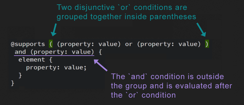
You can also combine and with or, testing conditions in the same @supports rule:
@supports ((property1: value1) or

          (-webkit-property1: value1)) and

          (property2: value2) {

  element {

    -webkit-property1: value1;

    property1: value1;

    property2: value2;

  }

}
When you group a number of conditions together, the correct use of parentheses is crucial. Having and, or, and not keywords mixed together won’t work. Also, the way you group the conditions inside parentheses establishes the order in which they get evaluated. In the snippet above, the disjunctive or conditions are evaluated first, then the resulting answer is evaluated against a further required condition introduced by the and keyword.
The not keyword lets you test for one condition at a time. For instance, the code below is not valid:
@supports not (property1: value1) and (property2: value2) {

  /* styles here... */

}
Instead, you need to group all the conditions you’re negating with the not keyword inside parentheses. Here’s the corrected version of the snippet above:
@supports not ((property1: value1) and (property2: value2)) {

  /* styles here... */

}
Finally, make sure you leave white space after a not and on both sides of an and or or.
The Operators in Action
You can apply a set of styles if the browser supports both gradients and blend modes using the following syntax (I’ve broken the code below into multiple lines for display purposes):
@supports (mix-blend-mode: overlay) and

  (background: linear-gradient(rgb(12, 185, 242), rgb(6, 49, 64))) {
  .artwork {

    background: linear-gradient(rgb(12, 185, 242), rgb(6, 49, 64));

  }
  .artwork img {

    mix-blend-mode: overlay;

  }
}
Because some older Android browsers require the -webkit- prefix for linear gradients, let’s check for browser support by incorporating this further condition into the @supports block:
@supports (mix-blend-mode: luminosity) and

  (

    (background: linear-gradient(rgb(12, 185, 242), rgb(6, 49, 64))) or

    (background: -webkit-linear-gradient(rgb(12, 185, 242), rgb(6, 49, 64)))

  )
{
  .artwork {

    background: -webkit-linear-gradient(rgb(12, 185, 242), rgb(6, 49, 64));

    background: linear-gradient(rgb(12, 185, 242), rgb(6, 49, 64));

  }
  .artwork img {

    mix-blend-mode: luminosity;

  }
}
Let’s say your website uses luminosity and saturation blend modes which, at the time of writing, are not supported in Safari. You still want to provide alternative styles for those browsers, so here’s how you can set up the appropriate conjunctive condition using @supports not with and:
@supports not (

    (mix-blend-mode: luminosity) and

    (mix-blend-mode: saturation)

  )

{
  .artwork img {

    mix-blend-mode: overlay;

  }
}
All the demos for this section are available on CodePen:
See the Pen Demos on Multiple Feature Testing with @supports by SitePoint (@SitePoint) on CodePen.
JavaScript with CSS Feature Queries
You can take advantage of CSS Feature Queries using the JavaScript CSS Interface and the supports() function. You can write the Css.supports() function in either of two ways.
The earlier and most widely supported syntax takes two arguments, i.e., property and value, and returns a boolean true or false value:
CSS.supports('mix-blend-mode', 'overlay')
Make sure you place the property and its corresponding value inside quotes. The specification makes clear that the above function returns true if it meets the following two conditions:
- The property is a “literal match for the name of a CSS property” that the browser supports;
- The value would be “successfully parsed as a supported value for that property”.
By literal match the specification means that CSS escapes are not processed and white space is not trimmed. Therefore, don’t escape characters or leave trailing white space, otherwise the test will return false.
The alternative, newer syntax takes only one argument inside parentheses:
CSS.supports('(mix-blend-mode: overlay)')
Using this syntax makes it convenient to test for multiple conditions with the and and or keywords.
Here’s a quick example. Let’s say you’d like to test if the browser supports the luminosity blend mode. If it does, your JavaScript will dynamically add a class of luminosity-blend to the target element, otherwise it will add a class of noluminosity. Your CSS will then style the element accordingly.
Here’s the CSS:
.luminosity-blend {

  mix-blend-mode: luminosity;

}
.noluminosity {

  mix-blend-mode: overlay;

}
If you follow the two-argument syntax, the JavaScript snippet could be as follows:
var init = function() {

  var test = CSS.supports('mix-blend-mode', 'luminosity'),

  targetElement = document.querySelector('img');
  if (test) {

    targetElement.classList.add('luminosity-blend');

  } else {

    targetElement.classList.add('noluminosity');

  }
};
window.addEventListener('DOMContentLoaded', init, false);
If you prefer the newest, single-argument syntax, simply replace the corresponding line of code above with the one below:
var test = CSS.supports('(mix-blend-mode: luminosity)')
Feel free to check out the demo:
See the Pen JavaScript API for CSS Feature Queries by SitePoint (@SitePoint) on CodePen.
Browser Support
All the latest versions of the major browsers have support for the @supports rule except for Internet Explorer 11 and Opera Mini. Is @supports ready for the real world? I’ve found the best answer to this question in Tiffany Brown’s words:
… be wary of defining mission-critical styles within @supports …
Define your base styles – the styles that every one of your targeted
browsers can handle. Then use @supports … to override and supplement
those styles in browsers that can handle newer features.CSS Master, p.303
Conclusion
In this article, I explored native CSS browser feature detection with the @supports rule (a.k.a feature queries). I also went through the corresponding JavaScript API, which lets you check the current state of browser support for the latest CSS properties using the flexible Css.supports() method.
Browser support for CSS feature queries is good but doesn’t cover all your bases. However, if you’d like to use @supports in your projects, strategic placement of styles in your CSS document, as Tiffany Brown suggests, and the css-supports.js polyfill by Han Lin Yap can help.
If you tried out the demos in this article or have had real world experience using @supports, I’d love to hear from you.
Frequently Asked Questions about CSS @supports Rule
What is the CSS @supports rule and how does it work?
The CSS @supports rule, also known as Feature Queries, is a conditional rule that checks if a browser supports a specific CSS feature. If the feature is supported, the browser will apply the styles within the @supports rule. If not, it will ignore them. This allows developers to use new CSS features while maintaining compatibility with older browsers. The syntax is @supports followed by the feature and its value in parentheses, like this: @supports (display: grid) { /* styles to apply if grid is supported */ }.
Can I use multiple conditions in a CSS @supports rule?
Yes, you can use multiple conditions in a CSS @supports rule by using logical operators. The ‘and’ operator allows you to check if multiple features are supported, while the ‘or’ operator checks if at least one of the features is supported. The ‘not’ operator checks if a feature is not supported. For example, @supports (display: grid) and (display: flex) { /* styles to apply if both grid and flex are supported */ }.
How can I check if a browser doesn’t support a CSS feature?
You can check if a browser doesn’t support a CSS feature by using the ‘not’ operator in the @supports rule. For example, @supports not (display: grid) { /* styles to apply if grid is not supported */ }. This will apply the styles if the browser doesn’t support CSS Grid.
What happens if a browser doesn’t support the @supports rule?
If a browser doesn’t support the @supports rule, it will ignore the entire rule, including the styles within it. This means you can safely use @supports without worrying about breaking your website on older browsers. However, it’s still important to provide fallback styles for browsers that don’t support the features you’re testing with @supports.
Can I nest @supports rules?
Yes, you can nest @supports rules, just like you can nest other CSS rules. This allows you to test for support of multiple features in a more complex way. For example, you could use a nested @supports rule to apply styles only if the browser supports both CSS Grid and Flexbox.
How reliable is the @supports rule for feature detection?
The @supports rule is a reliable method for feature detection in CSS, but it’s not perfect. Some older browsers don’t support @supports, and some browsers may report false positives or negatives. It’s always a good idea to test your website in multiple browsers to ensure it works as expected.
Can I use JavaScript with the @supports rule?
Yes, you can use JavaScript to test for CSS feature support with the CSS.supports() method. This method works similarly to the @supports rule, but allows you to test for feature support dynamically in your JavaScript code.
Are there any tools to check browser support for CSS features?
Yes, there are several tools that can help you check browser support for CSS features. One of the most popular is Can I Use, which provides up-to-date information on browser support for a wide range of CSS features.
Can I use @supports with media queries?
Yes, you can use @supports in combination with media queries to apply styles based on both feature support and viewport size. This can be very useful for creating responsive designs that also take advantage of new CSS features.
What are some common use cases for the @supports rule?
The @supports rule is commonly used to progressively enhance a website by applying advanced CSS features only if they’re supported by the browser. This can include things like CSS Grid, Flexbox, custom properties, and more. It’s also used to provide fallback styles for browsers that don’t support these features.

