Ask anyone who has had to fix a Website that’s littered with accessibility howlers, and top-most in their list of problems encountered will be forms, closely followed by tables. These two topics always seem to present the most difficulties, but they needn’t be a problem. For the most part, forms are a problem because the extra accessibility tags are simply not known to the Web designer — after all, it looks right, it seems to work… what’s the problem? Only by switching off the monitor and using a screen-reader can our oblivious Web developer understand the issues.
In this guide, I will very briefly cover the basics of layout for different form elements, and one particular accessibility tag that will make the form much more usable. I’ll then look at some extra ideas that perhaps you are unaware of, or didn’t know were possible, that will make your forms just that extra bit usable — for all of your audience members, sighted or otherwise.
Layout of Form Elements
Without even knowing it, many Web developers are already doing the right thing in terms of form layout – somehow, they have absorbed best practice by repeated exposure. However, people do still mistakes with some form controls. Here’s a quick summary of how to set out your form elements.
For most form inputs, the text (or label) that relates to the form control should precede the control (either directly above or to the left). Or, to use some examples:
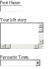
However, for radio buttons and checkboxes, the form control comes first, like so:
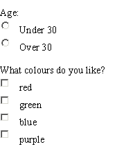
This may seem like common sense but people repeatedly make the mistake with of putting the control for the radio button after the text or, even worse, inline in the middle of a sentence. This can be extremely confusing for screen readers, which expect the radio or checkbox control to come first. The image below demonstrates just how difficult it can make filling in a form correctly.
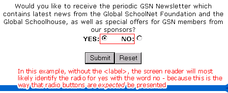
The layout of these radio buttons means that a screen reader will nearly always choose yes when they really meant no.
Accessibility Tags for Forms
If you have laid out your form elements according to the guidelines mentioned in the previous section, screen readers might, just might, be able to read out the purpose of each form input reasonably well. But in most cases it will struggle, or it will force the user to backtrack at each input to get a sense of where they are — in order to actively go and find the preceding text. This is why the <label> tag is so essential for making your form accessible.
For every form input, ensure that the associated text has a label tag wrapped around it. This label should explicitly refer to the form input.
If you do this for all your form elements, you will enhance your form’s accessibility levels by 200%. The difference, as a screen reader would announce form inputs, is best described with a transcription (example shown using Jaws, tabbing through the page).
Using the <label> tag:
“Edit: First Name”
“Edit: Middle Name”
“Edit: Last Name”
“Edit: Title”
“Edit: Sex”
Without the <label> tag, it might* sound something like this:
“Edit”
“Edit”
“Edit”
“Edit”
“Edit”
*Jaws — and other screen readers — might still correctly read out the input fields, depending on how you have laid elements out.
So, which form would you find easier to fill in if you were hearing this from your screen reader?
Note: A full list of example form elements, marked up with the <label> tag, is available at the end of this article.
More Helpful Labels
As with most HTML tags, you can apply styles to the <label> tag using Cascading Style Sheets (CSS) quite easily. It may be enough to use a bold weighting for the label text to make it stand out from other text in the form. However, there is another trick that you can employ for the <label> to make it a more appealing for sighted users.
A <label> not only makes it easier for screen readers to identify what the input is, it also gives the sighted user a larger area to click on with their mouse. This is particularly useful when employed with checkboxes and radio buttons. No longer do you have to move your troublesome mouse to a tiny little spot on the screen to activate the control — now the whole of the wording is clickable! And if you think about this, most software applications have done this as standard for years.
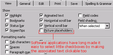
Software applications have made it easier to select checkboxes by making the whole of the associated text clickable.

Now you can make the associated text clickable in HTML forms. Incidentally, there is a law known as Fitt’s Law which states that:
“The time to acquire a target is a function of the distance to and size of the target.”
…and here is a great example of improving the usability (as well as the accessibility) of your form.
However, if you use a label, and sighted users don’t know that the associated input text is clickable, then they won’t get this advantage, right? Well, you can suggest that something’s clickable for them…
label {

font-weight:bold;

cursor:hand;

}
Now, when the user hovers over a label, the cursor changes to a pointer which seems to say “Ooh, ooh, click me, click me!”, at which point the user discovers that the text can set the focus to that field.
Note that the use of cursor:hand may mean that your CSS file does not validate properly. You win some, you lose some — you have to ask yourself what’s more important.
Laying Out Your Form
My best advice for the overall layout of a form is to keep it clean — leave some breathing space around inputs, and don’t cram it with explanatory text. If you must provide help, do it subtly (perhaps linking to a separate help file to reduce on-screen clutter).
I always find that forms that have a clean solid background colour that differentiates itself from the document background colour works nicely. It says to me “This is the area that you need to do something with.” A pastel shade, grayscale or something similar can works quite well.
Almost always, you will opt for a table to present form inputs to get everything to line up correctly. There is no problem with this, as long as you check your table in a linearized view (see the links section at the end of this tutorial). The worst thing you can do is put the text for each form input in separate cells from the inputs themselves, like so:
 Screen readers will have real difficulties with this, as will text browsers such as Lynx. The advice is simple — keep them together! If you do use a table layout like the one mentioned above, you will get this kind of problem:
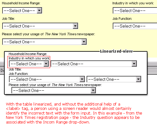
This, the New York Times’ registration page, works poorly when linearized. The following two tables would not have the same problems as demonstrated by the New York Times’ registration page, though. In these examples, the text would appear next to the correct input field. However, if you’re using the <label> tag correctly, you really should have no problems whatsoever with screen readers:

Logical Grouping of Items
We now step slightly out of the realm of accessibility and into the realms of general usability. Or, some might argue, into the world of common sense.
People hate filling in long forms. People hate reading long blocks of text (particularly on screen). But just as you can insert paragraph breaks at appropriate points in a block of text, so you should with forms.
- Think about all the data you’re collecting then try to group them into smaller chunks
- Break these chunks of data up into clearly defined areas on the form or
- Break these up into separate forms (remembering to clearly inform users where they are in the process – “Step 1 of three: your personal details”)
This alone will make a big difference. But there’s another neat trick you can use — the little known (or at least little used) <fieldset> and <legend> tags.
<fieldset> lets you bind a group of form controls together visually. In theory, screen readers should also be able to identify this fact, but for the moment, support for fieldset is very limited.
<legend>is simply a tag that you use alongside (or rather inside) the<fieldset>tag -- to give the group of form controls a heading.You are most likely to use the
<fieldset>tag with radio buttons or checkboxes, as shown below, but equally, you could use the<fieldset>to group whole chunks of data collection.
Summary
A form can be presented in countless different ways, but there are some basic things you need to do to make it accessible. But like anything, there are some special touches that you can apply to make your forms that extra bit clearer, usable and accessible. You probably have your own ideas, some additional tricks that you have up your sleeve. If so, why not share them!
Further reading:

