Designers always loved Helvetica. And they redeclared their love for it constantly. In film. On countless t-shirts. Pinterest collections. Hell, there’s even a Helvetica perfume!

As a typeface, it’s always been the ‘Glenda the Good Witch’ to Comic Sans’ cackling ‘Wicked Witch of the West’.
But some time around 2010 something happened to the relationship.
We started seeing posts from rockstar typographers and designers trash-talking Helvetica.
Swiss type designer Bruno Maag called it ‘vanilla ice cream’ and designed a new typeface — Aktiv Grotesk — with the explicit aim of replacing it.
In 2012, Erik Spiekermann declared it sucked, and can be very difficult to decipher. Earlier he’d even called it ‘the McDonalds of type’.
Dirk and Weiss at AnyoneCanSwiss queried whether Helvetica was just ‘a complete design cop-out‘.
After 50 years of puppy-eyed admiration, the tide certainly seemed to have turned on the former designer’s darling.
Ironically, on Monday Apple announced the next version of OS X (Yosemite) would drop Lucida Grande — a fixture of the OS since 1999 — in favor of Helvetica Neue.
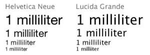
There was an immediate and mostly negative reaction from designers.
In particular, Tobias Frere-Jones — perhaps the ‘Paul McCartney’ of rockstar type designers — said ‘despite its grand reputation, Helvetica can’t do everything. It works well in big sizes but it can be really weak in small sizes ‘.
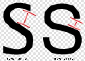
Tobias argues that the apertures — or openings — in letters like ‘S’ close off when scaled to smaller sizes.
Obviously in anything as complicated as an operating system, text will be presented in many sizes, weights and colors. Versatility is key.
Now, there’s little doubt that Apple is a company that has built an empire on smart design choices. They’ve also never shied away from potentially difficult decisions.
Nevertheless, this one seems a little bit tin-eared.
We will see.
(Originally published in the SitePoint Design Newsletter)
 Alex Walker
Alex has been doing cruel and unusual things to CSS since 2001. He is the lead front-end design and dev for SitePoint and one-time SitePoint's Design and UX editor with over 150+ newsletter written. Co-author of The Principles of Beautiful Web Design. Now Alex is involved in the planning, development, production, and marketing of a huge range of printed and online products and references. He has designed over 60+ of SitePoint's book covers.


