

You can’t have failed to notice the drop-cap effect we’re using in the new blogs design, as well as the first-line uppercasing that most browsers display (except Safari, for reasons I’ll explain in a moment).
There are quite a few hacky methods for implementing this effect, but the cleanest and most maintainable is pure CSS, using the :first-letter and :first-line pseudo-classes.
This approach means no additional markup, no images, and no need to know about the content — whatever the first letter and first line are, they’ll have the effect applied.
Here’s the CSS that makes it happen:
#post-content > p:first-child:first-line,
#post-content > .ad:first-child + p:first-line
{
    text-transform:uppercase;
    position:relative;
    font-size:0.95em;
    letter-spacing:1px;
}

#post-content > p:first-child:first-letter,
#post-content > .ad:first-child + p:first-letter
{
    letter-spacing:0;
    text-transform:uppercase;
    color:#628fbe;
    font-family:times,serif;
    font-size:3.5em;
    float:left;
    margin:0.13em 0.2em 0 0;
    line-height:0.7;
}
You’ll notice how there are two different selectors attempting to apply the effect, to the first paragraph inside the content area. It needed to be flexible enough to allow for the presence, or lack, of an ad immediately before the paragraph, marked-up as <div class="ad">. So ideally I would have used :first-of-type, which selects the first element of a specified type within its parent context:
#post-content > p:first-of-type:first-line
{
}

#post-content > p:first-of-type:first-letter
{
}
But that’s not as widely supported; the selectors we’re using mean we get support for IE8 that we otherwise wouldn’t.
For the first-line uppercasing we unfortunately don’t get support for Safari. It’s not because of the selectors — it supports all the examples shown here, and does apply other properties within those rules — it just doesn’t apply the text-transform. This is something I’ve noticed in a number of different situations, where Safari doesn’t apply the transform, for no readily-apparent reason. I’ve seen it fail to apply to an <input> element where it worked for a corresponding <button>, and here we see it fail to apply to the paragraph’s first line even though it would work if it were applied to the whole paragraph! Go figure.
For the drop-cap itself, you can see that it’s pretty simple to implement. The notable thing in that rule is the combination of margin-top and line-height that brings the letter into position. If we omit those two properties, we get this:
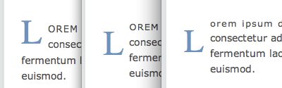
The drop-cap before line-height is applied.
What you’re seeing there, from left to right, is Firefox, Opera and Safari. And in fact it’s Firefox that’s rendering that incorrectly, while Opera and Safari get it right — Firefox is still applying the parent paragraph’s line-height to the first letter, ignoring its much-larger font size, while the other browsers are correctly applying a line-height that corresponds with the letter’s font-size.
So we can take advantage of the difference to even-out the result between browsers — reducing the line-height progressively, which makes no difference to Firefox, until we get a similar result in Opera and Safari (and IE8):
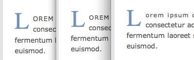
The drop-cap after line-height is applied.
Then it’s simply a case of adding margin-top until the vertical position looks right.
It’s not the first time I’ve seen this rendering behavior in Firefox. And since we have no CSS hacks that can apply only to Firefox, differences like this are really the only way we can apply browser tweaks. And as browser tweaks go, this one is entirely future-proof — if Firefox ever fixes its implementation and applies the correct line-height, it will come-out like the others in the first place.
It’s ironic really, that we should end up fixing every browser except Firefox, when Firefox is the only browser that gets it wrong! But that’s just how our industry works — Firefox, like your missus, is “always right”.
Thumbnail credit: Thoth
Frequently Asked Questions (FAQs) about CSS Drop Cap
What is a CSS Drop Cap and why is it used?
A CSS Drop Cap is a typographical style where the first letter of a paragraph is larger than the rest and drops down to span several lines. It’s used to draw attention to the beginning of a piece, making it more visually appealing and easier to read. This style is often seen in books, magazines, and websites to enhance the user experience and engagement.
How can I create a CSS Drop Cap?
Creating a CSS Drop Cap involves using the CSS pseudo-element ::first-letter. This pseudo-element targets the first letter of a block-level element. You can then apply styles such as font-size, line-height, and float to create the drop cap effect.
Can I customize the appearance of my CSS Drop Cap?
Yes, you can customize the appearance of your CSS Drop Cap. You can change the font, color, size, and even add a background or border. This allows you to create a unique and visually appealing design that matches your website’s style and branding.
Are there any browser compatibility issues with CSS Drop Cap?
The CSS ::first-letter pseudo-element is widely supported by all modern browsers. However, there may be some inconsistencies in how different browsers render the drop cap, especially when it comes to vertical alignment and padding. It’s always a good idea to test your design in multiple browsers to ensure it looks as intended.
Can I use CSS Drop Cap with any text element?
The CSS Drop Cap can be applied to any block-level text element, such as paragraphs, headings, and divs. However, it may not work as expected with inline elements or elements with a display value of inline.
Why isn’t my CSS Drop Cap working?
If your CSS Drop Cap isn’t working, there could be several reasons. The most common issues are incorrect CSS syntax, applying the style to an inline element, or browser compatibility issues. Make sure your CSS is correct, the element is a block-level element, and your browser supports the ::first-letter pseudo-element.
How can I make my CSS Drop Cap responsive?
To make your CSS Drop Cap responsive, you can use media queries to adjust the size and position of the drop cap based on the screen size. This ensures that your drop cap looks good on all devices, from desktops to mobile phones.
Can I animate my CSS Drop Cap?
Yes, you can animate your CSS Drop Cap using CSS animations or transitions. You can create effects such as fade-in, bounce, or rotate to make your drop cap more dynamic and engaging.
How can I add a background to my CSS Drop Cap?
You can add a background to your CSS Drop Cap by using the background property in your CSS. You can specify a color, image, or gradient as the background. You can also adjust the size and position of the background to fit your design.
Can I use CSS Drop Cap with web fonts?
Yes, you can use CSS Drop Cap with web fonts. You can specify the font-family in your CSS to use a custom font for your drop cap. This allows you to create a unique and personalized design that matches your website’s style and branding.