
 Although a bit behind the times (admittedly this whole debacle unfolded back in January), following much controversy and some verbal fisticuffs, US chat show host Jay Leno is returning to his late night show slot which has been vacated by Conan O’Brien. As part of the return, the show has a new logo which was revealed on thejaylenoshow.com web site. The new logo features dark blue text on a black background with a small slither of a moon hanging like a dot over the letter “i”. The words “with Jay Leno” are slotted in between in white.
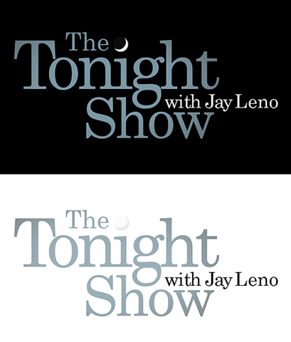
(Image from B Carvahlo on Twitpic)
Here’s the old logo from Jay Leno’s previous Tonight Show, which also used the quarter moon over the letter “i” trick.

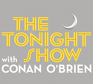
Below you can see the logo for the The Tonight Show as hosted by Conan O’Brien. This particular logo was unveiled in April 2009 as Conan was preparing to take over the helm from Jay Leno. At the time he said:
I wanted a logo that acknowledged the long, rich tradition of The Tonight Show while still looking good on hats, T-shirts, mugs, lawn furniture, notebooks, stemware, urns, defibrillators, water bottles, cell phones, sports equipment, pens, vacuums, chimes and our new line of unisex cologne.
(Funny because it’s true in so many cases of branding).
The new Leno logo is not a million miles away from this, but is not as striking in terms of color or typography. Having said that I do like the simplicity of the typeface and color used in the new logo.
What do you think of the new Leno logo? Should they have just reverted back to the original one or is it too dated now? Or should they have just replaced Conan O’Brien’s name on the gray and yellow version?
Frequently Asked Questions about the New Logo for Leno
What is the significance of the new logo for Leno?
The new logo for Leno is a significant change that represents the evolution of the brand. It is a modern and sleek design that reflects the company’s commitment to innovation and progress. The logo is simple yet powerful, with a bold typeface that stands out and commands attention. It is a symbol of the brand’s strength and reliability, and it communicates the company’s mission to provide high-quality products and services.
How does the new logo for Leno differ from the old one?
The new logo for Leno is a departure from the old one in several ways. The most noticeable difference is the typeface, which is more modern and streamlined. The color scheme has also been updated, with a vibrant and energetic palette that reflects the brand’s dynamic nature. The new logo is more minimalist and clean, which aligns with current design trends.
Why was the logo for Leno changed?
The logo for Leno was changed to reflect the company’s growth and evolution. The new logo is a visual representation of the brand’s forward-thinking approach and commitment to innovation. It is a symbol of the company’s future direction and its dedication to meeting the needs of its customers.
What does the new logo for Leno represent?
The new logo for Leno represents the brand’s commitment to quality, innovation, and customer satisfaction. It is a symbol of the company’s strength and reliability, and it communicates the brand’s mission to provide high-quality products and services.
How was the new logo for Leno designed?
The new logo for Leno was designed with a focus on simplicity and clarity. The design team wanted to create a logo that was modern and sleek, yet still conveyed the brand’s core values. The result is a bold and dynamic logo that stands out and commands attention.
What is the reaction to the new logo for Leno?
The reaction to the new logo for Leno has been largely positive. Many people have praised the modern and sleek design, and the bold typeface has been well-received. The new logo has been seen as a successful evolution of the brand’s identity.
How does the new logo for Leno compare to competitors’ logos?
The new logo for Leno stands out in the competitive landscape with its bold and dynamic design. It is a unique and distinctive logo that sets the brand apart from its competitors.
What is the impact of the new logo on the brand image of Leno?
The new logo has a positive impact on the brand image of Leno. It communicates the brand’s commitment to innovation and quality, and it reinforces the brand’s position as a leader in its industry.
How does the new logo for Leno align with current design trends?
The new logo for Leno aligns with current design trends with its minimalist and clean design. The bold typeface and vibrant color scheme are also in line with modern design aesthetics.
What is the future direction of the Leno brand as indicated by the new logo?
The new logo indicates a future direction for the Leno brand that is focused on innovation, quality, and customer satisfaction. It is a symbol of the brand’s commitment to progress and its dedication to meeting the needs of its customers.