Many designers have been designing for 1024px screen widths for the past few years. The 800px resolution is dead and buried, but with many users on monitors and laptops of 1280px wide and wider screens, how do you go about designing for that size?
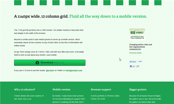
A resource you may find useful is the 1140px Grid created by Australian designer Andy Taylor. The 1140 grid fits perfectly into a 1280 monitor. On smaller monitors it becomes fluid and adapts to the width of the browser. The grid consists of twelve columns, which can be evenly divided into columns of two, three, four or six. In terms of browser support, Andy’s grid works in Chrome, Safari, Firefox, IE7, and IE8. IE6 (there’s always one, isn’t there?) doesn’t support max-width, so the grid doesn’t fix to 1140px. It spans the full width of the browser.
Gutters and Images
The gutters vary in size because the grid is based on percentages. At full width the gutters are 40px wide. When using images, if an image is smaller than the column it is contained in, it will be displayed at its original size. If it is larger then it will be shrunk to the width of the column. For this reason the width and height of the images should not be defined.Grid for Mobile
The grid has not been designed to support older WAP phones, but has been tested and supports the iPhone 3 and 4, iPad, some Android phones and the Blackberry. It works for devices that recognize ‘handheld’ in the style sheet media and/or media queries. With media queries you can even include x2 images for the iPhone 4 Retina Display. You can download the grid for free from here. The download features an index.html file and six style sheets. It is licensed under a Creative Commons Attribution-ShareAlike 3.0 Australia License. You can also download a Photoshop template of the grid at 1140px here, which is based on how it’s displayed in Web Kit, so it’s actually 1133px, as all browsers round sub-pixels slightly differently. What resolution are you designing for? Is is too soon to move to a 1280 pixel layout?Frequently Asked Questions (FAQs) about 1140px Design
What is the significance of 1140px in web design?
The 1140px grid is a popular choice among web designers due to its compatibility with most modern screens. It is a flexible layout that can adapt to different screen sizes, making it ideal for responsive web design. The 1140px grid is divided into 12 columns, providing a versatile structure for various design elements. It is particularly effective for wide-screen displays, as it utilizes the available space efficiently without compromising the design’s aesthetics or functionality.
How does the 1140px grid compare to other grid systems?
The 1140px grid system is a step up from the traditional 960px grid. It offers more space for design elements and content, making it a better fit for larger screens. Unlike fixed grid systems, the 1140px grid is fluid and can adapt to different screen sizes. This makes it a more flexible and versatile choice for responsive web design.
Why should I use a fluid grid like the 1140px grid?
A fluid grid like the 1140px grid offers several advantages. It allows for a more flexible and responsive design that can adapt to different screen sizes. This is particularly important in today’s digital landscape, where users access websites from a variety of devices with different screen sizes. A fluid grid ensures that your design looks good and functions well on all devices, providing a better user experience.
How can I implement the 1140px grid in my web design?
Implementing the 1140px grid in your web design involves setting the maximum width of your layout to 1140px and dividing it into 12 columns. You can then place your design elements within these columns. There are several tools and frameworks available that can help you implement the 1140px grid, such as CSS Grid and Bootstrap.
What are some best practices for using the 1140px grid?
When using the 1140px grid, it’s important to maintain consistency in your design. Make sure to align your design elements with the grid lines to create a clean and organized layout. Also, consider the spacing between your elements. The 1140px grid provides ample space, so use it wisely to avoid clutter and ensure readability.
Can I use the 1140px grid for mobile design?
Yes, the 1140px grid can be used for mobile design. However, due to the smaller screen size of mobile devices, the grid will need to be adjusted accordingly. This is where the fluid nature of the 1140px grid comes in handy, as it can adapt to different screen sizes.
What are the limitations of the 1140px grid?
While the 1140px grid offers many advantages, it does have some limitations. For instance, it may not be the best fit for very small or very large screens. Also, because it’s a fluid grid, it can be more complex to implement than fixed grid systems.
How does the 1140px grid affect the user experience?
The 1140px grid can greatly enhance the user experience by providing a clean, organized, and responsive design. It ensures that your content is easily readable and accessible on different devices, which can lead to increased user engagement and satisfaction.
Can I customize the 1140px grid?
Yes, the 1140px grid is highly customizable. You can adjust the number of columns, the column width, and the gutter width to suit your design needs. However, it’s important to maintain consistency in your design to ensure a cohesive and professional look.
What resources are available to help me with the 1140px grid?
There are several resources available to help you with the 1140px grid. These include online tutorials, design tools, and frameworks like CSS Grid and Bootstrap. You can also find plenty of inspiration and examples of 1140px grid designs on various design websites and communities.
 Jennifer Farley
Jennifer Farley is a designer, illustrator and design instructor based in Ireland. She writes about design and illustration on her blog at Laughing Lion Design.