Shadow Boxing: Image-free, CSS3, Glossy Buttons

Key Takeaways
- CSS3 gradients are becoming increasingly popular for styling buttons due to their easy configurability and ability to stretch and resize with the button area. However, support for CSS3 gradients is currently limited to Firefox, Chrome, and Safari, and the CSS syntax for gradients is inconsistent between these browsers.
- A different approach to creating CSS buttons involves using the box-shadow property to build up layers of color, similar to how a painter builds up layers of paint. This method allows for the creation of image-free, resizable, fully configurable, glossy buttons. However, the layering of box-shadow color can be complex to understand at first.
- While pure CSS3 gradient support is currently too patchy for important UI elements, image-based buttons are not as flexible or easily reconfigurable as pure CSS buttons. Therefore, understanding how to create buttons using CSS3 gradients and the box-shadow property can be a valuable skill for web designers.
Buttons. As web monkeys, we use a lot of them. Search buttons, buy buttons, send buttons, close buttons. You generally find them at the most important intersections of our websites, so we naturally want them to look special.Traditionally, this has been a job for CSS background-images—and no doubt, often still is. The major drawback with using images is their inability to scale or conform to your button’s size and shape.While it’s true that support for multiple background-images and background-size can help us out, support for either of these CSS properties is patchy, to say the least.Other considerations include fatter files, extra server connections, and workflow; you need to leave your CSS editor to adjust any image.Lately it seems that CSS3 gradients are becoming increasingly popular as a styling option for buttons. There’s a lot to like about them, too. They’re easily configurable without needing to leave your CSS coder, and they effortlessly stretch and resize as your button area does.However it’s not ALL sunshine and lollipops. On the downside:
- Currently only Firefox, Chrome, and Safari support CSS3 gradients of any type. As good as IE9 and Opera are with CSS3, both tend to stick their fingers in their ears and sing, “La, la la, ..I can’t hear you …” when it comes to CSS gradients.
- Gradient types are limited to linear and radial.
- The CSS syntax for gradients is horribly inconsistent between the few browsers that DO support it.
Rather than embark on a long-winded explanation of the differences, I thought I’d just show you a CSS code snippet that renders similar radial gradients in Mozilla and WebKit:
-moz-radial-gradient(13% 24% 0deg,circle farthest-corner, #AB1A03, #FFFFFF, #C7C7C7 38%)-webkit-gradient(radial, 59 64, 324, 100 59, 15, from(#C7C7C7), to(#AB1A03), color-stop(.6,#FFFFFF))Not exactly intuitive to work with.Recently, I’ve been taking a slightly different approach to CSS buttons that I thought I’d walk you through.Let’s start out with a basic, flat-color, orange button. I’ve set up a test page here. It’s just a link with a class and an unremarkable hover state.
Step 1: Give your button a standard shadow
Most of us have probably already used the CSS3 box-shadow property in some form. If not, the basic syntax is relatively easy to get your head around. It works like this:
| X offset in pixels | Y offset in pixels | Blur in pixels | Color (HEX, RGB, RGBA, or named color) | |
box-shadow |
2px |
1px |
3px |
#662299 |
Being a Chrome user, I’m going to use the WebKit CSS in these examples, but we’ll cover the support of a range of browsers later.One of the useful aspects of box-shadow is that you’re free to stack up as many shadows on the same object as you like. You just need to separate each shadow declaration with a comma. I’m going to start out by giving our button two basic shadows:
-webkit-box-shadow: 3px 3px 6px rgba(0, 0, 0, .20), 0px 0px 3px rgba(0, 0, 0, .40);The first shadow creates a black shadow (0,0,0) with 20% opacity, and offsets it 3 pixels down, 3 pixels to the right. It also blurs the edge by 6px. I’m using RGBA color values here because it allows me to control the opacity too. This is really cool, but I do find that standard HEX colors are much easier to work with.My second shadow has no offset and so just provides a subtle, dark glow on all sides. This might sound silly at first, but I find a subtle, dark glow gives an object a sense of weight.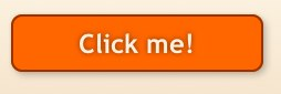
Step 2: Add a burnt orange base layer
One of the handiest variations on box-shadow is the 'inset' value, which effectively inverts your shadow. Instead of appearing outside your button area, your shadow is now only visible inside your button area. If you’ve yet to use it, the syntax looks like this:
-webkit-box-shadow:inset -8px -8px 10px #fffafe;Now, the stock standard use for inset shadows is the classic bevel effect: darken the bottom edge and lighten the top edge, and you have yourself a 3D button.The problem is, this rarely actually looks attractive as a standalone effect.Instead, we’re going to build up layers of box-shadow color, almost like a painter builds up layers of paint.
 Painters from Leonardo to Degas learned to create deep, rich, complex tone by building up layer upon layer of semi-transparent color. We are trying to do something similar with inset box-shadows.
First, I’m going to lay down a darker, burnt-orange shadow layer with this snippet of code:
inset 0px 25px 25px #930;I’ve given this shadow layer a very blurry edge (25px), and positioned it 25px down from the button’s upper edge.As you can see in the image below, this leaves a soft, lighter orange section on the lower half of the button.If you look at real glass, it tends to capture light from above and then focus it towards the lower half — a little like a magnifying glass. We’re mimicking that effect here.
Step 3: Add a highlight color
In the real world, light tends to come from above us, so I’m positioning a much lighter orange shadow on the upper 20px of our button. I’m looking for a hard-edged, horizon-like reflection, so I’m going to keep the blur to a minimum (2px):
inset 0px 20px 2px rgba(240, 150, 69, .5)I want to be careful not to interfere with the legibility of the text too much, so I’m setting the opacity of this layer to 50%.Beware, there IS a potential gotcha here.Each new box-shadow described in your CSS is automatically slotted in beneath the previous one. That means we need to insert our highlight color before our darker color in our code to make it visible.Irritating, but true.The result should look like this: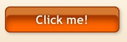
Step 4: Moderate the reflection
Our button is taking shape, but the highlight color is a little too flat. I’d prefer it to gradually dissipate towards the top edge.The easiest way to achieve this is to overlay another layer of blurred dark-orange along the top edge of our button.The code might be like this:
inset 0px 5px 12px #930So, now we have a glossy rendered button.
Step 5: Add a hover state
Sometimes, we might like our button to react to a hovering cursor. I’m going to make two adjustment to our button’s hover state.In the real world, shadows become sharper and darker as an object nears a surface. We’ll do the same with our external button shadow.I’m also going to move our horizon-line down a few pixels on mouseover. The CSS for the hover state will look like this:
a.bigorange:hover { -webkit-box-shadow: 2px 2px 4px rgba(0, 0, 0, .2), 0px 0px 3px rgba(0, 0, 0, .1), inset 0px 10px 12px #930, inset 0px 20px 2px rgba(240, 150, 69, .7), inset 0px 25px 25px #930;}And there you have it. A pure CSS, image-free, resizable, fully configurable, glossy button.Check out the finished demo at the bottom of this page.
But what about the browser support?
FirefoxAt this point, we have a button that works perfectly in Safari and Chrome. Happily, the CSS syntax for box-shadow in Firefox is virtually identical. We simply make a copy of our button code and replace -webkit-box-shadow with -moz-box-shadow, and our button is Firefox-ready.OperaAlthough Opera currently has no support for gradients, it has near-flawless support for the W3C standard box-shadow specification. Making another copy of your button code and simply deleting the '-webkit-' prefix will have your button rendering perfectly in Opera.IE9Like Opera, IE9 has no gradient support, but seems to have perfect W3C-approved box-shadow support. If you fixed it for Opera, it should work in IE9.Older IEsNo previous version of Internet Explorer has supported the box-shadow property, so you’ll have to resolve yourself to a flat, working-class button in those browsers. Of course you could provide a background-image equivalent served only to older Explorers, but that is somewhat defeating the point.But that’s your call.
Thoughts
Here’s a little admission: I don’t particularly love the orange button example I’ve shown you today; it’s a little tacky and over the top. However, I think the method behind it is very useful, and hopefully the demo helps you gain a feel for the approach. Admittedly, trying to understand a complex gradient as a series of layered shadows can be quite headache-inducing at first.For me, pure CSS3 gradient support is currently too patchy for consideration in important UI elements.And no doubt there are also going to be many times when plain ol’ background images are going to be your safest bet. Regardless, image-based buttons will never be as flexible and as easily reconfigurable as pure CSS buttons, and that has to be a consideration.I hope this adds another weapon to your UI arsenal. Have a play and let me know how you go.
If you want to read more from Alex, subscribe to our weekly web design newsletter, The SitePoint Design View.
Frequently Asked Questions about CSS3 Glossy Buttons and Shadow Boxing
How can I add a shadow to a button in CSS3?
Adding a shadow to a button in CSS3 is quite simple. You can use the ‘box-shadow’ property to achieve this. The box-shadow property applies one or more shadows to an element. The property takes values for horizontal shadow, vertical shadow, blur distance, spread distance, and color. Here’s a simple example:button {
box-shadow: 10px 10px 5px grey;}
In this example, the horizontal shadow is 10px, the vertical shadow is 10px, the blur distance is 5px, and the color is grey. You can adjust these values to get the desired shadow effect.
What is the purpose of the ‘inset’ keyword in the box-shadow property?
The ‘inset’ keyword changes the shadow from an outer shadow (outset) to an inner shadow. An inner shadow is a shadow that’s drawn inside the border edge, rather than outside. This can create a pressed effect, which can be useful for interactive elements like buttons. Here’s an example:button {
box-shadow: inset 5px 5px 10px grey;}
In this example, the shadow is drawn inside the button, creating a pressed effect.
How can I create a glossy button in CSS3?
Creating a glossy button in CSS3 involves using gradients and box shadows. The ‘background’ property is used to create a gradient, and the ‘box-shadow’ property is used to create a 3D effect. Here’s an example:button {
background: linear-gradient(to bottom, #ff7f00, #ff5500);
box-shadow: 0px 2px 2px rgba(0, 0, 0, 0.2);}
In this example, the button has a gradient background that goes from #ff7f00 at the top to #ff5500 at the bottom. The box shadow creates a 3D effect.
How can I add a hover effect to a button in CSS3?
You can add a hover effect to a button in CSS3 using the ‘:hover’ pseudo-class. This pseudo-class matches when the user interacts with an element with a pointing device, but does not necessarily activate it. Here’s an example:button:hover {
background: #ff5500;}
In this example, the button’s background color changes to #ff5500 when the user hovers over it.
How can I create a glass button in CSS3?
Creating a glass button in CSS3 involves using the ‘background’ property to create a semi-transparent background, and the ‘box-shadow’ property to create a 3D effect. Here’s an example:button {
background: rgba(255, 255, 255, 0.3);
box-shadow: 0px 2px 2px rgba(0, 0, 0, 0.2);}
In this example, the button has a semi-transparent white background, and a box shadow that creates a 3D effect.
How can I add a drop shadow to a select element in HTML?
You can add a drop shadow to a select element in HTML using the ‘box-shadow’ property in CSS3. Here’s an example:select {
box-shadow: 5px 5px 10px grey;}
In this example, the select element has a drop shadow that’s 5px to the right, 5px down, and has a blur distance of 10px.
How can I create a 3D button in CSS3?
Creating a 3D button in CSS3 involves using the ‘box-shadow’ property to create a shadow that gives the illusion of depth. Here’s an example:button {
box-shadow: 5px 5px 10px grey;}
In this example, the button has a shadow that’s 5px to the right, 5px down, and has a blur distance of 10px, giving it a 3D effect.
How can I create a gradient background in CSS3?
You can create a gradient background in CSS3 using the ‘background’ property with the ‘linear-gradient’ function. Here’s an example:button {
background: linear-gradient(to bottom, #ff7f00, #ff5500);}
In this example, the button has a gradient background that goes from #ff7f00 at the top to #ff5500 at the bottom.
How can I create a rounded button in CSS3?
You can create a rounded button in CSS3 using the ‘border-radius’ property. This property defines the radius of the element’s corners. Here’s an example:button {
border-radius: 10px;}
In this example, the button has rounded corners with a radius of 10px.
How can I create a button with a border in CSS3?
You can create a button with a border in CSS3 using the ‘border’ property. This property sets the width, style, and color of the element’s border. Here’s an example:button {
border: 2px solid #ff7f00;}
In this example, the button has a 2px solid border with a color of #ff7f00.
Alex has been doing cruel and unusual things to CSS since 2001. He is the lead front-end design and dev for SitePoint and one-time SitePoint's Design and UX editor with over 150+ newsletter written. Co-author of The Principles of Beautiful Web Design. Now Alex is involved in the planning, development, production, and marketing of a huge range of printed and online products and references. He has designed over 60+ of SitePoint's book covers.