
Key Takeaways
- Twitter Bootstrap is a CSS framework designed to facilitate quick and easy web design for developers with minimal design knowledge, offering built-in styles and components.
- The framework includes a 12-grid system for arranging content, which simplifies the design process and is essential for creating structured layouts.
- Bootstrap’s components, such as navigation bars and buttons, can be easily customized and styled directly within HTML, reducing the need for extensive CSS coding.
- The tutorial demonstrates how to use Bootstrap’s grid system to create responsive layouts that adjust to different screen sizes without additional coding.
- For further customization, users can add their own CSS styles to Bootstrap’s defaults, allowing for unique designs while maintaining the framework’s functionality.
- Bootstrap also includes JavaScript plugins like modals and tooltips, enhancing interactivity and functionality of web pages with minimal setup.
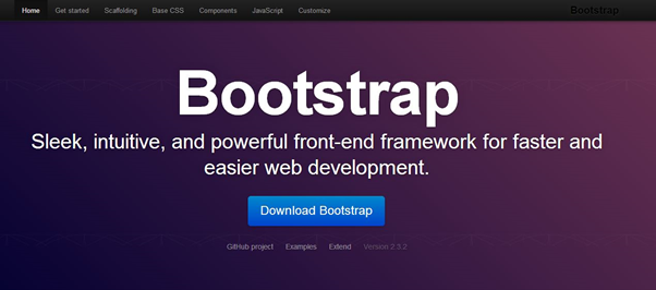
Much has been said and written about Twitter Bootstrap these days in the world of web designing and development. Some people call it a boon for web developers with zero designing knowledge, while others call it a blessing for the designers. Whatever it may be, it does things easier and faster.
In many scenarios web developers have the entire setup ready with them but they can’t proceed due to absence of the design of the project they are going to work on. They have to rely on the designers to complete the client side of their project. This process consumes a hell lot of time and is a serious wastage of time for a developer who needs his/her ideas to be implementing as quickly as possible. In such scenarios, Twitter Bootstrap comes to the rescue in the super-heroic fashion!
Twitter Bootstrap is a CSS framework that helps in designing web applications. It is one of the easiest CSS frameworks to use in the Industry today. It assumes you have no designing knowledge and all you want to do is write some HTML as per the Bootstrap specifications. In short, Twitter Bootstrap has already written a CSS style sheet for you, has inbuilt jQuery support and also has some popular JavaScript tools. Wooh! Isn’t that great? You get a bunch of popular tools ready to use. All you have to do is just place the right HTML mark-up at correct place.
In this tutorial, I will explain how you can start using Twitter Bootstrap by showcasing a demo layout page, and how you can explore the framework and customize it for your own requirements.
Getting Started
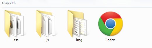
To start using Twitter Bootstrap, you have to download bootstrap.zip from their official github page. It contains a set of files, namely css, js and img that we need to start building websites with Twitter Bootstrap. The “css” folder has style sheet for both non-responsive and responsive designs and also their minimized versions. You will use the minimized version for making the site faster when the design has been finalized and the project is ready for the launch. The “js” folder has bootstrap.js and its minimized version. These JavaScript files contain various JavaScript components that we will use in our website designs. The last folder, “img” contains two set of Halflings images, both are exactly the same except for their foreground color. The halflings images are supplied by glyphicons who were very generous enough to provide the images for free in the Twitter Bootstrap project.
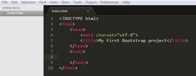
So let us get our hands dirty. Before we start, open your text editor and create the first file named “index.html” and save it in the home folder of your project.
Basic HTML Template for Bootstrap to work
In order to activate the Bootstrap framework, you need to include all the appropriate files and follow a proper HTML structure. Here, we will build the structure first and then see which files are required. The first thing that you should note is that it requires an HTML5 doctype declaration at the top:
<!DOCTYPE html>We will set the meta character to utf-8 because we will be using special characters in our project and we want the browser to parse them correctly. Twitter Bootstrap also specifies the use of utf-8 in their documentations for better compatibility.
<meta charset=”utf-8”> Then we will set normal html tags like <html>, <head> and <body> which are basic tags of html. Your index.html page should look as below.
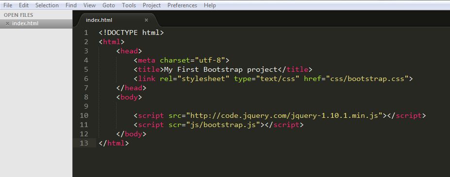
We will now proceed to include the necessary style sheet which is bootstrap.css.
<link rel=”stylesheet” href=”css/bootstrap.css” type=”text/css”/>Now that we have our CSS ready, we will include all the required JavaScript files. Firstly, you need to include a jQuery file, for this I will suggest including from the jQuery CDN, as below.
<script src="https://code.jquery.com/jquery-1.10.1.min.js"></script>Then we will include the Bootstrap file.
<script src=”js/bootstrap.js”></script>All these scripts should lie just above the end body tag </body>, in consideration of the performance of your web page.
Finally, we are done with the process of including all the necessary files. You are now set to start building the various components of your website. Your index.html should look like this.
Understanding how it works
Firstly, we need to understand that Twitter Bootstrap is largely dependent on 12 grids. So, what are grids?
Suppose you want two large equal divisions inside the body of your index.html. You have to give a class of “span6” to each of div element. This tells Bootstrap to make two equal divisions that should span six grids on each side. Hopefully, this gives you an idea of how Bootstrap works. It has a set of predefined classes for each element. You have to give appropriate classes to each when needed.
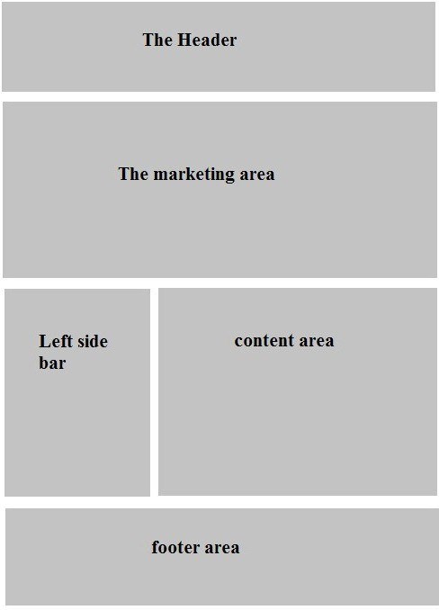
To better understand what we are going to build today, here’s the first demo page. Have a look and come back. We will start building it.
Coding with Bootstrap
Let us divide the demo page into five major parts:
- The header
- The marketing area
- The leftside bar
- The contents area
- The footer
To wrap everything contained in our website, we will create a container class that should be centered to the middle of the screen and also have a decent amount of padding on all sides. For this, Bootstrap has a class called “container”, which we will use as our parent wrapper. So go ahead and write the following piece of code:
<div class="”container”">
Now inside the container div, first we will jot down the title of the website. For this we will use, h1 heading tag.
<h1><a href="”#”">Bootstrap Site</a></h1>
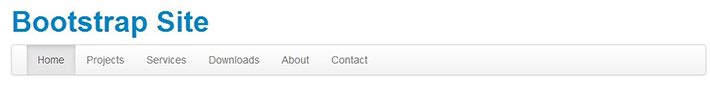
Check your index.html in the browser, it will be centered beautifully. It’s time for the navigation bar. Twitter Bootstrap specifies following markup for the navigation bar:
<div class="navbar">

	          <div class="navbar-inner">

	            <div class="container">

	              <ul class="nav">

	                <li class="active"><a href="#">Home</a></li>

	                <li><a href="#">Projects</a></li>

	                <li><a href="#">Services</a></li>

	                <li><a href="#">Downloads</a></li>

	                <li><a href="#">About</a></li>

	                <li><a href="#">Contact</a></li>

	              </ul>

	            </div>

	          </div>

	        </div>
“navbar” should be the class given to the main div of the navigation. You have to follow the above markup for the navigation to appear as per Twitter Bootstrap style. Place the above code just below the h1 tag. Make sure you are placing everything inside our parent wrapper class, i.e. “container”. Go to the browser and check your page, you will see a beautiful navigation bar just below the site title.
Obviously, you would want your header to look a bit different to this. At the end of this tutorial, we will look at how we can add our own styles to the existing Bootstrap styles and add a bit more CSS to design the header area. Let’s move on to make the second part, which we’ve called “The marketing area”.
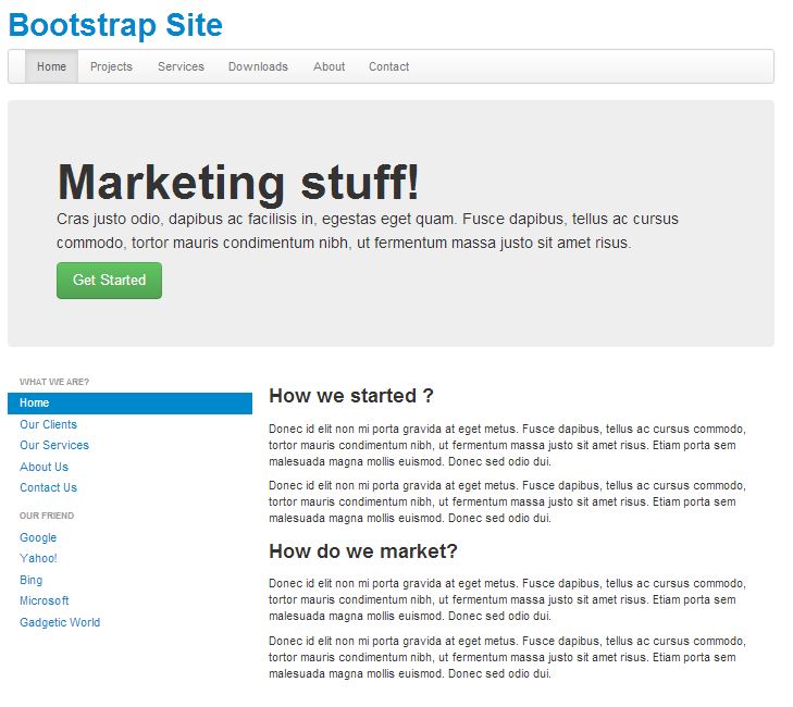
There is a beautiful predefined class supplied by Twitter Bootstrap for a marketing area. They have given it a class of “hero-unit”. Go ahead and copy the code given below and paste it below the navigation div.
    <div class="hero-unit">

        <h1>Marketing stuff!</h1>
        <p>Cras justo odio, dapibus ac facilisis in, egestas eget quam. Fusce dapibus, tellus ac cursus commodo, tortor mauris condimentum nibh, ut fermentum massa justo sit amet risus.</p>
        <a href="#" class="btn btn-large btn-success">Get Started</a>

     </div>
Check your page in the browser; it should now look like below:
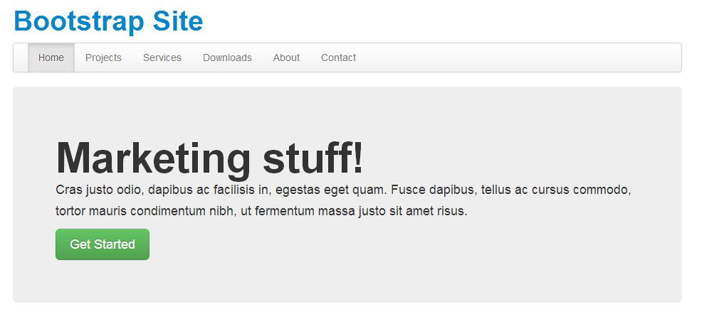
Isn’t that amazing? Without writing a single piece of CSS, you have such a beautiful marketing area. OK, let’s explore the above code. The “hero-unit” has a CSS designed for an h1 tag. So anything you write in an h1 heading will look bold and stand out from rest of the body elements. Next we have general <p> paragraph tag to describe our marketing or our product.
Here comes the interesting part, the links and buttons. You can make any link look like a button by adding a class “btn” and then vary its size by adding some more additional classes like btn-large/btn-small/btn-mini. To change the colors of the buttons, add classes like btn-success (green), btn-info (light blue), btn-warning (yellow) and btn-danger (red). More about buttons and decorating links can be found in the Twitter Bootstrap’s Base CSS section. These classes are applicable to the HTML button element.
I hope so far your journey has been interesting. Twitter Bootstrap is so easy that it doesn’t let you do anything inside CSS stylesheets. You have to just use the resources it provides. This is what makes it one of the most powerful CSS frameworks in the industry.
We will now proceed to the next sections, the left side bar and the contents section. You will understand how I was able to divide the area into two unequal vertical areas and how can we do more such divisions. As stated earlier, Twitter Bootstrap is a 12 grid system. You have to remember this, always. This means you can make at most 12 vertical grids inside any parent grid.
Currently we are working inside our parent wrapper class “container”. So we will divide the section into two unequal parts using the 12 grids. For the left side bar, we will use the class “span4” and for the rightside content section we will use “span8”. The class names reflect my intention that the left side should span to four grids and the right side should span across remaining the eight grids.
<div class="row">

	        	<div class="span4">

	        		<p>Dummy Text</p>

	        	</div>

	        	<div class="span8">

	        		<p>Dummy Text</p>

	        	</div>

	        </div>
Your webpage should now appear as below.
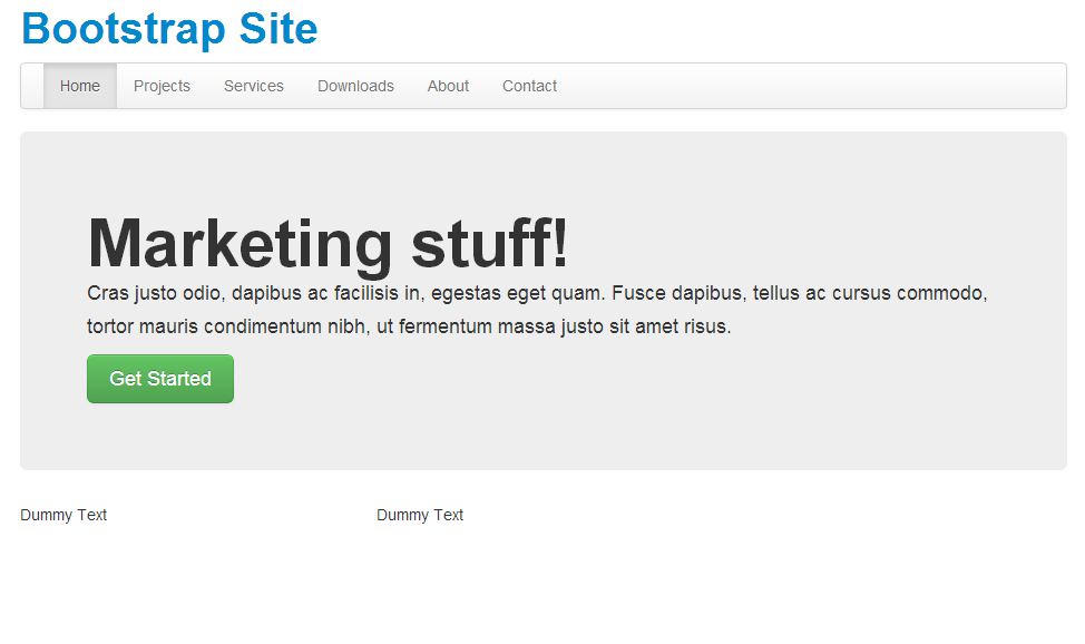
There should be two separate columns standing side by side. You must be now thinking about the extra wrapper div that I have added above with class “row”. Well, the reason is span* classes are by default floated left. To force both columns to be present below all the contents above we have added the “row” div. It acts like the traditional “<tr>” row of tables. Now you should delete the dummy paragraph elements from your code. We will now fill the left column with navigation list.
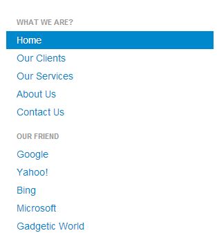
For the navigation list you have to follow the following markup.
<ul class="nav nav-list">

    <li class="nav-header">What we are?</li>

    <li class="active"><a href="#">Home</a></li>

    <li><a href="#">Our Clients</a></li>

    <li><a href="#">Our Services</a></li>

    <li><a href="#">About Us</a></li>

    <li><a href="#">Contact Us</a></li>

    <li class="nav-header">Our Friend</li>

    <li><a href="#">Google</a></li>

    <li><a href="#">Yahoo!</a></li>

    <li><a href="#">Bing</a></li>

    <li><a href="#">Microsoft</a></li>

    <li><a href="#">Gadgetic World</a></li>

</ul>
You have to add “nav-list” class in addition to “nav” class which will make it look like a list. Adding class “nav-header” to any “li” element of “nav” class will make it look like a heading to the section of links. Go ahead and see how it looks in the browser.
Moving to the content area, we will be just filling it up with general h3 tags and paragraph tags. No extra classes are needed as we want them to appear one below the other. Below is the code that I will be placing inside “span8”.
<h3>How we started ?</h3>
<p>Donec id elit non mi porta gravida at eget metus. Fusce dapibus, tellus ac cursus commodo, tortor mauris condimentum nibh, ut fermentum massa justo sit amet risus. Etiam porta sem malesuada magna mollis euismod. Donec sed odio dui.</p>
<p>Donec id elit non mi porta gravida at eget metus. Fusce dapibus, tellus ac cursus commodo, tortor mauris condimentum nibh, ut fermentum massa justo sit amet risus. Etiam porta sem malesuada magna mollis euismod. Donec sed odio dui.</p>
<h3>How do we market?</h3>
<p>Donec id elit non mi porta gravida at eget metus. Fusce dapibus, tellus ac cursus commodo, tortor mauris condimentum nibh, ut fermentum massa justo sit amet risus. Etiam porta sem malesuada magna mollis euismod. Donec sed odio dui.</p>
<p>Donec id elit non mi porta gravida at eget metus. Fusce dapibus, tellus ac cursus commodo, tortor mauris condimentum nibh, ut fermentum massa justo sit amet risus. Etiam porta sem malesuada magna mollis euismod. Donec sed odio dui.</p>
Refresh your browser and it should now look like below:
As you can see, we are very close to achieving our final design. We are just left with the footer portion.
For the footer, we will again divide the “row” into three parts as you can see in the demo page. This time the division will be in equal portions, which is “span4”. So we will create another “row” div just below the “row” div of the above left sidebar and content area. Follow the code below:
<div class="row">

<div class="span4">

		<h4 class="muted text-center">Meet Our Clients</h4>

		<p>Donec id elit non mi porta gravida at eget metus. Fusce dapibus, tellus ac cursus commodo, tortor mauris condimentum nibh, ut fermentum massa justo sit amet risus. Etiam porta sem malesuada magna mollis euismod. Donec sed odio dui.</p>

		<a href="#" class="btn"><i class="icon-user"></i> Our Clients</a>

	</div>

	<div class="span4">

		<h4 class="muted text-center">Know Our Employees</h4>

		<p>Donec id elit non mi porta gravida at eget metus. Fusce dapibus, tellus ac cursus commodo, tortor mauris condimentum nibh, ut fermentum massa justo sit amet risus. Etiam porta sem malesuada magna mollis euismod. Donec sed odio dui.</p>

		<a href="#" class="btn btn-success"><i class="icon-star icon-white"></i> Our Employees</a>

	</div>

	<div class="span4">

		<h4 class="muted text-center">Reach Us</h4>

		<p>Donec id elit non mi porta gravida at eget metus. Fusce dapibus, tellus ac cursus commodo, tortor mauris condimentum nibh, ut fermentum massa justo sit amet risus. Etiam porta sem malesuada magna mollis euismod. Donec sed odio dui.</p>

		<a href="#" class="btn btn-info">Contact Us</a>

	</div>

</div>
Simple enough! We have divided the row into three equal parts using “span4” class and then filled each one of them using h4 tags, paragraph tags and links that look like buttons. Check the output in your browser. You should be seeing little images inside the link buttons, Our Clients and Our Employees. You have to take help of <i> tag and add appropriate image classes like icon-user, icon-star, icon-glass etc. To change the icon to white, use class icon-white along with icon-user and icon-star classes. A full list of icon classes can be found in the Bootstrap’s documentation here.
To give a little spacing between the footer area and the above content, we will add a <hr> tag between each “row” div. Go ahead insert <hr> tag and compare it with the demo page.
Now for the copyright area, we will add the following code:
<hr>

<div class="footer">

<p>© 2013</p>

</div>
So finally, we have built a simple yet decent landing page using purely the Twitter Bootstrap framework.
Adding Custom Styles to Twitter Bootstrap
If you have a little knowledge of CSS and you want to tweak Bootstrap’s default styles, then the best way is to build your own custom style sheet, import Bootstrap’s Style sheets at the top and then override the styles in your own CSS file. Make sure to link to your custom style sheet and not to the Bootstrap’s CSS files. If you are happy with Twitter Bootstrap’s default style then obviously you don’t have to create a custom style sheet. But as many websites will use this framework, it will become a common style which can be seen in every other websites built with Bootstrap. So it is better if you add your own flavor of CSS on top of the Bootstrap’s CSS.
@import url("bootstrap.min.css");Some more Important Components of Twitter Bootstrap
Lead Paragraphs
To make a paragraph stand out in the middle of long document, you can add class “lead” to it. It will make the fonts of that particular paragraph a bit bigger than the rest of the document.
Emphasis Tags
You can also use the default Emphasis tags like <small>, <strong> and <em> inside your html page. Tags like <b> and <i> are still valid.
Text aligning
Text aligning inside any paragraph or a div tag can be done using the classes: “text-left”, “text-center” and “text-right”.
Text colors
You can set the default color for paragraph text by using various text color emphasis classes like “muted” for grey, “text-warning” for red, “text-error” for deep maroon, “text-info” for light blue and “text-success” for green color.
Styling Tables
Twitter Bootstrap also designs the default tables. Follow the following markup:
<table class="table">

 	<tr>

		<td></td>

		<td></td>

</tr>

…..

</table>
Playing with images
You can add images using the normal <img src=”demo.jpg”/> tag. To make your designs a bit more interesting, add classes like “img-rounded” for rounded corners, “img-circle” for circling the image and “img-polaroid” to give box-shadow and border radius to the image.
Drop down menu
To add a drop down menu to the existing navigation bar as shown in the demo page, you have to add the following markup inside a “li” element.
<li class="dropdown">

    <a href="#" class="dropdown-toggle" data-toggle="dropdown">

        <i class="icon-th-large"></i> Drop Down

        <b class="caret"></b>

    </a>

    <ul class="dropdown-menu">

        <li><a href="#">Item1</a></li>

        <li><a href="#">Item2</a></li>

        <li><a href="#">Item3</a></li>

    </ul>

</li>
For a dropdown, you have to wrap the parent element using the “dropdown” class and then use the default “a” markup for the caret and then nest another ul element with the items.
I have shown you the basics of using Twitter Bootstrap and how can you get started with it. Now that you have understood how it works, I hope it will be easier for you to understand their original documentations. Go through it and you will definitely find a lots of new features as you explore.
In my next tutorial, I will aim at building responsive websites using Twitter Bootstrap. So stay in touch with us and subscribe to our newsletter if you don’t want to miss my next tutorial, which will be twice as exciting this one.
Comments on this article are closed. Have a question about Twitter Bootstrap? Why not ask it on our forums?
Start building websites with Bootstrap today! Learnable memberships come with access to dozens of SitePoint books, including Jump Start Bootstrap.
Frequently Asked Questions about Handling Complex Designs with Twitter Bootstrap
How can I customize the default Bootstrap theme for my website?
Customizing the default Bootstrap theme is quite straightforward. You can modify the CSS files directly or use a preprocessor like LESS or SASS to make your changes. You can change the colors, fonts, and other design elements to suit your needs. Remember to always keep a copy of the original files before making any changes, so you can revert back if needed.
How can I make my Bootstrap website responsive?
Bootstrap is built to be responsive right out of the box. It uses a grid system that automatically adjusts to the screen size. However, you can further enhance the responsiveness by using Bootstrap’s responsive utility classes. These classes allow you to show or hide certain elements based on the screen size.
How can I add a navigation bar to my Bootstrap website?
Bootstrap provides a component called ‘navbar’ for creating navigation bars. You can customize the navbar by adding your own links, dropdowns, and even a brand logo. The navbar is also responsive and collapses into a hamburger menu on smaller screens.
How can I use Bootstrap’s grid system for complex layouts?
Bootstrap’s grid system is very flexible and allows you to create complex layouts with ease. The grid system is based on 12 columns, and you can specify how many columns a certain element should span. You can also nest grids within grids for even more complex layouts.
How can I use Bootstrap’s components to add functionality to my website?
Bootstrap provides a wide range of components that you can use to add functionality to your website. These include buttons, forms, modals, tooltips, and much more. Each component comes with its own options and methods, which you can customize to suit your needs.
How can I use Bootstrap’s JavaScript plugins?
Bootstrap comes with a number of JavaScript plugins that add interactivity to your website. These plugins include a modal dialog, tooltip, carousel, and much more. You can use these plugins by including the necessary JavaScript files and using the appropriate data attributes or JavaScript methods.
How can I customize Bootstrap’s components?
You can customize Bootstrap’s components by modifying the CSS or using a preprocessor like LESS or SASS. You can change the colors, fonts, sizes, and other design elements to suit your needs. Remember to always keep a copy of the original files before making any changes.
How can I use Bootstrap’s form controls?
Bootstrap provides a wide range of form controls that you can use to create forms. These include input fields, checkboxes, radio buttons, select menus, and much more. Each form control comes with its own classes and attributes, which you can customize to suit your needs.
How can I use Bootstrap’s utilities?
Bootstrap provides a number of utility classes that you can use to quickly style your website. These include classes for typography, spacing, colors, and much more. You can use these utilities by adding the appropriate class to your HTML elements.
How can I troubleshoot issues with my Bootstrap website?
If you’re having issues with your Bootstrap website, there are a few things you can do. First, check the console for any JavaScript errors. Next, make sure you’re including the correct CSS and JavaScript files. Finally, check the Bootstrap documentation for any known issues or solutions.