Lost World’s Fairs is a series of CSS font experiments designed to advertise fictitious World Fairs. My apologies if I am the last to know about this and these gorgeous typography designs are old news, but I only saw them today and thought they were quite beautiful (Atlantis being my particular favorite). The sites were set up to showcase Internet Explorer 9’s WOFF support.
What’s WOFF?
WOFF (the Web Open Font Format) is an important standardized format for using fonts on the web and these designs illustrate how much closer web typography is coming to the capabilities of print work. There is still a long way to go but this is encouraging and inspirational.
WOFF allows TrueType, OpenType or Open Font Format fonts to be embedded in a web page. Microsoft, Mozilla and Opera are backing the project and support is already built into Firefox 3.6 and above, Chrome 5 and above, Internet Explorer 9 and the next version of Safari.
The Lost World’s Fairs experimental sites were designed and developed by Frank Chimero, Naz Hamid, Trent Walton, Dave Rupert and Jason Santa Maria, known collectively as “The Friends Of Mighty”. The sites use WOFF in conjunction with Typekit. Jason said on his blog:
From the start, we agreed to do something in three parts (one by each designer), and more importantly, something that didn’t look like an article or a blog. Aside from some of the technical advantages the WOFF format provides, there’s little about it that’s aesthetically different than other formats. So we resolved just to have some fun and design something with strong typography as its centerpiece.
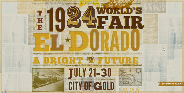
El Dorado in 1924 by Naz Hamid. You can see the fonts used in this design here.
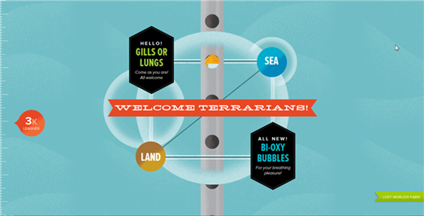
Atlantis in 1962 by Frank Chimero. You can see the fonts used in this design here.
The Moon In 2040 by Jason Santa Maria. You can see the fonts used in this design here.

See Jason’s blog to read more about how the project came about and how the designer’s worked out their designs. The Lost World’s Fair is an interesting and inspirational project and I’m looking forward to seeing more designers pushing out the web boundaries with typography.
What do you think of the design, typography and layout of these sites?
 Jennifer Farley
Jennifer Farley is a designer, illustrator and design instructor based in Ireland. She writes about design and illustration on her blog at Laughing Lion Design.