
Key Takeaways
- Usernames play a crucial role in UI patterns as they form the basis of user interaction with the system. Different platforms handle the display of usernames in various ways, often dictated by screen dimensions and the length of usernames.
- Facebook, for instance, opts for displaying only the user’s first name on the app-bar for personalization and convenience. Medium, on the other hand, does not use usernames at all on the app bar, but displays the username when writing an article.
- OneDrive displays the full user name and handles unusual cases by hiding menu options to make room for the username. Some websites choose to limit the length of usernames during the signup process to avoid design and UX issues.
- The importance of usernames can vary depending on the context. For instance, in publishing and discussion systems, names tend to become more important. As the web continues to evolve, designers should consider the importance of information in a given context.
When learning to design for the web, there are two lessons that I hold very dear and important.
The first one is – Everything is a rectangle.
It helps to think of everything as rectangles. Take any web page and you can instantly visualize the grid, if you can blur out the content and look for rectangles. This principle has helped me understand and design for the web better.
The other principle warrants some discussion first.
The Name-in-app-bar Pattern
Displaying a username on the app bar in either web and mobile apps, is a common and interesting problem to analyze. Front-end teams from many of the web’s biggest apps have taken it on — often with very different approaches.
Clearly the screen dimensions dictate that the username occupies a finite amount of screen real esatate. This problem is obviously accentuated in devices of smaller sizes.
However, we also know that username lengths can vary wildly. From possibly a single letter — did James Bond’s ‘M’ or ‘Q’ ever use Facebook? — up to much longer, more ambitious creations.
There are a variety of solutions for this problem. Let’s look at how some of the big names tackle the issue.
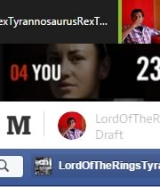
I decided to start with Facebook as the username is a central component of this app. I doubt that I’d know the last names of a lot of my friends had it not been for Facebook. For an app that was founded on the bedrock idea of using your real full name, it is quite interesting that it only displays the user’s first name on the app-bar.
![]()
The intention could be personalization. Calling someone by the first name makes the communication more personal. It is also a convenience because that space might not be practical for longer usernames.
Here’s how Facebook handles this design problem:
- They display first names only on desktop home screen, which is odd
- They don’t display usernames on mobile home screen, but do display full username in the settings screen
- The can display a fairly long first name on desktop (24 characters, 175 max-width on my 1366px screen)
Medium
My immediate thought when it comes to truncating usernames was, where else is the username so important that it can’t be truncated? Publishing, of course.
All articles are works of an author and their names are as important as the content itself. It is core to the application and I went on to investigate how a increasingly popular publishing medium (wink) would handle this scenario.
As it turns out, Medium handles this in a pretty interesting manner.
- The top right on the app bar does not use the usernames at all. Just the avatar. This is what you would notice if you were reading content.
- But, while writing an article, the avatar is displayed twice in the app bar. In the left, it also includes the username.
- Usernames here are given ample space and are free to be insanely long.
- On smaller screens, the username is given priority and the rest of the menu items get kicked down.
OneDrive
I also took a look at OneDrive because they handle this in a pleasantly surprising fashion. Not only does it display the full user name, but it handles unusual use cases really well.
![]()
OneDrive facilitates the full user name on wide screens. As it is, the names can be really long and have a lot of space.
On mobile, the entire app bar becomes minimal including logo and menu options.

But the surprise was when I deliberately made the username super long just to see what happened. It cleverly responded by hiding the menu options to make room for the username.
On the down side, important menu choices like create and upload are hidden behind ellipses as space is made to accommodate these super long username. While this is an edge case and I am thrilled by the solution, I can’t help nitpicking on why this decision was made.
![]()
Other solutions
Not displaying the username was the top choice among most other websites. Why waste energy trying to solve this problem when people are already habituated to acting on avatar alone.
Besides, what do you do when the screens gets smaller? Mobile, watches, glasses. Wearable tech will create some interesting problems with equally interesting solutions.
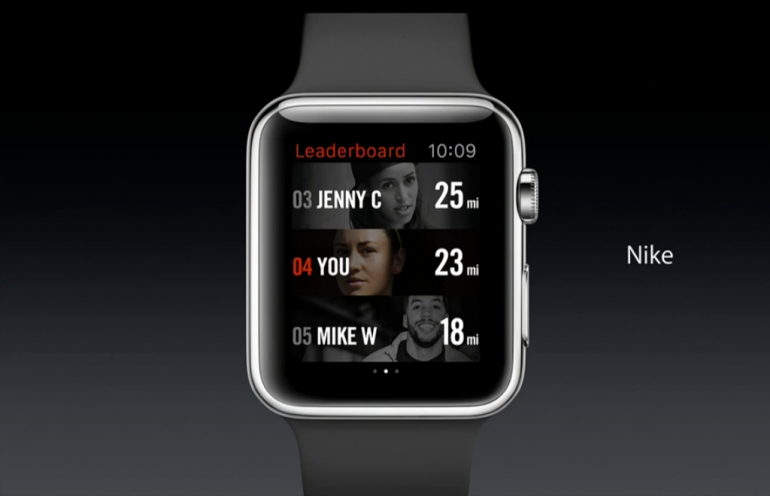
Unfortunately, in the real world, not everyone is a Jenny or a Mike.
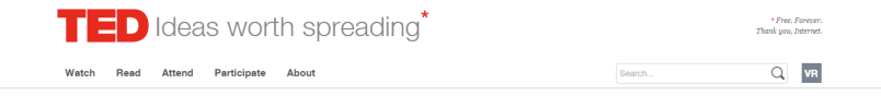
Ted.com chooses to display user initials in the app bar. This is an uncommon approach, and I must admit it took me some time to figure out they were in fact my initials – a pattern few people will even recognize in the real world because it is used so seldom.
Some websites choose to just display the avatar or an icon. But, when clicking it, they still display the user name in full within the dropdown. Longer usernames are a challenge in this approach as well.
Other websites handle this by limiting the length of username in the signup page itself. Disqus did this before their most recent UI revamp. Here’s the form validation result that was given when I tried a long name.
Ensure this value has at most 30 characters (it has 50).
This looks like a great use case for designer-developer collaboration. Let’s decide on a max length for usernames and drive all further design decisions based on this knowledge.
Good for databases, yes. Good for design and overall UX? Maybe not.
What’s in a name, you ask?
I did some preliminary (informal) research to find out what actual users think of their names in the app bar. The majority were not bothered by the presence of user names in a button that would trigger account settings.
I also did some research on what might be considered a reasonably long user name for assumption. Most of my social graph came up with nothing longer than Alexander or Elizabeth.
I also happened to learn that people with long names tend to be used to them being truncated. No problems there.
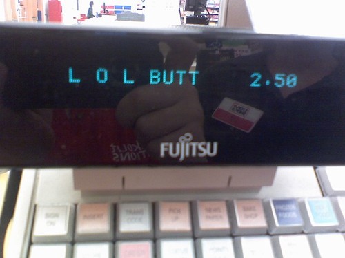
That doesn’t mean there are no problems when text gets cut unintentionally. For instance, when you purchase ‘Land O Lakes Butter‘ at the grocery store and this happens.
But, truncation goes beyond usernames.
How do you accommodate numbers without breaking design? A layout designed for 3 digit numbers might not work when the number becomes 6 digits. Facebook and Twitter handle these issues by truncating numbers to k’s and m’s.
The other lesson
This brings me to the second lesson that I consider very dear in designing for the web – Content vs Presentation.
The above mentioned design problems occur when presentation and content go hand in hand. Beautiful designs with equal height columns and crisp user names tend to break in real life situations. It helps to work with an actual sample of data rather than using ‘lipsum’ everywhere.
This is certainly not a problem that is exclusive to the web. This has been around since the age of newspapers, when headlines needed to be custom fitted to the space dictated by the column layout.
Specifications such as CSS regions are aimed at helping separate layout from content. This may be great for some use cases such as story telling. However it might not work in other situations.
Context is everything.
Names tend to become more important in certain contexts, like publishing and discussion systems. The web is maturing into an ecosystem that includes a vast range of smaller devices. Designers should take into account whether a given piece of information, no matter how trivial it seems, is important in a given context or not.
In the discussion, I’d love to learn what are the longest usernames you have encountered and how you have chosen to solve the app-bar user name problem.
Frequently Asked Questions (FAQs) about Usernames and UI Patterns
What is the significance of a username in UI patterns?
A username is a unique identifier that allows systems to distinguish between different users. In UI patterns, a username is crucial as it forms the basis of user interaction with the system. It is the first step in the authentication process, allowing the system to verify the user’s identity. A well-designed username UI pattern can enhance user experience by making the login process smooth and efficient.
How can I create an effective username UI pattern?
Creating an effective username UI pattern involves several factors. Firstly, it should be simple and intuitive, allowing users to easily understand what is required. Secondly, it should provide clear feedback, informing users if the username they’ve chosen is available or not. Lastly, it should be secure, ensuring that user data is protected.
What are some common mistakes in username UI patterns?
Common mistakes in username UI patterns include not providing clear instructions, not giving feedback on the availability of a username, and not implementing sufficient security measures. These mistakes can lead to a poor user experience and potential security risks.
How can I improve the user experience in username UI patterns?
Improving user experience in username UI patterns can be achieved by providing clear instructions, giving immediate feedback, and ensuring security. Additionally, allowing users to use their email address as a username can simplify the process, as it’s easier to remember.
What is the role of feedback in username UI patterns?
Feedback plays a crucial role in username UI patterns. It informs users if the username they’ve chosen is available, if it meets the required criteria, and if it has been successfully registered. This helps to prevent confusion and frustration, enhancing the overall user experience.
Why is security important in username UI patterns?
Security is important in username UI patterns to protect user data. A secure username UI pattern should prevent unauthorized access by implementing measures such as password protection and two-factor authentication.
Can I use my email address as a username?
Yes, many systems allow users to use their email address as a username. This can simplify the process, as an email address is often easier to remember than a unique username.
What are some examples of good username UI patterns?
Good username UI patterns are simple, intuitive, and secure. They provide clear instructions, immediate feedback, and implement security measures. Examples include systems that allow users to use their email address as a username, systems that provide feedback on the availability of a username, and systems that use two-factor authentication for added security.
How can I test the effectiveness of my username UI pattern?
The effectiveness of a username UI pattern can be tested through user testing. This involves observing users as they interact with the system, noting any difficulties they encounter, and making necessary adjustments to improve the user experience.
What is the future of username UI patterns?
The future of username UI patterns lies in further simplification and enhanced security. As technology advances, we can expect to see more intuitive and secure username UI patterns, such as biometric authentication and single sign-on solutions.