

The focus caret is that dotted outline you see around HTML elements when they have the focus. In some Mac browsers you see a standardized glowing blue border instead, but most browsers show a dotted outline. It’s not usually pretty, but it is completely necessary to give an indication of which element has the focus.
(Some developers hate them so much that they try to suppress them, with JavaScript abominations like onfocus="this.blur()". But I’m gonna take it as read that you, my dear reader, would sooner chew off your own leg than do something as awful as that.)
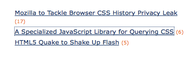
Here’s an example of what the caret might look like (this screenshot was taken with Mac/Firefox):
Focus carets serve a vital accessibility function for people who navigate with the keyboard, and so, far from trying to suppress them, what we as developers should really be doing is making them more obvious. And it turns out that there are some CSS properties we can use to do just that, and also make more attractive in the bargain — what I’m talking about is outline.
The outline property is similar to border, having sub-properties for outline-width, outline-style and outline-color and the same shorthand syntax, but it draws a border on top of the layout, not within it — so it doesn’t affect the box’s dimensions or cause any displacement, and it can, if large enough, overlap other elements or itself.
This on its own makes it a useful development tool, because you can draw test borders on elements without affecting the space they take up.
But what it’s really useful for is as a focus caret, and in fact what we find is that the browser’s built-in focus caret is an outline style, typically amounting to this:
a:focus
{
    outline:1px dotted
}
A dotted border that inherits the element’s focus color. And I recommend you leave that essentially as it is — it’s what people expect, and it makes visual sense.
But you can supplement it with two additional properties that improve the caret by giving it more space, and making look a little cooler; these are what this post is all about:
outline-offsetmoves the border away from the bounding box, creating space between the element and its outline; and-moz-outline-radiusgives it lovely rounded corners!
So as a global rule, we could do something like this:
a:focus
{
    outline:1px dotted;
    outline-offset:2px;
    -moz-outline-radius:5px;
}
And I’ve used those very styles for links in the new blog design — so the effect is literally all around you! Try tabbing around the page and you should see what I mean — Firefox is the best browser to see it in, because although the offset is cross-browser, the radius is Firefox only.
Then with a litle trial-and-error I adopted the following conventions:
- By default, elements have
5pxradius and2pxoffset:
- For very small text, decrease the offset to 1px:
- For elements with clearly defined borders already, such as the links in the main navigation bar, clear the offset so that the outline perfectly hugs the element:
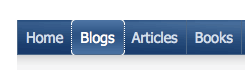
For a tightly-hugging outline you may also prefer to lose the rounded corners — on the navigation bar links I kept them because I thought they looked kinda cool! But on the categories tabs I changed them so that only the top corners are rounded, while the bottom corners are square, to match the tab itself: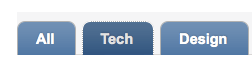
Hugging the tab’s existing border so tightly like that does make the outline less obvious — and that’s something you have to watch out for — but since there’s a background rollover going on there as well, I think it’s clear enough overall.
And there you have it! None of this works in IE of course (though the core outline properties work in IE8), but I’m guessing you guessed that already! It doesn’t really matter though, since we haven’t lost anything — the default outline isn’t affected and carries on as normal — so this is textbook progressive enhancement.
But I think what this demonstrates more than anything is that accessibility features don’t have to be dull or pefunctory — they can display just as much flair as any other part of the design (whether or not rounded corners are your thing!). And giving this attention to such features makes them more useful, and less of a bug-bear to those who’d otherwise prefer not to have them at all.
Thumbnail credit: ihtatho
Frequently Asked Questions (FAQs) about Focus Caret
What is a focus caret and why is it important in web design?
A focus caret is a visual indicator that shows where the keyboard actions will occur. It is crucial in web design because it enhances the accessibility of a website. Users who rely on keyboards for navigation can easily identify where they are on a page, making the website more user-friendly.
How does the focus caret differ from the mouse cursor?
While both the focus caret and mouse cursor serve as pointers, they function differently. The mouse cursor is controlled by the mouse movement and is used to select and interact with elements on the screen. On the other hand, the focus caret is controlled by the keyboard and indicates where the next keyboard action will occur.
How can I customize the appearance of the focus caret?
The appearance of the focus caret can be customized using CSS. You can change its color, shape, and size to make it more visible and appealing. However, it’s important to ensure that the customized focus caret still maintains its functionality and doesn’t compromise the accessibility of the website.
What is the role of the CSS outline property in customizing the focus caret?
The CSS outline property is used to set the style, color, and width of the outline of an element. When applied to the focus caret, it can help enhance its visibility and make it more distinguishable.
Can I use an upside-down caret character in my web design?
Yes, you can use an upside-down caret character in your web design. However, it’s important to note that the upside-down caret character may not be recognized by all browsers and devices. Therefore, it’s recommended to use standard characters and symbols that are universally recognized.
What is the -moz-outline-style property in CSS?
The -moz-outline-style property is a Mozilla extension to CSS that allows you to set the style of the outline of an element. It can be used to customize the appearance of the focus caret in Firefox browsers.
How can I make the focus caret cooler and more appealing?
To make the focus caret cooler and more appealing, you can experiment with different colors, shapes, and sizes. You can also add animations or transitions to make it more dynamic. However, it’s important to ensure that the focus caret remains functional and doesn’t distract users from the content of the website.
Why is my focus caret not visible?
If your focus caret is not visible, it could be due to several reasons. The color of the focus caret may be too similar to the background color, making it hard to see. Alternatively, the size of the focus caret may be too small. You can adjust these properties using CSS to make the focus caret more visible.
How can I test the functionality of the focus caret on my website?
You can test the functionality of the focus caret on your website by navigating through the website using only the keyboard. The focus caret should move as you press the tab key and should indicate where the next keyboard action will occur.
Can I disable the focus caret on my website?
While it’s technically possible to disable the focus caret on your website, it’s not recommended as it can negatively impact the accessibility of your website. The focus caret is crucial for users who rely on keyboards for navigation, and disabling it can make your website less user-friendly.