Color Associations
Describing the emotional connections that people can have with colors can be a very hippy-esque topic. If you find that hard to believe, just head over to your favorite online music store and sample some tracks from Colors by Ken Nordine. Although most designers will stop short at relying solely on the supposed meanings, characteristics, and personalities of specific colors, it’s still handy to have an understanding of the emotional attributes of some of the main color groups.Red
The color red has a reputation for stimulating adrenaline and blood pressure. Along with those physiological effects, red is also known to increase human metabolism; it’s an exciting, dramatic, and rich color. Red is also a color of passion. Nothing says love like painting a wall bright red on Valentine’s Day for your sweetheart, as seen in Figure 1.1, “Red, the color of affection (two gallons of it!)”. The darker shades of red, such as burgundy and maroon, have a rich, indulgent feeling about them—in fact, they can be quite hoity-toity. Think about these colors when designing anything for wine enthusiasts or connoisseurs of fine living. The more earthy, brownish shades of red are associated with the season of autumn and harvest.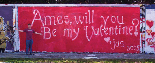 Figure 1.1. Red, the color of affection (two gallons of it!)
Orange
ike red, orange is a very active and energetic color, though it doesn’t evoke the passion that red can. Instead, orange is thought to promote happiness, and represents sunshine, enthusiasm, and creativity. Orange is a more informal and less corporate-feeling color than red, which is perhaps a reason why the designers behind the location-based service Gowalla chose it for their logo. Because orange doesn’t show up often in nature, it tends to jump out at us when we see it. For that reason, it’s often used for life jackets, road cones, and hunting vests. Since orange also stimulates metabolism and appetite, it’s a great color for promoting food and cooking. That’s probably why the picture of a tangerine in Figure 1.2, “Orange you glad I didn’t say banana?” is making you hungry, even if you don’t like citrus fruits.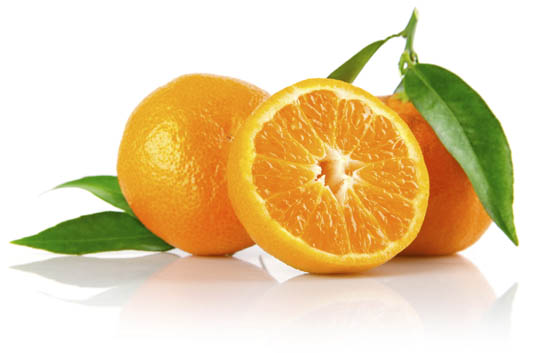 Figure 1.2. Orange you glad I didn’t say banana?
Yellow
Like orange, yellow is an active color, and being highly visible, it’s often used for taxicabs and caution signs. It’s also associated with happiness and, as Figure 1.3, “Yellow, the color of smileys” illustrates, is the signature color of smileys. The original orange and lemon-lime flavors of the sports energy drink Gatorade are still the best-selling of the brand’s products; this is likely due, in part at least, to the energetic characteristics associated with the colors orange and yellow.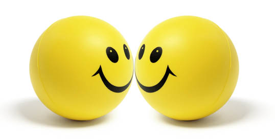 Figure 1.3. Yellow, the color of smileys
Green
Green is most commonly associated with nature. It’s a soothing color that symbolizes growth, freshness, and hope. There’s little doubt why the color has been so closely tied with environmental protection. Visually, green is much easier on the eyes, and far less dynamic than yellow, orange, or red. Although many website designs using green appeal to visitors’ sense of nature, green is a versatile color that can also represent wealth, stability, and education. When bright green is set against a black background, it really pops—giving the design a techy feel. For me, it brings back memories of my first computer, a trusty old Apple IIe. This was the inspiration for the MailChimp loading screen I designed recently, shown in Figure 1.4, “ASCII version of Freddie Von Chimpenheimer IV”. Figure 1.4. ASCII version of Freddie Von Chimpenheimer IV
Blue
When I was a kid, my favorite color was blue. Not just any blue, but cerulean blue from Crayola crayons. While most kids are less particular, blue is often cited as the universally favorite color. On the touchy-feely level, blue symbolizes openness, intelligence, and faith, and has been found to have calming effects. On the other hand, blue has also has been found to reduce appetite. This is probably due in part to the rarity of blue in real food. Aside from blueberries, how many naturally blue foods can you count? Blue, it would seem, is excluded from nature’s appetite-inducing palette; therefore, it’s less than ideal for promoting food products. In addition, blue is sometimes seen as a symbol of bad luck and trouble. This emotional color connection is evident in blues music, as well as in the paintings of Picasso’s depression-induced “blue period.” It’s not all about unnatural food colors and melancholy forms of art, though; blue has universal appeal because of its association with the sky and the sea. For me, the presence of blue in the stacked stones image in Figure 1.5, “Calming stones, sky, and sea” makes me feel more at ease. Figure 1.5. Calming stones, sky, and sea
This visual connection makes blue an obvious choice for websites associated with airlines, air conditioning, pool filters, and cruises. Have you ever noticed that blue is the primary color in the logos of IBM, Dell, HP, and Microsoft? That’s because blue also conveys a sense of stability and clarity of purpose … that is, until you’ve experienced the blue screen of death!
Purple
Historically, the color purple has been associated with royalty and power, as it is on the postage stamp in Figure 1.6, “Purple coat of arms on a Norwegian postage stamp”. The secret behind purple’s prestigious past has to do with the difficulty of producing the dye needed to create purple garments. To this day, purple still represents wealth and extravagance. That extravagance is carried over into nature. Purple is most often connected with flowers, gemstones, and wine. It balances the stimulation of red and the calming effects of blue. According to Patrick McNeil, author of The Web Designer’s Idea Book,1 purple is one of the least-used colors in web design. He explains that finding good examples of website designs featuring purple was so hard that he almost had to cut the section from his book. If you’re trying to create a website design that stands out from the crowd, think about using a rich shade of purple.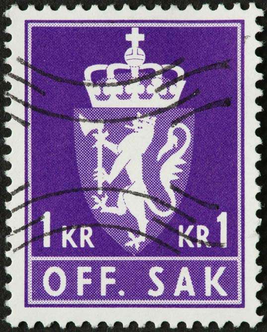 Figure 1.6. Purple coat of arms on a Norwegian postage stamp
White
You might think there’s nothing special about the color of the wind turbines in Figure 1.7, “These wind turbines might be white, but they’re also green”, but the use of white actually helps promote the idea that this is clean power. In Western cultures, white is considered to be the color of perfection, light, and purity. This is why crisp white sheets are used in detergent commercials, and why a bride wears a white dress on her wedding day. For an idea of how ingrained the meaning of white is in our culture, read the poem Design by Robert Frost.2 In it, Frost symbolically contradicts our associations by using white to represent death and darkness. Interestingly, in Chinese culture, white is a color traditionally associated with death and mourning. Such cultural distinctions should serve as a reminder to research the color associations of your target audience, as they may vary greatly from your own perception. In design, white is often overlooked because it’s the default background color. Don’t be afraid to shake it up, though. Try using a dark background with white text, or put a white background block on an off-white canvas to make it pop. Using colors in unexpected ways can make a bold statement. Figure 1.7. These wind turbines might be white, but they’re also green
Black
Although black often suffers from negative connotations such as death and evil, it can also be a color of power, elegance, and strength, depending on how it’s used. If you’re considering using a particular color and are wondering what the associations are for that color, just ask yourself, “What are the first three things that come to mind when I think about this color?” When I think about black, for instance, I think about Johnny Cash, tuxedos, and Batman. When I think about Johnny Cash, his dark clothing, deep voice, and sorrowful songs give a tangible meaning to the mental associations I perceive between the man and the color. Figure 1.8. Black, a color that represents power, elegance, and in this case, exorbitance
If you treat all your color choices this way, establishing three word associations for each, chances are you’ll gain a good idea of how that color is widely perceived among your audience.
Even though color psychology plays a role in the way a visitor may see your site, keep in mind there is no wrong color to use. While psychological reasoning may help to start your palette, the success of a color scheme depends on the harmony that exists between all the colors chosen. To achieve this harmony, we’ll need to be mindful of a few other attributes of color.
References
- Patrick McNeil, The Web Designer’s Idea Book, How Books, Cincinatti, USA, 2008
- This can be found in many a good poetry book, but I used The Norton Anthology of Poetry (5th edition), eds Margaret Ferguson, Mary Jo Salter, and Jon Stallworthy, WW Norton & Company, New York, 2004.
The Principles of Beautiful Web Design This article is from Jason Beaird’s The Principles of Beautiful Web Design book (second edition is out now!). Be sure to lookout for further articles from the book here on Design Festival.
Frequently Asked Questions about the Psychology of Color
How does color psychology impact our daily lives?
Color psychology plays a significant role in our daily lives. It influences our emotions, behaviors, and decision-making processes. For instance, marketers use color psychology to influence consumer behavior. Certain colors are known to evoke specific emotions, which can impact how we perceive a brand or product. Similarly, interior designers use color psychology to create specific moods in different spaces. Understanding color psychology can help us make more informed decisions and interpret the world around us more accurately.
Can color psychology be used to enhance learning and memory?
Yes, color psychology can be used to enhance learning and memory. Research has shown that color can improve memory performance by increasing our attention level and arousal. There are also studies suggesting that warm types of colors such as yellow and red can stimulate brain activity, which can enhance creativity and information retention.
How does color psychology relate to marketing and branding?
Color psychology is a crucial aspect of marketing and branding. Different colors can evoke different emotions and reactions from consumers. For example, red can create a sense of urgency, blue can evoke trust and reliability, while green is often associated with health and tranquility. Marketers use these color associations to influence consumer perceptions and behaviors towards a brand or product.
What are some common misconceptions about color psychology?
One common misconception about color psychology is that the same color will evoke the same emotion in everyone. However, individual experiences and cultural differences can significantly influence how we perceive and react to different colors. Another misconception is that color psychology is a one-size-fits-all solution. In reality, it’s a complex field that requires careful consideration of various factors, including context, culture, and individual differences.
How does color psychology apply to web design?
In web design, color psychology is used to create a visual hierarchy, guide users’ attention, and evoke specific emotions. For example, designers often use contrasting colors to highlight important elements, such as call-to-action buttons. They also use color to create a mood or atmosphere that aligns with the brand’s identity. Understanding color psychology can help web designers create more effective and engaging designs.
Can color psychology help in improving mental health?
While color psychology is not a standalone treatment for mental health issues, it can complement traditional therapies. Certain colors have been found to have calming effects, such as blue and green, which can be beneficial for individuals dealing with stress or anxiety. However, it’s important to note that individual responses to color can vary, and what works for one person may not work for another.
How does color psychology influence our perception of food?
Color psychology can significantly influence our perception of food. For instance, red is often used in food branding because it’s associated with excitement and appetite stimulation. On the other hand, blue is rarely used because it’s known to suppress appetite. Additionally, the color of the food itself can impact our perception of its taste and flavor.
What is the cultural significance of colors in color psychology?
The cultural significance of colors plays a crucial role in color psychology. Different cultures have different associations and meanings for various colors. For example, in Western cultures, white is often associated with purity and innocence, while in some Eastern cultures, it’s associated with mourning and death. Understanding these cultural differences is essential when applying color psychology, especially in a global context.
How does color psychology affect our buying decisions?
Color psychology can significantly influence our buying decisions. Marketers often use specific colors in their branding and advertising to evoke certain emotions and perceptions that can influence consumer behavior. For example, a study found that up to 90% of snap judgments made about products can be based on color alone. Therefore, understanding color psychology can be a powerful tool for businesses.
Can understanding color psychology improve our personal and professional lives?
Yes, understanding color psychology can improve both our personal and professional lives. On a personal level, it can help us make better decisions, from choosing the right clothes to decorating our homes. On a professional level, it can enhance our communication and influence skills, especially in fields like marketing, branding, interior design, and web design.
Jason Beaird is a designer and front-end developer with over ten years of experience working on a wide range of award-winning web projects. With a background in graphic design and a passion for web standards, he’s always looking for accessible ways to make the Web a more beautiful place. When he’s not pushing pixels in Photoshop or tinkering with markup, Jason loves sharing his passion for the Web with others.

