Taking CSS1k to the Garden of CSS-3den
Key Takeaways
- CSS1k is a project that challenges front-end developers to create something interesting with just 1024 characters of CSS, embracing the idea that limitation breeds creativity.
- The limitations of CSS1k include no images, no media, no web fonts, no other external files, and locked down HTML. The only resource available is CSS, and not much of it.
- The author demonstrates how to create a rich, organic and lush design without using images, using unconventional techniques and exploiting the efficiency of shorthand font declarations in CSS.
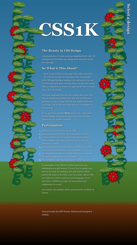
- The author uses the :before and :after pseudo elements, unicode characters, and CSS3 selectors to create a garden-themed design with leaves, vines, and flowers.
- The author notes that while some of the techniques used in the project would not be recommended for real-world projects, they are useful to know and can inspire creativity in working with CSS.
 Who’s seen the movie, ‘Apollo 13‘?
What a great story. Three astronauts trapped in a crippled lunar module hurtling through space. Their air is failing fast and they have little water, heat or power.
Just to make it back from moon orbit the crew must conserve power by shutting down almost all electrical systems on the command module. The catch is, they’ll burn up on re-entry if they can’t reboot the ship’s guidance systems — a task close to impossible given their crippled power supply. We’re talking something akin to jump-starting a seized Chevy with a watch battery. Things are looking grim.
Back on earth Capt. Ken Mattingly (played by Gary Sinise) is locked away in a cramped NASA replica of the spaceship trying to figure out a way to restart the computer without permanently frying it. They’ll only have one shot.
This is the sort of true story that’s almost too crazy to make up.
It’s also a perfect demonstration of the idea of limitation breeding creativity.
Capt. Mattingly can’t pop out to grab extra tools or a spare part. He can’t stroll by the storeroom to pick up another battery. Like his stranded colleagues above, he’s got whatever he can reach and his brain.
It’s a fact: Taking away resources forces you to think more deeply about the resources you have.
And that’s a very useful thing.
What is CSS1K?
Jacob Rask’s CSS1k is a project that has embraced this idea and used it to challenge front-end developers. At a time when even Google’s famously no-frills home page CSS is edging towards 40,000 CSS characters, CSS1k asks you to do something interesting with just 1024.
The limitations are many.
- No images (JPG, GIF, PNG, etc)
- No media (video, audio, etc)
- No web fonts
- No other external files (SVG, JavaScript, SWF)
- The HTML is locked down
You have CSS only — and not much of it.
There is one saving grace — CSS1k uses Lea Verou’s -prefix-free. This means you can write plain, unprefixed CSS3 and your code will automatically get the right prefixes in the right browser.
Sounds like a challenge. I’m in!
So, exactly how much is 1k?
At first glance, 1024 characters sounds like a pretty reasonable amount — but is it?
Here’s a quick guide. If you select the text in this post down to ‘..grab extra tools or a spare part‘ you’ll have yourself exactly 1000 characters. That’s not much to work with.
In real terms, you can probably count on having between 12 and 16 lines of CSS.
So, given these obvious constraints, I set myself a challenge:
Is it possible to make a rich, organic and lush design without using images?
If you’re interested, I’ll walk you through my design below. It’s very comprehensive, so feel free to skim.
WARNING: In the course of wringing every last character out of this design, I admit I’ve done some… well, let’s say ‘unconventional’ things with CSS. Some are a little sneaky. Some are dubious. Some contravene the Geneva Convention for humane treatment of CSS.
I’ll point this out in the code with a ‘dodginess rating’.
 The HTML
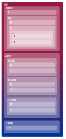
Like Dave Shea’s CSSZenGarden before it, you can’t alter Jacob’s markup.
The HTML itself is fairly unremarkable, using HTML5 elements throughout (<article>, <section>, <nav>, etc). The <nav> consists mostly of a long unordered list of entries and credit links. The <article> section contains the CSS1k explanation copy and a footer closes the page off.
Nothing terribly complex there.
The CSS
A lot of the CSS is self-apparent, so I won’t waste your time explaining every line.
1). Setting up the BODY (163 chars)
Dodginess rating: Low
body{
color:#fff;text-align:center;
padding:9%;
font:20px/160% Georgia;
background:#369;/* fallback */
background:linear-gradient(#369,#69c 66%,#582 66%,#460 86%,#630 88%,#000);  }
We start thing off with some solid document defaults: White, center-aligned 20px text with 160% line-height and some padding on the side.
We’re also applying a vertical linear gradient to the background, starting from sky blue at the top, to lush green in the middle, to earthy browns at the bottom.
By selecting the colors carefully, we’ve kept them all to 4 character hexidecimals. I was also able to leave out the gradient direction (top) and the starting and ending percentages (0% and 100%) as they are the browser defaults.
We also strike our first browser compatibility issue here.
For the release of IE9, Microsoft encouraged developers to use SVG to accomplish this kind of graded color. Technically we *could* make this gradient work in IE9 by embedding it directly in our CSS as a data URI.
It would look something like this:
background: url(data:image/svg+xml;base64,PD94bWwgdmVyc2lvbj0iMS4wIiA/
Pgo8c3ZnIHhtbG5zPSJodHRwOi8vd3d3LnczLm9yZy8yMDAwL3N2ZyIgd2
lkdGg9IjEwMCUiIGhlaWdodD0iMTAwJSIgdmlld0JveD0iM... etc, etc..
Unfortunately, that single line of code alone would chew up over 1000 characters. That might be ok for a real-world project, but we’re going to have to bench IE9 for this game.
Happily, IE10 does support an MS flavor of classic CSS gradients.
2) Carpet bombing the defaults
Dodginess rating: Extreme
* *{padding:0;
position:relative;
border-radius:50%;
text-shadow:1px 1px 7px #000
}
a,:visited{
color:#fff;
text-decoration:none
}
Ok, I know. This first rule targets ‘anything that’s inside anything’ and that certainly isn’t a recommended day-to-day CSS practice.
I actually started with ‘body *’ but found by accident that ‘* *’ gave me the same rendered result — at a grand saving of 3 characters.
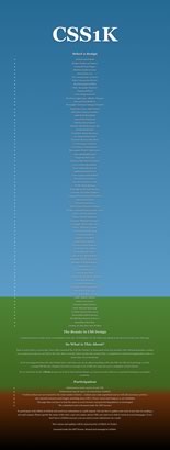
Sure, I know it’s not pretty but dammit this is war, people!!
For layout reasons I need every page item to be ‘position:relative’. I’m also rounding every border and giving every element a soft dark glow for contrast.
Yes, it’s true that any of these rules could unleash other issues, and certainly would never encouraged for everyday work, but I’m comfortable with it for CSS1k.
I’m also overriding the browser’s default link styling and found that ‘:visited’ is just as acceptable to modern browsers as the more standard ‘a:visited’.
3) Setting up the main content area
Dodginess rating: Medium
article,footer{
margin:14% 26%;text-align:left
}
h1{font:700 9em/45%""}
The first line is fairly self-explanatory. We left-align the article and footer areas and give them some useful margins.
The next line is less conventional.
Personally I love the efficiency of shorthand font declarations in CSS and always felt a little irritated at the relative verbosity required to make even small tweaks to the line-height or font-weight.
Why can’t I just write like ‘font:12px/16px’?
Unfortunately this fails as the shorthand font property require a minimum of a font-size and a font-family to work. In theory ‘inherit’ *should* be a valid value for font-family. Alas, for most browsers it isn’t.
However, I found that the vast majority of browsers and even CSS validators are perfectly happy for you to offer empty quotes (i.e. “”) as the font-family value, while simply inheriting the previously set value.
So instead of writing:
font-family:13px;
line-height:16px;
..we could just write:
font:13px/16px "";..or even:
font:bold 12px/120% "";In fact, you can even omit the space before the quotes in most cases. New browsers like it. Even older IE’s are fine with it.
Unfortunately — to my profound disappointment — our friend IE9 honors ‘inherit’, but fails when you use the empty quotes. And I’m seriously bummed about that.
So, in short, this font trick isn’t ready for prime time front-end work (yet) but it will do for CSS1k. And if you find a workaround, I’m all ears. I’d love to use this all the time.
4). Preparing the :before and :after pseudo elements.
Dodginess rating: Medium
:before,:after,nav h2{
position:absolute;
font:13em'';
top:-12%
}
I’m going to be making extensive use of the :before and :after pseudo elements later in the design, so from the start I’m going to make every one of them ‘position:absolute‘. This isn’t quite as risky as it might seem since these elements only come in existence when we specifically call them with generated content. We’re also using the font-sizing trick again.
You’ll also notice the h2 inside our nav is hitching a ride here. This just saves me from having to declare ‘position:absolute‘ again later in the document.
5). Repositioning the Navigation
Dodginess rating: low
nav{top:-22em}
nav h2{
transform:rotate(90deg);
right:-5em;
font-size:2em;
top:3em
}
Ultimately I want the list to wrap around the heading, so I’m going to push the navigation up and over the heading for now. I also want to run the ‘Select a design’ heading vertically down the right-hand side.
6). Sprouting leaves
Dodginess rating: low
Time to get get our hands dirty with that list. In the Garden of CSS3den I want each list-item to look like a leaf.
nav li{
margin:5px -3px;
border-bottom:4px solid #030;
float:left;
list-style:none;
font:60% arial;
background:linear-gradient(#690,#470 38%,#690 42%,#470);
padding:1em;
transform:rotate(9deg)
}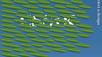
For this I can craft another CSS gradient to give each list-item a green leafy surface. The border-radiuswe applied earlier supplies our rounded leaf shape. For now, we’ll float our list items to the left and just let them stack.
Notice that since each entries is a different length, our leaves get some organic randomness for free.
I’ve got some border on the bottom to give each leaf some depth and 9 degrees of rotation to break up the squareness.
Why 9 degrees, you ask? Simply, that’s the largest angle we can get without going to double figures.
Oh yes. It all counts..
6). Parting the jungle
Dodginess rating: low
Next I want to separate our leaves into two separate vines and start to wrap them either side of the header and articles section.
nav li:nth-child(odd){
float:right;
transform:rotate(-9deg)
}
nav :nth-child(3n){
clear:both;
transform:rotate(-15deg)
}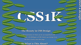
Firstly we use the ‘nth-child’ selector to float all the odd numbered leaves (i.e. 1,3,5,7..) to the right and give them a twist in the opposite direction.
Then the second rule reselects every third leaf and forcibly clears it.
This generates a pattern of ‘one leaf, two leaves, one leaf, two leaves, etc’ all the way down each side of the content.
7). Parting the jungle
Dodginess rating: low
Things are taking shape but currently the leaves on the righthand side currently look a little rigid and mechanical. Let’s shake them up by rotating every fifth leave in the opposite direction.
You can see that this combination of relatively simple rules is starting to produce a little chaos. This is exactly what we’re looking for.
nav li:nth-child(5n){transform:rotate(9deg)}
8). Polishing up the leaves
Each leaf contains two links — one to the CSS design and one to the author’s site. It might be nicer to break them onto separate lines.
nav a:first-child{
display:block;
font-weight:700
}
We can do this by selecting the first link on each leaf (i.e. a:first-child), and making it ‘display:block‘ and bold. This also makes each leaf shorter and rounder, which isn’t a bad thing for our layout anyway.
9). Let there be vines
Ok. So our leaves are shaping up nicely but they’re currently hanging unnervingly in mid-air. We need to somehow generate vines, but where are we going to get languid, organic-looking shapes without using graphics?
My solution was the humble unicode character.
Unicode is the built-in library of characters, punctuation, symbols, illustrations and shapes that ship with your browser — no downloads required. Although we only commonly use a hundred characters or so, your browser contains a treasure-trove of many thousands — although there is some variation amongst browsers, browser versions and OS’s.
All unicode characters are vector based, so they’re super-fast to load and scale perfectly. Provided we have the patience to search through them — give us lots of great vine-like options.
At various times I used the greek lowercase letter ‘xi’:
ξ
And the Devanagari number 3:
३
But eventually selected the arabic sign misra, which I believe refers to a single line of poetry:
؏
 Any of these will do the job fine.
Using the generated content property we can now embed our unicode vines into those :before pseudo elements for our list-items, and paint them deep green (#063).
nav li:before{content:'؏';color:#063}
Now we have surprisingly effective vines winding amongst the leaves. Things are really starting to take shape.
10). Randomizing the vines
The vines are good, but they’re a little bit ‘samey’.
My first instinct was to simply flip every third vine 180 degrees to create some chaos. Funnily enough, it actually takes more characters to flip an existing element than it does to introduce a brand new one.
Example #1: Rotating every third character 180 degrees.
nav :nth-child(3n):before{transform:rotate(180deg)}Example #2: Writing a new character into every third character
nav :nth-child(3n):before{content:'३'}So, now we’ll overwrite every third instance of our first vine with the Devanagari digit for ‘3’ (३) that we demoed in the last code snippet.
11). Make it bloom
Our vines are lush but I think we’re lacking a dash of color. Let’s add a floral touch.
I suspect that a appropriately-sized asterisk (*) would make a perfectly acceptable flower here, but hey, unicode offers us a bunch of flower-like options — why not use them?
I picked this one:
❁
So far we haven’t needed to call on our :after pseudo elements. Now’s the time to break them out.
nav :nth-child(5n):after{
content:'❁';
color:red;
top:9px;
left:-40%
}
Here we’re attaching a large red flower to the :after pseudo element of every fifth leaf, which gives us a lovely smattering of color through our foliage. Nice.
Here’s the entire CSS code block.
body{padding:9%;font:20px/160% Georgia;background:#369;background:linear-gradient(#369,#69c 66%,#582 66%,#460 86%,#630 88%,#000);color:#fff;text-align:center}
* *{padding:0;position:relative;border-radius:50%;text-shadow:1px 1px 7px #000}
a,:visited{color:#fff;text-decoration:none}h1{font:700 9em/45%''}
article,footer{margin:14% 26%;text-align:left}
:before,:after,nav h2{position:absolute;font:13em'';top:-6%}
nav{top:-22em}
nav h2{transform:rotate(90deg);right:-5em;font-size:2em;top:3em}
nav li{margin:5px -3px;border-bottom:4px solid #030;float:left;list-style:none;font:60% arial;background:linear-gradient(#690,#470 38%,#690 42%,#470);padding:1em;transform:rotate(9deg)}
nav li:nth-child(odd){float:right;transform:rotate(-9deg)}
nav :nth-child(3n){clear:both;transform:rotate(-15deg)}
nav li:nth-child(5n){transform:rotate(9deg)}
nav a:first-child{display:block;font-weight:700}
nav li:before{content:'؏';color:#063}
nav :nth-child(3n):before{content:'३'}
nav :nth-child(5n):after{content:'❁';color:red;top:9px;left:-40%}
Now if you were diligent enough to perform a character count on the block, you’d actually get 1030.
However, don’t panic. Each carriage return uses a character, so by simply collapsing the above code into a single line we get down to 1016 characters.
Random Notes
This was tough. My original concept had multiple flower varieties, a generated subheading, and unicode worms below ground. I even toyed with the idea of an animated bee.
However, like a real garden, it needed some tough love to make it flourish, so each of these elements eventually fell to the pruning shears.
I’m still tinkering a little, so this design might differ slightly from the version on CSS1k.com.
Again, there are things in this code that I wouldn’t do in real-world projects — but it’s useful to know you can. I’m also obviously using a lot of CSS3 selectors so you have to forget about non-current browsers.
- So what do you think?
- Any suggestions for saving a few more characters?
- Got a CSS1k idea of your own bubbling away in there?
PS: If you’ve been meaning to polish up on your CSS3, Rachel has just updated her CSS Anthology to cover a lot of this CSS3 stuff, so that’s great place to start.
Alex has been doing cruel and unusual things to CSS since 2001. He is the lead front-end design and dev for SitePoint and one-time SitePoint's Design and UX editor with over 150+ newsletter written. Co-author of The Principles of Beautiful Web Design. Now Alex is involved in the planning, development, production, and marketing of a huge range of printed and online products and references. He has designed over 60+ of SitePoint's book covers.
