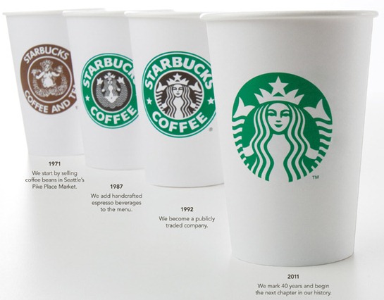
I don’t drink tea or coffee and I’ve never set foot in a Starbucks coffee shop, however I’m very much aware of the Starbucks logo as it’s visible in many cities around the world. This iconic logo has gone through several changes over the years, starting in the early seventies with a brown label and woodcut image of a mermaid. Now celebrating it’s 40th anniversary, Starbucks logo has evolved again with the removal of the words Starbucks Coffee and enlargement of the mermaid icon – the Siren – to fill the green circle. The re-design was carried out by international branding firm Lippincott.
 |
|
| New 2011 re-designed logo | |
 |
 |
| The early woodcut style Siren | The 1992 logo |
 The Starbucks logos in action.
The Siren has been at the heart of the Starbucks logo for forty years. When the company was set up, the designer found a 16th century Norse woodcut of a twin-tailed mermaid. The company founders believed she represented a seductive mystery mixed with a nautical theme and so she became the most important element of the mark. Her appearance has graphically become more sophisticated (yet simplified) with each iteration of the logo. Personally I like the new mark but I was very fond of the previous logo with the green ring, text and stars too so I’m still fully warming to it. I wonder if customers will find it as instantly recognizable as before?
What do you think about the new siren-only logo? Does it work?
Frequently Asked Questions about Starbucks Logo Evolution
What was the inspiration behind the original Starbucks logo?
The original Starbucks logo was inspired by a 16th-century Norse woodcut of a twin-tailed mermaid, or Siren. The founders of Starbucks wanted to capture the seafaring history of coffee and Seattle’s strong seaport roots, hence they chose this maritime theme. The Siren was seductive and alluring, a symbol of the irresistible nature of the coffee.
How has the Starbucks logo evolved over the years?
The Starbucks logo has undergone significant changes since its inception in 1971. The original logo was a brown emblem featuring the full-bodied Siren. In 1987, the logo was simplified to a green emblem with a more zoomed-in view of the Siren. In 1992, the navel of the Siren was removed, and in 2011, the logo was further simplified by removing the “Starbucks Coffee” text, leaving only the Siren in a green circle.
Why did Starbucks decide to remove the text from their logo in 2011?
Starbucks decided to remove the text from their logo in 2011 to signify their expansion beyond coffee. The company wanted a logo that represented more than just coffee as they started to offer more products like teas, food items, and merchandise. The simplified logo also helped in making the brand more recognizable globally.
What does the color in the Starbucks logo represent?
The green color in the Starbucks logo represents growth, freshness, uniqueness, and prosperity. It also signifies the company’s commitment to being environmentally friendly.
Has the Starbucks logo been controversial?
Yes, the Starbucks logo has faced some controversy over the years. The original logo, which featured a topless Siren, was considered too provocative by some. The logo was subsequently modified to a more modest version.
How has the Starbucks logo contributed to its brand identity?
The Starbucks logo has played a crucial role in establishing its brand identity. The Siren symbolizes the seductive power of coffee, while the green color represents growth and freshness. The logo’s evolution reflects the company’s growth and diversification.
Why did Starbucks choose a Siren for their logo?
Starbucks chose a Siren for their logo to represent the allure and appeal of their coffee. The Siren, a mythical creature known for luring sailors with her enchanting music and voice, symbolizes the irresistible nature of Starbucks coffee.
What is the significance of the twin-tailed Siren in the Starbucks logo?
The twin-tailed Siren in the Starbucks logo is a symbol of seduction and allure. It represents the idea that Starbucks coffee is so enticing and irresistible, much like the Siren’s song in mythology.
How does the current Starbucks logo differ from the original one?
The current Starbucks logo is a simplified version of the original one. It features only the Siren in a green circle, with no text or stars. The original logo was a brown emblem with a full-bodied Siren, surrounded by the text “Starbucks Coffee” and two stars.
Why has Starbucks maintained the Siren in all its logo changes?
Starbucks has maintained the Siren in all its logo changes to preserve its brand identity and continuity. The Siren has become synonymous with Starbucks, symbolizing the brand’s allure and the irresistible nature of its coffee.
Jennifer Farley is a designer, illustrator and design instructor based in Ireland. She writes about design and illustration on her blog at Laughing Lion Design.

