This is the Hypertext Editing System (HES) created at Brown University by the ‘father of the hyperlink’ – Ted Nelson in 1969.
The coolest thing about the system was the built-in lightpen, that allowed the operator to manually underline the text they wanted to link.
Gee Willikers, Mr. Peabody!
You can almost trace that lightpen directly through to the underlined links we still use on the web today. The underline may be the most widely understood convention on the Web, and isn’t going away any time soon.
On the other hand, in typography circles, underlining has always been a serious no-no. Butterick’s Practical Typography goes as far as saying:
Absolutely not. In a printed document, don’t underline. Ever. It’s ugly and it makes text harder to read.
Butterick identify the practice of underlining as a typewriter hack — a workaround for emphasizing text within a technology that didn’t offer any bold or italic functionality.
So,.. accessibility and UX people tell us we should use them, but we’re told they are typographical poison.
Mr. Rock. Can I introduce you to Mr. Hard Place?
The Problem
So, if we can’t throw away the underlined link convention, can we make it better? What are its biggest failings?
Beside the general cramping that comes with filling in the whitespace between lines, perhaps the biggest single issue is what happens when the underline touches the letterforms.

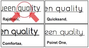
One common example of nastiness is where the descenders on lowercase p, g, y, q and sometimes z come crashing into an underline. Light bauhaus-influenced fonts with short descenders seem to suffer more than most typefaces.
As you can see below with Google Fonts such as Rajdhani and Poiret One, it’s visually difficult to discern the difference between a lowercase ‘q’ and an ‘a’ when an underline is involved.
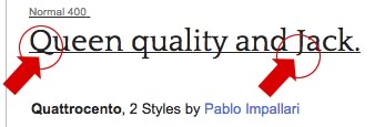
Likewise, the tail on capital ‘Q’ is usually fine with an underline, but can present serious problems with certain typefaces. For instance, Quattrocentro has a very low, horizontal tail that almost disappears in an underline. The small tail on the capital ‘J’ also becomes less clear.
Messy, right?
Is there a Solution?

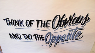
Signwriters have often used underlines in their work, but they typically clearly separate the line from letters.
Although we can’t literally break our underline into pieces, we can create the illusion that they break.
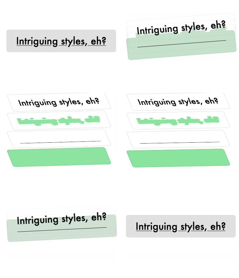
Adam Schwartz is someone who’s recently put some serious consideration into the problem. His ‘SmartUnderline’ approach uses CSS drop-shadows to generate a background-colored ‘halo’ around the text — while stripping away the default underline (text-decoration).
He then re-creates the underline using a background gradient, which pushes it back behind the text. This animation shows how the parts stack up.
I think it’s a really nice approach. Not only does it solve the ‘descender crash issue’, but it also hands the designer full control of your underline weight, color and vertical alignment.
I know in some cases it’s been exactly this lack of styling control that has pushed designers towards removing link underlines altogether. Maybe this would change their minds.
The only potential downside I could see, is situations where the halo color and the background aren’t kept in sync — perhaps a gray text box ends up with white glowing links.
Even this issue can be easily avoided with good CSS structuring and stylesguide documentation.
It’s clever stuff. Have a read.
Republished from the SitePoint Design Newsletter (archive)
 Alex Walker
Alex has been doing cruel and unusual things to CSS since 2001. He is the lead front-end design and dev for SitePoint and one-time SitePoint's Design and UX editor with over 150+ newsletter written. Co-author of The Principles of Beautiful Web Design. Now Alex is involved in the planning, development, production, and marketing of a huge range of printed and online products and references. He has designed over 60+ of SitePoint's book covers.


