Good design is key to any successful website for increasing user satisfaction and engagement.
Facebook, who currently has the largest user base in the world, says one of the most important ways they retain users is by focusing on user-friendly design (via Computer World), and Google says their number one philosophy, is to “Focus on the user and all else will follow.”
Clearly Google and Facebook have been doing something right to become the powerhouses they are today, so moving from their user-centered advice, how can you use good design to retain customers?
First off, you may be asking, what makes a design user-friendly, anyway?
Easy navigation:
Navigation should be as simple as possible – integrating tabs, paths linking pages, and linked text – so that users don’t get frustrated searching for the information they need.
If you’re stuck on how to make your navigation as effective as possible, check out
MarketingProf’s great guide to user-friendly navigation.
Smart placement:
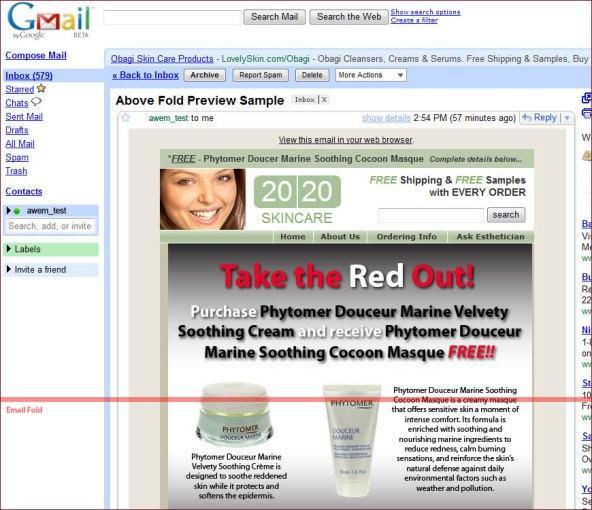
What goes above and below the fold is key.
High-impact visuals, important bullet points, and your call to action should be placed above the fold, so users see them as soon as they get to your page. Tagliaerbe offers these image examples of how to separate content above and below the fold.
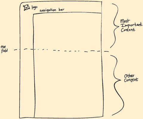
Place any expanded content below the fold so users can get more comprehensive info by scrolling down.
In other words, hook users with a taster of what you have to offer at first sight so they want to scroll down and engage with your website to get more information.
Attention to space:
Today’s users scan quickly, rather than read slowly.
Cluttered websites with large chunks of information confuse and distract users, so make sure your design is user-friendly by paying attention not just to placement, but how much space content takes up.

Go to any art gallery, and you won’t find the paintings butted up together, edge-to-edge. You could argue that if one masterpiece on a wall is good, two must be twice as good, right?
Of course, that’s not the case. We all understand that the negative space around each piece makes it more special.
Likewise, negative space, or whitespace, is your friend in design. This is any area not occupied by content, and balancing it with the areas that include content creates a design that is more effective overall.
Negative space can be used to separate chunks of text, graphics, and other lengthy information so users can relax and easily absorb the information. Negative space is also highly valuable when designing graphics or logos – see how FedEx used negative space effectively below (via Six Revisions ).
Great. So, you’ve got the basics and your site is designed to please the user, but how do you make sure your design enhances retention and engagement?
- Draw their eyes where you want by using highlighted and bolded text and graphics. Direct focus strategically to pull users in.
- Isolate important information and condense it as much as possible.
- Use bullet points, subheadings, and graphics to break up text.
- If you have big chunks of text, make it more manageable and visually appealing with appropriate line spacing.
And of course, never forget that you can’t read your users’ minds.
Test and test again to understand what users like and engage with and what they don’t. Usability tests help you understand your users’ browsing behavior and real responses to what works and what doesn’t. Tools such as UserTesting allow you to collect detailed metrics so you can integrate your users’ feedback and experience when improving your website’s design.
So, how does good design affect users’ experience?
Users subconsciously are attracted to designs that are comfortable while still being easy to comprehend quickly. It’s important to follow some conventions with your design.
Don’t surprise the user too much
While an innovative, gorgeously designed website may catch users’ eyes, it can also throw them off if you stray too far from what they are used to.
Established web design guidelines are based on tried-and-true browsing habits and following them makes the experience comfortable and familiar to users.
Look at popular websites – most of them don’t stray too far from standard design rules, such as including log-in buttons on the right hand side, navigation tabs on the top, and linked logos leading to more company information on the left.
Imagine how confused you would be if you arrived at a site and the log-in buttons were hidden on the bottom and the tabs ran down the sides.
Don’t surprise users too much or you risk turning them away.
But, by the same token, don’t be afraid to try something new…
How does Facebook know what it’s users want? By sometimes trying things users don’t know they want yet. As Henry Ford is reputed to have said, (but probably didn’t).”If I’d asked people what they wanted, they’d have asked for a faster horse“.
Facebook sometimes rolls out dramatic design changes slowly and allow users to opt-in at the beginning so they can use users’ feedback to adjust accordingly.
All of the design mainstays of the web — the three column design, log in panels, modal windows — were at one time novel, mold-breaking design ideas.
The Pinterest-style image wall is a recent example of a novel, non-standard design becoming a new pattern.
History tells us that most radical design ‘mutations’ end up as novelties, footnotes and interesting experiments.
But, a very small percentage of these design variations strike the right note at the right moment, and in a short time become a new design pattern that others follow.
Eric is Bitshakers resident tech junkie who loves everything digital and sharing his knowledge. BitShakers is a technology house for engaging and creative Apps that lead to revenue.