
Another day, another redesigned logo. MySpace is attempting to stage a comeback having fallen behind the times compared with sites like Facebook and Twitter.
In 2010, the site announced a revamp (which includes the new logo) and also that it would no longer try to compete with the aforementioned social networks but that it will work to become a “social entertainment destination for Gen Y.”
Myspace has been successful in recent years in promoting bands on video- and audio-heavy pages, but in terms of design it has always been a shambles. In the future there will be an emphasis on its strengths and an abandonment of some of the social network aspects of the site.
In a this video, we can see the My_ logo (it’s actually more akin to a sideways bracket than an underscore) in a variety of poses with cartoon characters, dancers and helicopters interacting with the “space.”

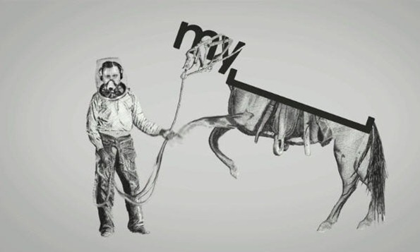
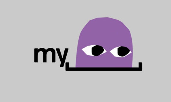
The new My_ logo as animated in yesterday’s video release

The old logo
So it’s goodbye to the three round-headed people and hello to the square bracket. I have to admit at first look I did think to myself “Dear God, what is that thing?” but in a strange way I’m warming to it. Maybe it’s because of the video, which I enjoyed, or maybe it’s because of the simplicity of the new look. It’s quite a dramatic change and a fairly bold move by Myspace. It makes you think there’s something missing, and that’s space. Presumably it’s easier to pull something like this off if your audience is already familiar with the name.
The bracket in the logo represents a space where people can express themselves, enabling users to personalize the logo and make it their own — just as they can throughout Myspace.
In a statement from the company’s CEO Mike Jones, he said, “Myspace is unique in that it is powered by the passions of our users, who program the site by expressing interests, sharing tastes and knowledge around particular topics, and scouting out up-and-coming subcultures,” Jones said in the statement. “This is just the first step and there will be many more features, programs and improvements to come.”
The redesign of the site is being rolled out now and should be available worldwide by the end of November and will give users personal entertainment-focused homepages, which are updated based on their interests.
From the screenshots I’ve seen it looks like a much cleaner design, although still holding quite a bit of information and the new logo fits in well.

What do you think of the new logo? Are you a Myspace user or do you think it’s irrelevant now?
Frequently Asked Questions about the MySpace Logo Redesign
What was the reason behind the MySpace logo redesign?
The MySpace logo redesign was a strategic move by the company to reposition itself in the market. The new logo was intended to reflect the company’s evolution from a social networking site to a social entertainment destination. The logo was designed to be more modern and dynamic, reflecting the company’s commitment to innovation and creativity.
Who designed the new MySpace logo?
The new MySpace logo was designed by Josephmark, a design consultancy based in Brisbane, Australia. The team at Josephmark worked closely with MySpace to create a logo that would reflect the company’s new direction and appeal to its target audience.
What does the new MySpace logo represent?
The new MySpace logo represents the company’s shift from a social networking site to a social entertainment platform. The logo features the word “My” followed by a symbol that represents a space. This symbol can be filled with various images or animations, representing the idea that MySpace is a platform where users can express their individuality and creativity.
How has the MySpace logo evolved over the years?
The MySpace logo has undergone several changes since the company was founded in 2003. The original logo featured the company’s name in a simple, sans-serif typeface. In 2010, the company introduced a new logo that featured the word “My” followed by a symbol representing a space. This logo was designed to reflect the company’s evolution and its focus on providing a platform for creativity and self-expression.
What was the public reaction to the MySpace logo redesign?
The public reaction to the MySpace logo redesign was mixed. Some praised the new logo for its modern and dynamic design, while others criticized it for being too abstract and difficult to understand. Despite the mixed reactions, the logo redesign was a significant step in the company’s rebranding efforts.
How does the MySpace logo compare to other social media logos?
The MySpace logo is unique in its design compared to other social media logos. While most social media logos feature the company’s name or initials, the MySpace logo features the word “My” followed by a symbol representing a space. This design reflects the company’s focus on individuality and creativity.
What is the significance of the “space” in the MySpace logo?
The “space” in the MySpace logo represents the idea that MySpace is a platform where users can express their individuality and creativity. The space can be filled with various images or animations, symbolizing the endless possibilities for self-expression on the platform.
What colors are used in the MySpace logo?
The MySpace logo is typically displayed in black and white, although it can also be displayed in other colors depending on the context. The use of black and white gives the logo a modern and minimalist look.
How has the MySpace logo influenced other logo designs?
The MySpace logo has influenced other logo designs with its unique use of space and symbolism. The logo’s design, which features a word followed by a symbol, has been emulated by other companies looking to convey a similar message of creativity and individuality.
What is the future of the MySpace logo?
The future of the MySpace logo is uncertain, as the company continues to evolve and adapt to changes in the market. However, the logo’s unique design and symbolism ensure that it will remain a significant part of the company’s brand identity.