Improvement is usually an incremental thing.
Look at your last two cars. Your last two cell phones. Smart people take the current best version of something and make a small adjustment to it — keeping all the other nice things that worked before. Baby and the bathwater.
But not always. Sometimes when the playing field evolves, radical invention get a slight edge.
Web interface design hasn’t changed a lot in the last 5 years. Sure, the coding techniques underlying it have evolved, but the visual structures are pretty similar — header, footer, column layouts, ‘teaser’ content leading to longer articles, etc.
However, the environment that our interfaces are being lauched into has changed. Users are more sophisticated, have faster connections, faster computers and smarter browsers (in relative terms) — all of which presents opportunities to try interfaces that wouldn’t have been possible 5 years ago.
The two following examples have been around for a little while but, I think, are worth spotlighting.
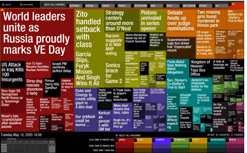
Case 1: Newsmap: Newsmap is a radical approach to understanding the current state of the world through Google News.
Stories on the same subject are grouped and ‘weighted’ on their prevalence — widely-reported stories have larger boxes. Stories are also color-coded by general category (World News, Sport, Health, National etc), currency (older stories are darker) and by country (by tab). I could spend 6 paragraphs explaining it in details but you’ll get a feel for it in seconds by using it.
The system is live and updates over literally minutes. Amazing work.
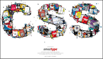
Case 2: Amaztype: The first time I saw Amaztype, it struck me as just a clever little gimmick to demonstrate Amazon’s Web Services. You enter a search term (let’s say, ‘CSS’) and the app uses Flash to pull down related cover images and stack them randomly into the shape of your search term.
Yeah, cute, but how useful?
Bizarrely enough, everyone here seemed to find it a remarkably efficient and satisfying way to browse for books. Clicking on any cover immediately pops up a box pulling down details of title, author, sales rank and price. More info is a click away — no doubt with an affiliate code locked in.
IMHO the cool thing about this interface is that, by happy accident, it comes off feeling like a ‘bricks-n-mortar’ book browsing experience. There is no navigation, no crumbtrails, no search boxes, no categories. You just pick up the cover that catches your eye. It’s like rumaging through the bargain table!
In both cases the examples probably break 9 out of 10 traditional web interface rules — but still manage to be useful and even quite usable regardless.
I’m certainly not suggesting the web, as we know it is, about to be set aflame with revolution,.. but it is amazing what is still possible with a little imagination.
 Alex Walker
Alex has been doing cruel and unusual things to CSS since 2001. He is the lead front-end design and dev for SitePoint and one-time SitePoint's Design and UX editor with over 150+ newsletter written. Co-author of The Principles of Beautiful Web Design. Now Alex is involved in the planning, development, production, and marketing of a huge range of printed and online products and references. He has designed over 60+ of SitePoint's book covers.