Designing a Custom Home Page for Your WordPress Website

WordPress is used on a large portion of sites on the web. It allows us to create a variety of different types of sites, but one of the most important components of any website is always the home page. The perfect landing page will help you to reduce bounce rates, boosting traffic and customers. In this article, we’ll cover how we can create a custom home page (or landing page) of a WordPress website.
There are many ways to achieve this goal, this is just one way.
Overview of What We Will Cover in This Article
First, we’ll complete these basic steps:
- Show a slider on the index page of WordPress.
- Show three panels for displaying a description of the products.
- Show two rows which contain details about your products with images and text side by side.
- Panels, showing your team members.
Then, we’ll look at the following advanced topics:
- Fetching the content from another page (for example from an About Us page).
- Creating a sidebar for the front page only.
- The most important aspect will be that we can change the images of the slider from the ‘WordPress Customizer’ option. We won’t need any plugins to add a slider or create a slideshow of images.
Things We’ll Need
- Kirki toolkit for providing options for the theme.
- Flexslider for providing the slider option.
Maria Antonietta Perna has covered Kirki in a previous article, if you’re looking for a good introduction on the topic.
Key Takeaways
- Optimize your WordPress home page by using the WordPress Customizer to easily modify elements like sliders and sidebars without needing additional plugins.
- Utilize the Kirki toolkit to enhance the WordPress Customizer’s capabilities, allowing for advanced customizations with minimal coding.
- Streamline design processes by organizing theme files within a ‘library’ folder for better management and modularity.
- Create a visually engaging product slider using Flexslider, directly integrated into your theme for showcasing key products or features prominently on the homepage.
- Employ custom templates for your homepage to maintain a unique layout that differentiates from other pages without altering the main index file.
- Leverage the power of Kirki to add and manage UI components such as panels, sections, and fields within the customizer, enhancing user interaction and experience.
- Ensure your homepage is both informative and appealing by including dynamic elements like team showcases, detailed product descriptions, and interactive sliders.
Note
For the sake of modularity, I’ve created a folder named library and put all the function files inside it so that it becomes easy to edit only the component that is necessary. Feel free to fork my theme at GitHub. In this theme, I’ve called all the files inside the library folder from the functions.php file. I’ve used Foundation CSS Framework for this theme.
You’ll find a file named theme-options.php inside the library folder which we will be editing the most in this tutorial. Open that file in your favorite text editor and get prepared to get your hands dirty!
Kirki
Kirki is not a framework. It’s a toolkit allowing WordPress developers to use the Customizer and take advantage of its advanced features and flexibility by abstracting the code and making it easier for everyone to create a beautiful and meaningful user experience.
We can use Kirki to add configurations, fields, sections and panels to the customizer. This does not replace the WordPress Customizer API. Kirki’s API is simply a wrapper for the default WordPress methods, simplifying the syntax and allowing you to write more with less code and taking advantage of some of its most advanced features.
Download Kirki files from GitHub and put it in a folder named ‘kirki’ inside of your theme folder.
First, you’ll have to create a new configuration. Configurations have a unique ID and all fields that use the same config_id will inherit the properties of that configuration.
Once you add your configuration you can then add panels, sections and fields. Please note that you should have at least one section in your customizer in order to be able to add fields. Fields can’t be ‘orphan’, they have to be grouped in a section.
Configuration
Kirki allows you to create configurations for your plugins or themes and group them by an ID. All fields that are then linked to that ID will inherit the configuration properties.
Kirki::add_config( 'my_theme', array(
    'capability'    => 'edit_theme_options',
    'option_type'   => 'option',
    'option_name'   => 'my_theme',
) );capability: any valid WordPress capability. See the WordPress Codex for details.option_type: can be either option or theme_mod.option_name: If you’re using options instead of theme mods then you can use this to specify an option name. All your fields will then be saved as an array under that option in the WordPress database.
Panels
Panels are wrappers for sections, a way to group multiple sections together.
Kirki::add_panel( 'panel_id', array(
    'priority'    => 10,
    'title'       => __( 'My Title', 'textdomain' ),
    'description' => __( 'My Description', 'textdomain' ),
) );
Sections
Sections are wrappers for fields, a way to group multiple fields together. All fields must belong to a section, no field can be an orphan.
Kirki::add_section( 'section_id', array(
    'title'          => __( 'My Title', 'textdomain' ),
    'description'    => __( 'My Description', 'textdomain' ),
    'panel'          => '', // Not typically needed.
    'priority'       => 160,
    'capability'     => 'edit_theme_options',
    'theme_supports' => '', // Rarely needed.
) );
Fields
Fields are the options such as text box and check box that are provided so that the users can input custom text inside it. Each field must be associated with a specific section only.
function my_custom_text_settings( $fields ) {
    // Add the controls
    $fields[] = array(
        'label'       => __( 'My custom control', 'translation_domain' ),
        'section'     => 'my_section',
        'settings'    => 'my_setting',
        'type'        => 'text',
        'priority'    => 10,
        'option_type' => 'theme_mod',
        'capability'  => 'edit_theme_options',
    );
    $fields[] = array(
        'label'       => __( 'My custom control 2', 'translation_domain' ),
        'section'     => 'my_section',
        'settings'    => 'my_setting_2',
        'type'        => 'text',
        'priority'    => 20,
        'option_type' => 'theme_mod',
        'capability'  => 'edit_theme_options',
    );
    return $fields;
}
add_filter( 'kirki/fields', 'my_custom_text_settings' );
Enough of the introduction. Now let’s customize our theme!
Integrating Kirki with Our Theme
The first thing we’ll need to do is to integrate Kirki with our theme. To do so, open your theme-options.php file which you’ll find in the library folder and add the following code to it:
// Integrating Kirki with our theme
include_once( get_template_directory() . '/kirki/kirki.php' );
The above code links the Kirki files with our theme. Please note that as mentioned earlier, the files that we downloaded from the GitHub source should be placed in a folder named ‘kirki’ inside the theme folder.
Creating the Configuration
As stated previously, we need to create a configuration which we can use with our options. Add the following code to your theme-options.php file.
// Adding the configuration
Kirki::add_config( 'mc', array(
    'capability'    => 'edit_theme_options',
    'option_type'   => 'option',
    'option_name'   => 'mc',
) );
We’ve successfully created a configuration for our theme. Now, we would be using mc as our option_name in our options.
Design
Let’s now look at the design of our landing page. Our home page will consist of the following:
- Product Slider (for showing a slideshow of your product pages).
- Description Boxes (for showing some information about your company).
- Product Details (for showing some details about your products).
- Team Showcase (for showing details about your team members).
We’ll be covering how to do these points one-by-one for our home page.
Note
All options will be customizable through the WordPress Customizer option. You will need to visit Appearance > Customize option inside your WordPress Admin panel to customize these options.
Creating a Custom Template for the Front Page
We wouldn’t want to change our index.php file since we can create a custom template for our front page. In this custom template, we will add our code so that it shows our customized front page. So, we’ll create a custom template which will show the contents in the front page.
Create a new file inside your theme folder called homepage.php and add the following:
/**
Template Name: Custom Homepage
**/
Inside this file, we add the code to show the slider.
We have to set this to our static front page. But, initially there isn’t a page that will be using this template. We will have to create a new page which will use this template. Follow the following steps:
- Create a new page (**Pages > Add new**).
- Add a title to the page (eg. **My Custom Homepage**).
- Select **Custom Homepage** from the **Template** dropdown under **Page Attributes**.
- Click on the **Publish** button.

Now, set the Static Front Page option inside the WordPress Customizer to A static page and select My Custom Homepage (or if you’ve used any other name for the page, select that one) from the dropdown below it.
Don’t forget to click on the Save & Publish button of the Customizer.
You won’t notice any visible changes inside the Customizer yet, since we haven’t added any code to our homepage.php file. Open homepage.php and let’s start adding code to it!
Let’s add the following code:
// Add the header
get_header();
// Add the footer
get_footer();
The above code includes our header.php and footer.php files from our current theme directory. If you refresh your Customizer now, you will probably see only the navigation and the footer menus.
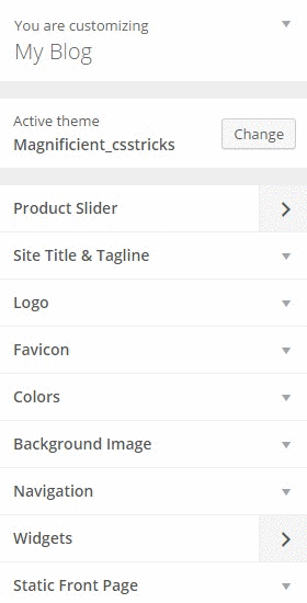
Product Slider
A Product Slider shows your most creative or your best-selling products. These are the products that a visitor sees first on your website. Creating a Product Slider involves the following steps:
- Creating a set of sliders (generally 5).
- Adding a background image to the slider.
- Adding a caption to the slider.
Creating a Set of Sliders
As mentioned previously, we’re using FlexSlider for showing a slider in our theme. So, first, we will need to download Flexslider from GitHub. We will only need to use the jquery.flexslider.js, flexslider.css, the bg_play_pause.png and the fonts folder. Copy these resources into your theme folder.
Note
If you’re working along with the theme I provided, you can copy jquery.flexslider.js inside the vendor folder, present inside the js folder, the flexslider.css file inside the css folder, the bg_play_pause.png file inside the images folder and the contents of the fonts folder (from the GitHub source of Flexslider) inside the fonts folder which is already inside the theme folder.
Now, we will need to enqueue these files with our theme. We’ll add the following enqueue code to the enqueue-scripts.php file present inside the library folder:
// adding flexslider scripts file in the footer
wp_register_script( 'flexslider-js', get_template_directory_uri() . '/js/vendor/jquery.flexslider.js', array( 'jquery' ), '', true );
wp_enqueue_script( 'flexslider-js' );
Next, we enqueue the CSS file inside our enqueue-style.php, inside the library folder using the following code:
// flexslider stylesheet
wp_register_style( 'magnificient-flexslider-stylesheet', get_stylesheet_directory_uri() . '/css/flexslider.css', array(), '' );
wp_enqueue_style( 'magnificient-flexslider-stylesheet' );
Congratulations! You have successfully enqueued the Flexslider files with your theme. You can check whether the enqueue has been successful by checking the source of your page. You can check the source of your page by right clicking on your page and clicking on view page source. Search for flexslider and you will find that the JS and CSS files has been successfully enqueued.
Note
If you’re not using the theme which I provided, you may need to edit the following parts: /js/vendor/jquery.flexslider.js and /css/flexslider.css and replace it with the path to your JS and CSS files.
First of all, let’s create a Panel inside our WordPress Customizer which will show the images, links and captions for our slider.
Open up theme-options.php again and add the following code to it:
// Adding the Product Slider panel
Kirki::add_panel( 'product_slider', array(
    'priority'    => 10,
    'title'       => __( 'Product Slider', 'magnificient' ),
    'description' => __( 'A slider to show the products', 'magnificient' ),
) );
The above code adds a Product Slider panel to our Customizer but it will not be visible since no sections have this panel and no fields contain any sections related to this panel. Confusing? Let’s proceed and it will become clearer.
Next, we need to add a section named Product Slider for Homepage. This can be done by adding the following code to the theme-options.php file:
// Adding the Product Slider for Homepage section
Kirki::add_section( 'product_slider_for_homepage', array(
    'title'          => __( 'Product Slider for Homepage', 'magnificient' ),
    'description'    => __( 'This slider will be shown on the front page of your website', 'magnificient' ),
    'panel'          => 'product_slider', // Not typically needed.
    'priority'       => 160,
    'capability'     => 'edit_theme_options',
    'theme_supports' => '', // Rarely needed.
) );
The above code adds the Product Slider for Homepage section inside the Product Slider panel.
Next, we add a field for showing images. We can create an image field using the following code:
// Adding the Product Slider image 1 field
Kirki::add_field( 'mc', array(
    'type'        => 'image',
    'settings'     => 'product_slider_image_1',
    'label'       => __( 'Product Slider image 1', 'magnificient' ),
    'description' => __( 'This image will be the first image for the Product Slider.', 'magnificient' ),
    'section'     => 'product_slider_for_homepage',
    'default'     => '',
    'priority'    => 10,
) );
Now, if we refresh our Customizer, we will see the Product Slider panel has appeared.
Through the image field, we can add images which will be shown in the slider. We will create four more similar fields so that we can have at least five images for the slider. The following code will add four more image fields:
// Adding the Product Slider image 2 field
Kirki::add_field( 'mc', array(
    'type'        => 'image',
    'settings'     => 'product_slider_image_2',
    'label'       => __( 'Product Slider image 2', 'magnificient' ),
    'description' => __( 'This image will be the second image for the Product Slider.', 'magnificient' ),
    'section'     => 'product_slider_for_homepage',
    'default'     => '',
    'priority'    => 10,
) );
// Adding the Product Slider image 3 field
Kirki::add_field( 'mc', array(
    'type'        => 'image',
    'settings'     => 'product_slider_image_3',
    'label'       => __( 'Product Slider image 3', 'magnificient' ),
    'description' => __( 'This image will be the third image for the Product Slider.', 'magnificient' ),
    'section'     => 'product_slider_for_homepage',
    'default'     => '',
    'priority'    => 10,
) );
// Adding the Product Slider image 4 field
Kirki::add_field( 'mc', array(
    'type'        => 'image',
    'settings'     => 'product_slider_image_4',
    'label'       => __( 'Product Slider image 4', 'magnificient' ),
    'description' => __( 'This image will be the fourth image for the Product Slider.', 'magnificient' ),
    'section'     => 'product_slider_for_homepage',
    'default'     => '',
    'priority'    => 10,
) );
// Adding the Product Slider image 5 field
Kirki::add_field( 'mc', array(
    'type'        => 'image',
    'settings'     => 'product_slider_image_5',
    'label'       => __( 'Product Slider image 5', 'magnificient' ),
    'description' => __( 'This image will be the fifth image for the Product Slider.', 'magnificient' ),
    'section'     => 'product_slider_for_homepage',
    'default'     => '',
    'priority'    => 10,
) );
We can upload images through these fields and then display them on the landing page.
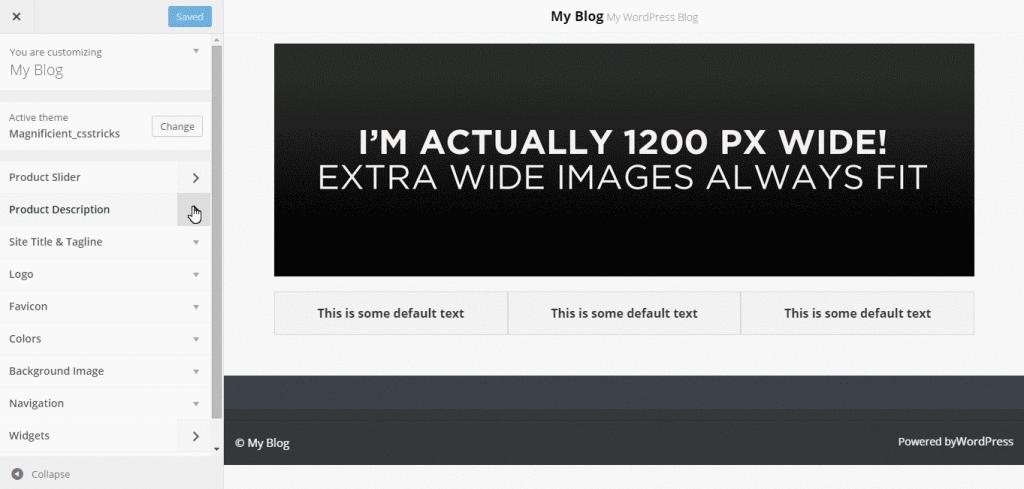
Adding a Background Image to the Slider
Now, we’ll be adding code for the Product Slider. Add the following code next to <?php get_header(); ?> inside a <?php tag:
// Getting  the images
$product_slider_image_1 = Kirki::get_option( mc, product_slider_image_1 );
$product_slider_image_2 = Kirki::get_option( mc, product_slider_image_2 );
$product_slider_image_3 = Kirki::get_option( mc, product_slider_image_3 );
$product_slider_image_4 = Kirki::get_option( mc, product_slider_image_4 );
$product_slider_image_5 = Kirki::get_option( mc, product_slider_image_5 );
These lines fetches the images for each slide that we had saved inside our Customizer. In our next step, we will check if any of these images exists or not. If any of them exists, we will call our slider.
// Check if any image exists
if ( $product_slider_image_1 || $product_slider_image_2 || $product_slider_image_3 || $product_slider_image_4 || $product_slider_image_5 ) {
This line checks whether any image inside any slide exists or not. If the image(s) exist, then flexslider is called. Now, we’ll echo out the images for each slide using the code below:
<div class="product-slider">
<ul class="slides">
<?php if ( $product_slider_image_1 ) { echo '<li><img src="'. $product_slider_image_1 .'" class="product-slider-image-1"></li>'; } ?>
<?php if ( $product_slider_image_2 ) { echo '<li><img src="'. $product_slider_image_2 .'" class="product-slider-image-2"></li>'; } ?>
<?php if ( $product_slider_image_3 ) { echo '<li><img src="'. $product_slider_image_3 .'" class="product-slider-image-3"></li>'; } ?>
<?php if ( $product_slider_image_4 ) { echo '<li><img src="'. $product_slider_image_4 .'" class="product-slider-image-4"></li>'; } ?>
<?php if ( $product_slider_image_5 ) { echo '<li><img src="'. $product_slider_image_5 .'" class="product-slider-image-5"></li>'; } ?>
</ul>
</div>Next, we just have to add the JavaScript for the Flexslider to work.
<script type="text/javascript">
    (function($) {
        $(window).load(function() {
            $('.product-slider').flexslider({
                animation: "slide",
                controlNav: false,
                directionNav: false,
                slideshowSpeed: 3000,
            });
        });
    })(jQuery);
</script>
Adding a Caption to the Slider
We can also add a caption to our slides. We just have to add a new field in our customizer that will accept the caption (text) for each slide and echo it out.
Let’s add the field first.
// Adding the Product Slider caption 1 field
Kirki::add_field( 'mc', array(
    'type'        => 'text',
    'settings'     => 'product_slider_caption_1',
    'label'       => __( 'Product Slider caption 1', 'magnificient' ),
    'description' => __( 'This caption will be the description for the first slide.', 'magnificient' ),
    'section'     => 'product_slider_for_homepage',
    'default'     => __( 'This is some default text', 'magnificient' ),
    'priority'    => 10,
) );
We can do a similar thing for four other slides.
Now, in the frontend, inside our Custom Homepage template, we need to edit our code a little to display these captions.
First, we need to store the captions in the variables:
//Getting the captions
$product_slider_caption_1 = Kirki::get_option( mc, product_slider_caption_1 );
$product_slider_caption_2 = Kirki::get_option( mc, product_slider_caption_2 );
$product_slider_caption_3 = Kirki::get_option( mc, product_slider_caption_3 );
$product_slider_caption_4 = Kirki::get_option( mc, product_slider_caption_4 );
$product_slider_caption_5 = Kirki::get_option( mc, product_slider_caption_5 );
Then, replace the following code:
<div class="product-slider">
<ul class="slides">
<?php if ( $product_slider_image_1 ) { echo '<li><img src="'. $product_slider_image_1 .'" class="product-slider-image-1"></li>'; } ?>
<?php if ( $product_slider_image_2 ) { echo '<li><img src="'. $product_slider_image_2 .'" class="product-slider-image-2"></li>'; } ?>
<?php if ( $product_slider_image_3 ) { echo '<li><img src="'. $product_slider_image_3 .'" class="product-slider-image-3"></li>'; } ?>
<?php if ( $product_slider_image_4 ) { echo '<li><img src="'. $product_slider_image_4 .'" class="product-slider-image-4"></li>'; } ?>
<?php if ( $product_slider_image_5 ) { echo '<li><img src="'. $product_slider_image_5 .'" class="product-slider-image-5"></li>'; } ?>
</ul>
</div>with the following code:
<div class="product-slider">
<ul class="slides">
<?php if ( $product_slider_image_1 )
{
?>
<li>
<img src="<?php echo $product_slider_image_1; ?>" class="product-slider-image-1" />
<?php if ( $product_slider_caption_1 ) { echo '<p class="flex-caption">'. $product_slider_caption_1 .'</p>'; } ?>
</li>
<?php
}
?>
<?php if ( $product_slider_image_2 )
{
?>
<li>
<img src="<?php echo $product_slider_image_2; ?>" class="product-slider-image-2" />
<?php if ( $product_slider_caption_2 ) { echo '<p class="flex-caption">'. $product_slider_caption_2 .'</p>'; } ?>
</li>
<?php
}
?>
<?php if ( $product_slider_image_3 )
{
?>
<li>
<img src="<?php echo $product_slider_image_3; ?>" class="product-slider-image-3" />
<?php if ( $product_slider_caption_3 ) { echo '<p class="flex-caption">'. $product_slider_caption_3 .'</p>'; } ?>
</li>
<?php
}
?>
<?php if ( $product_slider_image_4 )
{
?>
<li>
<img src="<?php echo $product_slider_image_4; ?>" class="product-slider-image-4" />
<?php if ( $product_slider_caption_4 ) { echo '<p class="flex-caption">'. $product_slider_caption_4 .'</p>'; } ?>
</li>
<?php
}
?>
<?php if ( $product_slider_image_5 )
{
?>
<li>
<img src="<?php echo $product_slider_image_5; ?>" class="product-slider-image-5" />
<?php if ( $product_slider_caption_5 ) { echo '<p class="flex-caption">'. $product_slider_caption_5 .'</p>'; } ?>
</li>
<?php
}
?>
</ul>
</div>Description Boxes
Description boxes can provide useful descriptions about our products. These boxes are positioned just below the slider so that it catches the attention of our visitors. These boxes are helpful if you want to show details about your products. Typically, there can be three to four boxes (or panels), but you can have more if you wish.
In this tutorial, we’re creating three boxes and are using the data-equalizer property of Foundation CSS Framework to provide uniform height for each panel.
Let’s get to work!
Creating the Panel
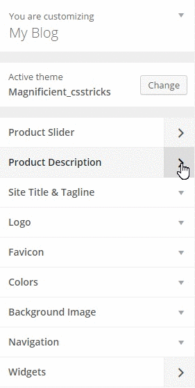
At first, we would be creating a separate panel for showing the description boxes. We can also provide all the options under the same panel (in the first panel we created), but it’s a good habit to keep things separate for later use.
We need to add the following code inside our theme-options.php file:
// Adding the Product Description panel
Kirki::add_panel( 'product_description', array(
    'priority'    => 10,
    'title'       => __( 'Product Description', 'magnificient' ),
    'description' => __( 'Panels to show description of the products', 'magnificient' ),
) );
Creating the Section
We will now create two sections for the Product Description. We’ll upload the images on one section and add the description in another section.
First, create a section for the images using the following code:
// Adding the Product Images for Homepage section
Kirki::add_section( 'product_images_for_homepage', array(
    'title'          => __( 'Product Images for Homepage', 'magnificient' ),
    'description'    => __( 'These images will be shown on the product description panels on the  front page of your website', 'magnificient' ),
    'panel'          => 'product_images', // Not typically needed.
    'priority'       => 160,
    'capability'     => 'edit_theme_options',
    'theme_supports' => '', // Rarely needed.
) );
We then create a section for the description:
// Adding the Product Description for Homepage section
Kirki::add_section( 'product_description_for_homepage', array(
    'title'          => __( 'Product Description for Homepage', 'magnificient' ),
    'description'    => __( 'These panels will be shown on the front page of your website', 'magnificient' ),
    'panel'          => 'product_description', // Not typically needed.
    'priority'       => 160,
    'capability'     => 'edit_theme_options',
    'theme_supports' => '', // Rarely needed.
) );
Creating the Fields
Next, we need to create three fields (since there will be three boxes and hence three images) for image input and after that we’ll be creating three fields for the product descriptions. The code looks like the following:
// Adding the Product Description Image 1 field
Kirki::add_field( 'mc', array(
    'type'        => 'image',
    'settings'     => 'product_description_image_1',
    'label'       => __( 'Product Description image 1', 'magnificient' ),
    'description' => __( 'This image will be the first image for the Product Description.', 'magnificient' ),
    'section'     => 'product_images_for_homepage',
    'default'     => '',
    'priority'    => 10,
) );
// Adding the Product Description Image 2 field
Kirki::add_field( 'mc', array(
    'type'        => 'image',
    'settings'     => 'product_description_image_2',
    'label'       => __( 'Product Description image 2', 'magnificient' ),
    'description' => __( 'This image will be the second image for the Product Description.', 'magnificient' ),
    'section'     => 'product_images_for_homepage',
    'default'     => '',
    'priority'    => 10,
) );
// Adding the Product Description Image 3 field
Kirki::add_field( 'mc', array(
    'type'        => 'image',
    'settings'     => 'product_description_image_3',
    'label'       => __( 'Product Description image 3', 'magnificient' ),
    'description' => __( 'This image will be the third image for the Product Description.', 'magnificient' ),
    'section'     => 'product_images_for_homepage',
    'default'     => '',
    'priority'    => 10,
) );
// Adding the Product Description Textarea 1 field
Kirki::add_field( 'mc', array(
    'type'        => 'textarea',
    'settings'     => 'product_description_textarea_1',
    'label'       => __( 'Product Description textarea 1', 'magnificient' ),
    'description' => __( 'This description will be the description for the first product.', 'magnificient' ),
    'section'     => 'product_description_for_homepage',
    'default'     => __( 'This is some default text', 'magnificient' ),
    'priority'    => 10,
) );
// Adding the Product Description Textarea 2 field
Kirki::add_field( 'mc', array(
    'type'        => 'textarea',
    'settings'     => 'product_description_textarea_2',
    'label'       => __( 'Product Description textarea 2', 'magnificient' ),
    'description' => __( 'This description will be the description for the second product.', 'magnificient' ),
    'section'     => 'product_description_for_homepage',
    'default'     => __( 'This is some default text', 'magnificient' ),
    'priority'    => 10,
) );
// Adding the Product Description Textarea 3 field
Kirki::add_field( 'mc', array(
    'type'        => 'textarea',
    'settings'     => 'product_description_textarea_3',
    'label'       => __( 'Product Description textarea 3', 'magnificient' ),
    'description' => __( 'This description will be the description for the third product.', 'magnificient' ),
    'section'     => 'product_description_for_homepage',
    'default'     => __( 'This is some default text', 'magnificient' ),
    'priority'    => 10,
) );
Displaying the Output
Now we will need to display the output on our custom template by using the following code.
$product_description_image_1 = Kirki::get_option( mc, product_description_image_1 );
$product_description_textarea_1 = Kirki::get_option( mc, product_description_textarea_1 );
if ( $product_description_image_1 ) {
    echo '<img src="'. $product_description_image_1 .'" class="product-description-image">';
}
if ( $product_description_textarea_1 ) {
    echo '<h6 class="product-description-textarea text-center">'. product_description_textarea_1 .'</h6>';
}
This displays the output for the first box. Similarly, we’ll do the same for the other two boxes.
$product_description_image_2 = Kirki::get_option( mc, product_description_image_2 );
$product_description_textarea_2 = Kirki::get_option( mc, product_description_textarea_2 );
if ( $product_description_image_2 ) {
    echo '<img src="'. $product_description_image_2 .'" class="product-description-image">';
}
if ( $product_description_textarea_2 ) {
    echo '<h6 class="product-description-textarea text-center">'. $product_description_textarea_2 .'</h6>';
}
$product_description_image_3 = Kirki::get_option( mc, product_description_image_3 );
$product_description_textarea_3 = Kirki::get_option( mc, product_description_textarea_3 );
if ( $product_description_image_3 ) {
    echo '<img src="'. $product_description_image_3 .'" class="product-description-image">';
}
if ( $product_description_textarea_3 ) {
    echo '<h6 class="product-description-textarea text-center">'. $product_description_textarea_3 .'</h6>';
}
Now go to your Customizer and add the images and the description and you’ll see the page displaying your input!
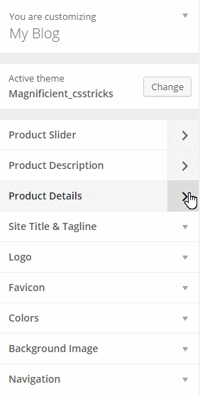
Product Details
This part contains two rows where there’s an image on one side and a description on the other side. This part or section of this page can be used as a visual for the most important aspects of the products to the visitors.
Creating the Panel
Let’s create a panel first. We’ll call it Product Details.
// Adding the Product Details panel
Kirki::add_panel( 'product_details', array(
    'priority'    => 10,
    'title'       => __( 'Product Details', 'magnificient' ),
    'description' => __( 'Panels to show details of the products', 'magnificient' ),
) );
Creating the Section
We’ll make a section for the fields using the code below:
// Adding the Product Details for Homepage section
Kirki::add_section( 'product_details_for_homepage', array(
    'title'          => __( 'Product Details for Homepage', 'magnificient' ),
    'description'    => __( 'This will show the details on the front page of your website', 'magnificient' ),
    'panel'          => 'product_details', // Not typically needed.
    'priority'       => 160,
    'capability'     => 'edit_theme_options',
    'theme_supports' => '', // Rarely needed.
) );
Creating the Fields
Similar to the previously covered concepts, we’ll create two image fields and two text area fields using the code below.
// Adding the Product Details image 1 field
Kirki::add_field( 'mc', array(
    'type'        => 'image',
    'settings'     => 'product_details_image_1',
    'label'       => __( 'Product Details image 1', 'magnificient' ),
    'description' => __( 'This image will be the first image for the Product Details.', 'magnificient' ),
    'section'     => 'product_details_for_homepage',
    'default'     => '',
    'priority'    => 10,
) );
// Adding the Product Details image 2 field
Kirki::add_field( 'mc', array(
    'type'        => 'image',
    'settings'     => 'product_details_image_2',
    'label'       => __( 'Product Details image 2', 'magnificient' ),
    'description' => __( 'This image will be the second image for the Product Details.', 'magnificient' ),
    'section'     => 'product_details_for_homepage',
    'default'     => '',
    'priority'    => 10,
) );
// Adding the Product Details textarea 1 field
Kirki::add_field( 'mc', array(
    'type'        => 'textarea',
    'settings'     => 'product_details_textarea_1',
    'label'       => __( 'Product Details textarea 1', 'magnificient' ),
    'description' => __( 'This description will be the details for the first product.', 'magnificient' ),
    'section'     => 'product_details_for_homepage',
    'default'     => __( 'This is some default text', 'magnificient' ),
    'priority'    => 10,
) );
// Adding the Product Details textarea 2 field
Kirki::add_field( 'mc', array(
    'type'        => 'textarea',
    'settings'     => 'product_details_textarea_2',
    'label'       => __( 'Product Details textarea 2', 'magnificient' ),
    'description' => __( 'This description will be the details for the second product.', 'magnificient' ),
    'section'     => 'product_details_for_homepage',
    'default'     => __( 'This is some default text', 'magnificient' ),
    'priority'    => 10,
) );
Showing the Output
We need to show the output on the custom homepage template. Open up your homepage.php file and add the following code:
<?php
    $product_details_image_1 = Kirki::get_option( mc, product_details_image_1 );
    $product_details_textarea_1 = Kirki::get_option( mc, product_details_textarea_1 );
    if ( $product_details_image_1 || $product_details_textarea_1 ) {
?>
        <div class="row" data-equalizer id="product-details-one">
            <div class="large-6 columns panel" data-equalizer-watch id="product-image">
                <?php
                    if ( $product_details_image_1 ) {
                        echo '<img src="'. $product_details_image_1 .'" />';
                    }
                ?>
            </div>
            <div class="large-6 columns panel" data-equalizer-watch id="product-description">
                <?php
                    if ( $product_details_textarea_1 ) {
                        echo '<h6>'. $product_details_textarea_1 .'</h6>';
                    }
                ?>
            </div>
        </div>
<?php
    }
?>
Just do the same for the other row too. Then, go to your Customizer and refresh it.

Team Showcase
This section of the page is used to provide some information about your team. This section should is useful, because it lets our visitors get to know who they will be working with.
Typically, this section might consist of a lot of team members. In this example, we’ll be only providing options for three members, but you can extend it as needed.
Creating the Panel
We’ll create a new panel and call it Team Showcase.
// Adding the Team Showcase panel
Kirki::add_panel( 'team_showcase', array(
    'priority'    => 10,
    'title'       => __( 'Team Showcase', 'magnificient' ),
    'description' => __( 'A section to show your team', 'magnificient' ),
) );
Creating the Section
Next, we’ll create a section that has options for the team showcase.
// Adding the Team Showcase for Homepage section
Kirki::add_section( 'team_showcase_for_homepage', array(
    'title'          => __( 'Team Showcase for Homepage', 'magnificient' ),
    'description'    => __( 'This will show the team members on the front page of your website', 'magnificient' ),
    'panel'          => 'team_showcase', // Not typically needed.
    'priority'       => 160,
    'capability'     => 'edit_theme_options',
    'theme_supports' => '', // Rarely needed.
) );
Creating the Fields
There will be a total of six fields which consist of three image fields for the avatars and three text fields for the names of the members.
// Adding the Team Showcase image 1 field
Kirki::add_field( 'mc', array(
    'type'        => 'image',
    'settings'     => 'team_showcase_image_1',
    'label'       => __( 'Team Showcase image 1', 'magnificient' ),
    'description' => __( 'This image will be the first image for the Team Showcase.', 'magnificient' ),
    'section'     => 'team_showcase_for_homepage',
    'default'     => '',
    'priority'    => 10,
) );
// Adding the Team Showcase image 2 field
Kirki::add_field( 'mc', array(
    'type'        => 'image',
    'settings'     => 'team_showcase_image_2',
    'label'       => __( 'Team Showcase image 2', 'magnificient' ),
    'description' => __( 'This image will be the second image for the Team Showcase.', 'magnificient' ),
    'section'     => 'team_showcase_for_homepage',
    'default'     => '',
    'priority'    => 10,
) );
// Adding the Team Showcase image 3 field
Kirki::add_field( 'mc', array(
    'type'        => 'image',
    'settings'     => 'team_showcase_image_3',
    'label'       => __( 'Team Showcase image 3', 'magnificient' ),
    'description' => __( 'This image will be the third image for the Team Showcase.', 'magnificient' ),
    'section'     => 'team_showcase_for_homepage',
    'default'     => '',
    'priority'    => 10,
) );
// Adding the Team Showcase text 1 field
Kirki::add_field( 'mc', array(
    'type'        => 'text',
    'settings'     => 'team_showcase_text_1',
    'label'       => __( 'Team Member 1', 'magnificient' ),
    'description' => __( 'Name of the first member.', 'magnificient' ),
    'section'     => 'team_showcase_for_homepage',
    'default'     => __( 'John Doe', 'magnificient' ),
    'priority'    => 10,
) );
// Adding the Team Showcase text 2 field
Kirki::add_field( 'mc', array(
    'type'        => 'text',
    'settings'     => 'team_showcase_text_2',
    'label'       => __( 'Team Member 2', 'magnificient' ),
    'description' => __( 'Name of the second member.', 'magnificient' ),
    'section'     => 'team_showcase_for_homepage',
    'default'     => __( 'John Doe', 'magnificient' ),
    'priority'    => 10,
) );
// Adding the Team Showcase text 3 field
Kirki::add_field( 'mc', array(
    'type'        => 'text',
    'settings'     => 'team_showcase_text_3',
    'label'       => __( 'Team Member 3', 'magnificient' ),
    'description' => __( 'Name of the third member.', 'magnificient' ),
    'section'     => 'team_showcase_for_homepage',
    'default'     => __( 'John Doe', 'magnificient' ),
    'priority'    => 10,
) );
Showing the Output
We’ll now display the images and names of the three members of the team on our Custom Homepage template. Open up homepage.php and insert the following:
Let’s first store the values of the images and the text in the variables.
// For team member 1
$team_showcase_image_1 = Kirki::get_option( mc, team_showcase_image_1 );
$team_showcase_text_1 = Kirki::get_option( mc, team_showcase_text_1 );
// For team member 2
$team_showcase_image_2 = Kirki::get_option( mc, team_showcase_image_2 );
$team_showcase_text_2 = Kirki::get_option( mc, team_showcase_text_2 );
// For team member 3
$team_showcase_image_3 = Kirki::get_option( mc, team_showcase_image_3 );
$team_showcase_text_3 = Kirki::get_option( mc, team_showcase_text_3 );
Then, we can show each member using the code below:
//Team Member 1
if ( $team_showcase_image_1 ) { echo '<img src="'. $team_showcase_image_1 .'" />'; }
if ( $team_showcase_text_1 ) { echo '<h6 class="team-showcase-member text-center">'. $team_showcase_text_1 .'</h6>'; }
//Team Member 2
if ( $team_showcase_image_1 ) { echo '<img src="'. $team_showcase_image_1 .'" />'; }
if ( $team_showcase_text_1 ) { echo '<h6 class="team-showcase-member text-center">'. $team_showcase_text_1 .'</h6>'; }
//Team Member 3
if ( $team_showcase_image_1 ) { echo '<img src="'. $team_showcase_image_1 .'" />'; }
if ( $team_showcase_text_1 ) { echo '<h6 class="team-showcase-member text-center">'. $team_showcase_text_1 .'</h6>'; }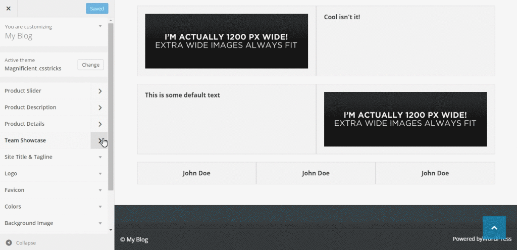
Advanced Topics
Fetching the Content from Another Page
We can also fetch the content of another page into our home page. This is particularly useful if you want to show some information about your company and you already have an About Us page. You don’t need to write the same content all over again. You can just fetch that content using Kirki.
We can create a separate panel for providing this option, let’s do this!
Here’s the code for the panel:
// Adding the Frontpage Separate Page Content panel
Kirki::add_panel( 'front_page_separate_page_content', array(
    'priority'    => 10,
    'title'       => __( 'Frontpage Separate Page Content', 'magnificient' ),
    'description' => __( 'A section to fetch content from another page', 'magnificient' ),
) );
And here’s the code for the section:
// Adding the Frontpage Separate Page Content for Homepage section
Kirki::add_section( 'front_page_separate_page_content_for_homepage', array(
    'title'          => __( 'Frontpage Separate Page Content for Homepage', 'magnificient' ),
    'description'    => __( 'This will show the separate page content on the front page of your website', 'magnificient' ),
    'panel'          => 'front_page_separate_page_content', // Not typically needed.
    'priority'       => 160,
    'capability'     => 'edit_theme_options',
    'theme_supports' => '', // Rarely needed.
) );
Next, we’ll show a dropdown from where the admin can choose which page to show on the front page. We can use the dropdown-pages option of Kirki.
We can add the field using the following:
// Adding the Separate Page Content dropdown field
Kirki::add_field( 'mc', array(
    'type'        => 'dropdown-pages',
    'settings'     => 'front_page_separate_page_content_dropdown',
    'label'       => __( 'Frontpage Separate Page Content', 'kirki' ),
    'description' => __( 'Select the page whose content will be shown on the front page inside the frontpage separate page section', 'kirki' ),
    'section'     => 'front_page_separate_page_content_for_homepage',
    'default'     => '',
    'priority'    => 10,
) );
This enables the option inside the WordPress Customizer. We can now edit our homepage.php file to show the content. Open up that file and copy the following code where you want this content to be shown:
$front_page_separate_page_content_dropdown = Kirki::get_option( mc, front_page_separate_page_content_dropdown );
if ( $front_page_separate_page_content_dropdown ) {
    $front_page_separate_page_content_dropdown_content = get_post_field('post_content', $front_page_separate_page_content_dropdown);
    echo $front_page_separate_page_content_dropdown_content;
}
Creating a Sidebar for the Frontpage Only
Creating a sidebar for your theme is simple if you follow the WordPress Codex. Rather than go into too much detail here, I would just add the sidebar to this theme by using the following code inside the library/widget-areas.php file.
Open up widget-areas.php and add the following:
// Frontpage Sidebar
register_sidebar(array('name'=> 'Frontpage Sidebar',
    'id' => 'frontpage-sidebar',
    'description' => __(  'This is the sidebar which will be visible only on the frontpage (homepage) of your website.', 'magnificient' ),
    'before_widget' => '<article id="%1$s" class="panel widget %2$s">',
    'after_widget' => '</article>',
    'before_title' => '<h4>',
    'after_title' => '</h4>'
));
Note
The widget-areas.php file located inside the library folder contains all the widget areas for this theme, so I’ve added the sidebar code there.
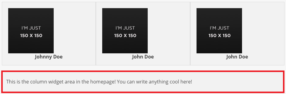
Then, we just have to edit our homepage.php file to show this widget area on that page. Open up your homepage.php and add the following code:
<?php dynamic_sidebar("frontpage-sidebar"); ?>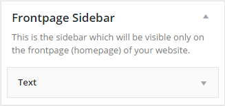
Now, when you add a widget in this sidebar, it will be shown on the frontpage only.
Wrapping It Up
In this tutorial, I’ve explained how to make a landing page for your WordPress website using the Kirki toolkit. You can decorate this with some CSS and customize it just the way you like. It would be great have any cool ideas about implementing this toolkit and let me know in the comments section below. If you encounter any problems or have any questions, just let me know and I’ll be glad to help.
Frequently Asked Questions on Designing a Custom Home Page for Your WordPress Website
How Can I Create a Static Front Page in WordPress?
Creating a static front page in WordPress is quite simple. First, you need to log in to your WordPress dashboard. Then, go to ‘Pages’ and click on ‘Add New’. Name this new page ‘Home’ or any other name you prefer. After that, create another new page and name it ‘Blog’ or ‘Posts’. Once you’ve created these two pages, go to ‘Settings’, then ‘Reading’. Under ‘Your homepage displays’, select ‘A static page’. In the dropdown menus, set ‘Homepage’ to the page you created for your home and ‘Posts page’ to the page you created for your blog or posts. Click ‘Save Changes’ to finalize your settings.
How Can I Customize My WordPress Homepage?
WordPress offers a variety of ways to customize your homepage. You can use the WordPress Customizer, which allows you to preview changes in real-time. To access it, go to ‘Appearance’, then ‘Customize’. Here, you can change your site’s identity, colors, background image, menus, widgets, and more. Alternatively, you can use a page builder plugin like Elementor or Beaver Builder. These plugins provide a drag-and-drop interface that makes it easy to design your homepage exactly how you want it.
What Are Some Best Practices for Designing a WordPress Homepage?
When designing a WordPress homepage, it’s important to keep your audience and purpose in mind. Make sure your homepage clearly communicates who you are and what you do. Use high-quality images and compelling headlines to grab visitors’ attention. Keep your design clean and simple to make it easy for visitors to navigate your site. Also, make sure your site is mobile-friendly, as a large percentage of web traffic comes from mobile devices.
How Can I Add a Custom Header to My WordPress Homepage?
To add a custom header to your WordPress homepage, go to ‘Appearance’, then ‘Customize’. Click on ‘Header’ or ‘Header Image’, depending on your theme. From here, you can upload a new image, crop it to your desired size, and add any text or links you want. Click ‘Save & Publish’ when you’re done.
How Can I Add a Custom Footer to My WordPress Homepage?
Adding a custom footer to your WordPress homepage is similar to adding a custom header. Go to ‘Appearance’, then ‘Customize’. Click on ‘Footer’ or ‘Footer Settings’, depending on your theme. Here, you can customize your footer text, add widgets, and change the layout. Click ‘Save & Publish’ when you’re done.
How Can I Add a Slider to My WordPress Homepage?
To add a slider to your WordPress homepage, you’ll need a slider plugin like Slider Revolution or Smart Slider 3. Once you’ve installed and activated your chosen plugin, you can create a new slider, add images, and customize the settings. Then, you can add the slider to your homepage using a shortcode, widget, or template tag, depending on the plugin.
How Can I Add a Blog Section to My WordPress Homepage?
To add a blog section to your WordPress homepage, first, make sure you’ve created a separate page for your blog posts. Then, go to ‘Appearance’, then ‘Customize’. Click on ‘Homepage Settings’ and select ‘Your latest posts’ under ‘Your homepage displays’. This will display your most recent blog posts on your homepage.
How Can I Add Social Media Icons to My WordPress Homepage?
To add social media icons to your WordPress homepage, you can use a social media plugin like Social Media Widget or Simple Social Icons. Once you’ve installed and activated your chosen plugin, you can add your social media links and choose your preferred icon style and size. Then, you can add the social media icons to your homepage using a widget.
How Can I Make My WordPress Homepage SEO-Friendly?
To make your WordPress homepage SEO-friendly, start by choosing a clean, responsive theme. Use an SEO plugin like Yoast SEO to optimize your title tag and meta description. Include relevant keywords in your content, but avoid keyword stuffing. Use header tags to structure your content and make it easier to read. Also, make sure your site loads quickly, as page speed is a ranking factor.
How Can I Add a Contact Form to My WordPress Homepage?
To add a contact form to your WordPress homepage, you’ll need a contact form plugin like Contact Form 7 or WPForms. Once you’ve installed and activated your chosen plugin, you can create a new contact form and customize the fields as needed. Then, you can add the contact form to your homepage using a shortcode.
I'm a computer science engineer specializing in web design and development with an eye for detail. I love working with React.js.

