
Charts are among the most essential components of web applications. A wide range of applications, from analytics dashboards to financial platforms, use charts. They help users understand data faster than tables or plain numbers.
One method for creating charts on the web is to use SVG. SVG charts are built with Scalable Vector Graphics, a browser-supported format that lets developers draw shapes, lines, text, and paths directly in HTML. Since SVG is resolution-independent, it can produce clean, sharp visuals across different screen sizes and devices.
In this guide, we will look at what SVG charts are, how they work, and how to build a simple SVG bar chart. We will also discuss when to use a charting library instead of creating charts manually.
TL;DR
SVG charts are scalable, sharp, and flexible data visualizations built with Scalable Vector Graphics. They are useful for simple web charts, custom UI visuals, and interactive elements that can be styled with CSS and updated with JavaScript. Developers can build basic SVG charts manually using elements like <svg>, <rect>, <line>, <circle>, <text>, and <path>. However, manual SVG chart development becomes more difficult when applications require advanced features, large datasets, responsiveness, tooltips, legends, exports, or real-time updates. For production dashboards and complex web applications, a charting library is often the faster and more practical choice.
What Are SVG Charts?
SVG charts are data visualizations created using Scalable Vector Graphics. SVG is an XML-based format used to draw two-dimensional graphics in the browser. It can be written directly inside HTML and styled with CSS.
Unlike raster images, SVG graphics do not lose quality when they are resized. This makes them useful for charts that need to look sharp on desktops, mobile devices, and high-resolution screens.
An SVG chart is usually made by combining basic graphic elements such as rectangles, lines, circles, text labels, and paths. For example, a bar chart can be created using rectangles. A line chart can be created using lines or paths. A scatter plot can use circles to represent data points.
Because SVG elements are part of the DOM, developers can style, animate, and make them interactive using CSS and JavaScript.
Why Use SVG for Charts?
SVG is a good option for many charting use cases because it gives developers direct control over how each part of the chart is drawn. This is useful when you need custom visuals or lightweight charts without relying on a large external library.
- One of the biggest advantages of SVG charts is scalability. Since SVG uses vector graphics, the chart remains sharp even when it is resized. This is especially helpful for responsive web applications where the same chart may appear on different screen sizes.
- SVG charts also provide clean visuals. Lines, shapes, and text can look crisp on modern displays. It makes SVG a strong choice for dashboards and reports where readability matters.
- Another benefit is DOM access. Each SVG element can be selected and modified using JavaScript. For example, you can change the height of a bar, update the color of a line, or show a tooltip when a user hovers over a data point.
- SVG also works well with CSS. You can style chart elements using classes, add hover effects, and create simple animations. This makes it easier to match charts with the visual design of a web application.
- Interactivity is another reason developers use SVG charts. Since SVG elements behave like regular DOM elements, they can respond to events such as clicks, mouse movements, and keyboard interactions.
- Accessibility is also possible with SVG. Developers can add labels, titles, descriptions, and ARIA attributes to make charts easier for users who rely on assistive technologies to understand.
- SVG is supported by modern browsers. Developers can use it directly in HTML without extra rendering plugins.
How SVG Charts Work
SVG charts are built using SVG elements. These elements define the visual parts of the chart.
- The main container is the <svg> element. It defines the chart's drawing area. Inside the <svg> element, you can add shapes, lines, text, and paths.
- The <rect> element is used to draw rectangles. It is commonly used for bar charts because each bar can be represented as a rectangle with a specific width and height.
- The <line> element is used to draw straight lines. It can be used for axes, grid lines, or simple line charts.
- The <circle> element is used to draw circles. It is useful for scatter plots, data points, and markers.
- The <text> element is used to add labels, values, and axis text to the chart.
- The <path> element is one of the most flexible SVG elements. It can draw complex shapes, curves, and connected lines. It is often used for line charts, area charts, and custom chart shapes.
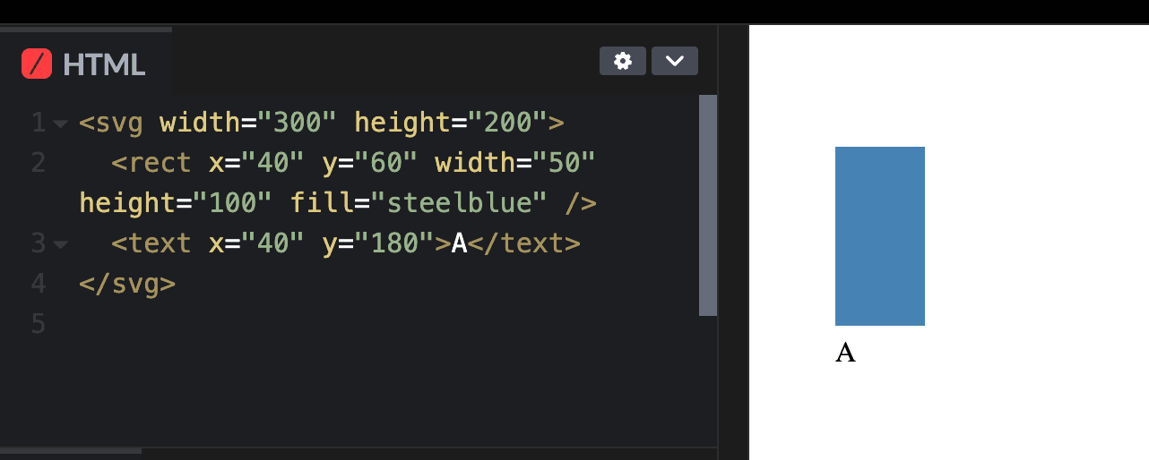
Here is a simple SVG example:
<svg width="300" height="200">
  <rect x="40" y="60" width="50" height="100" fill="steelblue"></rect>
  <text x="40" y="180">A</text>
</svg>
In this example, the <svg> element creates a drawing area. The <rect> element draws a bar. The <text> element adds a label below the bar.
The position of each SVG element is controlled using coordinates. The x and y attributes define where an element starts. Width and height define the size of shapes such as rectangles.
One important thing to understand is that the SVG coordinate system starts from the top-left corner. This means the y value increases as you move downward. For charts, developers often need to calculate bar positions carefully so that the bars appear to grow upward visually.
You can see this basic bar chart in CodePen below:
A Basic SVG Bar Chart Drawn in CodePen
How to Build a Simple SVG Bar Chart
Let’s build a simple SVG bar chart using HTML and basic SVG elements.
Suppose we have the following data:
const data = [
  { label: "Jan", value: 40 },
  { label: "Feb", value: 70 },
  { label: "Mar", value: 55 },
  { label: "Apr", value: 90 }
];
We can create a basic bar chart manually using SVG:
<svg width="400" height="250" viewBox="0 0 400 250">
  <!-- Chart axis -->
  <line x1="40" y1="200" x2="360" y2="200" stroke="#333"></line>
  <line x1="40" y1="30" x2="40" y2="200" stroke="#333"></line>

  <!-- Bars -->
  <rect x="70" y="120" width="40" height="80" fill="#3498db"></rect>
  <rect x="140" y="60" width="40" height="140" fill="#3498db"></rect>
  <rect x="210" y="90" width="40" height="110" fill="#3498db"></rect>
  <rect x="280" y="20" width="40" height="180" fill="#3498db"></rect>

  <!-- Labels -->
  <text x="78" y="220" font-size="14">Jan</text>
  <text x="148" y="220" font-size="14">Feb</text>
  <text x="218" y="220" font-size="14">Mar</text>
  <text x="288" y="220" font-size="14">Apr</text>
</svg>
This creates a simple bar chart with four bars. Each <rect> element represents one data value. The height of the rectangle controls the height of the bar, while the y value controls where the bar starts.
For example:
<rect x="140" y="60" width="40" height="140" fill="#3498db"></rect>
This bar starts at x="140" and y="60". It has a width of 40 and a height of 140.
Because the SVG coordinate system starts at the top, a taller bar usually requires a smaller y-value. This is why the tallest bar in the example starts closer to the top of the SVG area.
You can also add hover effects using CSS:
rect {
    transition: opacity 0.2s ease;
  }

  rect:hover {
    opacity: 0.7;
    cursor: pointer;
  }
This makes the bars slightly fade when the user hovers over them.
Here is our simple SVG bar chart in CodePen:
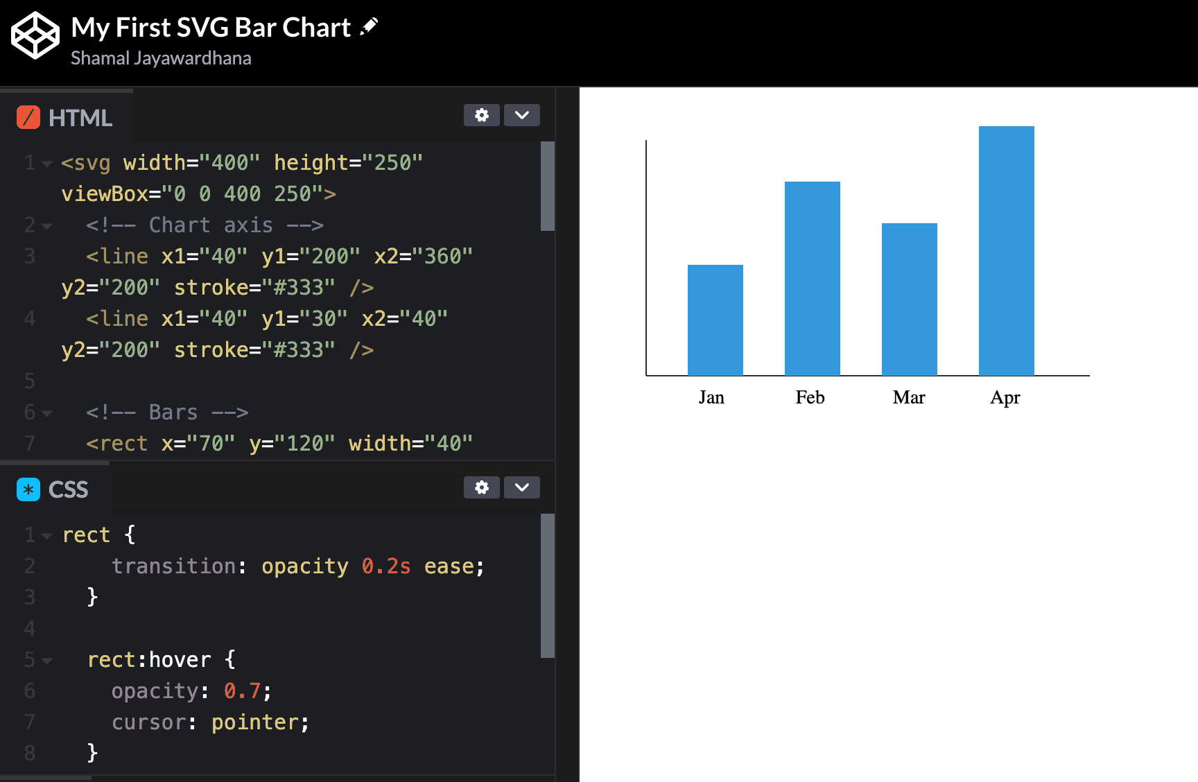
A simple HTML and SVG bar chart built in CodePen
For small charts, this manual approach works well. It helps developers understand how chart graphics are drawn in the browser. But as charts become more complex, the amount of manual work increases quickly.
Common Use Cases for SVG Charts in Web Applications
SVG charts are useful in web applications where visual clarity, responsiveness, and interaction matter. They work well for dashboards, admin panels, analytics pages, and custom UI components.
For example, SVG can be a good choice for simple bar charts, line charts, progress charts, KPI widgets, and small interactive visuals. Since SVG elements can be styled with CSS and updated with JavaScript, developers can match the chart design with the rest of the application interface.
SVG charts are also helpful when users need to interact with specific parts of a chart. A user can hover over a bar, click a data point, or view extra details through a tooltip. This makes SVG suitable for charts that need more than a static image.
However, SVG is usually better for small to medium-sized datasets. If an application needs to render thousands of data points or provide frequent real-time updates, developers may need to consider Canvas or a performance-optimized charting library.
Limitations of Building Charts Manually with SVG
Although SVG charts are powerful, building them manually has limitations.
The first limitation is complexity. A simple bar chart is easy to create. But more advanced charts require much more work. Line charts, stacked charts, pie charts, area charts, maps, real-time charts, and interactive dashboards can become difficult to manage manually.
The second limitation is data calculation. Developers need to calculate scales, positions, dimensions, axis labels, spacing, and responsive behavior. These calculations can become complicated as the dataset grows.
The third limitation is responsiveness. Creating a chart that looks good across desktop, tablet, and mobile screens requires careful planning. You may need to adjust labels, spacing, font sizes, and chart dimensions.
The fourth limitation is interactivity. Basic hover effects are simple. But advanced interactions such as zooming, panning, drill-downs, legends, tooltips, and exports require more JavaScript.
Performance can also become an issue. Since SVG elements are part of the DOM, charts with thousands of elements may render and update more slowly. For very large datasets, other rendering methods may be more suitable.
Maintenance is another challenge. A manually built chart may work for one use case, but it can become harder to update as product requirements change. If your application requires multiple chart types, maintaining custom SVG logic for each can take a lot of development time.
SVG Charts vs Canvas Charts
SVG and Canvas are both used for web-based data visualization, but they work in different ways.
SVG is vector-based and DOM-based. Each visual element in an SVG chart exists as an individual element in the page. This makes SVG easier to inspect, style, and interact with using CSS and JavaScript.
Canvas, on the other hand, is pixel-based. It uses JavaScript to draw graphics on a bitmap surface. Once something is drawn on Canvas, it does not exist as a separate DOM element. This can make interactions with individual elements more difficult, but Canvas can perform better with large datasets or graphics-heavy visualizations.
SVG is often a good choice when you need sharp visuals, accessibility, styling control, and the ability to interact with individual chart elements.
Canvas is often a better choice when you need to render large volumes of data, complex animations, or high-performance visualizations.
For a deeper comparison, you can read this guide on Canvas vs SVG charts, which explains how both rendering approaches work and when to use each.
In many web applications, the right choice depends on the chart type, dataset size, interactivity needs, and performance requirements.
When to Use a Charting Library Instead of Manual SVG
Manual SVG charts are useful for learning, prototyping, and building small custom visualizations. They give developers full control and help explain how chart rendering works.
However, a charting library is usually a better choice for production applications.
If your application needs multiple chart types, manual SVG development can become time-consuming. A charting library provides ready-made charts, including bar, line, pie, and area charts, as well as heatmaps, gauges, maps, and more.
If your users need interactivity, a charting library can also save a lot of work. Features such as tooltips, legends, drill-downs, zooming, real-time updates, and exports often come built in.
A charting library is also useful when your team needs consistency. Instead of building every chart from scratch, developers can use a shared charting system across the application.
For business dashboards, SaaS platforms, analytics tools, and enterprise reporting applications, this can be a major advantage.
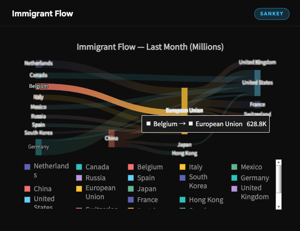
A Sankey Chart Built with a Charting Library
In short, manual SVG is great for simple charts and custom controls. A charting library is better when your application needs scale, consistency, advanced features, and faster development.
Final Thoughts
SVG charts are a powerful way to create scalable, sharp, and interactive data visualizations for web applications. They work well for simple charts, custom graphics, and use cases where developers need direct control over chart elements.
By using SVG elements such as <svg>, <rect>, <line>, <circle>, <text>, and <path>, developers can build charts directly in HTML. This makes SVG a useful skill for anyone working with web-based data visualization.
However, building charts manually with SVG also has limits. As chart requirements grow, developers need to handle scaling, responsiveness, accessibility, interactivity, performance, and maintenance.
For simple projects, manual SVG charts may be enough. For larger applications, dashboards, and analytics products, a charting library can help teams build better charts faster.
The best approach depends on your project. If you need a lightweight custom chart, SVG is a great place to start. If you need advanced interactive visualizations for production, using a charting library can save time and reduce complexity. </path></text></circle></line></rect></svg></rect></text></rect></svg></path></text></circle></line></rect></svg></svg></path></text></circle></line></rect></svg>