
Key Takeaways
- Grid theory, often credited to Dutch painter Piet Mondrian, is an essential tool in graphic design and website design, focusing not just on alignment but also on proportion. It traces back to mathematical concepts established by Pythagoras and his followers, who identified a pattern in nature, known as the golden ratio or divine proportion, that is considered aesthetically pleasing.
- The rule of thirds is a simplified version of the golden ratio, dividing a composition into thirds which is an easy way to apply divine proportion without calculations. This rule can be used to create appealing layouts on a website, with various elements placed within these thirds.
- The 960 Grid System, created by Nathan Smith, is a popular tool for arranging website components. This CSS framework was inspired by web designers Khoi Vinh and Mark Boulton, and uses a width of 960px as it is divisible by many numbers, making it ideal for grids. The system includes three layout foundations with different numbers of columns.
- Grid theory is not a guarantee for good design, but rather a tool that aids in creating visually appealing layouts. It requires practice to master and should not limit creativity. The grid should serve the content, not the other way around. Experimentation and adjustments are key to achieving balance in a layout.
When most people think about grids, they think about engineering and architecture. However, the grid is an essential tool for graphic design as well, and the use of grids in website design have exploded in popularity in the last few years.
Using a grid is more than just about making elements on the page be square and line up: it’s about proportion as well. That’s where the theory comes into grid theory. Many art historians credit Dutch painter Piet Mondrian as the father of graphic design for his sophisticated use of grids. Yet classical grid theory has influenced successful artistic efforts for thousands of years. The concept of dividing the elements of a composition extends back to the mathematical ideas established by Pythagoras and his followers, who defined numbers as ratios rather than single units.
The Pythagoreans observed a mathematical pattern that occurred so often in nature that they believed it to be divinely inspired. They referred to this pattern as the golden ratio or golden ratio or divine proportion. The basic idea is illustrated in Figure 1.6, “The golden ratio”.

A line can be bisected using the golden ratio by dividing its length by 1.62. This magical 1.62 number is really 1.6180339 …, an irrational number that’s usually represented as Φ (pronounced phi). Explaining the math used to come up with this number is a bit too involved for this discussion, and is likely to be of no real help to you becoming a better designer, so I’ll spare you the details. Besides, my math is a little rusty.
So just what does this ratio have to do with graphic design? In general, compositions divided by lines that are proportionate to the golden ratio are considered to be aesthetically pleasing. The artists of the Renaissance used divine proportion to design their paintings, sculpture, and architecture, just as designers today often employ this ratio when creating page layouts, posters, and brochures. Rather than relying on artistic notion, divine proportion gives us logical guidelines for producing appealing layouts.
This sunflower is an example of the golden ratio in nature, as Figure 1.7, “The golden ratio in nature” shows. The diameter of the sunflower’s center the total diameter of the sunflower, including the petals, divided by Φ.

4.1. The Rule of Thirds
A simplified version of the golden ratio is the rule of thirds. A line bisected by the golden ratio is divided into two sections, one of which is approximately twice the size of the other. Dividing a composition into thirds is an easy way to apply divine proportion without your calculator.
For quick layout experimentation, I like to start off by drawing a bunch of simple rule-of-thirds grids with pencil and paper. Just draw a rectangle, divide it into thirds horizontally and vertically, then draw a line between each vertical line to create six columns to work within.
With this simple gridwork in place, we can begin to lay out our elements. The large, original rectangle represents the container that we talked about in “Web Page Anatomy”. When using this method of layout design, I like to place the biggest block first. Usually, that block represents the content. In my first rule-of-thirds grid, I place the content block within the two-thirds of the layout at the lower-right. Next, I place my navigation block in the middle third of the left-hand column. I place the text part of the identity block over the left side of the content, and the image part of the identity over the menu. Finally, I squash the copyright block below the content, in the right-hand column of the grid. The result is the top-left of the four possible layout arrangements shown in Figure 1.8, “Four layouts in grids that follow the rule of thirds”.

These initial sketches provide a quick look into what general layout approaches might work for your website. No need to stop there, though—the growth in popularity of grid-based design on the Web has inspired many great articles about—and tools for—designing websites on a grid.
4.2. 960 Grid System
One of my favorite tools for laying out website components are the templates and sketch sheets from Nathan Smith’s 960 Grid System. Inspired by articles from web designers Khoi Vinh and Mark Boulton, the 960 Grid System is primarily a CSS framework. The width of the templates comes from an article by Cameron Moll. In contemplating what width would fit within 1,024px wide displays, Moll landed at 960px, and pointed out that the number was divisible by 3, 4, 5, 6, 8, 10, 12, 15, and 16—making it an ideal width for grids. Nathan combined these ideas into a framework and created three layout foundations: one with 12 columns, one with 16 columns, and one with 24. I personally prefer to work from the 12-column templates, as they allow me to easily divide content into quarters by spanning four columns, thirds by spanning three, and halves by spanning six.
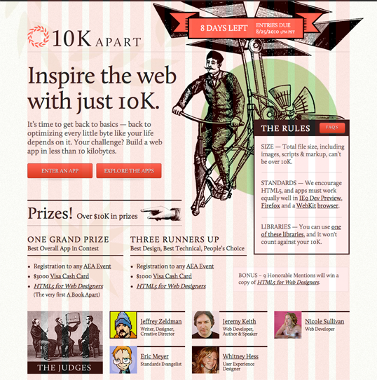
As you experiment with different arrangements for your own layouts, use the columns of whatever grid you’ve chosen as alignment guides for the identity, navigation, content, and footer blocks. It’s very tempting to arrange all your elements within the same one or two blocks, but try to avoid this—it’s not very interesting visually. Instead, consider pushing some elements into another column or off the grid entirely. One of the biggest complaints new designers have about working with grids is that everything looks boxed in and griddy. To those opposed to using grids for this reason, I say take a look at websites such as 10K Apart, seen in Figure 1.9, “10K Apart website with 16-column grid overlay” (on the next page). The red columns you see are from the 16-column 960 Grid System template, and do not exist in the actual website. With those columns hidden, you might never realize this design was created on a grid.
To quote Josef Müller-Brockmann, graphic design pioneer (and author of Grid Systems in Graphic Design): “The grid system is an aid, not a guarantee. It permits a number of possible uses and each designer can look for a solution appropriate to his personal style. But one must learn how to use the grid; it is an art that requires practice.”
The longing we have for structure, grids, and ideal proportion is deeply ingrained in human nature. A layout that “doesn’t look quite right” can often be fixed by moving elements and resizing them on the grid. So if a layout isn’t working, keep experimenting. At some point, all the pieces will click together and the Tetris level-up sound will play in your head. You will have achieved balance.
The Principles of Beautiful Web Design
This article is from Jason Beaird’s The Principles of Beautiful Web Design book (the second edition of which is out now). This is the fourth part of the first chapter.
Frequently Asked Questions about Grid Theory
What is the significance of grid theory in web design?
Grid theory is a fundamental principle in web design that helps in structuring content in a systematic and visually appealing manner. It provides a framework that designers can use to arrange various elements on a webpage. This ensures consistency, improves readability, and enhances the overall user experience. Grids can be flexible or fixed, and they can vary in size and number of columns. They are especially useful in responsive design, where the layout needs to adapt to different screen sizes.
How does grid theory relate to the rule of thirds?
The rule of thirds is a principle derived from grid theory. It involves dividing an image or layout into thirds, both horizontally and vertically, creating a grid of nine equal squares. The key elements or points of interest are then placed along these lines or at their intersections. This technique is widely used in photography and design to create balance, flow, and visual interest.
What is the difference between a modular grid and a hierarchical grid?
A modular grid is a type of grid that consists of equal-sized modules. These modules can be combined and used in different ways to create a variety of layouts. On the other hand, a hierarchical grid is based on a clear ranking of elements, with the most important elements given the most space or prominence. This type of grid is often used in newspapers and magazines, where information needs to be organized in a clear and logical manner.
How can I apply grid theory to my own web design projects?
Applying grid theory to your web design projects involves understanding the content you have and how best to present it. Start by defining the grid structure that suits your content. This could be a simple single-column layout for text-heavy sites or a multi-column grid for more complex sites. Then, place your content within this grid, ensuring that it aligns with the grid lines and spaces. Remember to maintain consistency across different pages for a cohesive look and feel.
What are some common mistakes to avoid when using grids in web design?
Some common mistakes to avoid when using grids in web design include not aligning elements properly, using too many columns, not maintaining consistent spacing and margins, and not considering the responsive behavior of the grid. It’s also important to avoid being too rigid with the grid. While it’s a useful tool for organization and structure, it should not limit creativity. The grid should serve the content, not the other way around.
How does grid theory contribute to responsive design?
Grid theory is a key component of responsive design. A responsive grid adjusts according to the screen size, ensuring that the content is displayed optimally on all devices. This is achieved by using relative units like percentages instead of fixed units like pixels. The grid columns and gutters resize and reposition themselves as the viewport changes, providing a flexible and user-friendly layout.
Can grid theory be applied to other areas of design?
Yes, grid theory can be applied to various areas of design, including graphic design, interior design, and architecture. In graphic design, grids are used to organize text and images in a layout. In interior design, grids can help in arranging furniture and other elements in a room. In architecture, grids can guide the placement of structural elements and spaces.
What is the relationship between grid theory and typography?
Grid theory and typography are closely related. A well-designed grid can guide the placement and sizing of typographic elements, ensuring a balanced and harmonious layout. The baseline grid, a type of grid aligned with the lines of text, is particularly useful in typography. It helps to maintain vertical rhythm and consistency, improving readability and aesthetic appeal.
How does grid theory affect the user experience?
Grid theory plays a crucial role in shaping the user experience. A well-structured grid makes it easier for users to navigate the site, find information, and understand the content. It creates a sense of order and predictability, reducing cognitive load and making the user experience more enjoyable and efficient.
Are there any tools or resources to help with grid design?
There are numerous tools and resources available to assist with grid design. These include CSS frameworks like Bootstrap and Foundation, which come with pre-designed grid systems. There are also online tools like Gridpak and Gridulator, which allow you to create custom grids. Additionally, many design software like Adobe Illustrator and Sketch have built-in grid systems.