The Dollar ReDe$ign Project is an open submissions project organized by New York designer Richard Smith to rebrand the US dollar. The concept behind the project is “that the ‘only’ realistic way for a swift economic recovery is through a thorough, in-depth, rebranding scheme – starting with the redesign of the iconic US Dollar.” Designers from all over the world have responded to the call and as is the case with many design competitions the quality ranges from the ridiculous to the sublime.
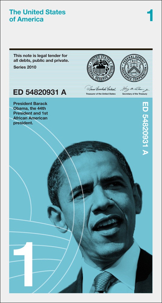
Looking through some of the entries, it’s a case of goodbye greenback, hello purpleback, yellowback, and redback. Here’s a selection of submissions from 2010.
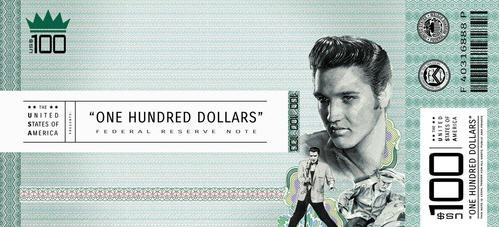
“Music Man” by Fabiano Pinel. “Each Dollar bill would represent a genuinely American music genre, such as Blues, Jazz, Soul, Country, RAP and Rock’n’Roll.”
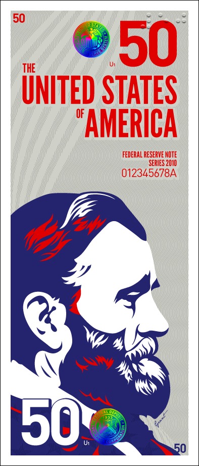
 “The future is now” by Jon Stefaniak. “So naturally I turned to Old Glory for inspiration, only to find an instantly recognizable color trio, the good ol’ red, white and blue.”
 “Money Maker” by Lee Willet. “The characters on the bills represent a diverse array of Americans who made significant contributions to the development of our country.”
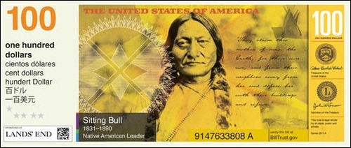
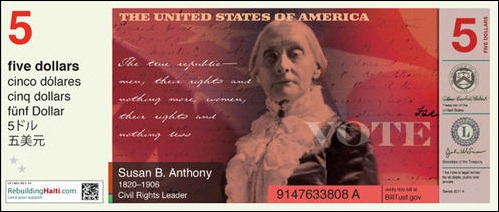 “Creed or Greed” by Jonathon Miller. “I used the official American creed on all the bills. I think it is a good reminder of what this nation is all about.”
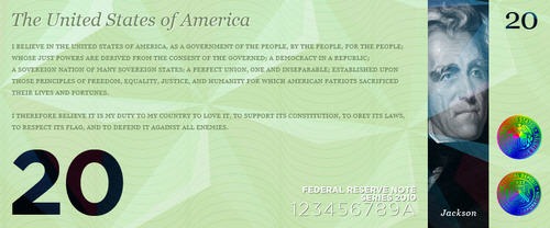
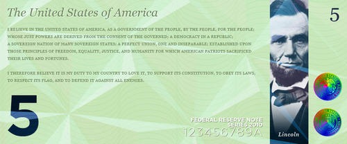 “American Icons” by Matus Benza. “When I was redesigning the American bank notes, I wanted to create a series of 21st Century, very sleek, modern-looking banknotes, which would not resemble Monopoly money or supermarket coupons.”
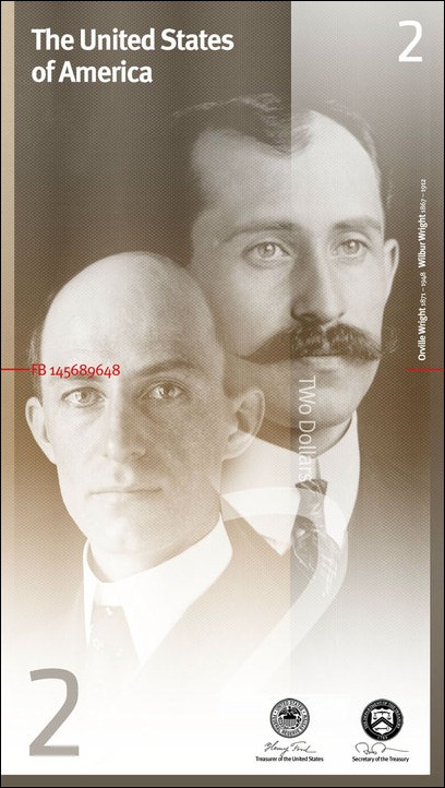 “Girl Power” by Magen Farrar. “”Despite representing half the human population, women have been struggling with discrimination and suppression for far too long. I wanted to take this opportunity to commemorate some of the most influential American women of the 20th century – Amelia Earhart, Jackie Joyner-Kersee, Rosa Parks, Eleanor Roosevelt, Marilyn Monroe and Maya Angelou.”
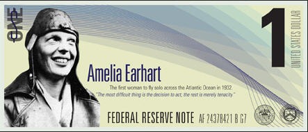
 “Relative Value” by Duncan Dowling. “We have kept the width the same as the existing dollars. However we have changed the size of the note so that the one dollar is shorter and the 100 dollar is the longest. When stacked on top of each other it is easy to see how much money you have.”

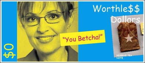
 “Tea Time” by Vincent Kettering set beautifully in Comic Sans type.
 You can enter your own design here and can see all of the submissions here and vote for your favorite one here.
On a related note, there is an interesting article here on The Atlantic web site in which Pentagram designer Michael Bierut discusses the best and worst currency designs from around the world.
What do you think of the designs featured here? Would any of them make a good US Dollar design?
Frequently Asked Questions about Dollar Redesign Project
What is the Dollar Redesign Project?
The Dollar Redesign Project is an initiative that aims to reimagine the design of U.S. currency. The project is not officially affiliated with the U.S. government or the Federal Reserve, but rather, it is a creative exercise that invites designers to envision a new look for the dollar. The project has attracted a wide range of submissions, from designs that incorporate modern aesthetics to those that pay homage to historical figures and events.
Why is there a need for a Dollar Redesign Project?
The Dollar Redesign Project is driven by the belief that the design of currency should evolve with the times. While the U.S. dollar has undergone minor updates over the years, its overall design has remained largely unchanged. The project aims to spark conversation about the role of design in our everyday lives and how it can be used to reflect our values, history, and future aspirations.
Who can participate in the Dollar Redesign Project?
The Dollar Redesign Project is open to anyone who is interested in contributing their design ideas. This includes professional designers, artists, students, and anyone with a creative vision for the future of the U.S. dollar. Participants are encouraged to think outside the box and come up with designs that are innovative, meaningful, and visually appealing.
What are some notable designs from the Dollar Redesign Project?
The Dollar Redesign Project has received a wide range of submissions, each with its own unique take on the design of the U.S. dollar. Some designs incorporate modern aesthetics and bold colors, while others pay homage to historical figures and events. Notable designs include those that feature prominent American figures, such as Martin Luther King Jr. and Eleanor Roosevelt, as well as designs that incorporate elements of American culture and history.
How can I submit my design to the Dollar Redesign Project?
To submit your design to the Dollar Redesign Project, you can visit the project’s website and follow the submission guidelines. The guidelines provide information on the format and size of the design, as well as any specific elements that need to be included. Once your design is ready, you can submit it through the website for consideration.
What happens to the designs after they are submitted?
After a design is submitted to the Dollar Redesign Project, it is reviewed by the project team. The team selects designs that best meet the project’s criteria and showcases them on the project’s website. The goal is to spark conversation and inspire others with the creative possibilities of currency design.
Can the designs from the Dollar Redesign Project be used in real currency?
The designs from the Dollar Redesign Project are not intended to be used in real currency. The project is a creative exercise and is not affiliated with the U.S. government or the Federal Reserve. However, the project aims to inspire conversation about the role of design in our everyday lives, including the design of our currency.
What is the goal of the Dollar Redesign Project?
The goal of the Dollar Redesign Project is to spark conversation about the role of design in our everyday lives and how it can be used to reflect our values, history, and future aspirations. The project invites designers to reimagine the design of the U.S. dollar and showcases their submissions on its website to inspire others.
How can I support the Dollar Redesign Project?
You can support the Dollar Redesign Project by submitting your own design, sharing the project with others, or engaging in conversation about the role of design in our everyday lives. The project is a creative exercise that aims to inspire and spark conversation, and your participation can help achieve this goal.
Where can I see the designs from the Dollar Redesign Project?
You can see the designs from the Dollar Redesign Project on the project’s website. The website showcases a wide range of submissions, each with its own unique take on the design of the U.S. dollar. You can browse through the designs to get a sense of the creative possibilities of currency design.
Jennifer Farley is a designer, illustrator and design instructor based in Ireland. She writes about design and illustration on her blog at Laughing Lion Design.
