The BBC unveiled the new logo for its long-running science fiction show Doctor Who back in 2009. The show is pretty much an institution in some parts of the world and the new series had a new writer and producer, a new Doctor, and as mentioned a new logo. The new design was created by Red Bee Media.
The logo features the letters D and W molded together to form the shape of the Tardis with a futuristic flashing police light on top. The type and the tardis have a strong metallic feel in blue and dark purple tones. Like the very best logos, it’s simple, it’s relevant and it’s aesthetically pleasing. Personally, I love it.
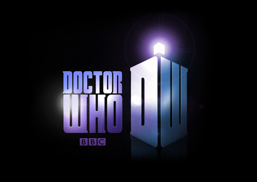 According to Red Bee Media, the new identity aims to align the Doctor’s brand with blockbuster sci-fi and super hero film emblems, such as Superman, Star Trek and Batman, which are universally recognized.
The design uses the same base color as the original designs from the 1950s and “explores light and dimension to depict the adventure and mystery that is synonymous with the alien time-travelling Doctor”.
Steven Moffat, the new Lead Writer and Executive Producer, said:
According to Red Bee Media, the new identity aims to align the Doctor’s brand with blockbuster sci-fi and super hero film emblems, such as Superman, Star Trek and Batman, which are universally recognized.
The design uses the same base color as the original designs from the 1950s and “explores light and dimension to depict the adventure and mystery that is synonymous with the alien time-travelling Doctor”.
Steven Moffat, the new Lead Writer and Executive Producer, said:
The 11th logo for the 11th Doctor – those grand old words, Doctor Who, suddenly looking newer than ever. And, look at that, something really new – an insignia! DW in TARDIS form! Simple and beautiful, and most important of all, a completely irresistible doodle. I apologise to school notebooks everywhere, because in 2010 that’s what they’re going to be wearing.
 The new logo is the eleventh Dr Who logo in the 47 years the show has been running. Below you can see some of the previous iterations of the logo, beginning at the top left with the orange/gold logo which has just been replaced.
 |
 |
 |
 |
Frequently Asked Questions (FAQs) about the Doctor Who Logo
What is the significance of the Doctor Who logo design?
The Doctor Who logo design is a significant aspect of the show’s branding. It has evolved over the years, reflecting the changes in the show’s direction and tone. The logo is often inspired by the TARDIS, the time-traveling spaceship used by the Doctor. The design elements used in the logo, such as the color scheme, typography, and imagery, are carefully chosen to represent the show’s unique blend of science fiction, adventure, and drama.
How has the Doctor Who logo evolved over the years?
The Doctor Who logo has undergone several changes since the show’s inception in 1963. Each iteration of the logo reflects the era of the show it represents. For instance, the original logo had a simple, clean design, while the 1980s saw a more stylized and futuristic logo. The current logo, introduced in 2018, features a sleek, modern design with a nod to the show’s history through the inclusion of the TARDIS silhouette.
What does the TARDIS symbolize in the Doctor Who logo?
The TARDIS, or Time and Relative Dimension in Space, is a central element of the Doctor Who series. It is the Doctor’s time-traveling spaceship, which appears as a blue British police box. In the logo, the TARDIS symbolizes the show’s themes of time travel, adventure, and the unknown. It also serves as a recognizable icon for fans of the series.
Why was the Doctor Who logo changed in 2018?
The Doctor Who logo was changed in 2018 to coincide with the introduction of Jodie Whittaker as the Thirteenth Doctor. The new logo, designed by creative agency Little Hawk, features a more modern and streamlined design. The change was made to reflect the new direction of the show, with a female Doctor at the helm for the first time in the show’s history.
How does the Doctor Who logo reflect the show’s themes?
The Doctor Who logo is designed to reflect the show’s themes of time travel, adventure, and the unknown. The use of the TARDIS in the logo is a clear nod to these themes. The typography and design elements used in the logo also contribute to this, with the futuristic font and stylized imagery evoking a sense of mystery and excitement.
What is the color scheme of the Doctor Who logo?
The color scheme of the Doctor Who logo has varied over the years, but it often features shades of blue, a nod to the iconic blue TARDIS. The current logo, introduced in 2018, features a gold and white color scheme, giving it a modern and sleek appearance.
Who designed the current Doctor Who logo?
The current Doctor Who logo was designed by the creative agency Little Hawk. The agency was tasked with creating a logo that reflected the new direction of the show, with Jodie Whittaker taking on the role of the Doctor.
How has the Doctor Who logo been received by fans?
The Doctor Who logo has generally been well-received by fans. Each iteration of the logo brings with it a sense of anticipation and excitement for the new direction of the show. The current logo, introduced in 2018, was praised for its modern and sleek design, as well as its nod to the show’s history with the inclusion of the TARDIS silhouette.
What is the significance of the font used in the Doctor Who logo?
The font used in the Doctor Who logo is an important aspect of its design. The font is often futuristic and stylized, reflecting the show’s science fiction genre. The current logo features a custom typeface, designed specifically for the show, which adds a unique and distinctive touch to the logo.
How does the Doctor Who logo contribute to the show’s branding?
The Doctor Who logo plays a crucial role in the show’s branding. It is a recognizable symbol that immediately identifies the show. The logo’s design elements, such as the TARDIS and the futuristic font, reflect the show’s themes and genre. The logo is used across various platforms, including merchandise, promotional materials, and digital media, helping to create a consistent and cohesive brand identity for the show.
 Jennifer Farley
Jennifer Farley is a designer, illustrator and design instructor based in Ireland. She writes about design and illustration on her blog at Laughing Lion Design.


