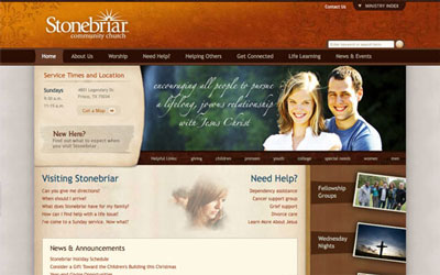
Any web designer subscribing to CSS Mania or Best Web Gallery can attest to the recent rise of hip, high-quality church web sites. A non-churchgoing designer might wonder how places of worship fit in amongst software startups and cutting-edge businesses; yet, these churches are branded as intensely as any business and supported by savvy church-marketing communities on the Web.
I interviewed some of the industry’s top church designers and marketers to understand how design helps communicate the spiritual life.
Recent History
In the 1960s and 1970s, many Christian churches made overt efforts to attract younger and more diverse congregations. The advent of Christian rock music and large outdoor festivals helped make the churchgoing experience more approachable to younger crowds. Throughout the 1980s and 1990s, youth church events became larger, more noticeable, and more countercultural, at least aesthetically. Their flyers and marketing materials began mirroring the gritty and irreverent imagery usually reserved for secular rock bands.
In the last decade, more churches have increased their visibility further by partnering with design and media firms. Many have assembled their own in-house marketing teams who collaborate with outside designers to produce contemporary and distinctive church branding. A new breed of pastors like Mark Driscoll and magazines like Relevant have achieved pop culture success with an emphasis on youth, visibility, and a carefully designed public image.
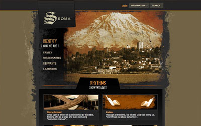
Grunge Christianity
Yet the recent image makeover of churches is unpalatable for some. In 2006, Pastor John MacArthur published a popular article condemning modern churches that trade sanctity for “cultural relevancy.” MacArthur and his supporters disagree with so-called pragmatists who seek bigger, more worldly congregations. Nathan Smith (GodBit.com) counters, “we are naive if we try to take an isolationist approach. God wants a direct relationship with each person, so we – as facilitators of that calling – have to meet people through what they know, and if that is pop culture, then so be it.”
From a design perspective, applying a pop culture flavor to a place of worship can mean many things, but comes down to doing what’s appropriate on a church-by-church basis. Says Chris Merritt (Pixel Light Creative), “If the church is a traditional conservative church, then I’m probably not going to use an abundance of grunge brushes and ragged textures. Every once in a while there’s a church who wants to launch a new image and use the web site as a launching pad. Even in that case, moderation is important; otherwise you may end up alienating those who are comfortable with the original image.”
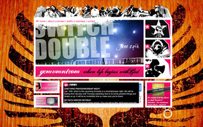
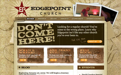
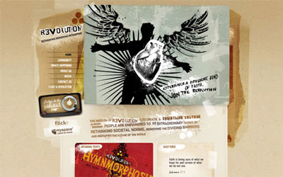
So what about the multitude of recent church web sites designed around ragged, dark, asymmetrical elements – what does this communicate about the church? How many congregations identify with dark, gritty imagery?
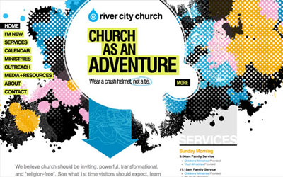
Dustin Stearman (Church Plant Media) says this prevalent style is requested by churches with a more “edgy worship style” intending to attract “20-somethings and/or their artistic culture.” Nathan Smith agrees that it’s a positive trend, but he warns of design excesses that “make the site feel as though it’s the side of a freeway underpass, full of grime and graffiti. One should strive to be respectful in the approach to the design, facilitating the wishes of the church staff, but also helping them realize the messages they’re sending.”
Seeing grungy design elements on a church web site might surprise a non-churchgoer, but churches are just as susceptible to trends as businesses are to changing markets. And, for designers, the organic, handmade style can be plain fun. “Grunge is probably our specialty right now,” says Matt Adams (Factor 1 Studios). “I really enjoy the work we put into these projects. Sometimes we will age our own paper in the sun or tear up some cardboard, rust some nails and staples … we really have a good time on these projects. The hard part is when the church is just looking for the trend, rather than looking to show their true culture.”
James Dalman (Church Communications Pro) shared the same concerns about accurately conveying church culture through design. “There’s usually a huge disconnect. Many churches paint a picture of what they’d like to be instead of who they really are.” It’s also a problem of ego, says Dalman – some churches seeking an image makeover “just want to look cool or better than the guy next door.”
Struggle for Identity
Every designer interviewed repeatedly acknowledged the pressure churches face in the quest for visibility. Ironically, many churches who pour money into establishing a unique graphical identity simply ask their designer to follow the latest trends. Matt Adams expressed frustration at churches “who claim they ‘want to be unique, just like X.’ It’s terrible. So many young pastors want instant church plant success, and rely on stealing or borrowing from other pastors, or dropping as much pop/tech culture as they can into their web site and church. Just the other day I ran across a church web site promoting Wi-Fi access right in their church tag line.”
Just like working with a secular business, designing for a church requires digging deep into the spirit of the organization to help find their identity. “What’s right for one church might be completely different for another,” says Nathan Smith, “and it’s your responsibility as a designer to help them discern their motives. Do they want to innovate, or are they simply trying to break the mold, just like everyone else?”
Smith also says churches should be steered clear of simply mashing up marketing elements or isolating themselves. “Every time I see a T-shirt that misappropriates a popular brand name, I think to myself, ugh, they just don’t get it. They’re unsuccessfully trying to redeem a marketing approach by rehashing an advertisement seen on a billboard. A Christian version of product XYZ is gratuitous, like a Christians-only Facebook, or some social marketing whiz-bang tool. We need Christians amongst their fellow men, who can be there to lean on, rather than off in some self-congratulatory walled garden.”
Dustin Stearman concedes that some churches simply go too far to make their point, despite good intentions. When it comes to design and new media, Stearman says, “churches should be pushing the envelope the most” to reach their followers. Instead, too many push it in the wrong direction, claims Matt Adams. “Generally, I see churches trying to one-up each other … who can be sexier or bolder. Sure, it starts small, but often leads to a church being on the news defending their biblical position. There’s been a string of these stories this summer, usually relating to sermon topics on sex or money. While they might be correct biblically, to people who are old school church, or even anti-church, it looks pretty bad.”
A Changing Market
Churches going too far with marketing in recent decades might have had the opposite intended effect for some. Studies show that the “proportion of Americans without a religious preference doubled from 7% to 14% in the 1990s.” In England, between 1979 and 2005, “half of all Christians stopped going to church on a Sunday.” Does the aggressive, edgier approach to church marketing imply an urgency to reclaim members?
“Marketing has to be about more than numbers, or we are totally missing the point,” says Nathan Smith. “I think that our designs have to portray more than just food, folks, and fun because we, as a Church, are more than just a drive-through.” Despite the pressures to compete with larger and more visible churches, the design experience must – above all – remain authentic, adds Chris Merritt. “That means no stock photos. It also means writing web copy that’s less formal and more like a real person talking to you.”
Matt Adams points out that “so many Americans have been burned by the church, or turned off by church. Sometimes the reasons why a person stops attending church are so minor, that often communicating to them how this particular church is different is the key theme.”
Designing the Church Experience
Obviously, hopping on design bandwagons to capture the authentic spirituality of a church will ultimately be in vain. Sussing out the right design feel for a church might also require more nuanced reasoning. Nathan Smith has done design for “congregations who believe in predestination, as well as those who believe that people inherently can either choose or reject God. It has been my experience that the former tend to focus on shepherding the home flock, first and foremost, through Bible studies, seminars, retreats, and so on. So, a design for a church like that would want to feel cozy, giving established members a place to keep up on the latest happenings. The latter tend to be more evangelistic in nature, so their designs are often seen as more edgy, attempting to reach those who might have a non-Christian background.”
So, if church web sites expect to convey the spirit of the physical church itself, what happens when remote design teams 1,000 miles away must design for a church unseen? Most designers interviewed answered simply, “lots and lots of phone consultation.” James Dalman says it’s taken 15 years for him to hone his own branding approach: asking the right questions to encourage the right answers. Dustin Stearman asks his clients “for a list of adjectives” and combines that with what he knows about their colors and typography. Improvisation is often required, as well as collaborating with in-house media teams that some churches deploy.
Establishing the perfect feel for a church web site depends on the story you’re trying to tell, graphically speaking. The primary design elements (typography, color, photography, text) go beyond trying to sell, as a corporate site would. Conveying spirituality with design should be about balance, a “perfect blend of form and function,” says Dustin Stearman, and “an emotional, artistic process.”
The Church as a Business
But realistically, churches do “sell a lifestyle,” as several designers put it, and using design and media to convey that lifestyle has become vital to the success of a church, whether that be financial or otherwise. Forbes online features a news category called Christian Capitalism, with stories like “Megachurches, Megabusinesses” and “Spiritually Profitable Gaming.” Business Week has also reported on the growth of multi-million dollar church consulting efforts. As Church Marketing Sucks points out, marketing is simply the “process of promoting, selling, and distributing goods or services. As much as we bristle at comparing evangelism to a sales pitch, there are certain similarities.”
The designers interviewed disagreed on there being any conflict with the comparison of churches to businesses because they all felt the end goal was still authenticity. Marketing doesn’t have to be a dirty word. Chris Merritt says, “businesses want to communicate a message and an identity, just like churches do. The message is vastly different, but both utilize the same best practices in communicating that message.” Dustin Stearman acknowledged the “fine line between coming across as just another organization trying to sell something and trying to reach people with the Gospel message using traditional marketing techniques.”
Designing for secular businesses inevitably means discussing how to look better than one’s competitors. The designers interviewed regarded design as more than a tool to make the experience of Church X better than Church Y, despite the occasional pressure to do just that. As with businesses, designing for churches requires restraint. Matt Adams says, “I become concerned when I see churches really push hard ministries and campus amenities. We try to be careful in the imagery we select. Great photography can go a long way, with … a solid balance between happy people, and normal relaxed faces.”
Big-time Designs, Small-time Values
Church designers seem to face a massive challenge: make beautiful, polished interactive experiences that retain humility and communicate spirituality, all without appearing contrived. Reducing the role of the ego is standard practice in nearly all religions, yet ironically many of today’s churches need to promote themselves more than ever as they seek greater numbers and visibility. Do church designers feel conflicted, trying to convey core values while wrapping them in slick, expensive designs?
Matt Adams urges for a moderate approach in which designers can “balance the technological advances with good content and a more middle-of-the-road design. A church site with an over-the-top approach to displaying technology advancements can quickly come across as egotistical to some.”
How often do clients reject the more eye-grabbing, commercial look? Adams cites examples like marshill.org and savannahcanvas.com, in which quiet minimalism is specifically “part of their marketing strategy and appeal.” Dustin Stearman says about 25% of his clients ask for a minimal design style. “A lot of people are turned off by the slick, smiling faces that they’ve seen in the past. They want a site that speaks to people where they are, rather than looking like it was manufactured by perfect people.”
Nathan Smith acknowledges he’s seen “less and less attempts at modesty in church web design of late. Rather than vain self-flattery, I think churches are realizing it’s okay to spread their wings a bit.” The designers claimed being stylistically “slick” was without advantage. The authentic imperfections of humanity actually give design its power, Smith implies, as reflected in the current grunge trend. After all, he says, “we’re all flawed people, trying to seek the will of God to be made whole. Seeing a bit of that in a design is refreshing from time to time.”
Conclusions
The consensus is that business strategies can peacefully exist within church culture without compromising core values or tainting the role of the designer. As all the designers expressed, priority #1 is authenticity – an honest reflection of the church values that skew trendy for more than just trendy’s sake.
As their designs reflect, many Christian churches of the last few decades are emerging as diverse, evolving organizations who see great value in staying current. It’s undetermined how much cutting-edge design is affecting the size of congregations, but existing congregants have a whole new breed of gorgeous, feature-rich web sites to connect them with their community.
 Darren Hoyt
Darren Hoyt is a Virginia-based designer and developer with an emphasis on building for content management systems like Expression Engine and WordPress. He also releases WordPress themes and other bits at his personal blog.