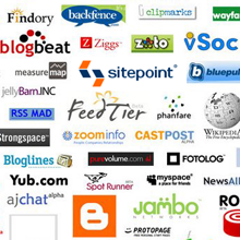
The logo is the visual heart of a brand. The most memorable quote that can also pass as the most important “tip” for logo design is attributed to Steven Gilliatt: “A logo should look just as good in 15-foot letters on top of company headquarters as it does one sixteenth of an inch tall on company stationery.”
What is true for the real world applies successfully online, but the Internet, with all its dynamic technologies, gives more flexibility when it comes to logo design. The trend for the coming year distances itself from the 3D effects, shines and shadows of the Web 2.0 logos, and goes in a direction where less is more and more is spectacular, breathtaking, unique.
Coming years will see logo designs influenced by an escalating technology and innovation. Black and white printing is no longer mandatory, and the new logos no longer need to translate well in grayscale. The Web companies will need bold logos, types of logos that are refreshing and stand out, enhancing brand visibility and user response. But trends come and go, and in the end only the quality stands. Here are five logo design tips from one of the best logo designers in the UK – David Airey.
1. Make it memorable, timeless, scalable and appropriate
Experienced logo designers don’t always agree with the concept of “trend.” They say that good design is not trendy design, and that logos should be iconic and timeless, regardless of if they were produced for the web or for print.
“Regardless of whether a logo is seen online or off, they act as identifiers.”- says David Airey. “They help your target audience associate the product or service with you. A well-designed logo will also express qualities appropriate to the business, such as expense, trustworthiness, a sense of fun, etc.”
2. Make it recognizable across all media
Are “web logos” different than offline logos? We know that the answer is “yes” – the glossy “Web 2.0” trend is the proof, but these are too common now. Will the new logos be dynamic, or will the trend follow the “avatar” and “favicon” concepts and lead to a generation of pictographic logos? So what will make a good Website logo? Designer David Airey answers:
“It depends on the company. Some logos can be designed to allow for a level of animation. This can be shown online, or on TV advertising, but not in print. Ultimately, the logo should be equally recognizable across all media.”
3. If it ain’t broken, don’t fix it
Already an industry standard, logos are almost always placed at the top left of a web page. This probably won’t change in the immediate future. “If it ain’t broken, don’t fix it” as they say.
“Stats would suggest the top left, as this is where most web users look first – unless of course you have a huge flashing image in the middle of your website, which I don’t recommend,” says Airey. “My logo can be found in the top left corner of my own website, but if someone can suggest a better position, I’m always open to ideas.”
4. Avoid monotony
Good logos are timeless – like Philips, Nike, BMW, etc. But when it comes to how these blend with the colors of the websites they are placed on, there is always an element of surprise. The logo stands by itself, as a powerful identifier, but the design of the site adds colors that appeals to its viewers. People are visual beings, and monotony is categorically not something that triggers positive response.
“You want to keep a level of consistency, so a monotone logo lends itself well to a monotone website, perhaps with a dash of color to accentuate the appeal.”
5. A logo is not a person
Brand enforcement campaigns lead sometimes to desperate measures: companies use logos to create social media profile avatars, they even use brand names to name their social media profile. The last is not so bad, but using a logo for an avatar is cold, impersonal, distant… There’s a time and a place for everything: corporate social profiles should not be created wearing the mask of the brand.
However, where social media is concerned (Twitter, Facebook, etc.), my personal preference is to use a photo in your avatar, rather than your logo. This gives an increased sense of personality, and reinforces the fact that you’re actually a human, and not one of the ever-increasing ‘bots’ that spring up.
What about you? Do you have your own logo? Would you consider creating a logo for your name and using this logo to promote yourself as a brand? What trends do you think we will see in the coming years? Do you have any tips to add to the list? Come on, let’s talk!
This article was originally published on DesignFestival on the 28th February 2009.
Jennifer Farley is a designer, illustrator and design instructor based in Ireland. She writes about design and illustration on her blog at Laughing Lion Design.
