
Key Takeaways
- The CSS3 sliding menu can be built using clean semantic HTML5 and does not rely on JavaScript or additional graphics. It works on mobile and tablet touch devices and degrades gracefully in older browsers.
- The sliding menu involves styling the HTML elements, setting up the navigation styles, and creating the animation for the sliding effect. The article, navigation, and menu items are given transitions for a smooth sliding effect.
- The sliding menu can be customized and made accessible using ARIA roles and properties. It can also be made responsive using media queries, and animations can be added using CSS3 transitions and transforms. It can be used with other JavaScript frameworks and can work on older browsers using CSS and JavaScript polyfills.
It’s often best to put things away until you need them. Navigation menus are a good example. If I’m reading an article, I don’t want a large proportion of screen real estate taken with links — especially on a mobile device.
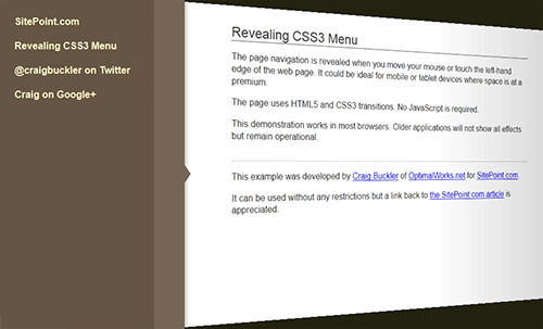
In this article, we’re going to build a slide-out menu using CSS alone. If you’re using a modern browser, it will also show a lovely 3D page effect. This is what we’ll achieve:
View the CSS3 sliding menu demonstration…
There are various solutions throughout the web, but I struggled to find one matching my requirements:
- It must use clean semantic HTML5 with no superfluous tags.
- It must not rely on JavaScript.
- It must not require additional graphics.
- It must work on mobile and tablet touch devices.
- It must degrade gracefully in older browsers (IE7+) or when specific CSS3 properties are not supported.
- It must look great!
Open your favorite editor and let’s get coding…
The HTML
No surprises here — we have an HTML5 document, the IE shim, a link to our stylesheet, a nav element for the menu, and an article for our body text:
<!DOCTYPE html>

<html lang="en">

<head>

<meta charset="UTF-8" />

<title>Revealing CSS3 Menu</title>

<!--[if lt IE 9]>

<script src="http://html5shiv.googlecode.com/svn/trunk/html5.js"></script>

<![endif]-->

<link rel="stylesheet" media="all" href="styles.css" />

</head>

<body>
	<!-- menu -->

	<nav>

		<ul>

			<li><a href="https://www.sitepoint.com/">SitePoint.com</a></li>

			<li><a href="https://www.sitepoint.com/css3-sliding-menu/">Revealing CSS3 Menu</a></li>

		</ul>

	</nav>
	<!-- main article -->

	<article>
		<h1>Revealing CSS3 Menu</h1>
		<p>body text</p>
	</article>
</body>

</html>
CSS: Article Styles
The article is a little unusual because we want to apply a 3D effect when the menu slides into place. It’s given a fixed position so it matches the dimensions of the body:
article

{

	position: fixed;

	width: 70%;

	left: 0;

	top: 0;

	right: 0;

	bottom: 0;

	padding: 30px 15%;

	background-color: #fff;

	overflow: auto;

	z-index: 0;

	-webkit-transform-origin: 0 50%;

	-moz-transform-origin: 0 50%;

	-ms-transform-origin: 0 50%;

	-o-transform-origin: 0 50%;

	transform-origin: 0 50%;

}
We’ve also defined the transform-origin to the middle of the left-hand edge. Even though the transform doesn’t occur until hover, Chrome becomes upset if we attempt to set the origin in the :hover styles.
We also require a shadow overlay when the page rotates — the right-hand edge will be darker, so we can do that with a gradient applied to a pseudo element attached to the article:
article:after

{

	position: absolute;

	content: ' ';

	left: 100%;

	top: 0;

	right: 0;

	bottom: 0;

	background-image: -webkit-linear-gradient(right, rgba(0,0,0,0.2) 0%, transparent 100%);

	background-image: -moz-linear-gradient(right, rgba(0,0,0,0.2) 0%, transparent 100%);

	background-image: -ms-linear-gradient(right, rgba(0,0,0,0.2) 0%, transparent 100%);

	background-image: -o-linear-gradient(right, rgba(0,0,0,0.2) 0%, transparent 100%);

	background-image: linear-gradient(right, rgba(0,0,0,0.2) 0%, transparent 100%);

	pointer-events: none;

}
The element is fixed as a zero-width block on the right-hand edge of the screen which is resized when the menu slides out. Note the pointer-events property — I said it would come in useful!
CSS: Navigation Styles
The main navigation block is fixed to the left of the screen. The content has a width of 16em, so we move it off to the left with -16em. However, the 50px right border will be shown. We can also apply a pseudo element to create a CSS triangle:
nav

{

	position: fixed;

	left: -16em;

	top: 0;

	bottom: 0;

	background-color: #654;

	border-right: 50px solid #765;

	box-shadow: 4px 0 5px rgba(0,0,0,0.2);

	z-index: 1;

	cursor: pointer;

}
nav:after

{

	position: absolute;

	content: ' ';

	width: 0;

	height: 0;

	right: -70px;

	top: 50%;

	border-width: 15px 10px;

	border-style: solid;

	border-color: transparent transparent transparent #765;

}
The menu styling is nothing unusual. The outer ul is given a width of 14em and padding of 1em which determines the 16em total:
nav ul

{

	width: 14em;

	list-style-type: none;

	margin: 0;

	padding: 1em;

}
CSS: The Animation
This is where it gets interesting. First, let’s apply transitions to the article, nav and menu items:
article, article:after, nav, nav *

{

	-webkit-transition: all 600ms ease;

	-moz-transition: all 600ms ease;

	-ms-transition: all 600ms ease;

	-o-transition: all 600ms ease;

	transition: all 600ms ease;

}
Moving the menu into place is simple — we move it from -16em to 0 when the user hovers over the element:
nav:hover

{

	left: 0;

}
The page effect is applied to any article sibling following the hovered nav. The translateX moves it by 16em to the right to make room for the menu. The perspective and rotateY apply a 3D transformation:
nav:hover ~ article

{

	-webkit-transform: translateX(16em) perspective(600px) rotateY(10deg);

	-moz-transform: translateX(16em) perspective(600px) rotateY(10deg);

	-ms-transform: translateX(16em) perspective(600px) rotateY(10deg);

	-o-transform: translateX(16em) perspective(600px) rotateY(10deg);

	transform: translateX(16em) perspective(600px) rotateY(10deg);

}
Finally, the shadow gradient applied to the article’s pseudo element has the left hand edge moved from 100% to 60%. In other words, it grows to 40% of the page width:
nav:hover ~ article:after

{

	left: 60%;

}
An that’s it. Even with vendor prefixes, the return on coding investment is far higher than you’d expect.
View the CSS3 sliding menu demonstration…
View the full stylesheet…
The page works in most browsers. Firefox is perfect, although:
- The page shadow appears instantly rather than expanding over time in Chrome and Safari (webkit does not support pseudo element animation).
- Opera does not support the 3D page transforms — the menu slides out over the page.
- IE does not support transform so the menu covers the page. Few of the effects are shown in IE7 and 8, but the menu can be used.
- Mobile browsers such as Android, Dolphin and Firefox Mobile work well although performance might be an issue on slower devices.
Let me know if you apply similar effects to your site.
And if you enjoyed reading this post, you’ll love Learnable; the place to learn fresh skills and techniques from the masters. Members get instant access to all of SitePoint’s ebooks and interactive online courses, like Learn CSS3.
Comments on this article are closed. Have a question about CSS3? Why not ask it on our forums?
Frequently Asked Questions about CSS3 Sliding Menu
How can I create a responsive CSS3 sliding menu?
Creating a responsive CSS3 sliding menu involves using media queries to adjust the menu’s layout based on the screen size. You can set different styles for different screen sizes. For instance, you can make the menu display horizontally on larger screens and vertically on smaller screens. You can also adjust the size of the menu items and the font size to make them more readable on smaller screens.
Can I add animations to my CSS3 sliding menu?
Yes, you can add animations to your CSS3 sliding menu using CSS3 transitions and transforms. Transitions allow you to animate the changes in CSS properties, while transforms let you rotate, scale, skew, or translate an element. You can use these features to create a smooth sliding effect when the menu opens and closes.
How can I make my CSS3 sliding menu accessible?
To make your CSS3 sliding menu accessible, you should use ARIA roles and properties to provide information about the menu’s structure and functionality to assistive technologies. You should also ensure that the menu can be navigated using the keyboard. This involves adding keyboard event listeners to the menu items and managing the focus order.
Can I use CSS3 sliding menu with other JavaScript frameworks?
Yes, you can use CSS3 sliding menu with other JavaScript frameworks like React, Angular, or Vue.js. You just need to integrate the CSS3 sliding menu code into the framework’s component structure. However, the exact implementation may vary depending on the framework.
How can I add a submenu to my CSS3 sliding menu?
To add a submenu to your CSS3 sliding menu, you can create a nested list inside a menu item. You can then use CSS to style the submenu and JavaScript to control its behavior. For instance, you can make the submenu appear when the parent menu item is clicked or hovered over.
How can I customize the appearance of my CSS3 sliding menu?
You can customize the appearance of your CSS3 sliding menu using CSS. You can change the color, size, font, and other properties of the menu and its items. You can also add borders, shadows, and other decorative effects.
How can I add icons to my CSS3 sliding menu items?
To add icons to your CSS3 sliding menu items, you can use icon fonts like Font Awesome or Ionicons. You just need to include the icon font’s CSS file in your HTML document and then add the appropriate class to the menu item.
How can I make my CSS3 sliding menu work on older browsers?
To make your CSS3 sliding menu work on older browsers, you can use CSS and JavaScript polyfills. These are scripts that provide modern functionality in older browsers that do not support it natively. However, keep in mind that not all CSS3 features can be polyfilled.
Can I use CSS3 sliding menu for mobile navigation?
Yes, you can use CSS3 sliding menu for mobile navigation. In fact, sliding menus are a popular choice for mobile navigation because they provide a compact and intuitive interface. You just need to ensure that the menu is responsive and touch-friendly.
How can I improve the performance of my CSS3 sliding menu?
To improve the performance of your CSS3 sliding menu, you can optimize your CSS and JavaScript code. This involves removing unnecessary code, using efficient selectors, and minimizing reflows and repaints. You can also use CSS3 hardware acceleration to make animations smoother.