Given many of the designs favored by the CSS purists, you’d be forgiven for thinking that the image is soon to be a thing of the past, eschewed in favor of clean, standards-compliant, CSS-formatted, text-based design.
However, while sites that rely entirely on sliced-up images are beginning to look a little dated in comparison with the clean simplicity of the CSS layout “style,” well-placed images can bring an otherwise commonplace design to life. And, as designers begin to push the boundaries of what can be achieved with standards-compliant semantic markup, sites that have managed to combine semantics and beauty are becoming much more commonplace.
Working with images in CSS requires a few simple skills, which can then be combined to create interesting effects. The solutions in this chapter demonstrate the basic concepts of working with images while answering some common questions. However, as with most of the solutions in this book, don’t be afraid to experiment and see what unique effects you can create. And don’t forget, if you’d rather read this information offline, you can download the .pdf version of the first 4 chapters here.
How do I add a border to images?
Photographic images, perhaps used to illustrate an article, or as a display in a photo album, look neat when bordered with a thin line. However, opening each shot in a graphics program to add the border is a time consuming process and, if you ever need to change that border’s color or thickness, you’ll need to go through the same arduous process all over again to create the desired images.
Solution
Adding a border to an image is a simple procedure using CSS. There are two images in the document displayed in Figure 3.1.
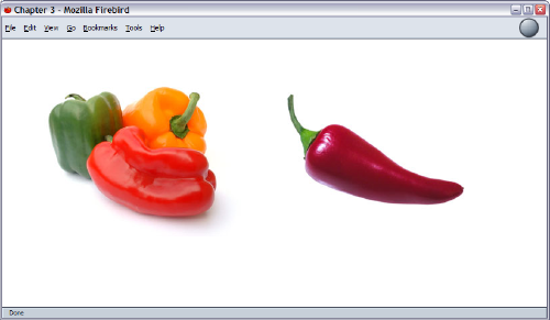
Figure 3.1. Images are displayed in a Web browser.
img {

  border-width: 1px;

  border-style: solid;

  border-color: #000000;

}
This code could also be written as follows:
img {

  border: 1px solid #000000;

}
In Figure 3.2, you can see the effect this has on the images.
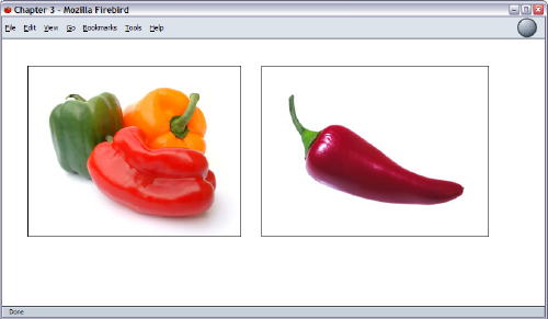
Figure 3.2. The images look neater once the CSS border is applied.
Your layout probably contains images to which you don’t really want to apply a permanent black border. You can create a CSS class for the border and apply it to selected images as required.
.imgborder {

  border: 1px solid #000000;

}


<img src="myfish.jpg" alt="My Fish" class="imgborder" />
If you have a whole selection of images – such as a photograph album – on the page, you could set borders on all the images within a container.
Example 3.1. imageborders.css (excerpt)
#album img {

  border: 1px solid #000000;

}
This approach will save you having to add the class to each individual image within the container.
How do I use CSS to replace the deprecated HTML border attribute on images?
If you’re anything like me, adding border="0" to images that are links to other documents is probably something you do almost automatically. Using the border attribute of the <img> tag is the way in which we all learned to ensure that an ugly blue border didn’t appear around our navigation buttons and so on. However, border has been deprecated in the current versions of HTML and XHTML.
Solution
Just as you can create a border, so you can remove one. Setting an image’s border property to none will remove those ugly borders.
img {

  border: none;

}
How do I set a background image for my page with CSS?
Before CSS, backgrounds were added using the background attribute of the <body> tag. This attribute is now deprecated and replaced by CSS properties.
Solution
Example 3.2. backgrounds.css
body {

  background-color: #ffffff;

  background-image: url(peppers_bg.jpg);

  background-repeat: no-repeat;

}
The above rules add the image peppers_bg.jpg as a background to any page to which this style sheet is attached, as shown in Figure 3.3.
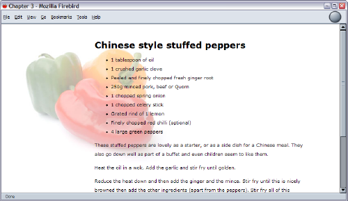
Figure 3.3. A standard image is displayed as a background image.
Discussion
The CSS property background-image enables you to specify as a URL the location of a background image. By default, the background will tile as shown in Figure 3.4.
As we don’t want multiple peppers in this example, we need to prevent this image from tiling. To do so, we set the property background-repeat to no-repeat. Other values for background-repeat are:
repeat– This default value causes the image to tile across and down the page, as shown in Figure 3.4.repeat-x– The image tiles across the page in a single row of images, as shown in Figure 3.5.repeat-y– The image tiles down the page in a single row, as shown in Figure 3.6.
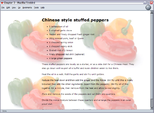
Figure 3.4. A background image is set to repeat by default.
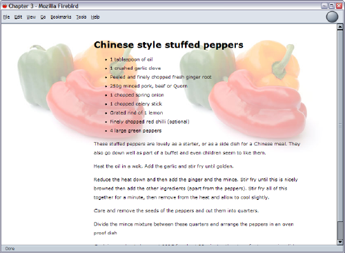
Figure 3.5. The background image is set to repeat-x.
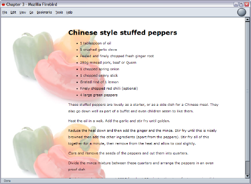
Figure 3.6. The background image is set to repeat-y.
How do I position my background image?
By default, if you add a single, non-repeating background image to the page, it will appear in the top left corner of the viewport. If you have set the background to tile in any direction, the first image will appear at that location, and will tile from that point. However, it is also possible for the image to be displayed anywhere else on the page.
Solution
To position the image, we need to use the CSS property background-position.
Example 3.3. backgroundposition.css (excerpt)
body {

  background-color: #FFFFFF;

  background-image: url(peppers_bg.jpg);

  background-repeat: no-repeat;

  background-position: center center;

}
The above CSS will center the image on the page as shown in Figure 3.7.
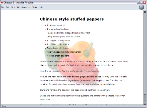
Figure 3.7. The background-position property can be used to center the image.
Discussion
The background-position property can take as values keywords, percentage values, or values in units, such as pixels.
Keywords
In the example above, we used keywords to specify that the background image should be displayed in the center of the page.
Example 3.4. backgroundposition.css (excerpt)
background-position: center center;Keyword combinations that you can use are:
top lefttop centertop rightcenter leftcenter centercenter rightbottom leftbottom centerbottom right
If you only specify one of the values, the other will default to center.
background-position: top;The above code is the same as the following:
background-position: top center;Percentage Values
To ensure more accurate image placement, you can specify the values as percentages. This is particularly useful in a liquid layout where other page elements are specified in percentages so that they resize in accordance with the user’s screen resolution and size.
background-position: 30% 80%;The first of the two percentages included here refers to the horizontal position; the second is the vertical position. Percentages are taken from the top left corner, with 0% 0% placing the top left corner of the image against the top left corner of the browser window, and 100% 100% placing the bottom right corner of the image against the bottom right corner of the window.
As with keywords, a default value comes into play if you only specify one value. That default is 50%.
background-position: 30%;The above code is, therefore, the same as that shown below:
background-position: 30% 50%;Unit Values
You can set the values using any CSS units, such as pixels or ems.
background-position: 20px 20px;Just as with percentages, the first value dictates the horizontal position, while the second dictates the vertical. But unlike percentages, the measurements directly control the position of the top left corner of the background image.
You can mix units with percentages and, if you only specify one value, the second will default to 50%.
How do I make a background image that stays still while the text moves when the page is scrolled?
You may have seen sites where the background image remains static while the content scrolls over it. This effect is achieved using CSS.
Solution
Example 3.5. backgroundfixed.html (excerpt)
body {

  background-color: #FFFFFF;

  background-image: url(peppers_bg.jpg);

  background-repeat: no-repeat;

  background-position: 20px 20px;

  background-attachment: fixed;

}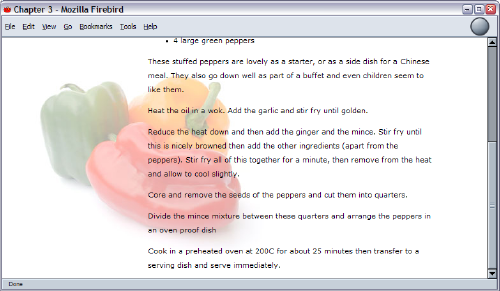
Figure 3.8. The background image is fixed and doesn’t scroll off the page with the content.
We can use the property background-attachment with a value of fixed to fix the background so that it doesn’t move with the content, as shown in Figure 3.8.
Discussion
In this solution, we’re using several CSS properties to add our image to the background, position it, and detail how it behaves when the document is scrolled. It is also possible to use a shorthand method to write out this information, applying the CSS property, background. This property allows you to declare background-color, background-image, background-repeat, background-attachment and background-position in a single property declaration.
Take, for example, the CSS declarations shown below:
Example 3.6. backgroundfixed.css (excerpt)
body {

  background-color: #FFFFFF;

  background-image: url(peppers_bg.jpg);

  background-repeat: no-repeat;

  background-attachment: fixed;

  background-position: 20px 20px;

}
These could also be written as follows:
body {

  background: #ffffff url(peppers_bg.jpg) no-repeat fixed 20px

    20px;

}
How do I set background images for other elements?
In this chapter, we’ve already looked at setting background images for the document. However, background images can be used on other elements, too.
Solution
Example 3.7. backgrounds2.css (excerpt)
#smallbox {

  background-image: url(mini_chilli.jpg);

  background-repeat: repeat-y;

  float: left;

  padding-left: 60px;

  margin-right: 20px;

  width: 220px;

  border: 1px solid #F5C9C9;

}
The red chillies appearing down the left-hand side of the box in Figure 3.9 comprise a background that’s created by tiling the background image on the y-axis. The background image shown here is applied to a <div>, along with other rules, to create the box.
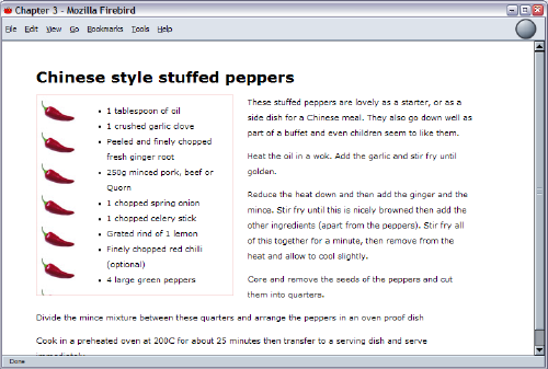
Figure 3.9. The chilli image is a tiled background image.
Discussion
Background images can be used on any page element. You can apply a background to a heading, as shown in Figure 3.10:
Example 3.8. backgrounds2.html (excerpt)
<h1 class="header">Chinese style stuffed peppers</h1>Example 3.9. backgrounds2.css (excerpt)
.header {

  background-image: url(dotty.gif);

  width: 400px;

  height: 30px;

  padding: 6px 6px 4px 8px;

  color: #B22222;

  background-color: transparent;

}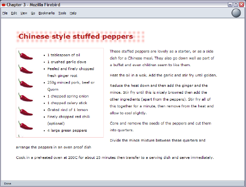
Figure 3.10. The heading has a background image.
You can even apply a background to links, which can assist you in making some interesting effects, as in Figure 3.11.
Example 3.10. backgrounds2.css (excerpt)
a:link, a:visited {

  color: #B22222;

  background-color: transparent;

  font-weight: bold;

}

a:hover {

  background-image: url(dotty.gif);

  text-decoration: none;

}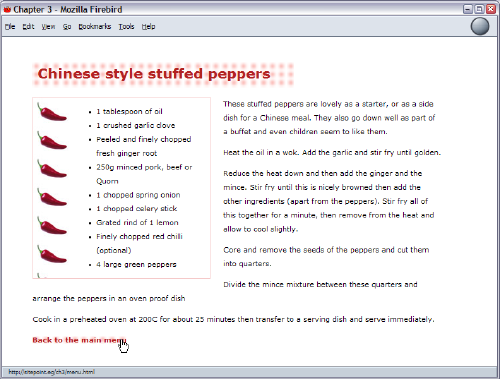
Figure 3.11. A background image is applied to the link on hover.
How do I place text on top of an image?
In the bad old pre-CSS days, the only way to add text to an image was to add the text in your graphics program! CSS provides far better means to achieve this effect.
Solution
The easiest way to layer text on top of an image is to make the image a background image. The chilli image beneath the list of ingredients shown in Figure 3.12 is added using the following properties:
Example 3.11. backgrounds3.css (excerpt)
  background-image: url(chilli2.jpg);

  background-repeat: no-repeat;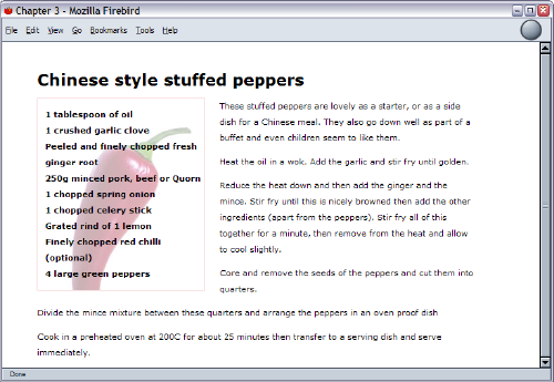
Figure 3.12. The chilli image is a background image.
Discussion
Using CSS to lay text over images has many advantages over the process of simply adding the text to the image in a graphics program.
First, it’s more difficult to change text that is part of a graphic. To do so, you need to find the original graphic, edit it in a graphics program, and upload it every time you need to change the text.
Second, text is far more accessible as text content than as part of an image. Browsers that don’t support images will still be able to read text that has been added as CSS. This also benefits your search engine ranking – search engines can’t index text that’s part of an image, but will see text laid over an image as regular text, and index it accordingly.
How do I add more than one background image to my document?
It isn’t possible to add more than one background image to your document. However, it is possible to give the effect of multiple background images by applying a background to elements that are nested, such as the <html> tag and the <body> tag.
Example 3.12. backgrounds4.css (excerpt)
html {

  background-image: url(mini_chilli.jpg);

  background-repeat: repeat-y;

  background-position: 2px 2px;

  background-attachment: fixed;

}

body {

  background-image: url(peppers_bg.jpg);

  background-repeat: no-repeat;

  background-position: 80px 20px;

}
This effect can be seen in Figure 3.13.
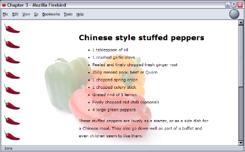
Figure 3.13. Background images are applied to the <html> and <body> elements.
Discussion
This simple example can form the basis of more complex effects using multiple background images. As you’ve seen through the examples in this chapter, a background image can be applied to any element on the page. The careful and creative use of images in this way can create many interesting visual effects while maintaining the accessibility of the document (as the background images will not interfere with the document’s structure).
Many of the entries in the CSS Zen garden rely on such careful use of background images to achieve their layouts.
Summary
This chapter has explained the answers to some common image-related questions. There are, of course, going to be image-related questions all through this book. In particular, the chapters that deal with positioning will explore the positioning of images along with other elements on the page.
Watch out for the next — and final! — chapter of The CSS Anthology: 101 Essential Tips, Tricks & Hacks — it’ll be on SitePoint soon. Or, if you can’t wait, download the fist 4 chapters free now.
Rachel Andrew is a front and back-end web developer, author and speaker. Her books include the recent Get Ready for CSS Grid Layout and she is a regular contributor to a number of publications both on and offline. Rachel is co-founder of the CMS Perch, a Google Developer Expert and an Invited Expert to the CSS Working Group. She writes about business and technology on her own site at rachelandrew.co.uk.

