
Recently, clients have asked me on a couple of occasions to implement designs like this:
When I say like this,
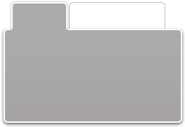
I’m referring to the drop shadow around the whole component. Both the main box and the selected tab at the top have shadows, but there’s no overlap; they combine to form a single gradiated result. Effectively, they describe a non-rectangular polygon.
Tab boxes aren’t the only application for this kind of effect. I’ve seen it used in drop-down menus too, and I’m sure you can think of other examples. What the designer wants is the sense that the whole shape creates a drop shadow, as it would in nature.
So, how would you go about implementing this sort of effect? And would it surprise you if I told you that I did it with pure CSS, without using any images at all?
The lynchpin of it all is the area where the tab and the box combine. How do we get a shadow to describe that complex shape in CSS? Obviously it’s going to involve box-shadow (and its vendor equivalents), but that property can only create rectangular shapes. It is flexible to border-radius (and its vendor equivalents), so it can describe rounded corners rather than being limited to straight edges. But still, that caveat is not enough to describe the complex polygon that this design requires. So how is it done?
The answer is deceptively simple!
Almost every polygon can be reduced to a combination of simpler shapes—a reduction that’s the essence of how we make complex shapes with HTML and CSS in the first place. This example can be reduced down to two rectangles: the tab, and the main box.
So what we have to do is apply the shadow to both those boxes, and then cut off the overlap with clip!
Polygon Box-shadows
I’ve prepared a simplified test case to illustrate the technique, which looks superficially like the tab structure shown above, but is simply two boxes with solid background colors. Here’s the CSS for it:
#container
{
    position:relative;
}

#small
{
    background:#336;
    width:8em;
    height:3em;

    position:absolute;
    left:1em;
    top:0;
    z-index:100;
    clip:rect(-10px 9em 3em -10px);

    -moz-box-shadow:0 0 10px #002;
    -webkit-box-shadow:0 0 10px #002;
    box-shadow:0 0 10px #002;
}

#large
{
    background:#336;
    width:18em;
    height:20em;

    position:relative;
    top:3em;
    z-index:0;

    -moz-box-shadow:0 0 10px #002;
    -webkit-box-shadow:0 0 10px #002;
    box-shadow:0 0 10px #002;
}
Both the boxes have shadows, but the small one has a clip value that removes the shadow at its bottom edge. The top, right, and left clip values extend beyond the dimension of the element, giving its shadow room to spread; however, the bottom clip is the same as the element’s height, and this effectively cuts off any shadow that would extend below it.
The large rectangle’s shadow is allowed to spread freely, but the part of it that adjoins the small one is covered by that small one, because its z-index is higher, placing it above. Overall, the combination of positioning and clip removes hides the parts of the shadow we don’t want.
And that then creates the final effect we’re looking for: the appearance of pure CSS drop shadows around a non-rectangular shape!
Keen observers will note that I’ve used em-based dimensions and positioning, so that it expands with font size, and thereby counteracts one of the major problems that absolute positioning can otherwise give rise to. And since the container element has relative positioning, to create that positioning context the overall structure is still within the page flow, can still be moved by other page content, and is affected by window resizing.
And there you have it! This technique will work in all modern browsers, including Internet Explorer. Of course, IE is without box-shadow, but it does have a Glow filter, and that can create a reasonable enough effect if used subtly.
Frequently Asked Questions (FAQs) about Creating Shadows Around Polygons in CSS
How can I create a shadow effect around a polygon in CSS?
Creating a shadow effect around a polygon in CSS involves using the filter: drop-shadow property. This property applies a shadow to an element. The syntax is filter: drop-shadow(h-shadow v-shadow blur spread color);. The h-shadow and v-shadow values are required and set the position of the shadow horizontally and vertically. The blur and spread values are optional and control the blur and size of the shadow. The color value is also optional and sets the color of the shadow.
Can I use the text-shadow property to create a shadow around a polygon?
The text-shadow property in CSS is used to apply a shadow to text, not to shapes or images. If you want to create a shadow around a polygon, you should use the filter: drop-shadow property instead.
How can I add a border to my clip-path polygon CSS style?
Unfortunately, CSS does not support adding borders to clip-path shapes directly. However, you can achieve a similar effect by creating a duplicate of your shape, scaling it slightly larger, and placing it behind your original shape. This will create the illusion of a border.
How can I make rounded corners when using CSS clip-path?
To create rounded corners on a polygon using CSS clip-path, you can use the border-radius property. However, this property only works on certain shapes, such as rectangles and circles. For more complex shapes, you may need to manually adjust the points in your clip-path to create the appearance of rounded corners.
How can I create a shadow effect in CSS3?
In CSS3, you can create a shadow effect using the box-shadow property. This property applies a shadow to the box that contains an element. The syntax is box-shadow: h-shadow v-shadow blur spread color inset;. The h-shadow and v-shadow values are required and set the position of the shadow horizontally and vertically. The blur, spread, color, and inset values are optional and control the blur, size, color, and whether the shadow is inside or outside of the box.