
Key Takeaways
- Flexbox, officially known as the CSS Flexible Box Layout Module, is designed to manage layout in one direction—a row or a column.
- By adding display: flex or display: inline-flex to a containing element, its immediate children become flex items that behave according to the rules of flex layout.
- Flexbox simplifies the code necessary for a range of user interface patterns, such as creating flexible form components or vertically centering elements.
- When choosing between Flexbox and Grid, use Grid for arranging elements into rows and columns that align both horizontally and vertically, and use Flexbox for arranging items in a row or a column, when you wish to align items vertically or horizontally, but not both.
The following introduction to Flexbox is an extract from Tiffany’s new book, CSS Master, 2nd Edition.
Before CSS Grid came along, there was Flexbox (which is officially known as the CSS Flexible Box Layout Module). Flexbox was designed to manage layout in one direction—a row (flex-direction: row or row-reverse) or a column (flex-direction: column or column-reverse). That’s in contrast to Grid, which accounts for rows and columns.
A basic flexible box layout is simple to create: add display: flex or display: inline-flex to the containing element. These values for display will trigger a flex formatting context for that containing element’s children. As with Grid, both flex and inline-flex are inside display modes. We set these values on the container, which behaves like a block-level or inline-level box, respectively. The children of that container are then arranged according to the rules of flex layout.
Note: Older versions of Blink-based browsers such as Chrome (≤ 28), and WebKit-based browsers like Safari (≤ 8), require a vendor prefix. If your project still supports those browsers, you’ll need to use display: -webkit-flex or display: -webkit-inline-flex. Older versions of Firefox (≤ 21) also require a prefix. Use -moz-flex and -moz-inline-flex to support those browsers.
By adding display: flex or display: inline-flex to a containing element, its immediate children become flex items, as shown in the image below. Flex items may be element children or non-empty text nodes. For instance, the markup below generates three flex item boxes that each behave according to the rules of flex layout:
<div style="display: flex">
    <span>This text is contained by a SPAN element.</span>
    <b>This text is contained by a B element.</b>
    This text node is still a flex item.
</div>
If no other properties are set, each flex item will have the same height as its tallest element (as determined by content). It will also stack horizontally (or vertically when the document has a vertical writing mode) without wrapping, and with no space between the edges of each box. Flex items may overflow the container.
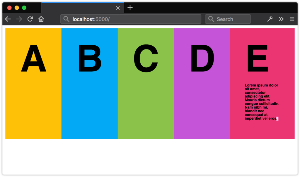 A list with
 display: flex applied to the ul containing element
This may not seem like such a big deal, but it simplifies the code necessary for a range of user interface patterns. Let’s look at a couple of examples.
A New Media Object Component
Take the following media object code:
<div class="media__object">
    <img src="video-thumb1.jpg">
    <div class="media__object__text">Lorem ipsum dolor sit amet, consectetur adipiscing elit, sed do eiusmod tempor incididunt ut labore et dolore magna aliqua.</div>
</div>
Before Flexbox, we might have paired the preceding markup with the following CSS:
.media__object img {
    float: left;
    height: auto;
    width: 150px;
}
.media__object__text {
    padding-left: 170px;
}
/* Let's use the clearfix hack! */
.media__object::after{
    content: ' ';
    display: block;
    clear: both;
}
This layout works, but it has one major drawback: it requires us to constrain the width of our images so that we know how much padding to use. That limits our ability to use this same component in multiple contexts. You may want an image 150px wide when this component is used for a “Related Stories” widget, and one that’s only 75px wide for comments.
Let’s try this using Flexbox. Here’s our updated CSS:
.media__object {
    display: flex;
}
.media_object img {
    margin-right: 20px;
}
That’s a lot less CSS. An added bonus is that we don’t have to worry about how wide or tall our image is. Nor do we have to concern ourselves with clearing floats. Whether the image is 200px wide or 20px wide, .media__object__text will abut the margin box of our img element.
Creating Flexible Form Components with flex
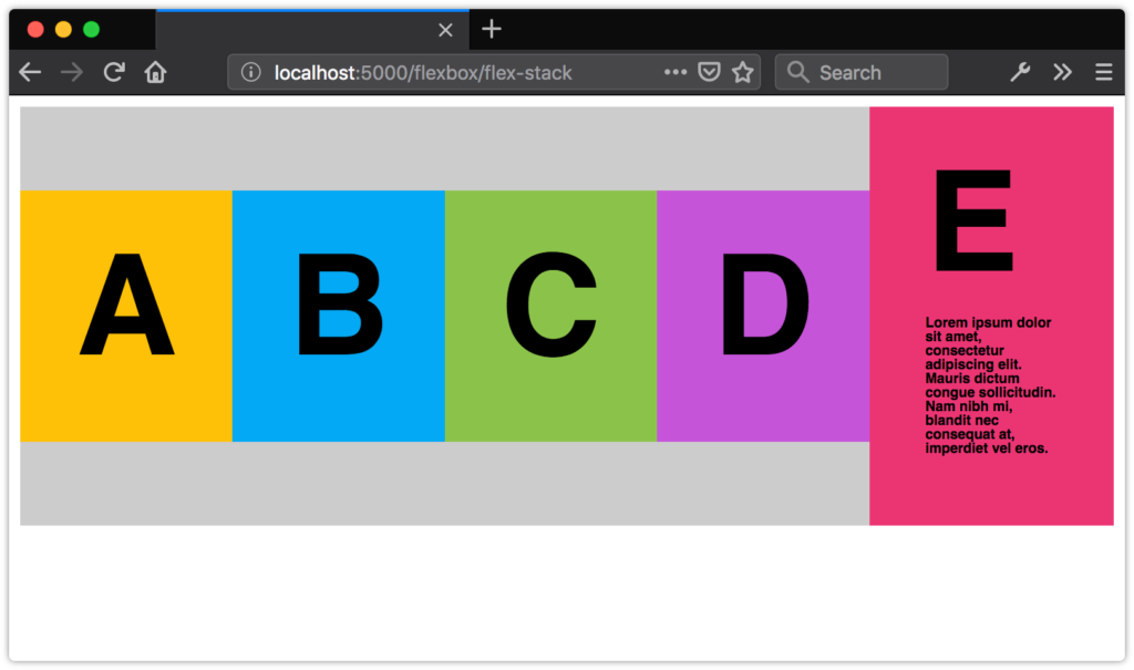
Another use case for Flexbox is creating flexible, vertically aligned form components. Consider the interface pattern shown in the image below.
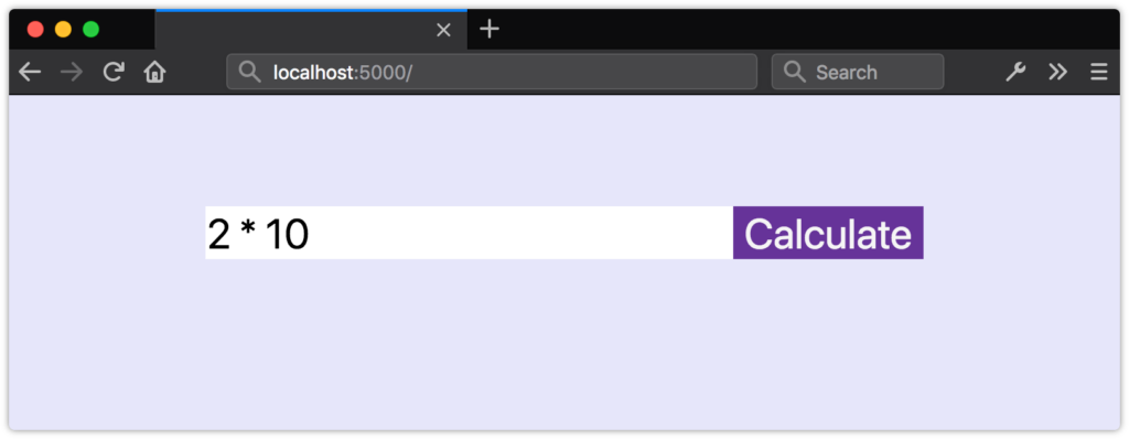 A form field with an adjacent button
Here, we have a form input control and an adjacent button. Both are vertically aligned, and our button is 150px wide.
What if we want our input element to expand to fill the available space in its container? Without Flexbox, we’d need some JavaScript and hand-waving to update the width of input in response to changes in the width of its parent. With Flexbox, however, we can just use flex.
The flex property is actually shorthand for three other properties.
flex-growindicates that an element should grow if necessary and must be a positive integer. Its initial value is0.flex-shrinkindicates that an element should shrink if necessary and must be a positive integer. Its initial value is1.flex-basis:indicates the initial or minimum width (when the flex axis is horizontal) or the height of an element (when it’s vertical). It may be a length or percentage, orauto, and its initial value isauto.
Though it’s possible to set each of these individually, the specification strongly recommends using the flex shorthand. Here’s an example:
div {
    display: flex;
}
input[type="text"], button {
    border: 0;
    font: inherit;
}
input[type="text"] {
    flex: 1 0 auto;
}
button {
    background: #003;
    color: whitesmoke;
    display: block;
    text-align: center;
    flex: 0 0 150px;
}
Here, we’ve used flex: 1 0 auto for our input element. Since its flex-grow value is 1, it will grow to fill the available space of its parent. For the button element, however, we’ve used flex: 0 0 150px. The 0 values for flex-grow and flex-shrink prevent the width of the button from increasing or decreasing, while the flex-basis value of 150px sets its width.
As you can see in the image below, our button remains the same size, but the width of input expands to fill the remaining space.
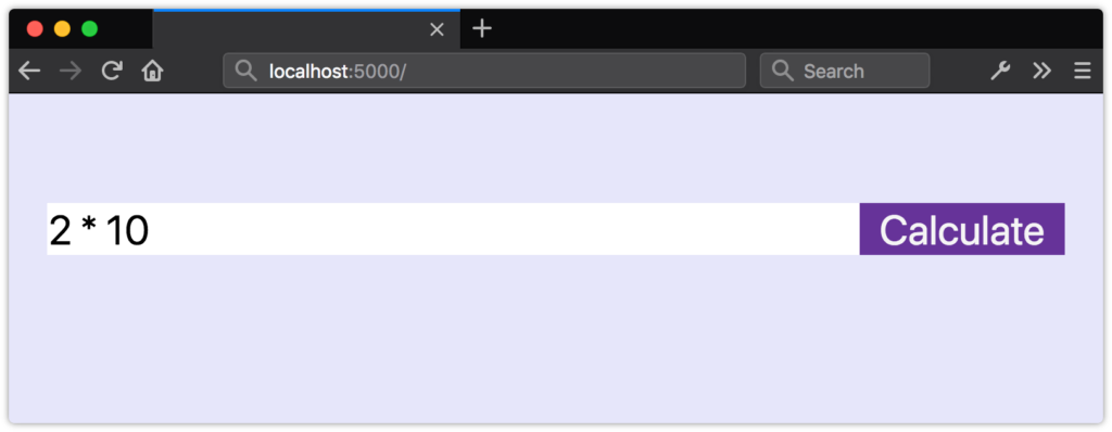 The effect of
 flex: 0 0 150px
The tricky bit about flex-grow and flex-shrink values is that they’re proportional. Yes, flex: 1 0 auto means our input element will be wider than our button. But changing the value of our button’s flex property to flex: 1 0 auto doesn’t necessarily mean that both elements will have the same size, as shown in the following image.
 Both items have the same flex value but are still different sizes
Instead, flex items will be resized to fill the container, taking their used min-width and max-width values into account (which may be their initial values).
Unfortunately, we can’t use fr units with the flex or flex-basis properties. Use length or percentage values instead.
Vertical Centering with Flexbox
Finally, let’s take a look at how to vertically center content with Flexbox. Vertically centering elements is one of the more difficult tasks to achieve with CSS, particularly if the height of your content is unknown. But with Flexbox, we require just one additional line of CSS—align-items: center:
.flex-container {
    display: flex;
    align-items: center;
}
Now our flex items and their contents are vertically centered within the flex container, as shown in the image below.
 Distributing flex items with
 align-items: center
Creating Grid-like Layouts with Flexbox
In most cases, you’ll want to use Grid to create grid-like layouts. However, you may find yourself wanting boxes that align when there’s an even number of items, but expand to fill the available space when there’s an odd number.
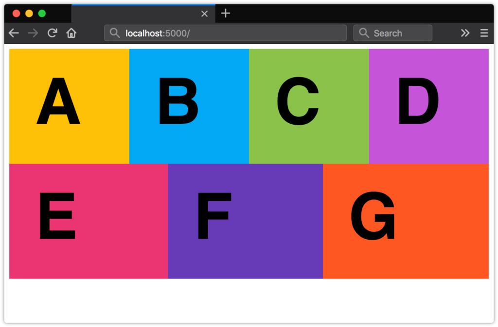 A grid-like layout with expanding cells
Here’s the markup we’ll use:
<ul class="flex-aligned">
    <li>A</li>
    <li>B</li>
    <li>C</li>
    <li>D</li>
    <li>E</li>
    <li>F</li>
    <li>G</li>
</li>
By default, flex items don’t wrap. To achieve the layout above, we’ll need to make them wrap using the flex-wrap property. It accepts three values: nowrap (the inital value), wrap, and wrap-reverse. We’ll use wrap here:
.flex-aligned {
    display: flex;
    flex-wrap: wrap;
}
Now we just need to indicate how our flex items should behave, and what their maximum width should be. Since we want a maximum of four columns, we’ll set our flex-basis value to 25%. And since we want our flex items to expand to fill the available space, we’ll set flex-grow to 1. We’ll keep flex-shrink at 0 so that our boxes never occupy less than 25% of their container:
.flex-aligned li {
    flex: 1 0 25%;
}
Learning More about Flexbox
There’s a lot more to Flexbox than what we’ve covered here. CSS-Tricks’ “A Complete Guide to Flexbox” digs into all the properties and values. You can also check out Philip Walton’s “Solved by Flexbox”, which showcases UI patterns that are made easier with Flexbox.
Choosing flex or grid
As you develop page or component layouts, you may find yourself wondering when it’s better to use Flexbox and when to use Grid.
- Use Grid when you want to arrange elements into rows and columns that align both horizontally and vertically.
- Use Flexbox when you want to arrange items in a row or a column, when you wish to align items vertically or horizontally, but not both.
Jen Simmons’ video “Flexbox vs. CSS Grid — Which is Better?” walks you through some things to consider when choosing between Grid and Flexbox. Rachel Andrew’s “Should I use Grid or Flexbox?” is another great resource for understanding both.
In practice, your projects will probably mix both of these techniques, as well as floats. For instance, you may use Grid to define the overall page layout, while using Flexbox for your navigation menu or search box, and floats to place tables or images.
Frequently Asked Questions about Creating Flexible Layouts with Flexbox
What is the difference between Flexbox and CSS Grid?
Flexbox and CSS Grid are both layout models in CSS. While they may seem similar, they serve different purposes. Flexbox is a one-dimensional layout model that allows you to control the layout of items in a container along a single axis – either horizontally or vertically. It’s ideal for components of an application or small-scale layouts. On the other hand, CSS Grid is a two-dimensional layout model that allows you to control the layout of items both horizontally and vertically at the same time. It’s ideal for larger scale layouts that require control over both rows and columns.
How can I align items vertically in a Flexbox?
To align items vertically in a Flexbox, you can use the ‘align-items’ property. This property aligns items along the cross axis (which is vertical if the main axis is horizontal). For example, if you want to center items vertically, you can use ‘align-items: center’. Other possible values for this property include ‘flex-start’, ‘flex-end’, ‘baseline’, and ‘stretch’.
What does the ‘flex’ property do in Flexbox?
The ‘flex’ property in Flexbox is a shorthand property that sets the ‘flex-grow’, ‘flex-shrink’, and ‘flex-basis’ properties in one go. It allows you to control how a flex item grows and shrinks relative to the rest of the flex items in the container, as well as its initial size before any available space is distributed. For example, ‘flex: 1 1 auto’ means the item can grow and shrink, and its initial size is ‘auto’.
How can I reverse the order of items in a Flexbox?
To reverse the order of items in a Flexbox, you can use the ‘flex-direction’ property with the value ‘row-reverse’ or ‘column-reverse’. This will reverse the order of items along the main axis. For example, ‘flex-direction: row-reverse’ will reverse the order of items from left to right.
Can I use Flexbox with all browsers?
Flexbox is widely supported in all modern browsers, including Chrome, Firefox, Safari, Edge, and Internet Explorer 10 and later. However, there may be some differences in how these browsers render Flexbox layouts, especially in older versions. Therefore, it’s always a good idea to test your layout in different browsers to ensure it looks and works as expected.
How can I create a responsive layout with Flexbox?
Flexbox makes it easy to create responsive layouts without having to use media queries. By using the ‘flex-wrap’ property, you can allow flex items to wrap onto multiple lines, creating a responsive layout. For example, ‘flex-wrap: wrap’ will allow items to wrap onto the next line if there’s not enough space in the container.
What is the difference between ‘justify-content’ and ‘align-items’ in Flexbox?
In Flexbox, ‘justify-content’ and ‘align-items’ are used to align items along the main axis and the cross axis, respectively. ‘justify-content’ aligns items along the line on which they’re laid out (which is horizontal if the main axis is horizontal), while ‘align-items’ aligns items perpendicular to this line.
How can I make a flex item take up the remaining space in the container?
To make a flex item take up the remaining space in the container, you can use the ‘flex-grow’ property with a value greater than 0. This will allow the item to grow and take up any remaining space after all items have been laid out and any space has been distributed.
Can I nest Flexbox containers?
Yes, you can nest Flexbox containers. This means you can have a Flexbox container inside another Flexbox container. This can be useful for creating complex layouts. However, keep in mind that the properties of the parent container don’t affect the child containers, and vice versa.
How can I control the order of flex items?
You can control the order of flex items using the ‘order’ property. This property takes an integer value, with higher values appearing later in the display order. By default, all flex items have an order of 0. For example, ‘order: 1’ will make an item appear after items with an order of 0.