

Key Takeaways
- There are four different techniques for creating beveled images with CSS, each offering varying levels of browser support. All methods are based on the same principle of overlaying black and white borders on an image and blending them with opacity.
- The first technique uses generated content on the image and works only in Opera. The second technique uses generated content on a wrapper element, offering wider browser support. The third method utilizes shadows instead of borders and is supported only in Firefox 3.5 or later. The fourth approach is the most cross-browser compatible, but requires more HTML modification.
- Beveled images can enhance the visual appeal of a web design by adding depth and a sense of realism. This effect can be achieved by manipulating the border properties of the image or element. Additional CSS3 properties like box-shadow and border-image can be used to create more complex and realistic bevel effects.
Recently, I wanted a simple CSS method for adding a beveled effect to images. It’s easy enough to create a sense of depth with normal outset borders (below left), but I was after an effect that would actually look like part of the image, as though it were a bevel on the image itself (below right).
In the end I found four different ways of doing it, each with different levels of support: from the cleanest approach that only worked in one browser, to the most robust that works in everything back to IE6.
All of them work on the same core principal; black borders for shade and white borders for highlighting are overlaid on top of an image, and then blended with some form of opacity. In each case, browsers without support for that technique will simply show the image as normal.
Technique 1: Using Generated Content on the Image (Demo)
- Pros: Ultra-clean technique requires no additional markup
- Cons: Only works in Opera
With this first technique we create a pseudo-element using :after, then style it to be perfectly overlaid on top of the image. Then we add borders to the overlaid element, and use RGBA to define each border color: the top and left borders are rgba(255,255,255,0.4), white with 40% opacity; and the bottom and right borders are rgba(0,0,0,0.4), black with 40% opacity:
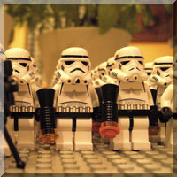
img.beveled{ position:relative;}img.beveled:after{ position:absolute; left:0; top:0; display:block; content:"0a0"; box-sizing:border-box; width:100%; height:100%; border:5px solid; border-color:rgba(255,255,255,0.4) rgba(0,0,0,0.4) rgba(0,0,0,0.4) rgba(255,255,255,0.4);}<img class="beveled" src="stormtroopers.jpg" alt="A legion of Lego Stormtroopers, standing in formation." />This technique only works in Opera because no other browser supports generated content on multimedia replacement elements like <img> and <object>. But since we’re only addressing Opera, we have the freedom to use box-sizing and 100% dimensions, rather than having to define the dimensions explicitly.(Note: the value of the content property in all these examples is a unicode non-breaking space. This is added because pseudo-elements have to contain something or they’re not rendered.)
Technique 2: Using Generated Content on a Wrapper Element (Demo)
- Pros: Wider range of supported browsers
- Cons: Requires additional markup and explicit dimensions
The second technique is essentially the same as the first, but this time we create the overlay element using generated content on a wrapper <span> for browsers that don’t support generated content on the <img> itself. For this technique we also need to begin defining explicit dimensions on the wrapper element and the generated content (although we could use vendor-specific versions of box-sizing on the generated content, we’d still have to define the dimensions of the wrapper, so we may as well do the same for both):
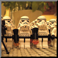
span.beveled{ position:relative; width:200px; height:200px; display:block;}span.beveled:after{ position:absolute; left:0; top:0; display:block; content:"0a0"; width:190px; height:190px; border:5px solid; border-color:rgba(255,255,255,0.4) rgba(0,0,0,0.4) rgba(0,0,0,0.4) rgba(255,255,255,0.4);}<span class="beveled"> <img src="stormtroopers.jpg" alt="A legion of Lego Stormtroopers, standing in formation." /></span>Technique 3: Using Shadows instead of Borders (Demo)
- Pros: The most visually attractive technique
- Cons: Only works in Firefox 3.5 or later
The third technique is a diversion from the second, where instead of using RGBA borders we’re using -moz-box-shadow:inset to create the beveling effect. Since box shadow effects have an alpha gradient (rather than the same opacity at all points), the overall effect is much prettier and more rounded; and the spread radius parameter can be subtly used to blend away the corner sharpness.This effect is only supported in Firefox 3.5 or later; although Safari does implement box-shadow (as -webkit-box-shadow), there’s no support for inset:
span.beveled{ position:relative; width:200px; height:200px; display:block;}span.beveled:after{ position:absolute; left:0; top:0; display:block; content:"0a0"; width:200px; height:200px; -moz-box-shadow:-5px -5px 2px rgba(0,0,0,0.4) inset, 5px 5px 2px rgba(255,255,255,0.4) inset;}<span class="beveled"> <img src="stormtroopers.jpg" alt="A legion of Lego Stormtroopers, standing in formation." /></span>I suppose we could have added a -webkit version anyway, in the hope of forward compatibility, but that would be a risk since we can’t know what any future implementation will be like — it might be worse than nothing!
Technique 4: Everybody’s Happy (Demo)
- Pros: Works in all modern browsers
- Cons: Requires more additional markup and explicit dimensions
The fourth and final technique is the most cross-browser compatible, but also requires the most HTML modification. It’s essentially the same as the second technique, but with two important differences: firstly, it uses a second physical <span> rather than generated content; and secondly, it uses ordinary hex border colors rather than RGBA, and then blends the whole element with opacity. Even Internet Explorer can handle this:
span.beveled{ position:relative; width:200px; height:200px; display:block;}span.beveled span{ position:absolute; left:0; top:0; display:block; width:190px; height:190px; border:5px solid; border-color:#fff #000 #000 #fff; filter:alpha(opacity=40); opacity:0.4;}<span class="beveled"> <img src="stormtroopers.jpg" alt="A legion of Lego Stormtroopers, standing in formation." /> <span></span></span>Further Development
You could take this further by using colorful borders for a gel-like effect, or even multiple staggered overlays to create effects that are more subtle or intricate.But the basic idea is here, and I hope you find it useful. It’s certainly been great fun to play with!
Frequently Asked Questions (FAQs) about Creating Beveled Images with CSS
What is a Beveled Image in CSS?
A beveled image in CSS is a visual effect that gives the illusion of a three-dimensional edge to an image or element. This effect is achieved by manipulating the border properties of the image or element. The bevel effect can add depth and a sense of realism to your web design, making it more visually appealing to users.
How can I create a Beveled Image using CSS?
Creating a beveled image using CSS involves manipulating the border properties of the image. You can use the border-style property to set the style of the border to “solid”, “double”, “dotted”, “dashed”, “groove”, “ridge”, “inset”, or “outset”. The “groove”, “ridge”, “inset”, and “outset” styles can create a beveled effect. You can also use the border-width and border-color properties to adjust the size and color of the border, respectively.
Can I create a Beveled Image with CSS3?
Yes, you can create a beveled image with CSS3. CSS3 introduces new properties and values that can be used to create more complex and realistic bevel effects. For example, you can use the box-shadow property to add a shadow to the border, creating a more pronounced bevel effect. You can also use the border-image property to apply an image to the border, creating a textured bevel effect.
How can I create a Bevel Effect for a Content Box in CSS?
Creating a bevel effect for a content box in CSS is similar to creating a beveled image. You can use the border-style, border-width, and border-color properties to create the bevel effect. You can also use the box-shadow property to add a shadow to the border, enhancing the bevel effect. Additionally, you can use the border-radius property to round the corners of the content box, creating a more subtle and sophisticated bevel effect.
What are some Options to Set CSS Bevel Border?
There are several options to set a CSS bevel border. You can use the border-style property to set the style of the border. The “groove”, “ridge”, “inset”, and “outset” styles can create a beveled effect. You can also use the border-width and border-color properties to adjust the size and color of the border. Additionally, you can use the box-shadow property to add a shadow to the border, enhancing the bevel effect.
How can I create a Bevel Effect in CSS3?
Creating a bevel effect in CSS3 involves using new properties and values. You can use the box-shadow property to add a shadow to the border, creating a more pronounced bevel effect. You can also use the border-image property to apply an image to the border, creating a textured bevel effect. Additionally, you can use the border-radius property to round the corners of the element, creating a more subtle and sophisticated bevel effect.
What is the Role of CSS Border in Creating Beveled Images?
The CSS border plays a crucial role in creating beveled images. By manipulating the border properties, you can create a bevel effect that gives the illusion of a three-dimensional edge to the image. The border-style, border-width, and border-color properties can be used to create the bevel effect. The “groove”, “ridge”, “inset”, and “outset” styles can create a beveled effect.
Can I create a Bevel Effect for a Content Box in CSS3?
Yes, you can create a bevel effect for a content box in CSS3. CSS3 introduces new properties and values that can be used to create more complex and realistic bevel effects. For example, you can use the box-shadow property to add a shadow to the border, enhancing the bevel effect. You can also use the border-image property to apply an image to the border, creating a textured bevel effect.
How can I create a Textured Bevel Effect in CSS?
Creating a textured bevel effect in CSS involves using the border-image property. This property allows you to apply an image to the border of an element. By choosing an image with a texture, you can create a textured bevel effect. You can also use the border-image-slice property to specify how the image is divided into border images.
Can I create a Beveled Image with CSS on all Browsers?
While most modern browsers support the CSS properties used to create a beveled image, there may be some differences in how these properties are implemented across different browsers. Therefore, it’s important to test your CSS code on multiple browsers to ensure that the bevel effect appears as intended. You can also use vendor prefixes to ensure compatibility with different browsers.