


Key Takeaways
- Utilize Vite to set up a new React project quickly, ensuring a robust development environment for building dynamic table components.
- Implement sorting and filtering functionalities in the table by managing state with React’s useState hook, allowing dynamic interaction based on user input.
- Enhance table readability and functionality by formatting Boolean values and capitalizing headings, improving the overall user experience.
- Integrate interactive controls like input fields and buttons to provide sorting and filtering capabilities, offering users a seamless way to manage displayed data.
- Address potential overfiltering by providing feedback when no results match the search criteria, ensuring users are aware of the need to adjust their filters.
Dynamic tables are often used in web applications to represent data in a structured format. Sorting and filtering the dataset can speed up processes when working with large sets of data. In this tutorial, we’ll take a look at how to create a sortable and filterable table component in React.
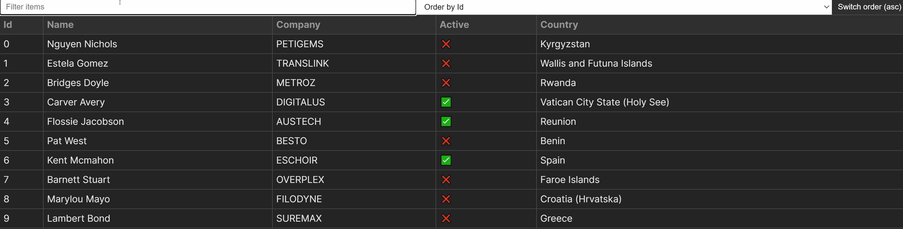
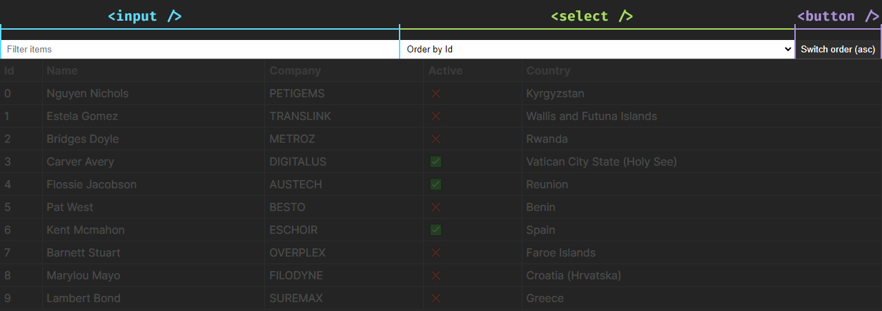
You can find the full source code in one piece hosted on GitHub. The end result is pictured below.
Prerequisites
Before we begin, this tutorial assumes you have a basic knowledge of HTML, CSS, JavaScript, and React. While we go over the project step by step, we won’t explain core concepts in React or JavaScript array methods in detail. We’ll also use TypeScript, but the same can be achieved without it. With that being said, let’s jump into coding.
Setting Up The Project
For this project, we’ll use Vite, a robust and popular frontend tool. If you don’t already have an existing React application, you can bootstrap a new project in Vite using one of the following commands inside your terminal:
# Using NPM
npm create vite@latest folder-name -- --template react-ts

# Using Yarn
yarn create vite folder-name --template react-ts

# Using PNPM
pnpm create vite folder-name --template react-ts

# Using Bun
bunx create-vite folder-name --template react-ts
Once you’re ready, set up a new folder for the Table component within the React project with the following structure:
src
├─ components
│  ├─ Table
│  │  ├─ index.ts
│  │  ├─ table.css
│  │  ├─ Table.tsx
├─ App.tsx
index.ts. We’ll use this file to re-exportTable.tsxto simplify import paths.table.css. Contains styles associated with the component. For this tutorial, we’ll use vanilla CSS.Table.tsx. The component itself.
Open Table.tsx and export the following, so that we can verify the component loads when we import it:
import './table.css'

export const Table = () => {
  return (
    <h1>Table component</h1>
  )
}
Inside index.ts, re-export the component using the following line:
export * from './Table'
Now that we have the component files set up, let’s verify that it loads by importing it into our app. In this tutorial, we’ll use the App component. If you have an existing React project, you can import it into your desired location. Import the Table component into your app like so:
import { Table } from './components/Table'

const App = () => {
  return (
    <Table />
  )
}

export default App
Generating the mock data
Of course, to work on the table, we’ll need some mock data first. For this tutorial, we can use JSON Generator, a free service for generating random JSON data. We’ll use the following schema to generate the data:
[
  '{{repeat(10)}}',
  {
    id: '{{index()}}',
    name: '{{firstName()}} {{surname()}}',
    company: '{{company().toUpperCase()}}',
    active: '{{bool()}}',
    country: '{{country()}}'
  }
]
JSON Generator comes with various built-in functionalities to generate different types of data. The above schema will create an array of objects with ten random objects in the form of:
{
  id: 0,                 // number - Index of the array, starting from 0
  name: 'Jaime Wallace', // string - A random name
  company: 'UBERLUX',    // string - Capitalized random string
  active: false,         // boolean - either `true` or `false`
  country: 'Peru'        // string - A random country name
}
Generate a list of entries using the schema above, then create a new file inside the src folder called data.ts and export the array in the following way:
export const data = [
  {
    id: 0,
    name: 'Jaime Wallace',
    company: 'UBERLUX',
    active: false,
    country: 'Peru'
  },
  { ... },
]
Open App.tsx, and pass this data to the Table component as a prop called rows. We’ll generate the table based on this data:
  import { Table } from './components/Table'
+ import { data } from './data'

  const App = () => {
    return (
-     <Table />
+     <Table rows={data} />
    )
  }

  export default App
Creating the Component
Now that we have both the component and data set up, we can start working on the table. To dynamically generate the table based on the passed data, replace everything in the Table component with the following lines of code:
import { useState } from 'react'

import './table.css'

export const Table = ({ rows }) => {
  const [sortedRows, setRows] = useState(rows)

  return (
    <table>
      <thead>
        <tr>
          {Object.keys(rows[0]).map((entry, index) => (
            <th key={index}>{entry}</th>
          ))}
        </tr>
      </thead>
      <tbody>
        {sortedRows.map((row, index) => (
          <tr key={index}>
            {Object.values(row).map((entry, columnIndex) => (
              <td key={columnIndex}>{entry}</td>
            ))}
          </tr>
        ))}
      </tbody>
    </table>
  )
}
This will dynamically generate both the table headings and cells based on the rows prop. Let’s break down how it works. As we’re going to sort and filter the rows, we need to store it in a state using the useState hook. The prop is passed as the initial value to the hook.
To display the table headings, we can use Object.keys on the first entry in the array, which will return the keys of the object as a list of strings:
const rows = [
  {
    id: 0,
    name: 'Jaime Wallace'
  },
  { ... }
]

// #1 Turn object properties into an array of keys:
Object.keys(rows[0]) -> ['id', 'name']

// #2 Chain `map` from the array to display the values inside `th` elements:
['id', 'name'].map((entry, index) => (...))
To display the table cells, we need to use Object.values on each row, which returns the value of each key in an object, as opposed to Object.keys. In detail, this is how we display table cells:
const sortedRows = [
  {
    id: 0,
    name: 'Jaime Wallace'
  },
  { ... }
]

// #1 Loop through each object in the array and create a `tr` element:
{sortedRows.map((row, index) => (<tr key={index}>...</tr>))}

// #2 Loop through each property of each object to create the `td` elements:
Object.values(row) -> [0, 'Jaime Wallace']
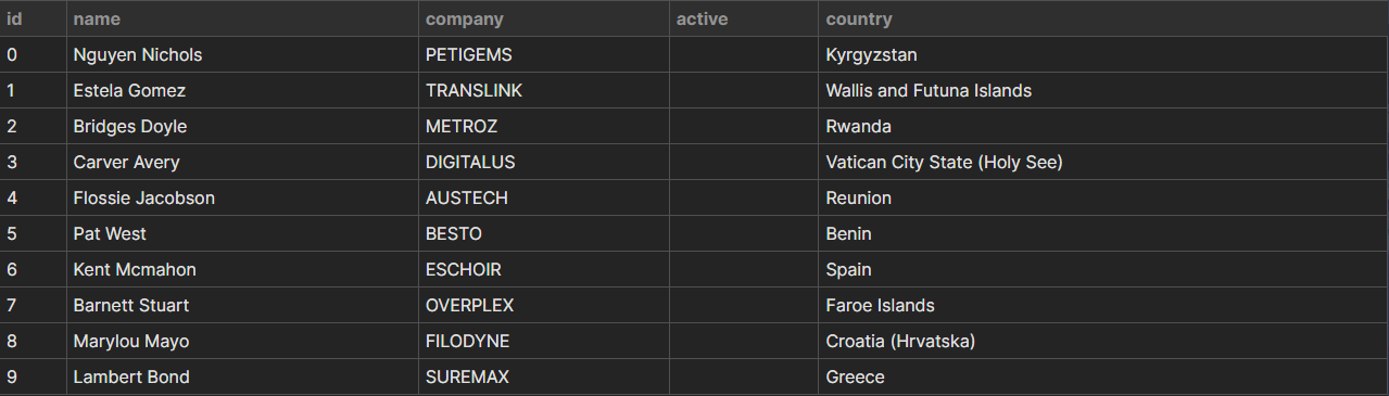
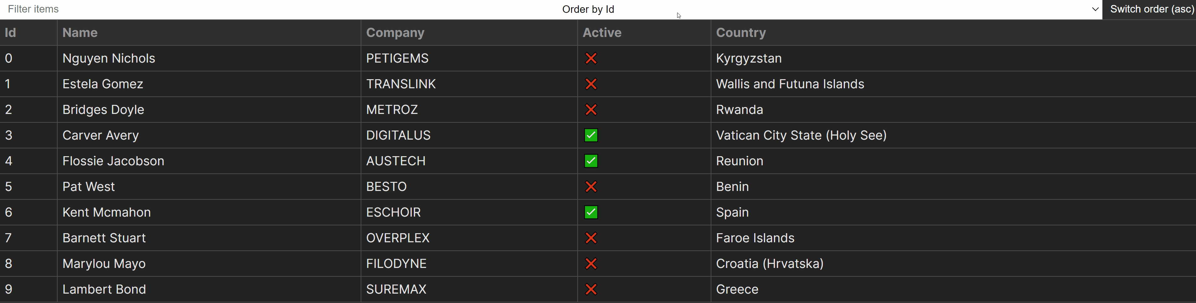
This approach makes it extremely flexible to use any type of data with our Table component, without having to rewrite the logic. So far, we’ll have the following table created using our component. However, there are some issues with the formatting.
Formatting table cells
Right now, the active column is not displayed. This is because the values for those fields are Boolean, and they aren’t printed as strings in JSX. To resolve this issue, we can introduce a new function for formatting entries based on their values. Add the following to the Table component and wrap entry into the function in the JSX:
const formatEntry = (entry: string | number | boolean) => {
  if (typeof entry === 'boolean') {
    return entry ? '✅' : '❌'
  }

  return entry
}

return (
  <table>
    <thead>...</thead>
    <tbody>
      {sortedRows.map((row, index) => (
        <tr key={index}>
          {Object.values(row).map((entry, columnIndex) => (
            <td key={columnIndex}>{formatEntry(entry)}</td>
          ))}
        </tr>
      ))}
    </tbody>
  </table>
)
The formatEntry function expects an entry, which in our case can be either string, number, or boolean, and then returns a formatted value if the typeof entry is a boolean, meaning for true values, we’ll display a green checkmark, and for false values, we’ll display a red cross. Using a similar approach, we can also format the table headings. Let’s make them capitalized with the following function:
export const capitalize = (
  str: string
) => str?.replace(/\b\w/g, substr => substr.toUpperCase())
This function uses a regex to grab the first letter from each word and turn it into uppercase. To use this function, we can create a utils.ts file at the root of the src folder, export this function, then import it into our Table component to use in the following way:
import { capitalize } from '../../utils'

export const Table = ({ rows }) => {
  ...

  return (
      <table>
        <thead>
          <tr>
            {Object.keys(rows[0]).map((entry, index) => (
              <th key={index}>{capitalize(entry)}</th>
            ))}
          </tr>
        </thead>
        <tbody>...</tbody>
      </table>
  )
}
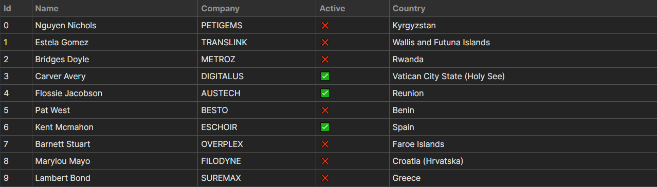
Based on these modifications, we now have a dynamically built, formatted table.
Typing props
Before we jump into styling the table and then adding controls, let’s properly type the rows prop. For this, we can create a types.ts file at the root of the src folder and export custom types that can be reused throughout the project. Create the file and export the following type:
export type Data = {
    id: number
    name: string
    company: string
    active: boolean
    country: string
}[]
To type the rows prop in the Table component, simply import this type and pass it to the component in the following way:
import { Data } from '../../types'

export type TableProps = {
  rows: Data
}

export const Table = ({ rows }: TableProps) => { ... }
Styling the Table
To style the entire table component, we’ll only need a couple of rules. First, we want to set the colors and borders, which we can do using the following styles:
table {
  width: 100%;
  border-collapse: collapse;
}

thead {
  text-align: left; /* `thead` is centered by default */
  color: #939393;
  background: #2f2f2f;
}

th,td {
  padding: 4px 6px;
  border: 1px solid #505050;
}
Add the above to table.css. Make sure to set border-collapse to collapse on the <table> to avoid double borders. As the table spans the entire screen, let’s also make some adjustments and remove the left and right border, as they aren’t visible anyway:
th:first-child,
td:first-child {
  border-left: 0;
}

th:last-child,
th:last-child {
  border-right: 0;
}
This will get rid of the borders on each side of the <table>, resulting in a cleaner look. Lastly, let’s add a hover effect to the table rows to aid users visually when searching the table:
tr:hover {
  background: #2f2f2f;
}
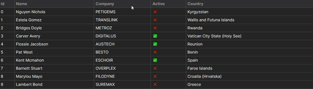
With everything so far, we now have the following behavior for the component.
Adding Controls
Now that we’ve styled the table, let’s add the controls for the sort and filter functionality. We’ll create an <input> for the filter and a <select> element for the sort. We’ll also include a button for switching between sort orders (ascending/descending).
To add the inputs, we’ll also need new states for the current order (ascending or descending) and a variable to keep track of the sort key (which key in the object is used for sorting). With that in mind, extend the Table component with the following:
const [order, setOrder] = useState('asc')
const [sortKey, setSortKey] = useState(Object.keys(rows[0])[0])
const filter = (event: React.ChangeEvent<HTMLInputElement>) => {}
const sort = (value: keyof Data[0], order: string) => {}
const updateOrder = () => {}
return (
<>
<div className="controls">
<input
type="text"
placeholder="Filter items"
onChange={filter}
/>
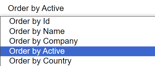
<select onChange={(event) => sort()}>
{Object.keys(rows[0]).map((entry, index) => (
<option value={entry} key={index}>
Order by {capitalize(entry)}
</option>
))}
</select>
<button onClick={updateOrder}>Switch order ({order})</button>
</div>
<table>...</table>
</>
)
Let’s go in order to understand what changed:
order. First, we need to create a new state for the sort order. This can be one ofascordesc. We’ll use its value in thesortfunction.sortKey. We also need a state for the sort key. By default, we can grab the key of the very first property in our array of objects usingObject.keys(rows[0])[0]. We’ll use this to keep track of the sort when switching between orders.filter. We’ll need a function for filtering results. This needs to be passed to theonChangeevent on the<input>element. Note thatReact.ChangeEventis a generic and can accept the type of HTML element that triggered the change.sort. Just like thefilterfunction, this will need to be attached to theonChangeevent, but this time, on the<select>element. It will accept two parameters:
value. It can take keys of our data object. We can specify the type using thekeyofkeyword. It means thatvaluecan be one ofid,name,company,active, orcountry.order. The order of the sort, eitherascordesc.
updateOrder. Lastly, we also need a function for updating the order. This will be triggered on button click.Note that we use the same logic we did for the <th> elements for dynamically generating the options for the <select>. We can also reuse the capitalize utility function to format the options.
Styling controls
Let’s style the controls before moving forward. This can be done with just a handful of CSS rules. Extend table.css with the following:
.controls {
  display: flex;
}

input,
select {
  flex: 1;
  padding: 5px 10px;
  border: 0;
}

button {
  background: #2f2f2f;
  color: #FFF;
  border: 0;
  cursor: pointer;
  padding: 5px 10px;
}
This will ensure that inputs are aligned next to each other. By using flex: 1 on the <input> and <select> elements, we can make them take up an equal amount of width from the available space. The <button> will take up as much space as needed for its text.
Filtering the Table
Now that we have the controls in place, let’s look at implementing the functionality. For filtering the table based on any field, we’ll need to follow this logic:
const rows = [
  {
    id: 0,
    name: 'Jaime Wallace'
  },
  { ... }
]

// #1: Set `rows` to a filtered version using `filter`
// The return value of `filter` will determine which rows to keep
setRows([ ...rows ].filter(row => { ... }))

// From here on, we discuss the return value of `filter`
// #2: Grab every field from the `row` object to use it for filtering
Object.values(row) -> [0, 'Jaime Wallace']

// #3: Join the values together into a single string
[0, 'Jaime Wallace'].join('') -> '0Jaime Wallace'

// #4: Convert the string into lowercase to make search case-insensitive
'0Jaime Wallace'.toLowerCase() -> '0jaime wallace'

// #5: Check if the string contains the value entered in the input
'0jaime wallace'.includes(value) -> true / false
With everything combined, we can create the return value for the filter based on the above logic. This leaves us with the following implementation for the filter function:
const filter = (event: React.ChangeEvent<HTMLInputElement>) => {
  const value = event.target.value

  if (value) {
    setRows([ ...rows.filter(row => {
      return Object.values(row)
        .join('')
        .toLowerCase()
        .includes(value)
    }) ])
  } else {
    setRows(rows)
  }
}
Note that we also want to check if the value is present. Its absence means the <input> field is empty. In such cases, we want to reset the state and pass the unfiltered rows to setRows to reset the table.
Sorting the Table
We have the filter functionality, but we’re still missing sorting. For sorting, we have two separate functions:
sort. The function that will handle sorting.updateOder. The function that will switch the order of sorting from ascending to descending and vice versa.
Let’s start with the sort function first. Whenever the <select> changes, the sort function will be called. We want to use the value of the <select> element to decide which key to use for sorting. For this, we can use a simple sort method and bracket notation to dynamically compare object keys:
const sort = (value: keyof Data[0], order: string) => {
  const returnValue = order === 'desc' ? 1 : -1

  setSortKey(value)
  setRows([ ...sortedRows.sort((a, b) => {
    return a[value] > b[value]
      ? returnValue * -1
      : returnValue
  }) ])
}
Let’s go through the function from top to bottom to better understand the implementation.
returnValue. Based on theorderstate, we want the return value to be either 1 or -1. This helps us define the sort order (1 for descending and -1 for ascending).setSortKey. Thevaluepassed to the function is the value of the<select>element. We want to record this value in our state (sortKey), which we can do by calling thesetSortKeyupdater function.setRows. The actual sorting happens in this call. Using bracket notation, we can comparea[value]withb[value]and return either -1 or 1.
Let’s take the following as an example:
const rows = [{ id: 0 }, { id: 1 }]
const value = 'id'

// This translate to a.id and b.id
rows.sort((a, b) => a[value] > b[value] ? -1 : 1)

// If `returnValue` is -1, the order changes
rows.sort((a, b) => a[value] > b[value] ? 1 : -1)
Switching between sort orders
To update the sort order, we just need to update the order state whenever the button is clicked. We can achieve this with the following functionality:
const updateOrder = () => {
  const updatedOrder = order === 'asc' ? 'desc' : 'asc'

  setOrder(updatedOrder)
  sort(sortKey as keyof Data[0], updatedOrder)
}
It’ll set the order to its opposite on each click. Note that after we update the order state using setOrder, we also need to call the sort function to resort the table based on the updated order. To infer the correct type for the sortKey variable, we can reference the keys of the Data type using typecasting: as keyof Data[0]. As the second parameter, we also need to pass the updated order.
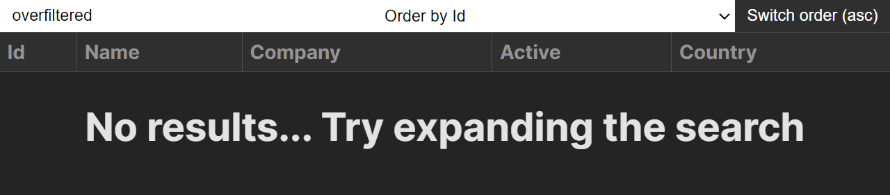
Handling Overfiltering
To complete this project, let’s add some indication for an overfiltered state. We only want to show an overfiltered state if there are no results. This can be easily done by checking the length of our sortedRows state. After the <table> element, add the following:
return (
  <>
    <div className="controls">...</div>
    <table>...</table>
    {!sortedRows.length && (
      <h1>No results... Try expanding the search</h1>
    )}
  </>
)
Conclusion
In conclusion, building a sortable and filterable table in React doesn’t have to be complicated. With array methods and function chaining, using the right functionality, we can create concise and precise functions for handling these tasks. With everything included, we managed to fit the entire logic into less than 100 lines of code.
As seen at the beginning of this tutorial, the entire project is available in one piece on GitHub. Thank you for reading through; happy coding!

