asasass
November 29, 2021, 4:33am
1
The diamond fence is stuck to the curtain..fence on top of that one.
Is there anything you would adjust in how I wrote this?
Can it be improved, if I wrote some things the wrong way that don’t make sense.
I just put this together now, I’m not sure if I did things the wrong way.
https://jsfiddle.net/5Ld3pngj/
Also, both of these work.
Which of these should it be if you were to go with one?
.cross::after {
  margin: -50% 0 0 -5px;
  width: 10px;
  height: 100%;
  padding-top: 56.25%;
}

.cross::after {
  margin: 0 0 0 -5px;
  width: 10px;
  height: 100%;
  top: 0%;
}
.curtain {
  flex: 1 0 0;
  margin: auto;
  max-width: 642px;
  box-shadow: inset 0 -2px 0px 0px #0a0a0a;
  border: 20px solid #000;
  border-radius: 3.2px;
  border-color: #000 #101010 #000 #101010;
  background: url('data:image/svg+xml;utf8,<svg xmlns="http://www.w3.org/2000/svg" width="10" height="10" viewBox="0 0 10 10"><path stroke="rgb(113, 121, 126)" d="m10 .15-4.85 4.85 4.85 4.85v.15h-.13l-4.86-4.86-4.86 4.86h-.15v-.14l4.87-4.86-4.87-4.87v-.13h.15l4.86 4.86 4.85-4.86h.14z"/></svg>');
}

.fence>div {
  position: absolute;
  top: 0;
  left: 0;
  width: 100%;
  height: 2px;
  background: #000;
}

.fence>div:nth-child(1) {
  top: 10%;
}

.fence>div:nth-child(2) {
  top: 20%;
}

.fence>div:nth-child(3) {
  top: 30%;
}

.fence>div:nth-child(4) {
  top: 40%;
}

.fence>div:nth-child(5) {
  top: 50%;
}

.fence>div:nth-child(6) {
  top: 60%;
}

.fence>div:nth-child(7) {
  top: 70%;
}

.fence>div:nth-child(8) {
  top: 80%;
}

.fence>div:nth-child(9) {
  top: 90%;
}

.fan svg {
  position: absolute;
  top: 0;
  left: 0;
  bottom: 0;
  right: 0;
  width: 70%;
  height: 70%;
  margin: auto;
  animation: fan-spin 8s  linear;
}

@keyframes fan-spin {
  0% {
    transform: rotate(0deg);
  }

  100% {
    transform: rotate(360deg);
  }
}

.cross::before,
.cross::after {
  content: "";
  position: absolute;
  left: 50%;
  top: 50%;
  background: #000;
}

.cross::before {
  margin: -5px 0 0 -50%;
  width: 100%;
  height: 10px;
}

.cross::after {
  margin: -50% 0 0 -5px;
  width: 10px;
  height: 100%;
  padding-top: 56.25%;
}
<div class="outer">
   <div class="curtain ">
     <div class="ratio-keeper">
       <div class="fence">
         <div></div>
         <div></div>
         <div></div>
         <div></div>
         <div></div>
         <div></div>
         <div></div>
         <div></div>
         <div></div>
       </div>

       <div class="fan">
         <svg xmlns="http://www.w3.org/2000/svg" width="70%" height="70%" viewBox="76 130 381 381">
           <path fill="#000100" stroke="#000" d="m166.3352 168.6294c5.5396 2.4448 45.2339 54.394 72.7499 91.0151-9.1901-44.8757-21.7959-109.0279-19.9558-114.796 4.1462-12.9949 33.7039-13.5172 41.5845-13.7579 7.8827-.2415 37.4165-1.5221 42.3488 11.1948 2.1872 5.6436-6.4773 70.4506-12.9142 115.8007 25.2309-38.2323 61.6818-92.5089 67.0612-95.2865 12.119-6.2568 33.3898 14.2749 39.1337 19.6768 5.7424 5.402 27.5341 25.3815 22.0294 37.859-2.4441 5.5389-54.3954 45.2354-91.0172 72.7506 44.8757-9.1901 109.0293-21.7959 114.7974-19.9559 12.9927 4.1442 13.5193 33.7032 13.7586 41.5838.2422 7.8819 1.5221 37.4165-11.192 42.3473-5.6471 2.1894-70.4541-6.4765-115.8049-12.9127 38.2323 25.2323 92.5081 61.6783 95.2871 67.0605 6.2581 12.1175-14.2742 33.3877-19.6776 39.133-5.4027 5.7432-25.3815 27.5341-37.8563 22.0279-5.5396-2.4434-45.2361-54.3961-72.7534-91.0143 9.1901 44.8757 21.7952 109.0287 19.9551 114.7953-4.1434 12.9934-33.7026 13.5157-41.5852 13.7586-7.8799.24-37.4165 1.5221-42.3431-11.1936-2.1887-5.6464 6.4779-70.4541 12.9133-115.8071-25.2323 38.2323-61.6824 92.5124-67.0639 95.2908-12.1169 6.256-33.3891-14.2728-39.1337-19.6754-5.7432-5.4027-27.5313-25.383-22.0251-37.8578 2.4434-5.5396 54.394-45.2339 91.0136-72.7526-44.8764 9.1908-109.0266 21.7944-114.7967 19.9566-12.9934-4.1434-13.5171-33.7025-13.7586-41.5852-.2407-7.8806-1.5221-37.4165 11.1963-42.346 5.6443-2.1879 70.4498 6.4752 115.8 12.9121-38.233-25.2316-92.5081-61.6783-95.2865-67.0612-6.256-12.1169 14.2748-33.3913 19.6768-39.1337 5.4006-5.7438 25.3794-27.5333 37.8584-22.0272z" /></svg>

       </div>
       <div id="cross"></div>

     </div>
   </div>
 </div>
asasass
November 29, 2021, 3:32pm
2
Removing negative margins I was able to do this: https://jsfiddle.net/4xmLbuog/
.cross::before,
.cross::after {
  content: "";
  background: red;
}

.cross::before {
  position: absolute;
  left: 0;
  top: 0;
  bottom: 0;
  right: 0;
  margin: auto;
  width: 100%;
  height: 10px;
}

.cross::after {
  position: absolute;
  left: 0;
  top: 0;
  bottom: 0;
  right: 0;
  margin: auto;
  width: 10px;
  height: 100%;
}
1 Like
asasass
November 29, 2021, 6:47pm
3
To be able to see through to the other side what I want to do is make the circle area transparent so you are able to see through to the background image.
How would this be done?
https://jsfiddle.net/tuw8qdrs/
.curtain {
  flex: 1 0 0;
  margin: auto;
  max-width: 642px;
  box-shadow: inset 0 -2px 0px 0px #0a0a0a;
  border: 20px solid #000;
  border-radius: 3.2px;
  border-color: #000 #101010 #000 #101010;
  background: #0a0a0a;
}

.fence {
  position: absolute;
  left: 0;
  top: 0;
  bottom: 0;
  right: 0;
  margin: auto;
  background: url('data:image/svg+xml;utf8,<svg xmlns="http://www.w3.org/2000/svg" width="10" height="10" viewBox="0 0 10 10" ><path stroke="rgb(113, 121, 126)" d="m10 .15-4.85 4.85 4.85 4.85v.15h-.13l-4.86-4.86-4.86 4.86h-.15v-.14l4.87-4.86-4.87-4.87v-.13h.15l4.86 4.86 4.85-4.86h.14z"/></svg>');
  filter: drop-shadow(0 0 5px #000);
  clip-path: circle(25% at center);
  animation: fade 8s linear;
}

@keyframes fade {
  0% {
    opacity: 0.9;

  }

  50% {
    opacity: 1;
  }

  100% {
    opacity: 0.9;
  }
}

.fence>div {
  position: absolute;
  top: 130px;
  left: 0;
  width: 100%;
  height: 2px;
  background: red;
}

.fence>div:nth-child(1) {
  top: 10%;
}

.fence>div:nth-child(2) {
  top: 20%;
}

.fence>div:nth-child(3) {
  top: 30%;
}

.fence>div:nth-child(4) {
  top: 40%;
}

.fence>div:nth-child(5) {
  top: 50%;
}

.fence>div:nth-child(6) {
  top: 60%;
}

.fence>div:nth-child(7) {
  top: 70%;
}

.fence>div:nth-child(8) {
  top: 80%;
}

.fence>div:nth-child(9) {
  top: 90%;
}

.fan svg {
  position: absolute;
  top: 0;
  left: 0;
  bottom: 0;
  right: 0;
  width: 70%;
  height: 70%;
  margin: auto;
  animation: fan-spin 100s linear;
}

@keyframes fan-spin {
  0% {
    transform: rotate(0deg);
  }

  100% {
    transform: rotate(360deg);
  }
}

.cross::before,
.cross::after {
  content: "";
  background: black;
}

.cross::before {
  position: absolute;
  left: 0;
  top: 0;
  bottom: 0;
  right: 0;
  margin: auto;
  width: 100%;
  height: 10px;
  clip-path: circle(29% at center);
}

.cross::after {
  position: absolute;
  left: 0;
  top: 0;
  bottom: 0;
  right: 0;
  margin: auto;
  width: 10px;
  height: 100%;
  clip-path: circle(51% at center);
}
PaulOB
November 29, 2021, 9:16pm
4
The background is the background of the curtain. You can’t punch holes in the middle of an element’s background.
The only trick I know is to use border-radius outside of a circle to rub stuff out but leave the centre transparent.
e.g.
.curtain {
  flex: 1 0 0;
  margin: auto;
  max-width: 642px;
  box-shadow: inset 0 -2px 0px 0px #0a0a0a;
  border: 20px solid #000;
  border-radius: 3.2px;
  border-color: #000 #101010 #000 #101010;
  /* background: #0a0a0a;*/
}
.ratio-keeper:before{
  content:"";
  position:absolute;
  top:0;
  left:0;
  right:0;
  bottom:0;
  margin:auto;
  width:40%;
  height:70%;
  border-radius:50%;
  box-shadow:0 0 0px 500px #0a0a0a;

}
I’m not sure how it will stand up to resize etc.
Otherwise I guess you have to make the whole background in your svg instead and construct it all with a hole in the middle. But svgs are not my thing.
1 Like
asasass
November 29, 2021, 10:14pm
5
The svg is only 1 X I believe.
background-repeat: repeat; is the default value which repeats to create the fence image.
asasass
November 29, 2021, 10:31pm
6
Your way worked also.
Doing this worked, but I don’t think there is a way to do this without using -webkit
https://jsfiddle.net/38rz6s27/
Update: Wait a second, This worked without -webkit: https://jsfiddle.net/Lv6mxfwj/ background: radial-gradient(circle, transparent 35%, #0a0a0a 0);
or this way: background: radial-gradient(circle, transparent 0% 35%, black 35%);
https://jsfiddle.net/to5814kj/
body {
  height: 100vh;
  margin: 0;
  background: radial-gradient(circle, transparent 35%, black 0);
  background-repeat: no-repeat;
}
Is 50% 50% in here a shorthand property that refers to something?-webkit-radial-gradient(50% 50%, circle, transparent 35%, #0a0a0a 0);
It seems to refer to the circle, maybe background-size, or position.
.curtain {
  flex: 1 0 0;
  margin: auto;
  max-width: 642px;
  box-shadow: inset 0 -2px 0px 0px #0a0a0a;
  border: 20px solid #000;
  border-radius: 3.2px;
  border-color: #000 #101010 #000 #101010;
  background-image: -webkit-radial-gradient(50% 50%, circle, transparent 35%, #0a0a0a 0);
}
PaulOB
November 30, 2021, 12:05pm
7
Don’t use that prefix as it is an old spec. Radial gradients have 96% support now so don’t use prefixes for them. This is a ‘use case’ for the comment I made in your other thread about prefixes and why you should remove them as soon as possible or you end up with an old spec interfering with the new ones.
1 Like
asasass
November 30, 2021, 12:14pm
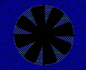
8
Using percentage, how come the 4th green line height is bigger than the 1st 3 lines?
Why is that?
I made the image bigger here so you can see it.
The first 3 lines are 2px.
The 4th line is 3px.
https://jsfiddle.net/u70grw89/
.fence>div {
  position: absolute;
  top: 0;
  left: 0;
  width: 100%;
  height: 0.6%;
  background: green;
}
PaulOB
November 30, 2021, 1:28pm
9
Because percentages get rounded up or down to the nearest pixel and sometimes some get rounded up and some get rounded down.
if you change the height of the screen you will see that some other lines change height also.
I suggest you use 2px height and then they will be exact (or try rounding down to 0.55%).
1 Like
asasass
November 30, 2021, 4:29pm
10
As I have come to learn, width and height are not needed here, but why?
https://jsfiddle.net/3y2rxas4/
 /*width: 100%;*/
  /*height: 100%;*/
.cross::before /*horizontal*/{
  position: absolute;
  left: 0;
  top: 0;
  bottom: 0;
  right: 0;
  margin: auto;
  /*width: 100%;*/
  height: 2.8%;
}

.cross::after /*vertical*/{
  position: absolute;
  left: 0;
  top: 0;
  bottom: 0;
  right: 0;
  margin: auto;
  width: 1.5%;
  /*height: 100%;*/
}
PaulOB
November 30, 2021, 5:06pm
11
Because you describe their size by four co-ordinates (top, bottom, left and right).
If you only used top and left then you would need width and height as well.
(Note that for iframes you generally need width and height also but they are a special exception.)
1 Like
asasass
November 30, 2021, 5:14pm
12
I see that works here too. https://jsfiddle.net/6L3x5hek/1/
I added: bottom: 0; right: 0; then width can be removed.
Is this good to do?
or not necessary?
.fence>div {
  position: absolute;
  left: 0;
  top: 0;
  bottom: 0;
  right: 0;
  /*width: 100%;*/
  height: 0.55%;
  background: green;
}
PaulOB
November 30, 2021, 5:18pm
13
The bottom:0 can be removed because you have a fixed height. You are not sizing the whole element to fill its container in this case.
The right:0 will allow the width to be removed which will save you a couple of characters
1 Like
asasass
November 30, 2021, 5:22pm
14
Why can’t top be removed also? https://jsfiddle.net/6L3x5hek/3/
.fence>div {
  position: absolute;
  /*top: 0;*/
  left: 0;
  right:0;
  /*width: 100%;*/
  height: 0.55%;
  background: green;
}
Don’t these top properties overrule the above top:0?
Which means the top:0 can be removed.
.fence>div:nth-child(1) {
  top: 10%;
}

.fence>div:nth-child(2) {
  top: 20%;
}

.fence>div:nth-child(3) {
  top: 30%;
}

.fence>div:nth-child(4) {
  top: 40%;
}

.fence>div:nth-child(5) {
  top: 50%;
}

.fence>div:nth-child(6) {
  top: 60%;
}

.fence>div:nth-child(7) {
  top: 70%;
}

.fence>div:nth-child(8) {
  top: 80%;
}

.fence>div:nth-child(9) {
  top: 90%;
}
asasass
December 2, 2021, 10:41am
16
I found this works also. https://jsfiddle.net/g1L8v5qw/
.curtain {
  flex: 1 0 0;
  margin: auto;
  max-width: 642px;
  /*box-shadow: inset 0 -2px 0px 0px #0a0a0a;*/
  border: 20px solid #000;
  border-radius: 3.2px;
  border-color: #000 #101010 #000 #101010;
  /* background: #0a0a0a;*/
}

.ratio-keeper:before {
  content: "";
  position: absolute;
  left: 50%;
  top: 50%;
  border-radius: 50%;
  width: 41%;
  height: 72%;
  border: 325px solid #0a0a0a;
  transform: translate(-50%, -50%);
}
PaulOB
December 2, 2021, 12:03pm
17
I don’t like that method because transform only moves elements visually. They still remain in their original position which means that if overflow was not hidden they would poke out of the element. It’s fine to use it as long as you know why it does what it does and what the consequences are.
Much neater to use the 4 co ordinates plus with and height and then margin:auto (as in my example) which centres the absolute element vertically and horizontally with no adverse side effects.
1 Like
asasass
December 2, 2021, 12:12pm
18
I was just seeing what other ways would work.
border: 325px solid #0a0a0a; works with:
transform: translate(-50%, -50%);
Using border doesn’t work with your code I don’t believe.
PaulOB
December 2, 2021, 12:25pm
19
You don’t need the border in my example as it uses the box-shadow for a similar effect. The beauty of box-shadow is that it does not change the size of the element so you don’t need to do anything clever to cater for it.
You could use outline for a similar effect.
.ratio-keeper:before {
  content: "";
  position: absolute;
  left:0;
  right:0;
  top:0;
  bottom:0;
  border-radius: 50%;
  width: 41%;
  height: 72%;
  margin:auto;
  outline: 325px solid #0a0a0a;
}
1 Like
asasass
December 6, 2021, 3:55pm
20
To have a repeating-conic-gradient as the background, how would I make the middle transparent?
https://jsfiddle.net/0kszLy7c/
.curtain {
  flex: 1 0 0;
  margin: auto;
  max-width: 642px;
  /*box-shadow: inset 0 -2px 0px 0px #0a0a0a;*/
  border: 20px solid #000;
  border-radius: 3.2px;
  border-color: #000 #101010 #000 #101010;
  /*background: radial-gradient(circle, transparent 35%, black 0);*/
  background: radial-gradient(circle, transparent 0% 35%, #0a0a0a 35%);
  background-image: repeating-conic-gradient(blue, black 0.00306deg);
}


