

A step wizard is a user interface component that helps a site’s visitor know what’s going on during a multiple-steps action. For instance, an online purchase. It is commonly used on payment forms describing the different steps to complete the desired action, as well as the current step.
I think it’s a good UI component as not only does it help in figuring how long an action could take, it also provides some context: what have I done so far? What’s left to do? Can I go back? Can I skip this step?
This article is not about the pros and cons of such a pattern. Nope. Today, I wanted to show how to build such a component with CSS, making sure to cover a lot of things. Including:
- The dynamic numbering of steps;
- A mobile-friendly view;
- Visually define the current step, completed steps and steps left to do;
- Use semantic markup;
- A fallback for old browsers;
- Create easily maintainable styles.

Key Takeaways
- Utilize an ordered list (
- ) for semantic markup and clear step progression in the step wizard.
- Implement BEM (Block Element Modifier) methodology for structured and maintainable CSS class naming.
- Use Sass for efficient styling, employing variables and functions to manage colors, spacing, and responsive breakpoints.
- Enhance user experience with dynamic CSS counters for step numbering and pseudo-elements for arrows indicating progression.
- Ensure accessibility and functionality across all devices with responsive design adjustments and fallbacks for older browsers.
- Optimize the step wizard for various screen sizes using media queries, ensuring a seamless transition between desktop and mobile views.
The markup
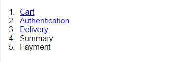
I think that the markup for a step-wizard should be an ordered list. Since steps are advancing one after another, the order matters. Hence, an ordered list (<ol>). Each item should be a list item (<li>), containing a link (<a>) or an anonymous element (<span>) if there is no link. That’s it.
<ol>

  <li>

    <a href="#">Cart</a>

  </li>

  <li>

    <a href="#">Authentication</a>

  </li>

  <li>

    <a href="#">Delivery</a>

  </li>

  <li>

    <span>Summary</span>

  </li>

  <li>

    <span>Payment</span>

  </li>

</ol>
Regarding naming, I went with something BEM-like (Block Element Modifier) since this is a perfect fit for such a methodology. If you are not familiar with BEM, I suggest you read this article introduction by (who else) Harry Roberts.
Using BEM we would have the class attributes:
stepsas the block;steps__itemfor individual steps;steps__item--donefor a completed step;steps__item--currentfor current step;steps__item--firstfor first step (not mandatory with:first-of-type);steps__item--lastfor last step (not mandatory with:last-of-type);
steps__linkfor either links or spans.
Also, we will add a disabled attribute to items coming after the current step.
Let’s add those class attributes to our previous markup, considering the 3rd step is the current one (for demo purpose):
<ol class="steps">

  <li class="steps__item  steps__item--done  steps__item--first">

    <a href="#" class="steps__link">Cart</a>

  </li>

  <li class="steps__item  steps__item--done">

    <a href="#" class="steps__link">Authentication</a>

  </li>

  <li class="steps__item  steps__item--active">

    <a href="#" class="steps__link">Delivery</a>

  </li>

  <li class="steps__item" disabled="disabled">

    <span class="steps__link">Summary</span>

  </li>

  <li class="steps__item  steps__item--last" disabled="disabled">

    <span class="steps__link">Payment</span>

  </li>

</ol>
Okay, that seems like a very good start!
Configuration
Before we jump ahead and start styling, we should declare a couple of variables. This is in order to avoid duplicating values that could be customized, and to keep everything that can be customized at the top of the stylesheet.
/**

 * Text color

 * 1. Done and active steps

 * 2. Disabled steps

 */

$step-text-color: #333; /* 1 */

$step-text-color-disabled: #999; /* 2 */
/**

 * Background color

 * 1. Everything but active step

 * 2. Active step

 */

$step-background-color: #EFEFEF; /* 1 */

$step-background-color-active: #FFF; /* 2 */
/**

 * Number background color

 * 1. Disabled steps

 * 2. Done and active steps

 */

$step-counter-color: #BCBCBC; /* 1 */

$step-counter-color-active: #22A4BC; /* 2 */
/**

 * Border that's being used pretty much everywhere

 */

$step-border: 1px solid #CCC;
/**

 * Common spacing value

 */

$step-baseline: .5em;
/**

 * Breakpoint triggering mobile view

 */

$step-breakpoint: 767px;
Now that we’ve set all our variables, we are ready to move forward.
A clean box model
First thing first, let’s use a decent box-model.
html {

  box-sizing: border-box;

}
*,

:before,

:after {

  box-sizing: inherit;

}
BOX-SIZING: BORDER-BOX ALL THE THINGS!
The container
Now, the container. Since we cannot apply styles on the numbers from an ordered list, here is what we are going to do:
- Hide the default numbering;
- Initialize a CSS counter on
.steps; - Increment the counter on
.steps__item; - Display the counter with the
:before pseudo-element from.steps__item`.
Note: if you are not familiar with CSS counters, I suggest you read this article from me on Codrops.
/**
* 1. Prevents user-selection from doing ugly things on screen
* without causing any accessibility issue since there is no point
* in selecting the step-wizard.
* 2. Hides default numbering.
* 3. Initializes a CSS counter called `steps` on the step-wizard.
* 4. Clears inner floats.
* 5. Resets initial padding.
* 6. Applies vertical rhythm.
*/
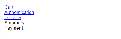
.steps {
user-select: none; /* 1 */
list-style: none; /* 2 */
counter-reset: steps; /* 3 */
overflow: hidden; /* 4 */
padding: 0; /* 5 */
margin: 0 0 ($step-baseline * 2) 0; /* 6 */
}
The items
So, we have our container ready and we can now give its children some styling.
/**

 * Step item

 * 1. Putting them all on the same line

 * 2. Context positioning for pseudo-elements

 * 3. Incrementing `steps` counter at each new item

 * 4. Top and border bottoms only

 * 5. Making sure content doesn't wrap

 */

.steps__item {

  float: left;                            /* 1 */

  position: relative;                     /* 2 */

  counter-increment: steps;               /* 3 */

  border-top: $step-border;               /* 4 */

  border-bottom: $step-border;            /* 4 */

  white-space: nowrap;                    /* 5 */

  background: $step-background-color;
  /**

   * Changing the cursor on disabled items

   * to something a bit more explicit.

   */

  &[disabled] {

    cursor: not-allowed;

  }

}
Sizing the items
You may have noticed we haven’t sized the steps yet. Remember how we want to allow any number of items (in a decent range, at least)? That means we need to know the number of steps to size them. Ouch, that’s rough. How are we going to do that?
Well, there are quite a few solutions at this point:
- Use JavaScript to size elements;
- Pass the number of steps from the backend/templater in a data attribute (e.g.
data-steps-count); - Use some CSS wizardry.
The first two solutions have very good browser support but I think it is a bad idea to use JavaScript for such a purpose. When I first built this step-wizard, I used to pass the number of steps in a data-attribute and then use it like so:
// Loop from 1 through 10 because it is rather unlikely

// to have a step-wizard hosting over 10 items.

// In most cases, looping through 1 to 5 is more than enough.

@for $i from 1 through 10 {

    .steps[data-steps-count="#{$i}"] .steps__item {

        width: (100% / $i);

    }

}
This would generate a CSS like this, sizing .steps__item according to the value passed in the data-attribute:
.steps[data-steps-count="1"]  .steps__item { width: 100%; }

.steps[data-steps-count="2"]  .steps__item { width: 50%; }

.steps[data-steps-count="3"]  .steps__item { width: 33.33333%; }

.steps[data-steps-count="4"]  .steps__item { width: 25%; }

.steps[data-steps-count="5"]  .steps__item { width: 20%; }

.steps[data-steps-count="6"]  .steps__item { width: 16.66667%; }

.steps[data-steps-count="7"]  .steps__item { width: 14.28571%; }

.steps[data-steps-count="8"]  .steps__item { width: 12.5%; }

.steps[data-steps-count="9"]  .steps__item { width: 11.11111%; }

.steps[data-steps-count="10"] .steps__item { width: 10%; }
So this is the safe way, which works back to Internet Explorer 7 (not 6, which does not support attribute selectors). I went with the CSS craziness way, inspired by Lea Verou’s technique to style elements based on the number of siblings.
The main idea is to use a combination of both :first-child, :nth-last-child and the general siblings operator (~) to size all elements from a container when there are N elements. The rule is:
E:first-child:nth-last-child(N),

E:first-child:nth-last-child(N) ~ E {

    /* Styles for E when there are N elements in E's parent */

}
Literally, this selector means style the first child that also happens to be the Nth to last child, as well as all the elements coming after it in the container. By duplicating this rule changing the value of N, we can style elements depending on the total number of siblings. In our case, here is what we can come up with:
.steps__item {

    /* Other styles... */
    @for $i from 1 through 10 {sp

        &:first-child:nth-last-child(#{$i}),

        &:first-child:nth-last-child(#{$i}) ~ & {

            width: (100% / $i);

        }

    }

}
This cute little loop yields this CSS:
.steps__item:first-child:nth-last-child(1),

.steps__item:first-child:nth-last-child(1) ~ .steps__item {

  width: 100%;

}

.steps__item:first-child:nth-last-child(2),

.steps__item:first-child:nth-last-child(2) ~ .steps__item {

  width: 50%;

}

.steps__item:first-child:nth-last-child(3),

.steps__item:first-child:nth-last-child(3) ~ .steps__item {

  width: 33.33333%;

}

.steps__item:first-child:nth-last-child(4),

.steps__item:first-child:nth-last-child(4) ~ .steps__item {

  width: 25%;

}

.steps__item:first-child:nth-last-child(5),

.steps__item:first-child:nth-last-child(5) ~ .steps__item {

  width: 20%;

}

.steps__item:first-child:nth-last-child(6),

.steps__item:first-child:nth-last-child(6) ~ .steps__item {

  width: 16.66667%;

}

.steps__item:first-child:nth-last-child(7),

.steps__item:first-child:nth-last-child(7) ~ .steps__item {

  width: 14.28571%;

}

.steps__item:first-child:nth-last-child(8),

.steps__item:first-child:nth-last-child(8) ~ .steps__item {

  width: 12.5%;

}

.steps__item:first-child:nth-last-child(9),

.steps__item:first-child:nth-last-child(9) ~ .steps__item {

  width: 11.11111%;

}

.steps__item:first-child:nth-last-child(10),

.steps__item:first-child:nth-last-child(10) ~ .steps__item {

  width: 10%;

}
Okay, that’s definitely some decent amount of CSS but that does the trick! Yes, as I’ve said before, chances are high that the maximum number of steps in a step wizard would be more like 5 or 6, not 10 or more.
One thing we must not forget is to add a left border to the first item and a right border to the last. Also, the last item shouldn’t have an arrow (at least in my opinion). To do this, again, two ways: either we use pseudo-classes:
.steps__item:first-of-type {

  border-left: $step-border;

}
.steps__item:last-of-type {

  border-right: $step-border;
  &:after {

    content: none;

  }

}
Or if we want to avoid using too much advanced CSS features to keep some backward compatibility, I suggest we add class attributes to the DOM:
.steps__item--first {

  border-left: $step-border;

}
.steps__item--last {

  border-right: $step-border;
  &:after {

    content: none;

  }

}

The links
Every .steps__item necessarily contains a sub-element; either a link when the section is not disabled or a span when it is. This element is responsible for content styles: font, color, align and so on…
/**

 * Links

 * 1. Move to block to enlarge mouse area

 * 2. Center the label inside the item

 * 3. Remove the initial underline in case it's a `a`

 * 4. Add some extra space on top and bottom

 * 5. Visual sugar

 */

.steps__link {

  display: block;                     /* 1 */

  text-align: center;                 /* 2 */

  text-decoration: none;              /* 3 */

  padding: $step-baseline 0;          /* 4 */

  transition: .25s ease-out;          /* 5 */

  color: $step-text-color-disabled;
  /**

   * Hover/focus styles

   * Changing the text color is enough

   */

  &:hover,

  &:focus {

    color: $step-text-color;

  }
  /**

   * Prevent any hover state on disabled items

   */

  [disabled] &:hover,

  [disabled] &:focus {

    color: $step-text-color-disabled;

  }

}
Rather than setting some styles for the hover/focus state, then override those when the step is disabled, we could rewrite it like this using the :not() pseudo-class (however keep in mind it has a slightly lower browser support):
.steps__link {

  /* Other styles... */
  :not([disabled]) > &:hover,

  :not([disabled]) > &:focus {

    color: $step-text-color;

  }

}
At this point it should be getting somewhere. It still needs some extra details but at least it does the job. There is no layout issue anymore, it’s accessible, readable and so on.

Adding the numbering
We have used an ordered list but we removed the numbers. We initialized a CSS counter, incremented on each step so it’s time we display this counter using a pseudo-element. This pseudo-element will be hosted by .steps__link because at this point it’s text content.
There is no magic here, it’s a sized pseudo-element with counter content as well as some extra styles to make it pretty.
/**

 * Numbers

 * 1. Display the current `steps` counter value

 * 2. Make it inline-block so it can be styled as a block

 * 3. Size the it according to the baseline

 * 4. Horizontal centering

 * 5. Vertical centering

 * 6. Extra space around it

 * 7. Make it round

 * 8. Color stuff

 */

.steps__link {

  /* Other styles...* /
  &:before {

    content: counter(steps);            /* 1 */

    display: inline-block;              /* 2 */

    width:  $step-baseline * 3;         /* 3 */

    height: $step-baseline * 3;         /* 3 */

    text-align: center;                 /* 4 */

    line-height: $step-baseline * 3;    /* 5 */

    margin: 0 $step-baseline * 2;       /* 6 */

    border-radius: 50%;                 /* 7 */

    background: $step-counter-color;    /* 8 */

    color: white;                       /* 8 */

  }

}

Adding the arrows
Let’s add the little arrows using pseudo-elements! Basically, each item but the last will have a pseudo-element shaped as a square on it’s very right, rotated to look like an arrow. A little tricky to set up, but we’ll make it!
Now, let’s start with a little bit of math, shall we? We are going to rotate the squares by 45 degrees so their angles are facing top, right, bottom and left directly. To make it look right, we’ll need to make sure the diagonal of the square is strictly equal to the height of a step item. And this involves some calculations.
First, let’s compute the height of a step item:
step_height = height of tallest content + twice the vertical padding + twice the border
We know the tallest content is the number we just added and we hard-coded its height to be three times the baseline. We know the vertical padding on links is equal to the base line. And finally, we have two 1px borders. Easy!
$step-height: ($step-baseline * 3) + ($step-baseline * 2) + (1/16 * 1em * 2);
Which turns to be 2.625em. So we know for a fact that the diagonal of our pseudo-element has to be 2.625em however we can’t size an element from its diagonal so we need to compute its side length from this value. The formula is:
side_length = diagonal * sqrt(2) / 2
Great! If you use Compass or SassyMath, there is a sqrt() function, else we need to include a rough estimation of what the square root of 2 actually is. I went with: 1.4142135623730951. To get the most of both worlds, we can write it like this:
$sqrt-2: if(function-exists('sqrt') == true, sqrt(2), 1.4142135623730951);
Okay we got everything, let’s write the code!
/**

 * Arrows

 * 1. Sizing (yay math!)

 * 2. Putting it on the right edge

 * 3. Moving it back to the left from one half of it's size

 * 4. Slightly translating it from the top

 * 5. Rotating it 45 degrees, obviously

 * 6. Moving it on top of other things

 * 7. Applying borders on the two visible sides

 */

.steps__item {

  /* Other styles... */
  &:after {

    $sqrt-2: if(function-exists('sqrt') == true, sqrt(2), 1.4142135623730951);

    $step-height: ($step-baseline * 3)  + ($step-baseline * 2) + (1/16 * 1em * 2);

    $step-arrow-size: $step-height * $sqrt-2 / 2;

    $top-offset: 1 / $sqrt-2 / 2;
    content: '';

    width:  $step-arrow-size;               /* 1 */

    height: $step-arrow-size;               /* 1 */

    position: absolute;

    left: 100%;                             /* 2 */

    margin-left: -$step-arrow-size / 2;     /* 3 */

    top: $top-offset;                       /* 4 */

    transform: rotate(45deg);               /* 5 */

    z-index: 2;                             /* 6 */

    background: inherit;

    border-right: $step-border;             /* 7 */

    border-top: $step-border;               /* 7 */

  }

}

Dealing with the current step
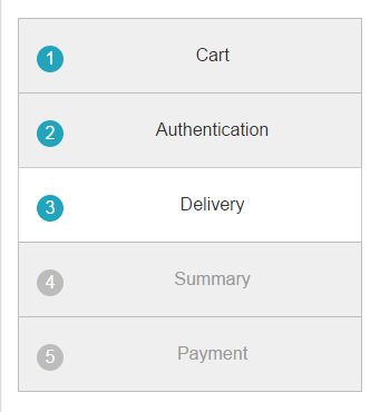
There is little to be done so the current step actually looks like it’s being highlighted. We only need to change the background color. Since pseudo-elements color are relative to the background color, everything will work just fine.
.steps__item--active {

  background: $step-background-color-active;

}
We also have to change the text color on both done and active steps, as well as the number background-color. Small things, but that’s what makes the step-wizard so nice.
.steps__item--done .steps__link,

.steps__iten--active .steps__link {

  color: $step-text-color;
  &:before {

    background: $step-counter-color-active;

  }

}
Dealing with small screens
Last but not least, we have to make sure it looks okay on small screens. I went with stacking all items one under the others so it still feels like a step-based process.
.steps__items {

  /* Other styles... */
  @media (max-width: $step-breakpoint) {

    width: 100% !important;

    border: $step-border;

    border-bottom: none;

    padding: ($step-baseline * 2) 0;
    /**

     * Removing the arrows

     */

    &:after {

      content: none;

    }

  }

}
.steps__item--last {

  /* Other styles... */
  @media (max-width: $step-breakpoint) {

    border-bottom: $step-border;

  }

}

.steps__link:before {

  /* Other styles... */
  /**

   * Moving numbers on the left rather than stuck to the content

   */

  @media (max-width: $step-breakpoint) {

    float: left;

    margin-right: 0;

  }

}
That’s it!
Dealing with older browsers
To deal with older browsers, there are two different ways of proceeding:
- use Modernizr;
- use Feature Queries.
Pick the one you prefer, it doesn’t matter. Our step-wizard use a couple of things that’s not supported in older browsers:
- advanced CSS selectors;
- CSS transforms;
- generated content (pseudo-elements).
Unfortunately, the first one cannot be easily polyfilled with CSS only, so I suggest you avoid advanced CSS selectors altogether if you have to support legacy browsers: just add more classes to the DOM.
Regarding CSS transforms that are used for arrows, it’s very easy to add a solution when they are not supported:
// With Modernizr
.no-csstransforms .steps__item {

  border-right: $step-border;
  &:after {

    content: none;

  }

}
// With Features Queries

@supports not (transform: rotate(45deg)), not (-webkit-transform: rotate(45deg)), not (-ms-transform: rotate(45deg)) {

  .steps__item {

    border-right: $step-border;
    &:after {

      content: none;

    }

  }

}
Last but not least, generated content: unfortunately, it is not possible to detect generated content support for Features Queries, so in order to fix this last bite, I suggest you have Modernizr.
.no-generatedcontent .steps {

  list-style-type: decimal;

  list-style-position: inside;

}
This rules put back the default numbering from the ordered list if pseudo-elements cannot be displayed. Pretty handy!

Final thoughts
That’s it folks! Hope you liked the explanation, and if you can think of anything to improve it, be sure to share!
See the Pen A Step wizard built with BEM and Sass by SitePoint (@SitePoint) on CodePen.
Frequently Asked Questions (FAQs) about Building a Step Wizard with BEM & SASS
How can I add more steps to the step wizard?
Adding more steps to the step wizard is quite straightforward. You need to add more list items in the HTML structure. Each list item represents a step in the wizard. Remember to add the appropriate class names for each step. In the SASS file, you can add the styles for the new steps. Make sure to adjust the width of the progress bar to accommodate the new steps.
Can I use this step wizard in a responsive design?
Yes, you can use this step wizard in a responsive design. The step wizard is built using flexible CSS properties, which means it can adapt to different screen sizes. However, you might need to adjust some styles or use media queries to ensure the step wizard looks good on smaller screens.
How can I change the color scheme of the step wizard?
Changing the color scheme of the step wizard involves modifying the SASS variables. The color scheme is defined by a few SASS variables at the top of the SASS file. You can change these variables to any color you want. Remember to compile the SASS file into CSS after making changes.
Can I use this step wizard without SASS?
Yes, you can use this step wizard without SASS. However, you will need to write plain CSS instead. The SASS file is compiled into a CSS file, which is what the browser reads. If you’re not familiar with SASS, you can just modify the CSS file directly.
How can I add animations to the step transitions?
Adding animations to the step transitions requires some knowledge of CSS animations or transitions. You can add a transition property to the .step class in the SASS file. The transition property allows you to specify the property to animate, the duration of the animation, and the timing function.
Can I use this step wizard with a framework like React or Vue?
Yes, you can use this step wizard with a framework like React or Vue. The step wizard is built with plain HTML, CSS, and JavaScript, which can be integrated into any framework. However, you might need to adjust the code to fit the framework’s structure and conventions.
How can I validate the form data in each step?
Validating the form data in each step requires some JavaScript. You can add a validation function that checks the form data when the user clicks the “Next” button. If the data is invalid, you can prevent the step from changing and show an error message.
How can I save the form data from each step?
Saving the form data from each step can be done with JavaScript. You can add an event listener to the “Next” button that saves the form data to a variable or sends it to a server. Remember to handle the data securely if it’s sensitive.
Can I add a “Previous” button to go back to the previous step?
Yes, you can add a “Previous” button to go back to the previous step. You need to add a new button in the HTML and add an event listener in the JavaScript that changes the current step to the previous one when the button is clicked.
How can I customize the look of the step wizard?
Customizing the look of the step wizard involves modifying the SASS file. You can change the size, color, font, and other styles of the step wizard. Remember to compile the SASS file into CSS after making changes.

