
Data is everywhere around us, from SaaS dashboards, financial platforms, to analytics tools and e-commerce applications. All modern web apps we use depend on data to help us make informed decisions. But simply displaying numbers in a table isn't enough anymore. We expect visual, interactive experiences that help us explore information quickly and uncover insights on our own.
That's where interactive JavaScript charts come in.
Static charts only present data. But interactive charts encourage exploration. Users can hover over data points for additional details, drill into specific categories, zoom into trends, and filter datasets. They can even watch information updates in real time.
We can transform charts from simple visuals into powerful decision-making tools with these interactive capabilities.
JS interactive charts provide us an opportunity to build applications that are more engaging, easier to use, and more valuable to end users. Whether we're creating an internal business dashboard, a reporting platform, or a customer-facing analytics product, understanding how interactive charts work is becoming an essential skill.
In this guide, we’ll explore what JavaScript interactive charts are, why they matter, and how they work behind the scenes. We’ll also discuss the best practices for implementing them in modern JavaScript applications.
What Are JavaScript Interactive Charts?
JavaScript interactive charts are data visualizations that enable users to interact directly with the data displayed in a web application. Instead of simply viewing a graph, users can explore the data through various interactions.
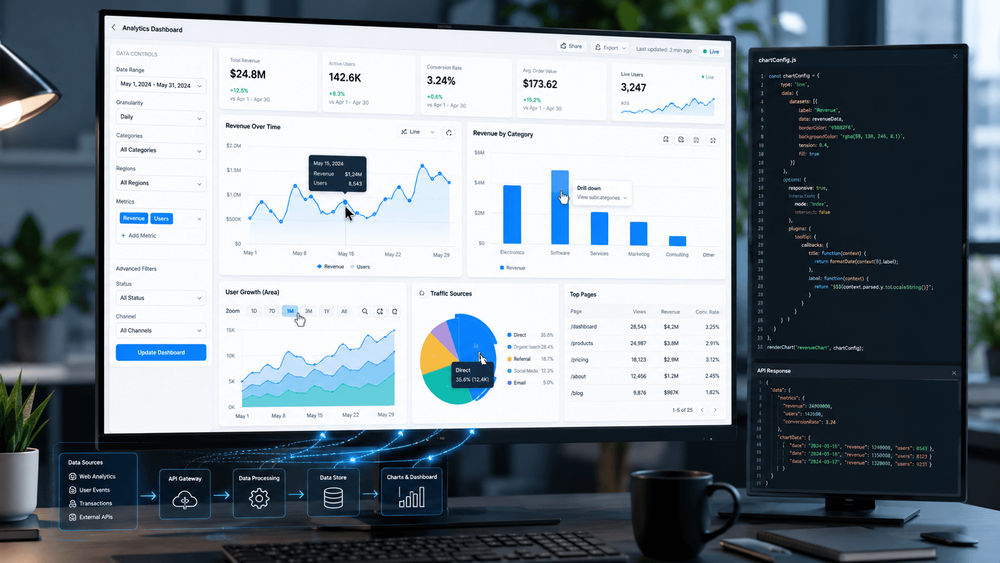
For example, imagine a sales dashboard displaying annual revenue. A static chart might show overall sales figures by month. An interactive chart, however, could allow users to:
- Hover over a data point to see exact values
- Filter results by region or product category
- Zoom into a specific date range
- Click a section of the chart to view more detailed information
- Compare multiple datasets dynamically
These interactions help users answer questions without leaving the page or requesting additional reports.
These interactions help users answer questions without leaving the page or requesting additional reports.
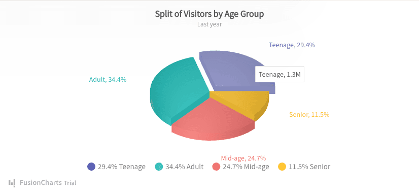
Interactive Pie Chart
Common examples of chart interactivity include:
Tooltips
When users hover over a chart element, a tooltip appears with additional information.
Drill-Down Navigation
Users can click a chart segment to reveal more detailed data.
Zooming and Panning
Large datasets become easier to explore when users can zoom into specific sections and move across the chart.
Filtering
Users can display only the information relevant to their needs.
Real-Time Updates
Charts automatically refresh as new data becomes available.
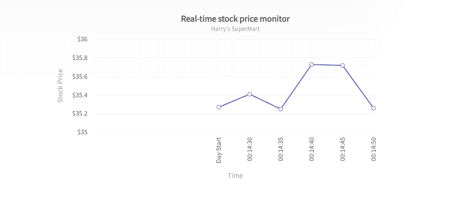
Real-time Line Chart
Animations and Transitions
Visual transitions help users understand changes in data over time.
These features make data exploration faster, more intuitive, and significantly more engaging.
Why Interactive Charts Improve User Experience
The primary purpose of any chart is to communicate information clearly. Interactive charts take this concept further by allowing users to explore information at their own pace. They improve user experience by:
Reducing Information Overload
Modern applications often manage large amounts of data. Showing everything at once can overwhelm users and make important insights difficult to find.
Interactive features such as filtering and drill-down views allow users to focus on the information that matters most to them.
Encouraging Exploration
Users naturally become more engaged when they can interact with visualizations.
Instead of passively viewing a report, they can investigate trends, compare values, and answer questions independently.
Improving Decision-Making
Business users frequently need detailed context before making decisions.
These users use interactive charts to access supporting information instantly. They don’t have to navigate through multiple screens or generate new reports.
Creating Better Dashboard Experiences
Dashboards often contain multiple visualizations working together.
Interactive charts allow users to move seamlessly between high-level summaries and detailed analysis, creating a more connected and efficient user experience.
What Are the Essential Interactive Features Developers Should Consider?
We don’t need every interactive feature in every JavaScript chart. We should focus on solving real user problems rather than adding complexity.
Here are the most valuable features to consider.
Tooltips
Tooltips are often the first interactive feature we should implement.
They provide additional context without cluttering the chart itself. Users can quickly access exact values, percentages, timestamps, or metadata simply by hovering over an element.
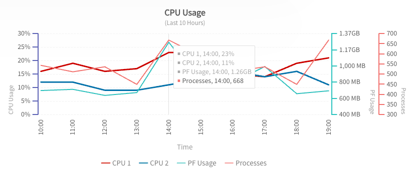
Multi-Axis Line Chart with Tooltips
Well-designed tooltips help maintain clean visualizations while still making detailed information accessible.
Drill-Down Functionality
Drill-down interactions allow users to move from summary data to detailed information.
For example:
- Country → State
- State → City
- City → Individual Store
This approach keeps charts simple while providing access to deeper insights when needed.
Zooming and Panning
Large datasets can quickly become difficult to read.
Zooming allows users to focus on specific sections of a chart, while panning lets them navigate across larger time ranges or datasets.
These features are especially useful for financial, operational, and monitoring applications.
Real-Time Updates
Many modern applications display live information.
Examples include:
- Stock prices
- IoT sensor readings
- Website analytics
- System monitoring dashboards
- Logistics tracking systems
Real-time chart updates help users monitor changing conditions without manually refreshing the page.
Data Filtering
Filtering allows users to customize the information displayed.
Instead of generating multiple charts for different scenarios, users can adjust the view themselves using dropdown menus, checkboxes, or chart controls.
Animations
Animations should support understanding rather than simply add visual flair.
Smooth transitions help users track changes between states and understand how data evolves over time.
When used carefully, animations improve both usability and visual appeal.
How Interactive Charts Work in JavaScript
From a user's perspective, interactive charts seem effortless. Hover over a data point, click a bar, zoom into a timeline, and the chart instantly responds. Behind the scenes, however, several moving parts work together to make these interactions possible.
At a high level, most JavaScript chart implementations follow this process:
- Data is collected from an API, database, or static source.
- The data is transformed into a format that the chart can understand.
- The chart is rendered using SVG, Canvas, or WebGL.
- Event listeners monitor user interactions.
- The chart updates dynamically based on user actions.
For instance, when a user hovers over a data point, the chart detects the mouse event. Then it identifies the corresponding data value and displays a tooltip with relevant information.
Similarly, when a user clicks a chart element to drill down into more detailed data, the application may request additional information from a server and update the visualization without reloading the page.
Modern JavaScript charting libraries handle much of this complexity automatically. These tools allow us to focus on user experience rather than low-level rendering logic.
Building Interactive Charts in JavaScript
Creating interactive charts doesn't have to be complicated. We can follow a structured approach to build scalable and maintainable visualizations.
Step 1: Prepare the Data
Good charts start with clean, organized data.
Most chart libraries work well with JSON data structures because they are lightweight and easy to manipulate in JavaScript applications.
Before building a chart, consider:
- Is the data accurate?
- Does it contain unnecessary fields?
- Can it be aggregated for better performance?
- Is it structured consistently?
The quality of your data directly impacts the quality of your visualizations.
Step 2: Choose the Right Charting Library
Not all charting libraries are designed for the same use cases.
When evaluating options, consider:
- Supported chart types
- Performance with large datasets
- Responsiveness
- Accessibility features
- Framework integrations
- Documentation quality
- Customization options
We have different requirements in different projects. A lightweight startup dashboard may prioritize simplicity, while an enterprise analytics platform may require advanced interactivity and scalability.
Explore the best JavaScript charting libraries to find the right solution for your project.
Step 3: Configure Interactive Features
Once the chart is rendering correctly, we should start adding interactive functionality.
Popular features include:
- Tooltips
- Click events
- Drill-down navigation
- Data filtering
- Zoom controls
- Real-time updates
We should focus on interactions that genuinely help users answer questions more efficiently.
Adding every available feature can make charts feel cluttered and confusing.
Step 4: Optimize for Responsive Design
Users increasingly access dashboards from multiple devices.
Interactive charts should adapt smoothly to:
- Desktop monitors
- Laptops
- Tablets
- Mobile devices
Responsive charts improve usability and ensure visualizations remain readable regardless of screen size.
Step 5: Test Real User Scenarios
Interactive charts often perform differently in production environments than in development.
We should test for:
- Large datasets
- Slow network conditions
- Different browsers
- Touch devices
- Accessibility requirements
Real-world testing helps identify performance bottlenecks before users encounter them.
For developers looking for a deeper walkthrough on implementing interactive visualizations, this guide to creating interactive JavaScript charts provides additional examples and best practices.
Common Challenges and How to Solve Them
JavaScript Interactive charts can significantly improve user experience, but they also introduce technical challenges.
Handling Large Datasets
As our datasets grow, rendering performance can suffer.
Thousands of points, multiple series, and continuous updates can create laggy experiences if charts aren't optimized properly.
Possible solutions include:
- Data aggregation
- Lazy loading
- Virtualization
- Sampling techniques
- Incremental rendering
The goal is to display useful information without overwhelming the browser.
Maintaining Mobile Usability
Features that work perfectly with a mouse may not translate well to touch devices.
Hover interactions, for example, may need alternative implementations on smartphones and tablets.
Design interactions that remain intuitive regardless of input method.
Supporting Accessibility
Accessibility is often overlooked during chart development.
Users relying on screen readers, keyboard navigation, or assistive technologies should still be able to access important information.
Let’s consider:
- Keyboard support
- ARIA labels
- Color contrast
- Alternative data representations
- Descriptive chart titles
Building accessible charts improves usability for everyone.
Managing Real-Time Data
Live dashboards can generate frequent updates.
If every update triggers a complete re-render, performance may degrade quickly.
Efficient state management and selective updates help maintain smooth user experiences even when data changes continuously.
Best Practices for Interactive JavaScript Charts
The most effective interactive charts aren't necessarily the most complex.
They focus on helping users understand information quickly and efficiently.
Keep Interactions Intuitive
Users should immediately understand how to interact with a chart.
We should avoid hidden functionality that requires extensive explanation.
Prioritize Clarity Over Features
More interactivity isn't always better.
Every feature should have a clear purpose and improve the user's ability to understand the data.
Use Tooltips Thoughtfully
Tooltips should provide meaningful context rather than duplicate information already visible on the chart.
Design for Performance
Users expect modern web applications to respond instantly.
We need to monitor rendering speed, memory usage, and responsiveness throughout development.
Make Accessibility a Priority
Accessibility should be part of the initial design process, not an afterthought.
Inclusive design often results in better experiences for all users.
Test With Real Users
Developers and end users often interact with software differently.
Observing how real users explore our charts can reveal opportunities for improvement that technical testing alone may miss.
Conclusion
Interactive JavaScript charts have become a core component of modern web applications. They help users move beyond simply viewing data and allow them to explore, analyze, and uncover insights independently.
By combining features such as tooltips, drill-down navigation, filtering, real-time updates, and responsive design, we can create visualizations that are both engaging and highly functional.
The key is to focus on user needs rather than adding interactivity for its own sake. Well-designed interactive charts make complex information easier to understand, improve decision-making, and create more valuable digital experiences.
Whether we're building a business dashboard, SaaS platform, reporting solution, or analytics application, investing in interactive JavaScript chart experiences can significantly improve how users interact with your data.

