

In this tutorial, we’ll walk through how to build a custom Chatbot application that will allow us to ask questions and receive high-quality answers. The bot will remember previous prompts, simulating context-aware conversation.
Key Takeaways
- Creating a Chatbot Using OpenAI’s ChatGPT and React: This tutorial provides step-by-step instructions for building a custom chatbot application with React, leveraging OpenAI’s ChatGPT for advanced language processing. The chatbot remembers previous prompts, simulating a continuous, context-aware conversation.
- Implementing User Interface and Features: The application features a user-friendly interface, with components like a message window, input area, submit button, and conversation history. It demonstrates how to structure a React application, manage state, and handle events for a seamless user experience.
- Integrating API Calls and Processing Data: The tutorial guides through the process of making API calls to OpenAI’s ChatGPT and handling the data to display chatbot responses. It highlights the importance of securing the API key, especially for production, and suggests enhancements like using Express for server-side operations and incorporating persistent storage for conversation history.

Chatbots have become indispensable tools for businesses and developers seeking to improve customer interactions and streamline user experiences in today’s rapidly evolving digital landscape.
OpenAI’s ChatGPT has transformed from a cutting-edge experiment into a powerhouse in chatbot development. Its meteoric rise to success is nothing short of remarkable, captivating users worldwide.
The demo code of this project is available on CodeSandbox. You’ll have to provide your own OpenAI API key in the .env file to test it live. To get one, create an account on the OpenAI, log in, navigate to the API keys and generate a new API key.
Planning Features and UI
Our application will be based on React, and we’ll use OpenAI API to access the data and use CSS modules for styling.
Utilizing React will allow us to create a dynamic and responsive user interface, enhancing the overall user experience.
The OpenAI API will let us gain access to advanced language processing capabilities, providing data for creating insightful interactions.
Additionally, CSS modules will allow us to maintain a modular design, facilitating efficient development and customization of the app.
The features we’ll be implementing include:
- A designated input area where users will be able to craft prompts, inviting contextually relevant inquiries.
- A Submit button that will allow users to submit their prompts to the API, initiating the conversation process.
- Message items that will be showcased as chat-style messages within the conversation window, enhancing the interactive chat experience.
- Message items to display ChatGPT replies that will provide a conversational flow.
- A History feature that will list all of the user’s recent prompts. This will also allow users to revisit previous conversations.
- A Clear button that will allow the removal of generated content, offering a clean slate for new conversations.
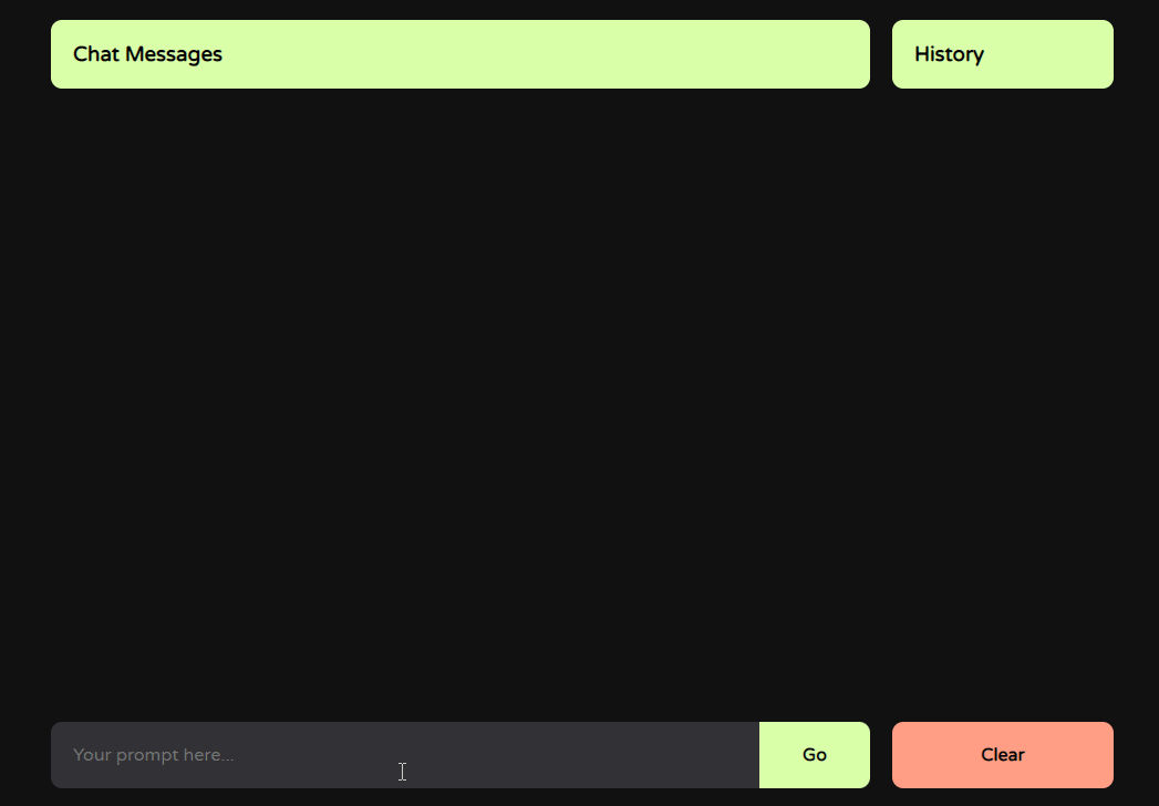
The image below shows our component-based wireframe.
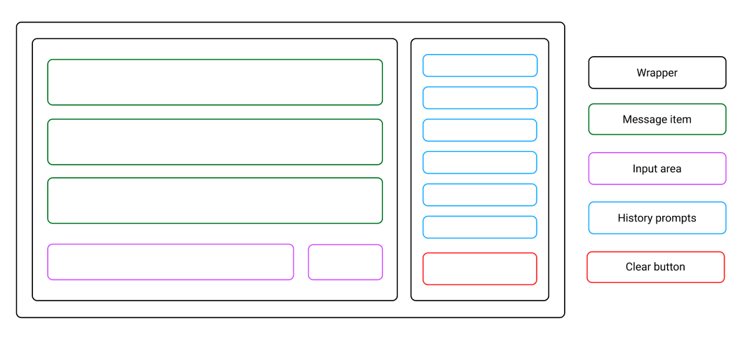
The whole application will be wrapped in the main container, which will hold all of the elements together. It will be further divided into a two-column layout.
The first column will include all of the messages from the user and ChatGPT. At the bottom of the column, there will be an input area and a button for submitting the prompt.
The second column will hold the history of all of the recent prompts. At the bottom of the column, there will be a Clear button that will allow the user to wipe the generated content.
Picking a Color Scheme
The application design will prioritize the ease of content perception. This will allow us to provide a couple of important benefits:
- Users will be able to quickly comprehend the presented information, leading to a more intuitive and user-friendly experience.
- It will also enhance accessibility, ensuring that individuals of varying backgrounds and abilities will be able to easily navigate and engage with the content.
The image below shows our color scheme.
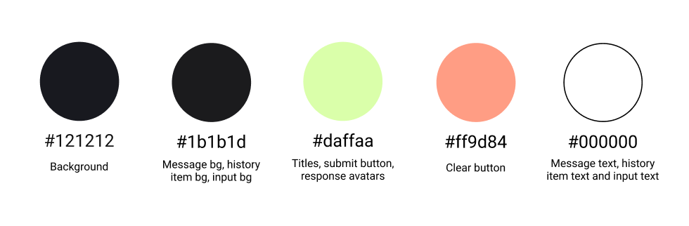
The background of the application will be black, while the messages, history items, and input form will be dark gray.
The text on the messages and input backgrounds will be white, providing a nice contrast and make text easy to read.
To give the app some highlights, the column titles, Submit button, and response message avatars will use a bright, lime-green tone.
To accent the Clear button, a mild red tone will be used. This will also help users avoid clicking the button accidentally.
Setting Up the React App
We’ll use create-react-app to create our application. Run npx create-react-app react-chatgpt to create a new React project.
Wait for a minute for the setup to complete, and then change the working directory to the newly created folder by cd react-chatgpt and run npm start to start the developer server.
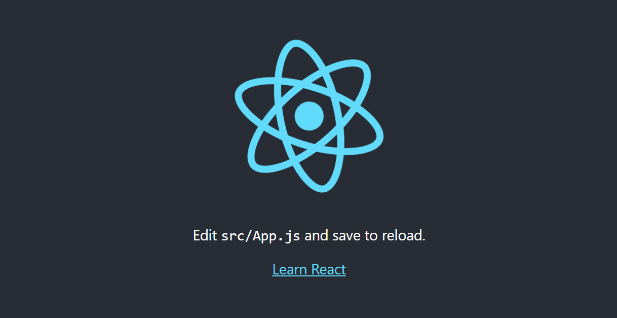
This should open up our project in our default browser. If not, navigate to http://localhost:3000 to open it manually. We should be presented with the React welcome screen, as pictured below.
Adding Global Styles
We’ll add global styling to establish a consistent and unified visual appearance across all components of the application.
Open index.css and include the following styling rules:
@import url("https://fonts.googleapis.com/css2?family=Varela+Round&display=swap");

* {
  margin: 0;
  padding: 0;
  box-sizing: border-box;
  font-family: "Varela Round", sans-serif;
}

body {
  background-color: #121212;
}
First, we import the Varela Round font and set the whole app to use it.
We also remove any pre-defined margins and paddings, as well as set box-sizing to border-box so the app looks the same on different browsers.
Finally, we set the background of the body to a dark tone, which allows us to highlight the content of the application.
Downloading the Media
We’ll need a couple of avatars to represent the authors of the messages from the user and OpenAI API. This way, they’ll be easier to distinguish.
Create a new icons folder inside the src directory and include the bot.png and user.png icons.
You can download samples from icons directory here, or you can use custom ones from sites like FlatIcon or Icons8, as long as you keep the above file names.
Building the Components
First, we need a well-organized file structure that matches the wireframe design.
We’ll use the terminal to create the necessary folder and component files. Each component will have its own JavaScript file for functionality and CSS file for styling.
Change the working directory in the src folder by running cd src and then run the following command:
mkdir components && cd components && touch Message.js Message.module.css Input.js Input.module.css History.js History.module.css Clear.js Clear.module.css
The command above will first create a /components/ folder, then change the working directory to it, and create all the necessary files inside it.
The Message component
The Message component will display user prompts and API responses within the conversation, facilitating the real-time exchange of information between the user and the chatbot.
Open the Message.js file and include the following code:
import bot from "../icons/bot.png";
import user from "../icons/user.png";

import styles from "./Message.module.css";

export default function Message({ role, content }) {
  return (
    <div className={styles.wrapper}>
      <div>
        <img
          src={role === "assistant" ? bot : user}
          className={styles.avatar}
          alt="profile avatar"
        />
      </div>
      <div>
        <p>{content}</p>
      </div>
    </div>
  );
}
First, we import the downloaded icons for avatars and then import the external CSS rules for styling.
After that, we create the wrapper for the Message component, which will contain both icons and text content.
We use the role prop in the conditional to display the appropriate avatar as the image src.
We also use the content prop, which will be passed in as the text response from the OpenAI API and user input prompt.
Now let’s style the component so it looks like a chat message! Open the Message.module.css file and include the following rules:
.wrapper {
  display: grid;
  grid-template-columns: 60px auto;
  min-height: 60px;
  padding: 20px;
  margin-bottom: 20px;
  border-radius: 10px;
  background-color: #1b1b1d;
}

.avatar {
  width: 40px;
  height: 40px;
}
We divide the layout into two columns, with the avatars shown in the fixed-width container on the right and the text on the left.
Next, we add some padding and margin to the bottom of the message. We also style the message to have round borders and set the background to dark gray.
Finally, we set the avatar icon to a fixed width and height.
The Input component
The Input component will be an interface element designed to capture user queries, serving as the means through which users interact and engage with the chatbot.
Open the Input.js file and include the following code:
import styles from "./Input.module.css";

export default function Input({ value, onChange, onClick }) {
  return (
    <div className={styles.wrapper}>
      <input
        className={styles.text}
        placeholder="Your prompt here..."
        value={value}
        onChange={onChange}
      />
      <button className={styles.btn} onClick={onClick}>
        Go
      </button>
    </div>
  );
}
We first import the external stylesheet to style the component.
We return the component wrapper that includes the input field for the user prompts and the button to submit it to the API.
We set the placeholder value to be displayed when the input form is empty, and create the value prop to hold the entered prompt, as well as the onChange prop that will be called once the input value changes.
For the button, the onClick prop will be called once the user clicks on the button.
Now let’s style the component so that the input area looks beautiful and the user is encouraged to provide prompts! Open the Input.module.css file and include the following rules:
.wrapper {
  display: grid;
  grid-template-columns: auto 100px;
  height: 60px;
  border-radius: 10px;
  background-color: #323236;
}

.text {
  border: none;
  outline: none;
  background: none;
  padding: 20px;
  color: white;
  font-size: 16px;
}

.btn {
  border: none;
  border-radius: 0 10px 10px 0;
  font-size: 16px;
  font-weight: bold;
  background-color: rgb(218, 255, 170);
}

.btn:hover {
  cursor: pointer;
  background-color: rgb(200, 253, 130);
}
We set the wrapper to be divided into two columns, with a fixed width for the button and the rest of the available width dedicated to the input area.
We also define the specific height of the component, set the rounded borders for it, and set the background to dark gray.
For the input area, we remove the default border, outline, background and add some padding. We set the text color to white and set a specific font size.
The History component
The History component will display the sequence of past user and chatbot interactions, providing users with a contextual reference of their conversation.
Open the History.js file and include the following code:
import styles from "./History.module.css";

export default function History({ question, onClick }) {
  return (
    <div className={styles.wrapper} onClick={onClick}>
      <p>{question.substring(0, 15)}...</p>
    </div>
  );
}
We first import the external style rules for the component. Then we return the wrapper that will include the text.
The text value will be passed in as a question prop from the user prompt, and only the first 15 characters of the text string will be displayed.
Users will be allowed to click on the history items, and we’ll pass the onClick prop to control the click behavior.
Now let’s style the component to ensure it’s visually appealing and fits well in the sidebar! Open the History.module.css file and include the following rules:
.wrapper {
  padding: 20px;
  margin-bottom: 20px;
  border-radius: 10px;
  background-color: #1b1b1d;
}

.wrapper:hover {
  cursor: pointer;
  background-color: #323236;
}
We set some padding, add the margin to the bottom, and set the rounded corners for the history items. We also set the background color to dark gray.
Once the user hovers over the item, the cursor will change to a pointer and the background color will change to a lighter shade of gray.
The Clear component
The Clear component will be a UI element designed to reset or clear the ongoing conversation, providing users with a quick way to start a new interaction without navigating away from the current interface.
Open the Clear.js file and include the following code:
import styles from "./Clear.module.css";

export default function Clear({ onClick }) {
  return (
    <button className={styles.wrapper} onClick={onClick}>
      Clear
    </button>
  );
}
We first import the external stylesheet to style the component.
We return the button that will allow users to clear the content of the application. We’ll pass the onClick prop to achieve the desired behavior.
Now let’s style the component to make it stand out and reduce the chances of users pressing it accidentally! Open the Clear.module.css file and include the following rules:
.wrapper {
  width: 100%;
  height: 60px;
  background-color: #ff9d84;
  border: none;
  border-radius: 10px;
  font-size: 16px;
  font-weight: bold;
}

.wrapper:hover {
  cursor: pointer;
  background-color: #ff886b;
}
We set the button to fill the available width of the column, set the specific height, and set the background color to mild red.
We also remove the default border, set the rounded corners, set a specific font size, and make it bold.
On hover, the cursor will change to a pointer and the background color will change to a darker shade of red.
Building the User Interface
In the previous section, we built all of the necessary components. Now let’s put them together and build the user interface for the application.
We’ll configure their functionality to create a functional and interactive chatbot interface with organized and reusable code.
Open the App.js file and include the following code:
import { useState } from "react";

import Message from "./components/Message";
import Input from "./components/Input";
import History from "./components/History";
import Clear from "./components/Clear";

import "./styles.css";

export default function App() {
  const [input, setInput] = useState("");
  const [messages, setMessages] = useState([]);
  const [history, setHistory] = useState([]);

  return (
    <div className="App">
      <div className="Column">
        <h3 className="Title">Chat Messages</h3>
        <div className="Content">
          {messages.map((el, i) => {
            return <Message key={i} role={el.role} content={el.content} />;
          })}
        </div>
        <Input
          value={input}
          onChange={(e) => setInput(e.target.value)}
          onClick={input ? handleSubmit : undefined}
        />
      </div>
      <div className="Column">
        <h3 className="Title">History</h3>
        <div className="Content">
          {history.map((el, i) => {
            return (
              <History
                key={i}
                question={el.question}
                onClick={() =>
                  setMessages([
                    { role: "user", content: history[i].question },
                    { role: "assistant", content: history[i].answer },
                  ])
                }
              />
            );
          })}
        </div>
        <Clear onClick={clear} />
      </div>
    </div>
  );
}
First, we import the useState hook that we’ll use to track the data state for the application. Then we import all the components we built and the external stylesheet for styling.
Then we create the input state variable to store the user prompt input, messages to store the conversation between the user and ChatGPT, and history to store the history of user prompts.
We also create the main wrapper for the whole app that will hold two columns.
Each column will have a title and content wrapper that will include the conversation messages, input area, and Submit button for the first column and history items and the Clear button for the second column.
The conversation messages will be generated by mapping through the messages state variable and the history items — by mapping through the history state variable.
We set the input onChange prop to update the input state variable each time user enters any value in the input form.
Once the user clicks the Send button, the user prompt will be sent to the OpenAI API to process and receive the reply.
For the history items, we set the onClick prop so that the messages state variable gets updated to the specific prompt and answer.
Finally, for the Clear button, we pass the onClick prop a function that will clear both the message and history values, clearing the application data.
Creating the App Layout
In this section, we’ll arrange the user interface components to create an intuitive structure for effective user interaction.
Open App.css and include the following styling rules:
.App {
  display: grid;
  grid-template-columns: auto 200px;
  gap: 20px;
  max-width: 1000px;
  margin: 0 auto;
  min-height: 100vh;
  padding: 20px;
}

.Column {
  color: white;
}

.Title {
  padding: 20px;
  margin-bottom: 20px;
  border-radius: 10px;
  color: black;
  background-color: rgb(218, 255, 170);
}

.Content {
  height: calc(100vh - 200px);
  overflow-y: scroll;
  margin-bottom: 20px;
}

::-webkit-scrollbar {
  display: none;
}
We split the main app wrapper into two columns, separated by a gap by using CSS grid layout, and we set the left column for history items to a fixed width.
Next, we set the wrapper to never exceed a certain width, center it on the screen, make it use all of the screen viewport height, and add some padding inside it.
For each column’s contents, we set the text color to white.
For the column titles, we set some padding, add the bottom margin, and set the rounded corners. We also set the title element background color to lime-green and set the text color to black.
We also style the columns themselves by setting the rule that the content shouldn’t exceed a certain height and set the content to be scrollable if it reaches outside the height. We also add a margin to the bottom.
We also hide the scrollbars, so that we don’t have to style them to override the default values for each browser. This rule is optional and we could leave it out.
Getting the API Key from OpenAI
If you haven’t already set up your own API key for the Sandbox in the introduction of this tutorial, make sure to create an account on the OpenAI website.
Next, log in and navigate to the API keys and generate a new API key.
Copy the key to the clipboard and open your project.
Create a new .env file in your project root and paste the value for the following key like so:
REACT_APP_OPENAI_API_KEY=paste-your-code-here
Preparing the Request Call to OpenAI API
Through the OpenAI API, our chatbot will be able to send textual prompts to the OpenAI server, which will then process the input and generate human-like responses.
This is achieved by leveraging a powerful language model that’s been trained on diverse text sources. By providing the model with a conversation history and the current user prompt, our chatbot will receive context-aware responses from the API.
In this section, we’ll prepare the request and implement the call to the API to receive the response and set the data to the state variable we defined earlier.
Open the App.js again and add the following code:
// imported modules ...

export default function App() {
  // useState variables ...

  const handleSubmit = async () => {
    const prompt = {
      role: "user",
      content: input,
    };

    setMessages([...messages, prompt]);

    await fetch("https://api.openai.com/v1/chat/completions", {
      method: "POST",
      headers: {
        Authorization: `Bearer ${process.env.REACT_APP_OPENAI_API_KEY}`,
        "Content-Type": "application/json",
      },
      body: JSON.stringify({
        model: "gpt-3.5-turbo",
        messages: [...messages, prompt],
      }),
    })
      .then((data) => data.json())
      .then((data) => {
        const res = data.choices[0].message.content;
        setMessages((messages) => [
          ...messages,
          {
            role: "assistant",
            content: res,
          },
        ]);
        setHistory((history) => [...history, { question: input, answer: res }]);
        setInput("");
      });
  };

  const clear = () => {
    setMessages([]);
    setHistory([]);
  };

  return <div className="App">// returned elements ...</div>;
}
First, we create a separate handleSubmit function, which will be executed once the user has entered the prompt in the input form and clicks the Submit button.
Inside handleSubmit, we first create the prompt variable that will hold the role user and the prompt itself as an object. The role is important because, when storing our messages, we’ll need to know which ones are user messages.
Then we update the messages state variable with the user prompt.
Next, we make an actual fetch call to the api.openai.com/v1/chat/completions endpoint to access the data from the OpenAI API.
We specify that it’s a POST request, and set the headers with the authorization token and the content type. For the body parameters, we specify which API model to use, and we pass the messages variable as the content from the user.
Once the response is received, we store it in the res variable. We add the object consisting of the role assistant and the response itself to the message state variable.
We also update the history state variable with the object, with the question and corresponding answer as the keys.
After the response is received and state variables are updated, we clear the input state variable to prepare the input form for the next user prompt.
Finally, we create a simple clear function to clear the messages and history state variables, allowing the user to clear the data of the application.
Testing the Application
At this point, we should have created a fully functional chat application! The last thing left to do is to test it.
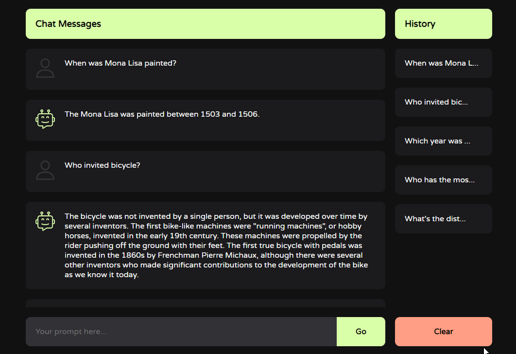
First, let’s try to ask ChatGPT a single question.

The animation above shows a question being submitted and an answer being received.
Now let’s try to create a conversation.
As shown in the animation above, the chatbot remembers the context from the previous messages, so we can speak with it while being fully context-aware.
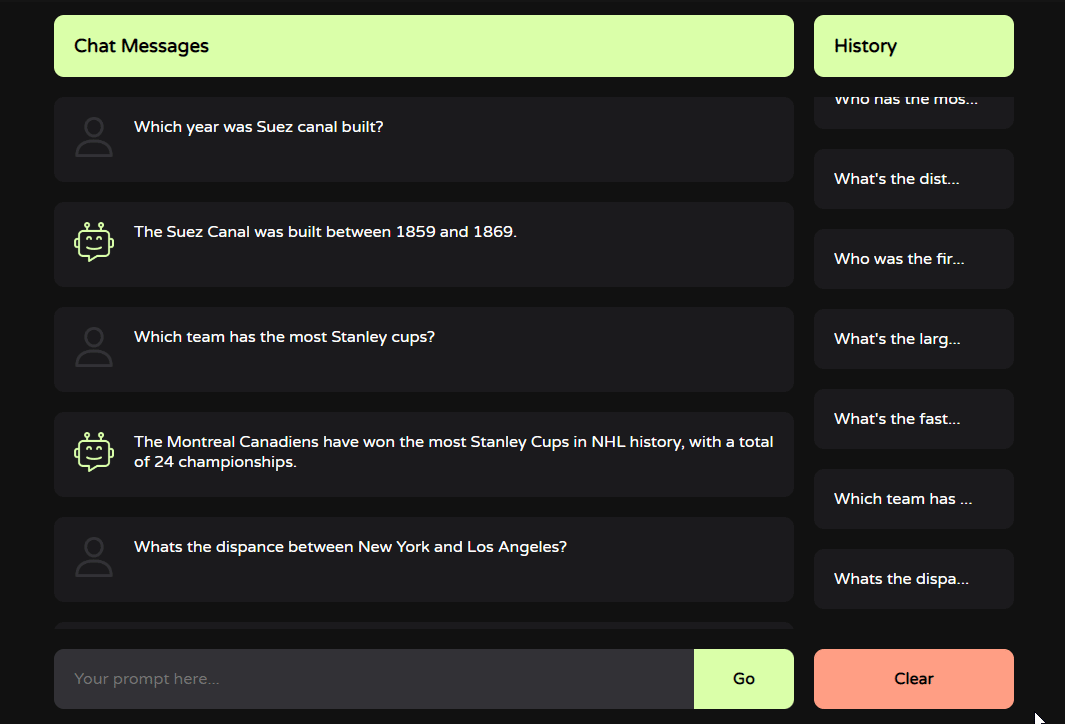
Now let’s see what happens once we click on the History button.
Notice how the chat switches to the respective user prompt and answer. This could be useful if we want to resume the conversation from a specific point.
Finally, let’s click on the Clear button.
As expected, the contents of the app are cleared. This is a useful option when there’s a lot of content and the user wants to start fresh.
Conclusion
In this tutorial, we’ve learned how to create an easy-to-use user interface, how to structure our code via components, how to work with states, how to make API calls, and how to process the received data.
With the combination of advanced natural language processing capabilities of the OpenIAI API and the flexibility of React, you’ll now be able to create sophisticated chatbot applications that you can customize further to your liking.
Notice that this tutorial stores the API key on the frontend, which might not be secure for production. If you want to deploy the project, it would be advisable to create an Express server and use the API key there.
Also, if you want the history prompts to be available after the next initial launch, you could store and then read them from local storage, or even connect a database to your app and store and read data from there.
Frequently Asked Questions (FAQs) about Building a ChatGPT Clone with React and OpenAI API
What is the primary purpose of using React in building a ChatGPT clone?
React is a popular JavaScript library for building user interfaces, particularly for single-page applications. It’s used for handling the view layer in web and mobile apps. React allows you to design simple views for each state in your application, and it will efficiently update and render the right components when your data changes. In the context of building a ChatGPT clone, React provides a flexible and efficient way to structure the chat interface, manage state changes like incoming and outgoing messages, and handle user interactions.
How does the OpenAI API contribute to the functionality of a ChatGPT clone?
The OpenAI API is the core engine that powers the conversational abilities of a ChatGPT clone. It provides access to the GPT-3 model, a state-of-the-art machine learning model for natural language processing tasks. When you send a user’s input to the API, it returns a generated message that simulates a human-like response. This interaction forms the basis of the chat functionality in the ChatGPT clone.
Can I customize the ChatGPT clone to suit my specific needs?
Absolutely. The beauty of building your own ChatGPT clone is the ability to customize it to suit your specific needs. You can modify the user interface, add additional features, or even integrate it with other services or APIs. The provided code serves as a starting point, and you’re encouraged to experiment and make it your own.
What are the prerequisites for building a ChatGPT clone?
To build a ChatGPT clone, you need a basic understanding of JavaScript and React. You also need to set up a development environment with Node.js and npm (Node Package Manager). Additionally, you need access to the OpenAI API, which requires an API key that you can obtain by signing up on the OpenAI website.
How can I handle errors or unexpected responses from the OpenAI API?
The OpenAI API may occasionally return errors or unexpected responses due to various reasons, such as network issues, invalid requests, or API limits. You can handle these situations by implementing error handling logic in your code. This could involve retrying the request, showing an error message to the user, or logging the error for further investigation.
How can I improve the performance of my ChatGPT clone?
There are several ways to optimize the performance of your ChatGPT clone. One approach is to implement efficient state management in your React components to minimize unnecessary renders. Another is to use the OpenAI API efficiently, for example by limiting the frequency of requests or reducing the amount of data sent in each request.
Is it possible to deploy the ChatGPT clone on a server?
Yes, you can deploy your ChatGPT clone on a server to make it accessible on the internet. This involves packaging your application into a deployable format, setting up a server environment, and configuring the server to serve your application. There are many hosting providers that can simplify this process, such as Vercel, Netlify, or Heroku.
Can I use other machine learning models with the ChatGPT clone?
While the provided code is designed to work with the OpenAI API, you can modify it to use other machine learning models if you wish. This would involve replacing the API calls with calls to your chosen model’s API, and potentially adjusting the data processing and handling logic to suit the new model.
How can I add more features to the ChatGPT clone?
Adding more features to the ChatGPT clone involves writing additional code and integrating it with the existing codebase. Some potential features could include support for multiple chat rooms, user authentication, message history, or even multimedia messages. The possibilities are limited only by your imagination and coding skills.
How can I secure the communication between the ChatGPT clone and the OpenAI API?
Securing the communication between your ChatGPT clone and the OpenAI API is crucial to protect your API key and the data being transmitted. This can be achieved by using HTTPS for all API requests, which encrypts the data in transit. Additionally, you should store your API key securely and not expose it in your client-side code.