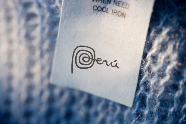
Earlier this month, the South American country of Peru launched its new identity. Created by British design firm FutureBrand, the logo is beautiful in its simplicity. There are no symbols, just a typographic-only treatment with a spiral letter P, which gives a nod to the country’s rich archaeological sites such as Moray and Caral.
 Peruvian tourism minister Eduardo Ferreyros Kuppers said at the launch “We’re ready to spread our brand, we’ve given our country an ID”. The word Peru sits proudly alone on the colored background and as the promoters say “it is enough”. The country name is short and is pronounced the same worldwide. The accent mark over the letter “u” stands out and creates a sense of balance.
Red will be used predominately as the background color of the brand, but it will also appear in yellow, purple, green and blue.
Peruvian tourism minister Eduardo Ferreyros Kuppers said at the launch “We’re ready to spread our brand, we’ve given our country an ID”. The word Peru sits proudly alone on the colored background and as the promoters say “it is enough”. The country name is short and is pronounced the same worldwide. The accent mark over the letter “u” stands out and creates a sense of balance.
Red will be used predominately as the background color of the brand, but it will also appear in yellow, purple, green and blue.
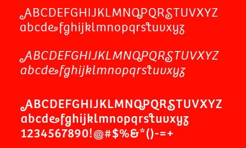
 The identity features a new font called Bree Peru, created by font design firm Type Together. The new typeface has a spiral squiggle at the end of some of the capital letters, tying in with the curving lines of the letter P and the patterns in the ancient culture.
 ,
Original Image from Brand New
José Luis Silva, president of Peru’s exporters association, ADEX, said that “three thousand Peruvian products or more are on the tables of consumers throughout the world. We need to put the brand on all these products.” The logo will eventually used on tags and labels on goods for export around the world.
,
Original Image from Brand New
José Luis Silva, president of Peru’s exporters association, ADEX, said that “three thousand Peruvian products or more are on the tables of consumers throughout the world. We need to put the brand on all these products.” The logo will eventually used on tags and labels on goods for export around the world.
 This is not the first time that Futurebrand has created a brand for a country. In 2003 it successfully designed the Australian country brand, while more recently, in 2009, they designed the branding for St. Lucia. I believe logo design is without doubt the most challenging area of graphic design. Condensing the idea of a company down into a symbol or piece of text takes a lot of skill, but to take the hopes and dreams of a country and do the same takes real skill.
Below you can see the promotional video created to accompany the launch. I love the sense of movement created with the lines overlaid on the images. There is a wonderful sense of movement.
Personally I love the identity. It is clean, bright and charming and probably my favorite new logo of 2011 so far.
But more importantly, what do you think of the logo? Have Futurebrand managed to encapsulate the feeling of an entire country into one small mark?
This is not the first time that Futurebrand has created a brand for a country. In 2003 it successfully designed the Australian country brand, while more recently, in 2009, they designed the branding for St. Lucia. I believe logo design is without doubt the most challenging area of graphic design. Condensing the idea of a company down into a symbol or piece of text takes a lot of skill, but to take the hopes and dreams of a country and do the same takes real skill.
Below you can see the promotional video created to accompany the launch. I love the sense of movement created with the lines overlaid on the images. There is a wonderful sense of movement.
Personally I love the identity. It is clean, bright and charming and probably my favorite new logo of 2011 so far.
But more importantly, what do you think of the logo? Have Futurebrand managed to encapsulate the feeling of an entire country into one small mark?
Frequently Asked Questions (FAQs) about Peru’s New Logo and Branding
What is the significance of Peru’s new logo?
The new logo of Peru is a significant part of the country’s rebranding strategy. It is designed to represent the country’s rich cultural heritage, diverse landscapes, and vibrant communities. The logo features a stylized representation of the national bird, the Andean cock-of-the-rock, in vibrant colors that reflect the country’s biodiversity. The logo is intended to promote Peru as a unique and attractive destination for tourism, business, and cultural exchange.
How does the new logo contribute to Peru’s branding?
The new logo plays a crucial role in Peru’s branding by providing a visual identity that is instantly recognizable and distinctly Peruvian. It helps to create a positive and memorable image of the country in the minds of international audiences. The logo is used in various promotional materials and campaigns to showcase Peru’s attractions and opportunities.
Who designed Peru’s new logo?
Peru’s new logo was designed by FutureBrand, a global brand strategy and design consultancy. The firm worked closely with PromPeru, the country’s tourism and export promotion agency, to create a logo that captures the essence of Peru and resonates with global audiences.
What elements are incorporated in Peru’s new logo?
Peru’s new logo incorporates several elements that reflect the country’s unique attributes. The central motif is the Andean cock-of-the-rock, a bird native to Peru and a national symbol. The bird is depicted in a stylized and abstract form, with vibrant colors that represent the country’s biodiversity. The logo also includes the word “Peru” in a modern and dynamic typeface.
How does Peru’s new logo compare with those of other countries?
Compared to the logos of other countries, Peru’s new logo stands out for its vibrant colors, dynamic design, and cultural symbolism. While many country logos rely on traditional symbols or landmarks, Peru’s logo takes a more abstract and creative approach. This helps to differentiate Peru and create a unique brand identity.
What was the public reaction to Peru’s new logo?
The public reaction to Peru’s new logo has been largely positive. Many people have praised the logo for its creative design and cultural relevance. However, like any rebranding effort, it has also faced some criticism. Some people feel that the logo does not adequately represent all aspects of Peru’s diverse culture and geography.
How is Peru’s new logo used in marketing and promotion?
Peru’s new logo is used extensively in marketing and promotional activities. It appears on a wide range of materials, from tourism brochures and websites to trade show displays and merchandise. The logo helps to create a consistent and recognizable brand image for Peru across different platforms and media.
What impact has the new logo had on Peru’s tourism and economy?
While it’s difficult to measure the direct impact of the new logo on Peru’s tourism and economy, it’s clear that the logo is a key part of the country’s broader branding and promotional efforts. These efforts have helped to increase international awareness of Peru and attract more tourists and investors to the country.
What challenges did the designers face in creating Peru’s new logo?
One of the main challenges in creating Peru’s new logo was to capture the diversity and complexity of the country in a simple and effective design. The designers also had to ensure that the logo would appeal to international audiences and work well across different media and formats.
What future plans does Peru have for its branding and logo?
Peru plans to continue using its new logo as a central element of its branding and promotional activities. The country is also exploring new ways to leverage the logo and its brand identity to attract more tourists, investors, and cultural exchanges.
 Jennifer Farley
Jennifer Farley is a designer, illustrator and design instructor based in Ireland. She writes about design and illustration on her blog at Laughing Lion Design.