

Google Chrome on Windows is notorious for the border-radius/Inset box-shadow bug. This bug has now spread to the Mac version of Chrome (version 10.0.648.127).
If you aren’t familiar with the bug here is a quick run down of the problem: when applying a border radius on an input element, inset box-shadow will ignore the border-radius and act as if it isn’t there at all. Result? You receive an ugly hard corner that goes underneath your borders.
After a bit of a fiddle I came up with a solution and possibly found the actual cause of this issue. It turns out that if your border radius is larger than the height of the element (taking in to account padding, font-size, and so forth) this visual error will occur.
We actually suffered this problem here on Design Festival on the search input. Here was the initial CSS that we were using:
input.text, #s {

    float: left;

    width: 163px;

    border: 1px solid #C0C0BA;

    font-size: 85%;

    padding: 4px 15px 4px 30px;

    -webkit-box-shadow: inset 0px 0px 5px rgba(0, 0, 0, 0.17);

    -moz-box-shadow: inset 0px 0px 5px rgba(0, 0, 0, 0.17);

    box-shadow: inset 0px 0px 5px rgba(0, 0, 0, 0.17);

    background: white url(/wp-content/themes/designfestival/images/social-icons/mail.png) no-repeat 7px 4px;

    height: 14px;

    }
input {

    -webkit-border-radius: 20px;

    -moz-border-radius: 20px;

    border-radius: 20px;

    padding: 2px 3px 3px;

    font-family: "Liberation Serif Italic", "Times New Roman", Serif;

    font-style: italic;

    }
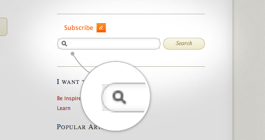
Here’s a screenshot of how that rendered:
The Fix
By changing the border radius of the input element I was able to fix the problem of the angry inset box-shadow.
Here is the finished CSS with the fix:
input.text, #s {

    float: left;

    width: 163px;

    border: 1px solid #C0C0BA;

    font-size: 85%;

    padding: 4px 15px 4px 30px;

    -webkit-box-shadow: inset 0px 0px 5px rgba(0, 0, 0, 0.17);

    -moz-box-shadow: inset 0px 0px 5px rgba(0, 0, 0, 0.17);

    box-shadow: inset 0px 0px 5px rgba(0, 0, 0, 0.17);

    background: white url(/wp-content/themes/designfestival/images/social-icons/mail.png) no-repeat 7px 4px;

    height: 14px;

    }
input {

    -webkit-border-radius: 12px;

    -moz-border-radius: 12px;

    border-radius: 12px;

    padding: 2px 3px 3px;

    font-family: "Liberation Serif Italic", "Times New Roman", Serif;

    font-style: italic;

    }

That ought to do it. Have you encountered this bug?
Frequently Asked Questions on Border Radius and Inset Box Shadow Bug Solution
What is the purpose of the border-radius property in CSS?
The border-radius property in CSS is used to add rounded corners to an element. This property can have one, two, or four values that define the radius of the quarter ellipse that defines the shape of the corner. The border-radius property can also be used to create circular elements if the radius is set to 50%.
How does the inset keyword work in CSS box-shadow?
The inset keyword in CSS box-shadow is used to create an inner shadow, rather than the default outer shadow. When inset is defined, the shadow is drawn inside the border edge, giving the impression that the box is embossed into the canvas.
What is the bug associated with border-radius and inset box-shadow?
The bug associated with border-radius and inset box-shadow is that when both properties are applied to an element, the inner shadow does not follow the curve of the border radius, but instead cuts off sharply. This can result in an undesirable visual effect.
What is the solution to the border-radius and inset box-shadow bug?
The solution to the border-radius and inset box-shadow bug is to use a pseudo-element with the same border-radius as the parent element. The pseudo-element is then positioned absolutely to cover the parent, and the box-shadow is applied to the pseudo-element instead of the parent.
How can I create an inverted rounded corner with CSS?
To create an inverted rounded corner with CSS, you can use the border-radius property with a large value. This will create a curve that extends beyond the box edge and back to the box content, creating an inverted rounded corner.
What is the basic shape inset in CSS?
The basic shape inset in CSS is used to define an inset rectangle as the reference box for a position, size, or shape. The inset() function takes four arguments that define the top, right, bottom, and left offsets of the inset rectangle.
How can I create a circular element with CSS?
To create a circular element with CSS, you can use the border-radius property with a value of 50%. This will create a quarter ellipse with a radius equal to half the width and height of the box, resulting in a perfect circle.
Can I use different values for the horizontal and vertical radii of a border-radius?
Yes, you can use different values for the horizontal and vertical radii of a border-radius. This is done by specifying two values for the border-radius property. The first value is the horizontal radius, and the second value is the vertical radius.
What is the difference between an outer shadow and an inner shadow?
An outer shadow is drawn outside the border edge, giving the impression that the box is lifted off the canvas. An inner shadow, on the other hand, is drawn inside the border edge, giving the impression that the box is embossed into the canvas.
Can I use the border-radius property with other CSS properties?
Yes, you can use the border-radius property with other CSS properties. For example, you can use it with the box-shadow property to create a shadow that follows the curve of the border radius. However, be aware of the bug associated with using border-radius and inset box-shadow together.