Bootstrap 4 was released as stable version (at last!) and brought many new cool features for us. One of them is a set of upgraded Bootstrap utility classes that we’ll focus on in this article.
Introducing Bootstrap Utility Classes
Bootstrap utility classes are meant to be applied to various elements on the page to quickly style them in some manner without the need to write custom CSS rules. In many cases, you just provide a class for your element and observe the result right away. If you’ve never employed utility classes before, fear not: in most cases they are quite simple, yet powerful. They are very convenient because you don’t need to reinvent the wheel and can concentrate on more complex tasks when creating a web application.
There are lots of Bootstrap utility classes available that set the element’s position, tweak its display and float properties, adjust margins and paddings, color the text and background, and more. A full list of these classes can be found on the getbootstrap.com official website, and in this article I’ll cover some interesting Bootstrap utility classes that may greatly simplify your life as a developer. So, shall we start?
Flex
Flex is a new and much-anticipated feature of Bootstrap 4. It allows us to easily manage an element’s layout and alignment with a bunch of classes. Note, however, that this feature relies on the display: flex property, which may not be supported by older browsers. Interestingly, Bootstrap’s grid system now also relies on flexbox.
Flex is quite a big topic on its own and we won’t discuss it thoroughly in this article. Let me just quickly show some results that you may achieve with this feature.
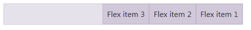
First, it’s possible to easily control the direction of your elements (that is, whether they’ll be displayed left to right or right to left). For instance:
<div class="d-flex flex-row-reverse">
  <div class="p-2">Flex item 1</div>
  <div class="p-2">Flex item 2</div>
  <div class="p-2">Flex item 3</div>
</div>
This will render three elements aligned to the right, with the first element located on the right-most position:
The order of the elements may be further controlled with the classes like order-N where N is the position’s number:
<div class="d-flex flex-nowrap">
  <div class="order-3 p-2">First flex item</div>
  <div class="order-2 p-2">Second flex item</div>
  <div class="order-1 p-2">Third flex item</div>
</div>
Note that this feature supports responsiveness with the classes like order-sm-1.
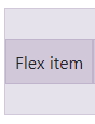
The elements can be also aligned in a specific manner on the X or Y axis. For example:
<div class="d-flex align-items-center bd-highlight mb-3">
  <div>Flex item</div>
</div>
This will center the item on the Y axis:
Float
Float is a new utility that replaces good old “pulls”. In Bootstrap 3 you would write:
<div class="pull-left">Pull to the left!</div>
In Bootstrap 4:
<div class="float-left">Float to the left!</div>
A cool enhancement is that floats have become responsive too, meaning you don’t need to craft your own styles to take care of various breakpoints. For instance, the following element will float to the right only on medium (or larger) screens:
<div class="float-md-right"></div>
Display
The display property has also been fully reworked in Bootstrap 4. It now supports all display values (from none to flex) and is fully responsive. The corresponding classes look like .d-{breakpoint}-{value}:
breakpointmay have values ofsm,md,lg, orxl. If this value is skipped, thenxsis used by default, which effectively means the display will have the same value on all viewports.The
{value}is any of those supported by thedisplayproperty.
This means that you may hide an element for chosen viewports like this:
<div class="d-lg-none">Hide on screens wider than lg</div>
What’s more, this utility works with print layouts too. For instance, an element may be hidden for printing:
<div class="d-print-none">Screen Only (Hide on print only)</div>
Sizing
With Bootstrap 4 you may also control the sizing of your elements with ease. Suppose we want to display a div that occupies 25% of the parent’s width:
<div class="w-25">Width 25%</div>
What about the height? That’s possible too:
<div class="h-25">Height 25%</div>
Want to provide max-height or max-width? Utilize either mh-100 or mw-100 classes. As you see, nothing complex!
Spacing
The Spacing feature presents a wide range of small but handy utilities that can be used to quickly set margins and paddings for any element. Lazy developers like me will surely love this addition!
The corresponding classes look like {property}{sides}-{size}:
{property}is eitherm(margin) orp(padding).{sides}can have values liket(top) orl(left). If it has a blank value, the sizing will be applied to all four sides of the element.{size}is an integer from0to5, orauto. This integer specifies a multiplier passed to the formula that calculates the resulting sizing($spacer * MULTIPLIER). The default value of$spaceris1 rem. For example1corresponds to the0.25multiplier,2corresponds to the0.5multiplier,3to the value of$spaceralone,4corresponds to the1.5multiplier, and finally5corresponds to the3multiplier.
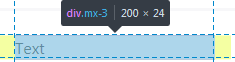
The following code means that the element will have left and right margins with the value of 1rem (x means “X axis”):
<div class="mx-3"></div>
Text
Text utilities were available in Bootstrap 3, but in the new version they’ve become even more powerful and convenient.
Alignment
As before, you can specify the alignment of text and, for example, make it centered:
<p class="text-center">Text is centered!</p>
But, what’s more, these utility classes are also responsive now, which means we can make this text centered only on extra-large viewports:
<p class="text-xl-center">Text is centered only on very large screens!</p>
Transform
Transform is a new, small feature that may change the text to lowercase, uppercase or capitalize it. For instance:
<p class="text-capitalize">capiTaliZed</p>
This will display our text as “CapiTaliZed” (only the first “c” letter is uppercased):

Font Weights
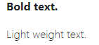
Changing a font’s weight is now as simple as it can be:
<p class="font-weight-bold">Bold text.</p>
<p class="font-weight-light">Light weight text.</p>
Colors
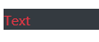
You can now make your website brighter with a collection of Bootstrap utility classes for color! This feature was already available in the previous version of Bootstrap, but now it provides some new classes and options. For instance, we may now combine the color and background in the following way:
<p class="text-danger bg-dark">Text</p>
This will display red text on a black background:
All in all, classes that change the text’s color itself look like text-{color}. Background can be changed with classes like bg-{color}.
There is also support for background gradients, but it must be enabled by explicitly setting the $enable-gradients Sass variable to true.
Borders
This is a new and quite cool feature of Bootstrap 4 that allows you to quickly style borders of any element (and even each border individually!).
For example, the following code will add a grey border for the element:
<div class="border"></div>
If, for some reason, you’re interested only in the top border, then write this:
<div class="border-top"></div>

The classes look like border-{side}, where side can have the following values:
leftrightbottomtop- no value (in this case border will be set for all sides)
We can be even more specific by utilizing so-called subtractive border classes. These classes look pretty much the same as the ones listed above, but must end with a -0 postfix: border-{side}-0. So, if we say:
<div class="border-top-0"></div>
our element will have all borders except for the top one. You can further combine these classes and, for instance, display only the left and bottom borders:
<div class="border-top-0 border-right-0"></div>

Quite neat, huh?
Color ’Em All!
What’s more, the border color can also be changed with the help of Bootstrap utility classes. The available colors correspond to the ones listed on the colors page.
So, for instance, we may say the following to make the element’s text appear in red:
<div class="border border-danger"></div>

Tweak the Radius
Lastly, the radius of any element can be modified as well with the help of the following classes:
roundedrounded-toprounded-leftrounded-rightrounded-bottomrounded-circlerounded-0
rounded-circle sets border-radius of an element to 50%, whereas rounded-0 cancels all the rounding. Other classes make the corresponding border slightly rounded by setting the value to 0.25rem:
Embeds
Embeds is yet another new Bootstrap utility classes feature that might greatly simplify things for you. As the name implies, it allows you to create responsive embeds that have specific ratio scaling on various devices.
What does that mean? Suppose you’d like to display a YouTube video on your website. You can do it like this:
<div class="embed-responsive embed-responsive-16by9">
  <iframe class="embed-responsive-item" src="SOME_URL_HERE"></iframe>
</div>
This will make sure that the video’s ratio is always 16:9 and it will scale properly! There are other ratios available:
embed-responsive-21by9embed-responsive-16by9embed-responsive-4by3embed-responsive-1by1
Close Icon
Last but not the least is this tiny utility that does what it says: displays a close icon. One thing to remember is to specify some text for screen readers in the following way:
<button type="button" class="close" aria-label="Close">
<span aria-hidden="true">×</span>
</button>
It looks like this:

Conclusion
In this article, we’ve discussed Bootstrap utility classes that simplify styling of various elements on the web page. We’ve covered utilities like flex, display, border, and seen some examples of their usage. Of course, there’s more to these classes, so be sure to browse the official documentation, where you’ll find even more useful examples.
Do you like the new features of Bootstrap 4? Are there any specific Bootstrap utility classes that you’ve found particularly useful or interesting? Share your opinion in the comments, and don’t hesitate to post your questions as well!
If you’ve heard about Bootstrap but have been putting off learning it because it seems too complicated, then play through our Introduction to Bootstrap 4 course for a quick and fun introduction to the power of Bootstrap.
Frequently Asked Questions about Bootstrap Utility Classes
What are the different types of Bootstrap utility classes available?
Bootstrap utility classes are a set of CSS classes that provide quick and convenient inbuilt styles. They include classes for layout, spacing, typography, colors, and visibility. Layout classes help in creating responsive designs and grid systems. Spacing classes are used for margin and padding adjustments. Typography classes help in styling text, while color classes are used for text and background color styling. Visibility classes, on the other hand, control the visibility of elements on different devices.
How can I use Bootstrap utility classes for responsive design?
Bootstrap utility classes offer a powerful tool for creating responsive designs. The grid system classes like .container, .row, and .col-* can be used to create a flexible layout that adjusts according to the screen size. Additionally, visibility classes like .d--none and .d--block can control the visibility of elements on different devices.
How do I use spacing utility classes in Bootstrap?
Spacing utility classes in Bootstrap are used to adjust margin and padding. They follow a simple syntax: {property}{sides}-{size}. The property can be ‘m’ for margins and ‘p’ for padding. The sides can be ‘t’, ‘b’, ‘l’, ‘r’, ‘x’, ‘y’, or blank for top, bottom, left, right, both x-axis, both y-axis, or all sides respectively. The size can be from 0 to 5, where 0 removes the space and 5 is the largest space.
Can I customize Bootstrap utility classes?
Yes, Bootstrap utility classes can be customized. You can override the default styles by adding your own CSS rules. However, it’s recommended to use a separate CSS file for your custom styles to avoid conflicts with the Bootstrap’s original CSS.
How do I use color utility classes in Bootstrap?
Color utility classes in Bootstrap are used to style the text and background color. For text color, use .text-{color} and for background color, use .bg-{color}. Replace {color} with the name of the color like ‘primary’, ‘secondary’, ‘success’, ‘danger’, ‘warning’, ‘info’, ‘light’, ‘dark’, or ‘white’.
What are the visibility classes in Bootstrap?
Visibility classes in Bootstrap control the visibility of elements on different devices. They follow the .d-{breakpoint}-{value} syntax. The breakpoint can be ‘sm’, ‘md’, ‘lg’, ‘xl’, or ‘xxl’ for different screen sizes. The value can be ‘none’ to hide the element or ‘block’ to show the element.
How do I use typography utility classes in Bootstrap?
Typography utility classes in Bootstrap help in styling text. They include classes for text alignment (.text-{direction}), text transformation (.text-{transform}), font weight (.font-weight-{value}), and text decoration (.text-decoration-{value}). Replace {direction} with ‘left’, ‘right’, ‘center’, or ‘justify’; {transform} with ‘lowercase’, ‘uppercase’, or ‘capitalize’; {value} with ‘bold’, ‘bolder’, ‘normal’, ‘light’, or ‘lighter’; and {value} with ‘none’, ‘underline’, ‘overline’, or ‘line-through’ respectively.
How do I use the display property in Bootstrap utility classes?
The display property in Bootstrap utility classes controls the display type of elements. It follows the .d-{value} syntax. The value can be ‘none’ to hide the element, ‘inline’ to display the element inline, ‘block’ to display the element as a block, or ‘inline-block’ to display the element as an inline-block.
Can I use multiple utility classes on a single element?
Yes, you can use multiple utility classes on a single element. Just separate each class with a space. For example,
Are Bootstrap utility classes compatible with all browsers?
Bootstrap utility classes are compatible with all modern browsers. However, some older versions of browsers may not support all features. It’s always a good practice to test your design in different browsers to ensure compatibility.
 Ilya Bodrov-Krukowski
Ilya Bodrov is personal IT teacher, a senior engineer working at Campaigner LLC, author and teaching assistant at Sitepoint and lecturer at Moscow Aviations Institute. His primary programming languages are Ruby (with Rails) and JavaScript. He enjoys coding, teaching people and learning new things. Ilya also has some Cisco and Microsoft certificates and was working as a tutor in an educational center for a couple of years. In his free time he tweets, writes posts for his website, participates in OpenSource projects, goes in for sports and plays music.